May 6, 2019
Include Grand Totals in Pivot Charts
If you work with PivotTables, then you’ve probably found that you can’t include grand totals in Pivot Charts, or subtotals
Read More
May 6, 2019
If you work with PivotTables, then you’ve probably found that you can’t include grand totals in Pivot Charts, or subtotals
Read More
January 30, 2019
Creating an Excel five star rating chart is easy with Conditional Formatting. They’re not limited to stars, you can also
Read More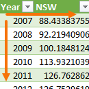
November 15, 2018
The options in the Pivot Chart library are limited, which you’ll know if you’ve ever tried to create a Scatter
Read More
November 8, 2018
Ok, that title is a lie. There’s no such thing as an Excel Scatter Pivot Chart. It’s like mixing water
Read More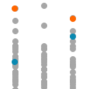
November 1, 2018
A common chart mistake is to use a line chart for the wrong type of data. An example of that
Read More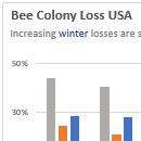
August 21, 2018
Excel Chart titles are often a wasted opportunity to connect with your audience and drive home your message. So, let’s
Read More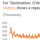
August 14, 2018
Understanding your data and creating Excel charts has never been easier with Excel's Analyze Data (previously known as Excel Ideas
Read More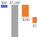
August 8, 2018
Excel Waterfall charts are now available to Office 365 users via the Insert > Charts menu. It makes light work
Read More
August 2, 2018
Last week I looked at getting real time data into Power BI using PubNub. This week I want to take
Read More
May 16, 2018
Excel mini charts are a great alternative to Sparklines. Mini charts are just regular charts made really small. You might
Read More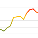
May 8, 2018
Excel multi-colored line charts are a little gimmicky, after all we don’t need color to tell if a line is
Read More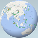
May 3, 2018
Excel 3D Maps in 2016, or Power Map as it’s known in Excel 2013, enable you to visualise data in,
Read More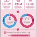
February 14, 2018
Excel infographics, like the one below, are easy to build and there are loads of tools you can use to
Read More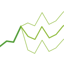
February 5, 2018
The Excel Forecast Sheet and charts are a new feature available in Excel 2016. In just a few clicks you
Read More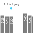
January 31, 2018
Plotting data over time can reveal patterns and trends, but often blips in the data require further explanation. We can
Read MoreDecember 14, 2017
Format your dashboards and reports fast with these pro Excel chart formatting tips. Watch the Video Pro Tip 1 –
Read More
December 6, 2017
Dumbbells and Lollipop Charts Excel Dot Plots, dumbbells and lollipop charts are good for comparing one, two or three points
Read More
November 30, 2017
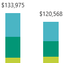
When you think of visualizing parts to a whole in Excel charts the first thing that’s likely to come to
Read More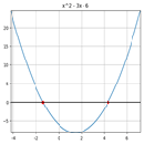
November 17, 2017
Something I've wanted to do easily in Excel is plot equations. If I have something like 2x2 + 3x +
Read More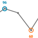
October 2, 2017
Highlighting the minimum and maximum in an Excel chart can help focus your readers’ attention. We can manually select points
Read More
September 26, 2017
The default Excel chart legends can be awkward and time consuming to read when you have more than 2 series
Read More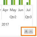
September 7, 2017
Excel Pivot Chart Drill down buttons are a new feature available in Excel 2016. You’ll find them in the bottom
Read More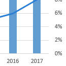
July 5, 2017
Sometimes a secondary axis is a necessary evil. After all, most of the time you can’t plot big numbers and
Read More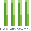
June 29, 2017
One of the cool features of Power BI is the ability to cross filter and highlight charts. With a simple
Read More
March 16, 2017
New in Excel 2016 (for Office 365 subscription users only*) are Map Charts. *If you have Office 365 and can’t
Read More
December 15, 2016
Survey data can be tricky to display in a chart so in this post I’m going to give you some
Read More
December 7, 2016
Excel Heat maps can speed up interpretation of data and focus the reader’s attention to problem or key areas. And
Read MoreDecember 1, 2016
Slopegraphs were first introduced by Edward Tufte in his book, The visual Display of Quantitative Information (1983) where he referred
Read More
August 11, 2016
Slicers are a great tool for easily filtering PivotTables and Pivot Charts, but what if you want to use a
Read More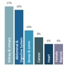
August 3, 2016
I was reading a health magazine last week and the chart below caught my eye. click image to enlarge (sorry
Read More