• Skip to main content
  • Skip to header right navigation
  • Skip to site footer

My Online Training Hub

Learn Dashboards, Excel, Power BI, Power Query, Power Pivot

  • Courses
  • Pricing
    • Free Courses
    • Power BI Course
    • Excel Power Query Course
    • Power Pivot and DAX Course
    • Excel Dashboard Course
    • Excel PivotTable Course – Quick Start
    • Advanced Excel Formulas Course
    • Excel Expert Advanced Excel Training
    • Excel Tables Course
    • Excel, Word, Outlook
    • Financial Modelling Course
    • Excel PivotTable Course
    • Excel for Customer Service Professionals
    • Multi-User Pricing
  • Resources
    • Free Downloads
    • Excel Functions Explained
    • Excel Formulas
    • Excel Add-ins
    • IF Function
      • Excel IF Statement Explained
      • Excel IF AND OR Functions
      • IF Formula Builder
    • Time & Dates in Excel
      • Excel Date & Time
      • Calculating Time in Excel
      • Excel Time Calculation Tricks
      • Excel Date and Time Formatting
    • Excel Keyboard Shortcuts
    • Excel Custom Number Format Guide
    • Pivot Tables Guide
    • VLOOKUP Guide
    • ALT Codes
    • Excel VBA & Macros
    • Excel User Forms
    • VBA String Functions
  • Members
    • Login
  • Blog
  • Excel Webinars
  • Excel Forum
    • Register as Forum Member

Visualizing Parts to a Whole in Excel Charts

You are here: Home / Excel Charts / Visualizing Parts to a Whole in Excel Charts
November 30, 2017 by Mynda Treacy

When you think of visualizing parts to a whole in Excel charts the first thing that’s likely to come to mind is the pie chart, or if you’re Homer Simpson then you might think of doughnut charts!

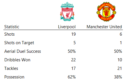
Being outnumbered 3:1 by football (soccer) fans in my household, I get to see my fair share of “the beautiful game” on TV. To pass the time I often find myself looking at the match statistics posted on the screen.

Football stats typically focus on possession, shots, corners, fouls and other comparisons that often bear no correlation to the outcome of the game, although I’m not complaining as they help to pass the time 😊

Using football as inspiration, let’s look at our options for visualizing parts to a whole data using this standard set of football statistics:

football stats

Pie Charts

We’ll start with the obvious and most favored among data visualization novices; the pie chart.

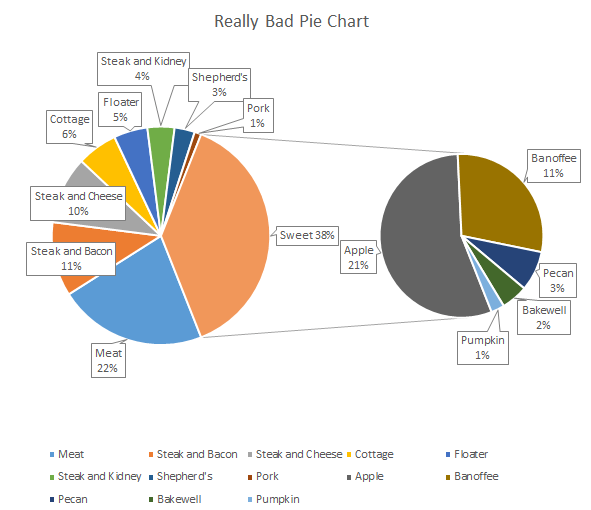
If you know me then you’ll know that I’m not a fan of pies, unless they contain apple and are edible 😊

That said, recently I’ve relaxed a little and used the occasional 2 or 3 segment (max) pie chart, but in doing so it only reinforces my reasons for disliking them.

My biggest gripe with pie charts, aside from when used poorly, is that they’re space hogs. Just take a look at the examples below (note: I would normally use colors from the football club logos in my charts, but the red is a bit harsh and the other colors clashed, so I abandoned them. If in doubt, go neutral.):

pie chart example

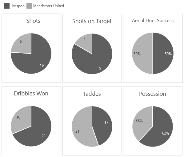
I even simplified them by extracting the legend and placing it at the top of the charts. After all, I don’t need to repeat it in each pie.

Sure, I could try to make them even smaller, but that’s just more fiddling about and I’m way too busy for that. I need my pies like fast food, ready to consume with one or two clicks.

The other downside of pies when used in multiples is they make it difficult to compare one metric to the next, not that it’s always relevant to do so, but if it was then pies make it hard work.
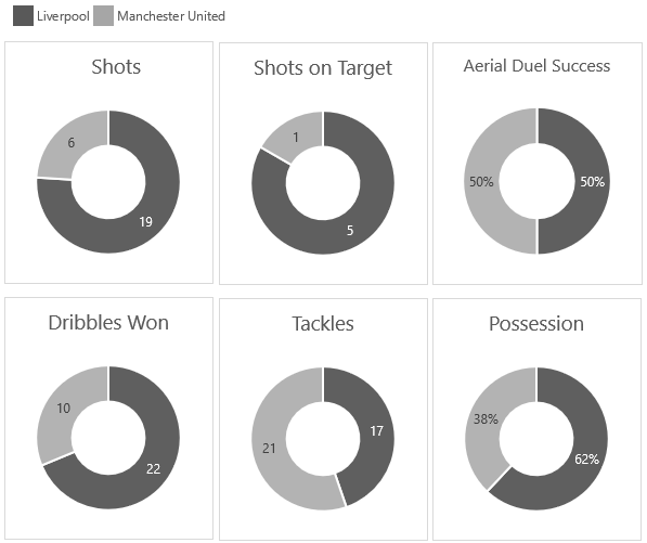
Doughnut Charts

Doughnut charts aren’t any better. Like their namesake they're certainly not slimming; they're big, chunky, space hogs:

doughnut chart example

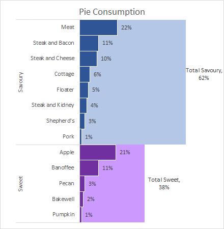
100% Stacked Column/Bar charts

My preferred way to visualize this type of data is using a 100% stacked bar chart. You can also use column charts, but if your category axis labels are long then you’ll want to stick with bars.

Visualizing Parts to a Whole in Excel Charts - stacked bar chart example

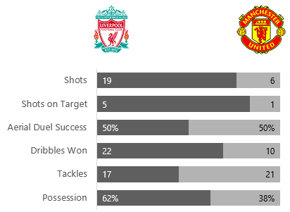
Advantages of Bar Charts over Pie Charts

  1. The main advantage of the bar chart is the ability to convey a lot of information in a very small space, which is essential when building Dashboards.
  2. If you’re wanting to compare multiple items, then the bar chart makes is a lot quicker.
  3. In Excel charts the bars are contained in one chart object, so if you want to make formatting changes you only have to do it once. For example, I could easily make those bars even smaller with a simple left click and drag of the corner.

However, if you or your boss insists on using pie or doughnut charts, then you should follow some rules:

  1. No more than 3 segments. Anymore and the comparison ability is lost, plus your reader will spend too much time trying to map the legend to the segments to understand the components.
  2. Make sure your segments are ordered from largest to smallest starting at 12 o’clock. You’ll notice that Excel doesn’t do this for you, you must sort your data. Case in point; the Tackles pie and doughnut charts.
  3. Don’t use labels on sticky-outy leader lines. If the labels don’t fit in the segments, use a different chart.

If you run into problems 1 or 3 above, use a clustered (not 100% stacked) bar chart instead.

Oh, and if you're ever tempted to create an exploding pie chart like this:

exploding pie chart example

Don't! Instead consider a layered bar chart like this:

layered bar chart

Other Parts to a Whole Visualizations

We're not limited to pies, doughnuts and bars for visualizing parts to a whole. Here are some other options available in Excel.

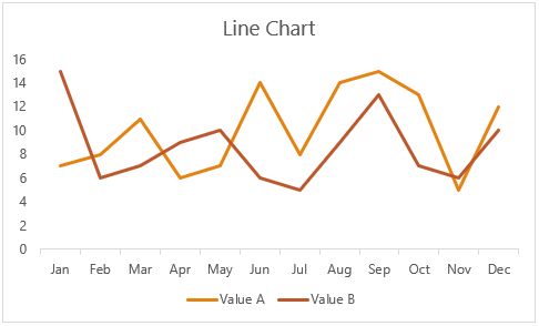
Stacked area charts – show data over time:

stacked area chart example

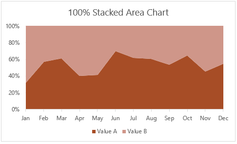
Although I think a good-old line chart is better for allowing comparisons in the data:

line chart example

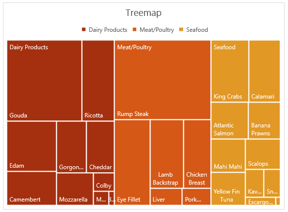
Treemaps (available in Excel 2016 Office 365) – use with hierarchical data

treemap example

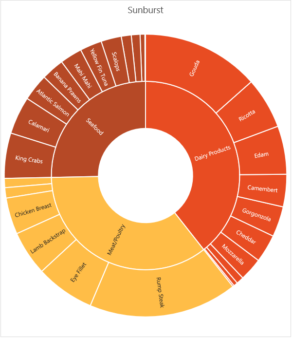
Sunburst (available in Excel 2016 Office 365) – also use with hierarchical data:

sunburst chart example

Note: Treemap and Sunburst charts aren’t available as Pivot Charts, yet!

The issue I have with Treemaps and Sunbursts, aside from their sheer size, is that small segments are lost. If you’re not interested in the small segments then that’s ok, but if you want to know what they are, then use a bar chart:

bar chart example

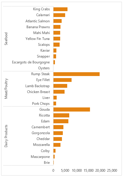
Or a layered bar chart :

layered bar chart

Marimekko – categorical data with two variables.

Marimekko

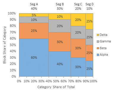
Image credit; www.peltiertech.com

There’s no built-in Excel chart type for the Marimekko, but Jon Peltier of Peltier Tech has an Excel add-in that can do it:

Peltier Tech Chart Utility

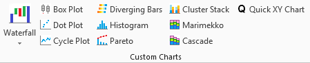
Peltier Tech Chart Utility – available for PC and Mac

Labels – don’t feel that you must always display proportions visually. If you only have one headline figure to highlight, why not just show the number in a label:

labels

Download the Workbook

Enter your email address below to download the sample workbook.

By submitting your email address you agree that we can email you our Excel newsletter.
Please enter a valid email address.

Download the Excel Workbook. Note: This is a .xlsx file please ensure your browser doesn't change the file extension on download.

Please Share

If you liked this please click the buttons below to share.

email icon twittericon fb icon LI icon

More Excel Charts Posts

excel speedometer charts

Excel Speedometer Charts

How to build Excel Speedometer Charts or Gauge Charts as they're also know, why they are BAD and what to use instead.
burn up burn down charts

Excel Project Management Burn Down and Burn Up Charts

Excel Burn Down and Burn Up Charts are easy to make with line or scatter charts. They are useful for monitoring the progress of a project.
wee people font charts

Excel WeePeople Font Charts

Excel WeePeople Font Charts are a nice change from generic shapes for waffle charts, bar/column charts and more.
excel dot map charts

Excel Dot Map Charts

Interactive Excel dot map charts are not built-in, but with some creative use of Excel’s built-in tools we can create something unique.
Excel S Curve Charts

Excel S-Curve Charts

Easy Excel S-curve Charts made with PivotTables for project management. Track progress by including budget amounts.
chart axis switch

Excel Chart Axis Switch

Use radio button form controls to create an Excel chart axis switch enabling you to toggle pannel charts between same axis and own axis.

Excel Charts with Shapes for Infographics

Excel Charts with Shapes for Infographic styling and increased interest in your charts. Easy to insert but there are a few tricks required.
excel pyramid chart

Excel Pyramid Charts

Excel Pyramid charts are useful for visualising demographic data across multiple categories. Let’s look at 3 ways we can build them in Excel.

Highlighting Periods in Excel Charts

Highlighting Periods in Excel Charts helps your users interpret them more quickly and or focus their attention on a point or area.
stacked bar waffle chart

Stacked Bar Excel Waffle Charts

Stacked Bar Excel Waffle Charts are an alternate to using conditional formatting to build waffle charts, and some say they're easier.
Category: Excel Charts
Previous Post:writing udfs in excel with pythonWriting UDFs in Excel With Python
Next Post:Excel Dot Plot ChartsExcel dot plot chart

Reader Interactions

Leave a Reply Cancel reply

Your email address will not be published. Required fields are marked *

Current ye@r *

Leave this field empty

Sidebar

More results...

Shopping Cart

mynda treacy microsoft mvpHi, I'm Mynda Treacy and I run MOTH with my husband, Phil. Through our blog, webinars, YouTube channel and courses we hope we can help you learn Excel, Power Pivot and DAX, Power Query, Power BI, and Excel Dashboards.

Subscribe to Our Newsletter

Receive weekly tutorials on Excel, Power Query, Power Pivot, Power BI and More.

We respect your email privacy

Guides and Resources

  • Excel Keyboard Shortcuts
  • Excel Functions
  • Excel Formulas
  • Excel Custom Number Formatting
  • ALT Codes
  • Pivot Tables
  • VLOOKUP
  • VBA
  • Excel Userforms
  • Free Downloads

239 Excel Keyboard Shortcuts

Download Free PDF

Free Webinars

Excel Dashboards Webinar

Watch our free webinars and learn to create Interactive Dashboard Reports in Excel or Power BI

Click Here to Watch Now
  • Excel
  • Excel Charts
  • Excel Dashboard
  • Excel Formulas
  • Excel PivotTables
  • Excel Shortcuts
  • Excel VBA
  • General Tips
  • Online Training
  • Outlook
  • Power Apps
  • Power Automate
  • Power BI
  • Power Pivot
  • Power Query
 
  • About My Online Training Hub
  • Contact
  • Disclosure Statement
  • Frequently Asked Questions
  • Guarantee
  • Privacy Policy
  • Terms & Conditions
  • Testimonials
  • Become an Affiliate

Copyright © 2023 · My Online Training Hub · All Rights Reserved

Microsoft and the Microsoft Office logo are trademarks or registered trademarks of Microsoft Corporation in the United States and/or other countries. Product names, logos, brands, and other trademarks featured or referred to within this website are the property of their respective trademark holders.

Download A Free Copy of 100 Excel Tips & Tricks

excel tips and tricks ebook

We respect your privacy. We won’t spam you.

x