Design can make or break how well your dashboard communicates your message. Unfortunately, there are some common mistakes I see again and again. At best they make you look like an amateur and at worst they make your report difficult to read and can even be misleading. Thankfully there are some easy things we can do to improve our reports. In this tutorial, I’m going to cover 5 Pro Excel dashboard design tips you can easily implement.
Watch the Excel Dashboard Design Tips Video

Download the Dashboard Workbook
Dashboard Design Tips
Note: please see the video for a visual representation of the topics covered below.
1. Avoid Chartjunk
Chartjunk is one of the most common issues I see. It’s the term coined by Edward Tufte that refers to all visual elements in charts that aren’t necessary to comprehend the data or that distract the viewer from the information. Now Tufte would have you remove everything that didn’t fit this strict definition, but I think there’s a balance between using design elements that grab an audience’s attention and unnecessary embellishment and duplicate information.
Common duplicated information I see are:
- Legends that aren’t required because there’s only one series in the chart
- Numeric axes where there are also data labels
- Axis titles where the chart title already explains the data
- Gridlines where there are also data labels
Other common Chartjunk are:
- Background colours
- Gradient, patterns, and texture fills
- Shadow and glow effects
- 3D charts
- Bold headings and labels
2. White Space
White space helps readers understand the content better by forming distinct areas in your report. Effective use of white space has been shown to improve content comprehension by up to 20 percent.
You can create whitespace by aligning charts and tables and if you allow adequate space between visuals, you don’t even need borders on your charts. I personally prefer to have pale borders as this enables me to fit more into my dashboards.
3. Colour
Colour is perhaps the most powerful reporting tools we have available because it’s so quickly and clearly conveyed. We can use it to:
- Draw attention to a key metric or data point. Bold colours have more emphasis than lighter shades.
- Link data points and areas together using the same colors to show they have something in common. Equally, don’t use the same colors for different types of data as this can be misleading.
- Like with many things, less is more. A good rule of thumb is to use no more than 3 different colors in your reports. You can use shades of a colour to differentiate.
- You should also keep in mind people with colour vision deficiency – see resources at links below, or use the Accessibility Checker in Excel.
Color Brewer: For choosing sequential, diverging and qualitative colors that are colour blind safe, print friendly or photocopy safe.
Coblis Color Blindness Simulator: A helpful simulator to see how readers who have colour vision deficiencies see the colors you used.
For more on Chart Colours see this critique of colours used in a chart displayed in a magazine
4. Sorting Data
You can help reduce the cognitive load on your audience by sorting data in order of importance. Depending on the data this might be in ascending or descending order. Alternatively, you can use colour to call attention to a point or time period.5. Reduce Noise
When it comes time to sharing your report be sure to reduce noise:
- Hide sheet tabs via the File tab > Options > Advanced > Display options for this workbook; deselect ‘Show sheet tabs’
- From the view tab of the ribbon turn off gridlines, headings (column and row labels) and the formula bar
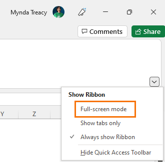
- Minimise the ribbon – Full Screen Mode (CTRL+SHIFT+F1, in earlier versions of Excel it’s CTRL+F1) or click on Ribbon drop down:
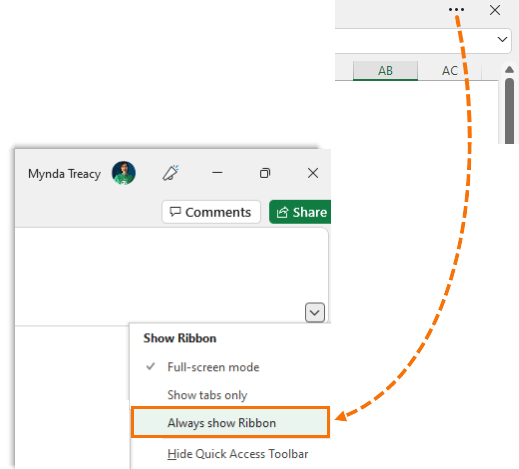
To revert back, click on the ellipsis in the top right:
These settings (except the Formula bar) are retained for the file, so when you share it, it will open in Full Screen Mode with the gridlines, column, row labels hidden.
I hope you found these Excel dashboard design tips helpful. If you'd like to learn more please consider Excel Dashboards course.


