I was reading a health magazine last week and the chart below caught my eye.
click image to enlarge (sorry about the quality, it's a photo of the magazine and photography is not my 'thing' 😉 )
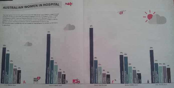
There’s something fundamentally wrong with this chart. Can you see what it is?
Overall the layout is good. The columns are sorted from largest to smallest allowing us to quickly see the reasons for hospitalisation in order for each age band. The scale for each chart starts and finishes at the same point so the columns can be fairly compared.
But what do the column colors represent? My initial thought was that they would color code the different reasons, allowing me to quickly find the same reason in each age band.
Color can also be used to draw attention, but the largest and smallest columns both use strong bold colors, so that doesn’t appear to be the motivation here either.
After some time I realised that the colors simply match the column order. The gratuitous use of color has distracted me from the message, wasting my time for no good reason. The columns are already sorted from largest to smallest, I don’t also need different colors for each column.
Note: you may have noticed that the age bands are different sizes. Generally the bin sizes should be equal, but since the values are percentages of a population, as opposed to absolute values, it is ok to have different size bins.
The Power of Color
“A good design will use color to save the viewer from thinking too much. With several hundred million years of evolution behind us, color perception is deeply wired into our fabric. As a result, color perception is fast, accurate, automatic, and effortless.
On the other hand, thinking is a relatively recent evolutionary advance, and we are not yet very good at it. By thinking, I mean reading text, attaching meaning to an icon, searching memory, etc. These activities are relatively slow, error-prone, require mental resources and effort and take learning.
How many times have you misread a word? Probably often. How many times have you mistakenly seen blue as orange? Probably never, even if you are a dichromate.
In sum, a designer should strive to capitalize on our hard-wired perceptual capabilities whenever possible.”
Source: http://www.visualexpert.com/FAQ/Part5/cfaqPart5.html#p5.6
Better Excel Chart Colors
Click image to enlarge
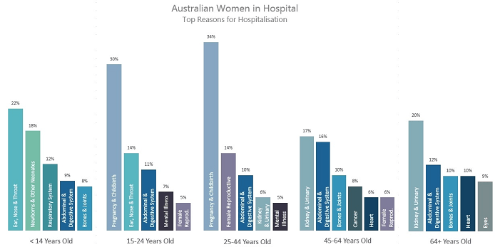
By using color to create relationships in the data I’m able to quickly glean the following insights:
- Abdominal & Digestive System is an issue throughout life
- Pregnancy & Childbirth and Mental Illness are prominent from 15 to 44 years old
- Kidney & Urinary start causing issues from 25 to 44 and progressively become more common
- Bones & Joints are problems when you’re young and later in life. No doubt for different reasons.
- Issues with Ear, nose & throat seem to improve by 25
Trying to glean the above insights from the first chart is tediously slow and error prone because I’m forced to read each label and memorize their position. In contrast the second chart (above) allows me to easily single out a colour e.g. Abdominal & Digestive System, and focus on it as it moves through the age bands.
Download the Workbook
Enter your email address below to download the sample workbook.
Techniques used to build this chart:
- There are actually 5 separate charts.
- I used a Ghost Series to ensure the axis scale is the same on each chart.
- I duplicated the series in each chart so I could have 2 sets of labels: one for the percentage set to 'outside end', and a separate label for the category label set to 'inside base'.
- I set the color of each column manually by clicking on the column once to select the series and then again to select a single column. I then changed the fill color.
Reasons to Use Color in Charts
Color is perhaps the most powerful reporting tool we have available because it’s so quickly and clearly conveyed. We can use it to:
- Draw attention to a key metric or data point. Bold colours have more emphasis than lighter shades.
- Form distinct areas in your report. Use white space to segregate. An example of this is the wider space between the columns separating each age band.
- Link data points and areas together using the same colors to show they have something in common. Equally, don’t use the same colors for different types of data as this can be misleading.
- Less is more. While the colors in this chart are complimentary, if I’m honest there are probably too many colors for my liking. I’d be inclined to pick out 3 key reasons and color them, with the rest a paler shade of grey to detract attention away from them. This would also make it easier for people with color vision deficiency to read the chart. More on that in a moment.
- A good rule of thumb is to use no more than 3 different colors in your reports. You can use shades of a color to differentiate.
Common Color Mistakes
- Christmas Tree Effect: Too many bright and varied colors.
- Misleading color relationships: The same colors used to code different types of data.
- Gratuitous color: gradient fills and dark backgrounds in charts.
Formatting for Color-blind / Color Vision Deficiency
While we’re on the subject of color it’s a great time to share some resources for choosing colors suitable for readers with color vision deficiency:
- Color Brewer: For choosing sequential, diverging and qualitative colors that are color blind safe, print friendly or photocopy safe.
- Coblis Color Blindness Simulator: A helpful simulator to see how readers who have color vision deficiencies see the colors you used.


i love your posts !!
Thanks so much, Cristina!
I have two suggestions: (1) vary the colors a bit more and (2) only color the bars that show up in multiple categories.
Although it looks nice, having most of the colors be some form of blue/green makes it difficult for me to immediately know which categories are related and I end up having to read the column labels to confirm. Might just be my eye, but it’s still a little tough for me to immediately “see” the connections.
I’d also suggest dropping all of the one-off categories to a neutral grey color. For example, I was scanning through the various categories a few times looking for the match to “Eyes” in the 64+ category only to figure out there is no match. Likewise with “Respiratory System” in kids. If color is the methodology for connecting things, I expect everything with a color to have a match somewhere.
Just some random thoughts…hope they are helpful.
Hi Michael,
Thanks for your thoughts. I agree, as I mentioned in point 4 of my ‘Reasons to Use Color in Charts’.
Cheers,
Mynda
I tried to identify what was wrong and lacked chart-savvy. I knew some things irritated me, but could not articulate them. I came up with
1. “the percentages don’t add up to 100%”
however, if you put in a bar for “other”, that would add no value and probably confuse since it would be a greater percentage than some of the other top 5 reasons.
2. “bars for the same reason appear in different orders in the different groups”.
Your approach to color-code the reasons solves this – you can order the bars by percentage AND make it easy to see what reasons occur to different ages.
Hi Judy,
Glad you had a go at figuring out what was wrong with this chart. You’re right, the bars don’t add up to 100%, but if we had an ‘other’ category this would detract from the top 5.
Mynda
I don’t quite follow how you duplicated the series in each chart so you could have 2 labels. I have tried to recreate the charts, but was not successful in doing so. Could you elaborate a little more on how that is accomplished? Thanks
Hi RK,
Each chart has 3 series. You can see them if you right-click the chart > Select Data. In the dialog box there are 3 legend entries (series).
The Ghost series column fill is set to none so you can’t actually see it in the chart. The other 2 series are set to 100% overlap (right-click > format data series > series options), so they appear to be just one series.
You can then set the labels on these two series differently so one label is the value and is outside end, and the other series is the category label set to inside base.
If you download the sample file you can see the series and settings I’ve applied. If you’re still stuck please post your question on the Excel forum and upload your file and we’ll be happy to help.
Mynda
The chart also leaves out 14-year olds. 🙂
Your points about use of color are very good.
Cheers, Jon.
14 year olds are at the height of puberty, including them might have skewed the results 😉
Mindy,
I can’t get the link to Lighthouse International to resolve. Can you post the URL of the website?
Hi Jomili,
If you right-click the link you can choose ‘copy’ and that will give you the URL.
Mynda
One more suggestion to make the chart easier to read: Use horizontal bars so that the text label for each can be read without having to turn your head sideways. (In a magazine, this is probably not a big deal, since you can easily turn the mag, but with a PC monitor, it’s a pain.)
Good point, Glenn. I had the same thoughts and if you download the Excel file you’ll see I included a portrait version of the chart too.
Mynda
Good subject Mynda. I am always very particular about the quality of data presentation. You can either “score” well with your audience because you get the message across clearly, or you can ruin it completely because you get sidetracked by questions & discussions about details because of a crappy presentation. And colour is very often 1 of the most important aspects of a presentation.
Having said all this, I am a weeny bit surprised by the 1st version of the Australian women graph at the top of the page. It is meant to show something, but because of the grey overlay it is not very clear. Even enlarging it does not improve it much. I don’t understand why you put that overlay in. The subsequent versions are fine.
Last but not least: I have published a G+ post about your article – see https://plus.google.com/+PeterBuyze/posts/LaLaj9ebREu.
Cheers, Peter.
Sorry about the quality of the first image. There’s no grey overlay, it’s just a photo of the magazine. Unfortunately I couldn’t find a copy of it published online, I only had the hard copy.
Thanks for your feedback. I’ll make mention of this so others don’t think the same.
Mynda
Are you able to make the image brighter once you’re in an editing programme/Preview?
And also take out the noise?