Slicers are a great tool for easily filtering PivotTables and Pivot Charts, but what if you want to use a Slicer to control a regular chart like this:
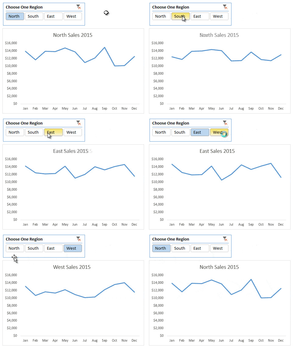
Note: This technique applies to Excel 2010 onwards.
Download the Workbook
Enter your email address below to download the sample workbook.
Creating Slicer Controlled Interactive Excel Charts
The process to set up Slicer controlled interactive Excel charts is easier than you might think, so don’t be put off by the number of steps involved.
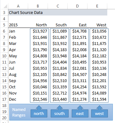
Step 1: Get some data and give each column a named range. Here is mine:
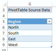
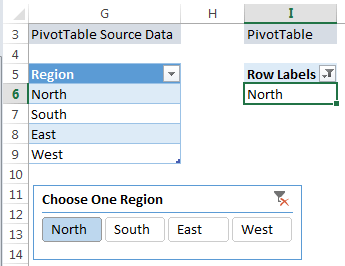
Step 2: In a separate column create a list of your named ranges. I’ve formatted mine in an Excel Table in cells G5:G9 called TableRegions:
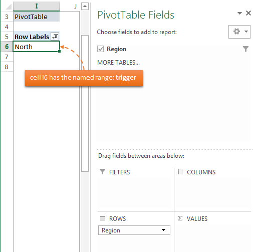
Step 3: Insert a PivotTable and use the table from step 2 as your source data. Put the ‘Region’ field in the rows area of the PivotTable (note: your PivotTable will list all regions when you first create it):
Tip 1: Remove the Grand Totals from the PivotTable. You don’t need them.
Tip 2: give the first cell in your PivotTable (below the header) a named range. Mine is cell I6 and it’s called ‘trigger’. This just makes it easier to reference later on.
Step 4: Insert a Slicer for the Region field:
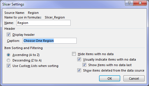
Tip: Change the Slicer caption to something useful: right-click the Slicer > Slicer Settings:
Step 5: Create a Dynamic Named Range that picks up the region from the PivotTable that is selected in the Slicer, and returns the appropriate range from the Chart Source Data (as shown in step 1). Mine is called ‘chart_rng’ and you can see it in the Name Manager below:
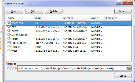
If you’re familiar with dynamic named ranges then this one might look a little different to what you’re used to. Let’s take a closer look at the formula:
=IF(trigger="north",north,IF(trigger="south",south,IF(trigger="east",east,west)))
Yes, we’re using a nested IF Formula to return a range. The IF function can return a range as opposed to just a single value like you’re probably used to.
Tip: Take particular note of the use of double quotes in the IF formula above.
In English the formula reads:
IF the value in the cell called trigger is north, then return the named range ‘north’, else IF the value in the cell called trigger is south, then return the named range ‘south’, else IF the value in the cell called trigger is east, return the named range ‘east’, else return the named range ‘west’ since there’s no other ranges it could be.
A simpler approach would be to use the INDIRECT function like so:
=INDIRECT(trigger)
But beware of the volatility of the INDIRECT function.
Step 6: Insert your chart. Create a regular chart for just one series, e.g. North. Then (1) edit the chart source (right-click the chart > select data) and (2) replace the cell ranges in the ‘Series Values’ with (3) your dynamic named range.
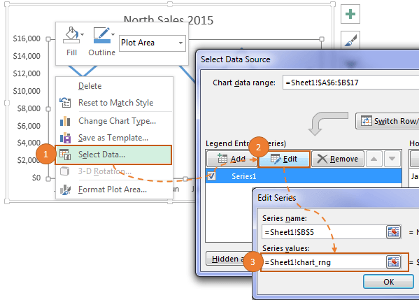
Tip: in the ‘Series Values’ field make sure you keep the sheet name/workbook name part of the reference and only replace the cell references with your named range.
Step 7: Insert a dynamic chart title that changes based on the region selected in the Slicer
Step 8: Apply any formatting to your chart and then merrily click your Slicer to toggle through the different views.
Other cool Slicer Tricks
Use Slicer Selection in Formulas
Thanks
A big thank you to Bob Abrams for the IF function technique to select named ranges.


I would like to know if it’s possible to use this method to control multiple ‘normal’ charts with 1 slicer. Thank you
Yes! They just all need to reference the output of the PivotTable controlled by the Slicer.
Great – thank you. Say I wanted to show the data at 2 levels of category (i.e. Region & SalesRep). How could I apply 2 slicers to make this work?
To show the data you want to have those fields in your PivotTable. If you want to filter on those fields, then insert Slicers for them. If you’re stuck, please post your question on our Excel forum where you can also upload a sample file and we can help you further.
I’m have trouble creating Step 2: G5:G9 called TableRegions:
I looked at the refernce link: https://www.myonlinetraininghub.com/excel-tables
But not sure how you created filter drop down list for Region.
I’m missing something,
The drop down that you see in the Region header cell is automatically inserted when you format the data in an Excel Table. Try downloading the Excel file to see how it is done. If you’re still stuck, please post your question on our Excel forum where we can help you troubleshoot.
Hi Mynda,
I’m trying to use your guide to build Pivot charts showing progress data over time (Weekly for a 12 month period). I can make the interactive Pivot Chart okay but when I add data on a weekly basis the chart doesn’t seem to pickup the new entries and update (adding the data and an additional date on the X axis).
Do you know why this may be and how to resolve it?
Many thanks
Hi Sean,
Assuming the source data is in an Excel Table, you should be able to refresh the PivotTable and it feeds through to the chart. If your source data isn’t in an Excel Table then you need to edit the range the PivotTable is referencing to include the new rows.
If that’s not the issue, please post your question and Excel file on our forum where we can help you further.
Mynda
Hi Mynda,
I’m using slicer to allow user to select data for a particular year in a line graph and it works great. Is it possible that i could show different lines to compare the changes over the years in the same graph while keeping the slicer intact?
Many thanks
Hi Ruchi,
Yes, but this would be best done with a Pivot Chart where you put the month in the horizontal Axis labels and the Year is a series/legend item with a Slicer.
Mynda
I am using a pivot chart to display enrollment and performance in courses over a period of time. I have a number of courses that are all displaying at once on the chart until slicer parameters are selected, which looks like a total mess. Is there a way to have the chart blank until slicer selections are made?
Hi Nick,
There’s no out of the box way to do this but you could use VBA to hide the real chart until such time an item is selected in the Slicer.
Mynda
When I make a selection from my slicer, the formatting of my series (column chart) is reset. Any idea how to keep it without having to write a macro?
Hi Ted,
You need to remove all filters from the Slicer so that all series are present in the chart. Then format each series. That should make them stick.
Mynda
Tip 2: give the first cell in your PivotTable (below the header) a named range. Mine is cell I6 and it’s called ‘trigger’. This just makes it easier to reference later on.
It can’t be “named” since it is already in the pivot tabel as data, how you are solving this issue?
BR
Robert
Hi Robert,
There’s nothing stopping you selecting the first cell in the PivotTable and giving it a name in the Name Box. If you download the file for this tutorial you’ll see the cell is named.
Mynda
Mynda,
Today I read your article on “Using Slicers doesn’t have to be limited to PivotTables and Pivot Charts.” In looking at the chart I noticed when a region was not selected the chart reflected the sales for the north region. My thought was it would be great for the chart to show a total for all of the regions when a region had not been selected on the slicer. So in trying to make this change it helped me to better understand how this was developed. It took me a few attempts but I finally figured it out. I add a “All Regions” column to the right of the West column and named the range. I changed the formula for the Dynamic Chart Label to =IF(COUNTA(J6:J9)=4,”All Regions Sales 2015″,Sheet1!$J$6&” Sales 2015″). And I changed the name range for chart_rng to begin with =IF(COUNTA(Sheet1!$J$6:$J$9)=4,All_Regions,IF(trigger=”north”,….). I am uncertain if it is the most efficient way for the total for all regions to appear when a selection has not been made on the slicer, but it works.
Thank you for your easy to follow instructions.
Nice touch, Paul. Thanks for sharing.
Mynda
Hi Mynda,
I’ve learn new things today and would like to know how should I do if I’ve a stack chart for example if I wanted to stack each region with 3 product like below;
North_ProductA, North_ProductB, North_ProductC,
South_ProductA, South_ProductB, South_ProductC,
East_ProductA, East_ProductB, East_ProductC,
West_ProductA, West_ProductB, West_ProductC,
Thanks you for your guidance.
Have a nice day!
Hi Patrick,
Great to hear you picked up a few ideas from this post.
I would avoid stacked charts as they make comparisons of all bar the bottom series difficult to compare because the subsequent series don’t start at the same point. Instead I recommend using panel charts as you can see in this tutorial.
You can imagine your data either arranged with a chart for each product and the region on the horizontal axis, or a chart for each region with the product on the horizontal axis.
I hope that helps.
Mynda
Hi Mynda,
Thanks you for your reply actually I’m using your ideal in this interactive chart to present it in such a way that I’ve 5 different manufacturing lines and each lines produce different product with different head count but I’m face some issue with the dynamic range for the chart.
I’ll post it in the forum with the file so that some guru could help me out.
Thanks you for your time and really appreciate it.
Best Regards,
Patrick
Hey Mynda,
Timing on this is fantastic – just what I need to complete a project! And your directions are always so clear and concise. Thank you for that!
I only have one problem – the dynamic chart title will not accept a named range. The error message is not specific but lists things to check, i.e. using quotes. What am I missing?
Thanks again.
Hi Dana,
Great to hear it’s been helpful.
Chart titles cannot accept a named range. Your options are to put your formula in a cell and link to that cell, or use a Shape or Text Box as your Chart Title and link the Shape to your named range.
Let me know if you get stuck.
Mynda
Hi, I am trying to replicate your slicer interactive chart and I cannot get Step 6 to work for me. I have followed to the letter as per your instructions but when I try and change the series value to the dynamic names range that contains the IF trigger formula Excel says that “we found a problem with formula references”…. can you assist ? I can send you my workbook that I am using if that helps.
Steve
Hi Steve,
Yes, please raise a question on our Excel Forum and upload your workbook so we can see where things went wrong.
Cheers,
Mynda
Hi Steve
was this problem fixed, im having the same problem.
Hi Mukul,
Steve’s formula was wrong so it may not be the same problem as yours. Please raise your question on our Excel Forum and include your Excel workbook so we can see where the issue is.
Thanks,
Mynda
Thanks! Your lessons are always completely organized.
Cheers, David 🙂