• Skip to main content
  • Skip to header right navigation
  • Skip to site footer

My Online Training Hub

Learn Dashboards, Excel, Power BI, Power Query, Power Pivot

  • Courses
  • Pricing
    • Free Courses
    • Power BI Course
    • Excel Power Query Course
    • Power Pivot and DAX Course
    • Excel Dashboard Course
    • Excel PivotTable Course โ€“ Quick Start
    • Advanced Excel Formulas Course
    • Excel Expert Advanced Excel Training
    • Excel Tables Course
    • Excel, Word, Outlook
    • Financial Modelling Course
    • Excel PivotTable Course
    • Excel for Customer Service Professionals
    • Excel for Operations Management Course
    • Excel for Decision Making Under Uncertainty Course
    • Excel for Finance Course
    • Excel Analysis ToolPak Course
    • Multi-User Pricing
  • Resources
    • Free Downloads
    • Excel Functions Explained
    • Excel Formulas
    • Excel Add-ins
    • IF Function
      • Excel IF Statement Explained
      • Excel IF AND OR Functions
      • IF Formula Builder
    • Time & Dates in Excel
      • Excel Date & Time
      • Calculating Time in Excel
      • Excel Time Calculation Tricks
      • Excel Date and Time Formatting
    • Excel Keyboard Shortcuts
    • Excel Custom Number Format Guide
    • Pivot Tables Guide
    • VLOOKUP Guide
    • ALT Codes
    • Excel VBA & Macros
    • Excel User Forms
    • VBA String Functions
  • Members
    • Login
  • Blog
  • Excel Webinars
  • Excel Forum
    • Register as Forum Member

Fix Excel Chart Axis with a Ghost Series

You are here: Home / Excel Charts / Fix Excel Chart Axis with a Ghost Series
July 22, 2014 by Mynda Treacy

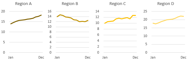
Below is a set of Panel Charts. In this case theyโ€™re actually 4 separate charts aligned close together.

Comparing one chart to the next isnโ€™t easy since each chart uses a different vertical axis scale:

Panel charts with different axes

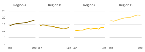
If we could put all charts on the same axis then we could remove the 3 superfluous axes and ensure comparison from one chart to the next is unambiguous, like this:

Panel charts with same axes

Enter your email address below to download the sample workbook.

By submitting your email address you agree that we can email you our Excel newsletter.
Please enter a valid email address.

Download the Excel Workbook. Note: This is a .xlsx file please ensure your browser doesn't change the file extension on download.

Options:

We could combine all four charts into one Panel Chart, but thereโ€™s no built in Panel Chart option in Excel so this means a lot of fiddling about (unless you have an Add-in for it).

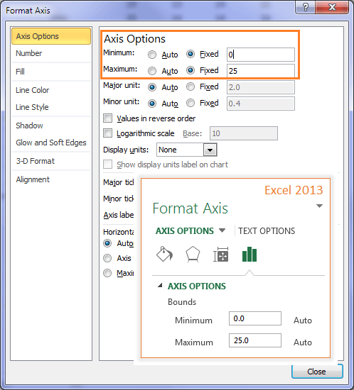
Another way to do this is to fix the minimum and maximum of each axis in the Axis Options which is fine if the data in the charts isnโ€™t likely to change.

To Fix Axis Min and Max

Select the axis > right-click > Format Axis > Axis Options (or in Excel 2010/13 double click the axis) โ€“ which opens the dialog box for Excel 2007/10 below (Excel 2013 inset):

set min and max axis for panel charts

As I said, this method is fine if you donโ€™t expect your data to change, but if your chart is likely to get updated with new data, or itโ€™s linked to a Data Validation List or Combo Box which allows the user to change the data displayed in the chart (like the example below), then fixing the axis minimum and maximum will omit any new data from the chart which falls outside of the range.

dynamic min and max axis for panel charts

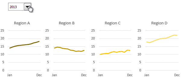
Note: If you'd like to learn how to make interactive charts like the one above, please check out my Excel Dashboard course.

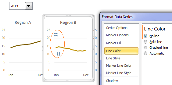
When creating dynamic charts I like to use what I call the 'Ghost Series' to fix the axis minimum and maximum dynamically based on the overall MIN and MAX values for all of the charts.

I call it a Ghost Series because the line is hidden in the chart by formatting it with โ€˜No line'. You can see in the image below that the Ghost Series (circled in orange) is selected in the chart, but you canโ€™t see a line joining the two points.

hide ghost line

Calculating the Ghost Series

The Ghost series calculations are straight forward; see cell G5 in the image below for the maximum value formula.

calculate ghost line values

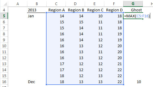
And cell G16 contains the Minimum formula which is =MIN(C5:F16). Easy peasy.

Note: We only need two values for the Ghost and you can put them anywhere in cells G5:G16, they don't have to be at the beginning and end of the range like mine.

Add Ghost Series to Charts

Now all you do is add the Ghost Series to each of your charts which will ensure the axes for all charts is the same.

add ghost line series to charts

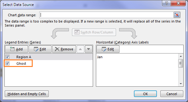
Tip: A quick way to do this is simply copy the Ghost Series cells G5:G16 > click on the chart > CTRL+V to paste them in.

Then format the line with โ€˜No lineโ€™: select line > right-click > Format Data Series (or double click the line in Excel 2010/13) > Line Color > choose โ€˜No Lineโ€™.

If the values in your charts update then the Ghost series will automatically adjust accordingly.

More Excel Charts Posts

picture fill excel charts

Picture Fill Excel Charts

Using a stylish picture fill in your Excel Charts is a simple way to make your data visualizations more captivating and memorable
excel speedometer charts

Excel Speedometer Charts

How to build Excel Speedometer Charts or Gauge Charts as they're also know, why they are BAD and what to use instead.
burn up burn down charts

Excel Project Management Burn Down and Burn Up Charts

Excel Burn Down and Burn Up Charts are easy to make with line or scatter charts. They are useful for monitoring the progress of a project.
wee people font charts

Excel WeePeople Font Charts

Excel WeePeople Font Charts are a nice change from generic shapes for waffle charts, bar/column charts and more.
excel dot map charts

Excel Dot Map Charts

Interactive Excel dot map charts are not built-in, but with some creative use of Excelโ€™s built-in tools we can create something unique.
Excel S Curve Charts

Excel S-Curve Charts

Easy Excel S-curve Charts made with PivotTables for project management. Track progress by including budget amounts.
chart axis switch

Excel Chart Axis Switch

Use radio button form controls to create an Excel chart axis switch enabling you to toggle pannel charts between same axis and own axis.

Excel Charts with Shapes for Infographics

Excel Charts with Shapes for Infographic styling and increased interest in your charts. Easy to insert but there are a few tricks required.
excel pyramid chart

Excel Pyramid Charts

Excel Pyramid charts are useful for visualising demographic data across multiple categories. Letโ€™s look at 3 ways we can build them in Excel.

Highlighting Periods in Excel Charts

Highlighting Periods in Excel Charts helps your users interpret them more quickly and or focus their attention on a point or area.


Category: Excel Charts
Previous Post:3 Steps to Easy Bullet Graphs in Excel
Next Post:Sorting Excel Date SlicersSorting Excel Date Slicers

Reader Interactions

Comments

  1. Jan

    May 19, 2018 at 2:08 am

    I’ve done this work with a different technique. You can simply offset each data set with blanks so that each row of data starts in the column immediately to the right of the last entry in the row above and graph the entire data set as a single graph. This will create small multiples on a single chart. This guarantees shared scaling and links the charts to be moved or copied as one.

    Reply
    • Mynda Treacy

      May 19, 2018 at 6:06 pm

      Hi Jan,

      Yes, I teach that technique in my Excel Dashboard course as well. I also add error bars to segregate the different data sets, but by the time you do all of that and add separate text boxes for the titles etc., it can be just as quick to insert separate charts, or insert one and copy it for the others.

      Mynda

      Reply
  2. Louise Maria

    August 11, 2016 at 3:24 am

    Thank you so much! This is excellent. You are brilliant!
    Kind regards.

    Reply
    • Mynda Treacy

      August 11, 2016 at 10:06 am

      Thank you, Louise! I’m glad you’ll find this tip useful.

      Mynda

      Reply
  3. Win Mogan

    August 4, 2016 at 10:55 pm

    The ghost series is a great idea! Thank you for this tip.

    Reply
    • Mynda Treacy

      August 5, 2016 at 9:11 am

      Cheers, Win. Glad you’ll find it useful.

      Mynda

      Reply
  4. Bruno

    July 24, 2014 at 6:14 pm

    so easy to implement… great tip!!!
    Thanks!

    Bruno

    Reply
    • Mynda Treacy

      July 24, 2014 at 8:45 pm

      Thanks, Bruno. Glad you like it ๐Ÿ™‚

      Reply
      • Pratish Sharma

        August 28, 2014 at 8:15 pm

        Hi Mynda

        Excellent tip and a neatly explained article. First rate!

        Thanks ๐Ÿ™‚

        Reply
        • Mynda Treacy

          August 28, 2014 at 10:23 pm

          Thank you, Pratish ๐Ÿ™‚ Glad you liked it.

          Mynda

          Reply
  5. Mudassir Ahmed

    July 24, 2014 at 5:51 pm

    Hello,

    I did not get how the values of the chart are changed after selecting year from Combo box. What is the objective to use Ghost Series?

    Reply
    • Mynda Treacy

      July 24, 2014 at 6:04 pm

      Hi Mudassir,

      Excel will automatically adjust the axis height to fit the data displayed in the chart. When working with Panel charts you don’t want this, you want all axis heights the same. The objective of using the ghost series is to ensure that the vertical axis on all charts is the same, irrespective of the actual data displayed in each chart.

      The combo box demonstrates that even when the data in the charts is altered, the axis height still remains the same one each chart, although it may adjust if required by the data, however in the example above it doesn’t.

      You can download the workbook at the link above to see how the combo box works.

      I hope that helps.

      Mynda

      Reply
      • Mudassir Ahmed

        July 24, 2014 at 7:10 pm

        Thanks for your prompt response.

        Just last query, how the data in chart is changed after selecting year from Combo Box?

        Reply
        • Mynda Treacy

          July 24, 2014 at 8:45 pm

          Hi Mudassir,

          It uses the INDEX function to pick up the range for the year selected in the Combo Box.

          I teach this technique in my Excel Dashboard course.

          Kind regards,

          Mynda

          Reply
          • Mudassir Ahmed

            July 24, 2014 at 9:09 pm

            Thanks Mynda,

            Yes I saw promo and will enrol soon.

          • Mynda Treacy

            July 24, 2014 at 9:18 pm

            Will be great to have you join the course ๐Ÿ™‚

  6. Jef

    July 23, 2014 at 11:56 pm

    This was great. Very clear. Thanks for sharing.

    Reply
    • Mynda Treacy

      July 24, 2014 at 9:29 am

      You’re welcome, Jef ๐Ÿ™‚

      Reply
  7. MF

    July 22, 2014 at 8:03 pm

    Simple and nice trick!!
    Thanks for sharing!

    Reply
    • Mynda Treacy

      July 22, 2014 at 8:05 pm

      Thanks, MF. Glad you liked it ๐Ÿ™‚

      Reply

Leave a Reply Cancel reply

Your email address will not be published. Required fields are marked *

Current ye@r *

Leave this field empty

Sidebar

More results...

launch excel macros course excel vba course

Featured Content

  • 10 Common Excel Mistakes to Avoid
  • Top Excel Functions for Data Analysts
  • Secrets to Building Excel Dashboards in Less Than 15 Minutes
  • Pro Excel Formula Writing Tips
  • Hidden Excel Double-Click Shortcuts
  • Top 10 Intermediate Excel Functions
  • 5 Pro Excel Dashboard Design Tips
  • 5 Excel SUM Function Tricks
  • 239 Excel Keyboard Shortcuts

100 Excel Tips and Tricks eBook

Download Free Tips & Tricks

Subscribe to Our Newsletter

Receive weekly tutorials on Excel, Power Query, Power Pivot, Power BI and More.

We respect your email privacy

239 Excel Keyboard Shortcuts

Download Free PDF

mynda treacy microsoft mvpHi, I'm Mynda Treacy and I run MOTH with my husband, Phil. Through our blog, webinars, YouTube channel and courses we hope we can help you learn Excel, Power Pivot and DAX, Power Query, Power BI, and Excel Dashboards.

Blog Categories

  • Excel
  • Excel Charts
  • Excel Dashboard
  • Excel Formulas
  • Excel PivotTables
  • Excel Shortcuts
  • Excel VBA
  • General Tips
  • Online Training
  • Outlook
  • Power Apps
  • Power Automate
  • Power BI
  • Power Pivot
  • Power Query
microsoft mvp logo
trustpilot excellent rating
Secured by Sucuri Badge
MyOnlineTrainingHub on YouTube Mynda Treacy on Linked In Mynda Treacy on Instagram Mynda Treacy on Twitter Mynda Treacy on Pinterest MyOnlineTrainingHub on Facebook
 

Company

  • About My Online Training Hub
  • Disclosure Statement
  • Frequently Asked Questions
  • Guarantee
  • Privacy Policy
  • Terms & Conditions
  • Testimonials
  • Become an Affiliate

Support

  • Contact
  • Forum
  • Helpdesk – For Technical Issues

Copyright © 2023 ยท My Online Training Hub ยท All Rights Reserved. Microsoft and the Microsoft Office logo are trademarks or registered trademarks of Microsoft Corporation in the United States and/or other countries. Product names, logos, brands, and other trademarks featured or referred to within this website are the property of their respective trademark holders.