• Skip to main content
  • Skip to header right navigation
  • Skip to site footer

My Online Training Hub

Learn Dashboards, Excel, Power BI, Power Query, Power Pivot

  • Courses
  • Pricing
    • Free Courses
    • Power BI Course
    • Excel Power Query Course
    • Power Pivot and DAX Course
    • Excel Dashboard Course
    • Excel PivotTable Course – Quick Start
    • Advanced Excel Formulas Course
    • Excel Expert Advanced Excel Training
    • Excel Tables Course
    • Excel, Word, Outlook
    • Financial Modelling Course
    • Excel PivotTable Course
    • Excel for Customer Service Professionals
    • Excel for Operations Management Course
    • Excel for Decision Making Under Uncertainty Course
    • Excel for Finance Course
    • Excel Analysis ToolPak Course
    • Multi-User Pricing
  • Resources
    • Free Downloads
    • Excel Functions Explained
    • Excel Formulas
    • Excel Add-ins
    • IF Function
      • Excel IF Statement Explained
      • Excel IF AND OR Functions
      • IF Formula Builder
    • Time & Dates in Excel
      • Excel Date & Time
      • Calculating Time in Excel
      • Excel Time Calculation Tricks
      • Excel Date and Time Formatting
    • Excel Keyboard Shortcuts
    • Excel Custom Number Format Guide
    • Pivot Tables Guide
    • VLOOKUP Guide
    • ALT Codes
    • Excel VBA & Macros
    • Excel User Forms
    • VBA String Functions
  • Members
    • Login
    • Password Reset
  • Blog
  • Excel Webinars
  • Excel Forum
    • Register as Forum Member

3 Steps to Easy Bullet Graphs in Excel

You are here: Home / Excel Charts / 3 Steps to Easy Bullet Graphs in Excel
July 15, 2014 by Mynda Treacy

Bullet graphs were developed by data visualisation expert Stephen Few to address the need for visually rich displays of data in small spaces which are typical of a dashboard report.

Excel Bullet Chart Example

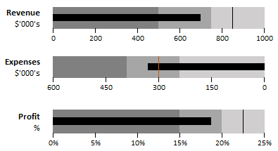
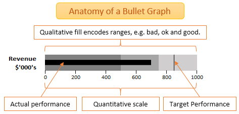
They enable you to compare your actual measure to a target/budget and also a qualitative range as denoted by the background fill.

components of a Bullet Chart

While Excel is an ideal tool for creating dynamic and interactive dashboards it unfortunately lacks a built-in bullet chart. Although you can coerce a combination of Excel’s built in charts to create a bullet chart look-a-like, it’s an onerous task.

A simple alternative is to apply Conditional Formatting to a 3 row x 20 column grid of cells like so:

cell grid for chart

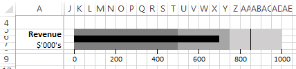
You might call it an in-cell(s) bullet chart! I agree it takes up a bit of spreadsheet real estate but at > 1M available rows (since Excel 2007) I think we can afford it.

Enter your email address below to download the sample workbook.

By submitting your email address you agree that we can email you our Excel newsletter.
Please enter a valid email address.

Download the Excel Workbook. Note: this is a .xlsx file please ensure your browser doesn't change the file extension on download.

Conditional Formatting Bullet Graphs - 3 Step Guide:

Step 1: Format your columns

Decide how many columns (or rows for a vertical bullet chart) you want to use and set the width/height – I’ve used a 3 row x 20 column grid set to 1.43 wide.

We will be scaling our actual values down to fit into the number of columns available therefore the number of columns/rows you choose will depend on the level of accuracy required.

Since I have used 20 columns I can only be accurate to 1/20. If you require more granular accuracy simply use more columns – even 100 if you want. You can make them super skinny so they don’t make the graph any bigger while allowing for accuracy to 1/100.

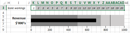
Number each of your columns as shown below in row 3 (these numbers are used in step 3 for your Conditional Formatting - you can hide this row later, likewise the gridlines):

workings for Bullet Chart

Step 2: Get your data ready

Set out a table for your graph source data. Mine is horizontally laid out (see below) but you can set it out vertically if you prefer.

Chart Source

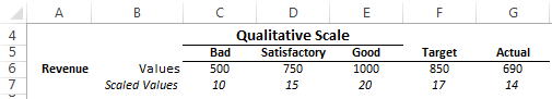
  • In row 6 enter your qualitative scale upper limits, and your Target/Budget and Actual figures.
  • In row 7 scale your values to the number of columns/rows available for your graph using this formula in cell C7: =ROUND(C6/$E$6*20,0) – copy across cells D7:G7.

Note: I’ve multiplied the ‘Good’ value in my scale (cell E6) by 20 as is the number of columns I’m using for my graph - change this value to match the number of columns/rows you use.

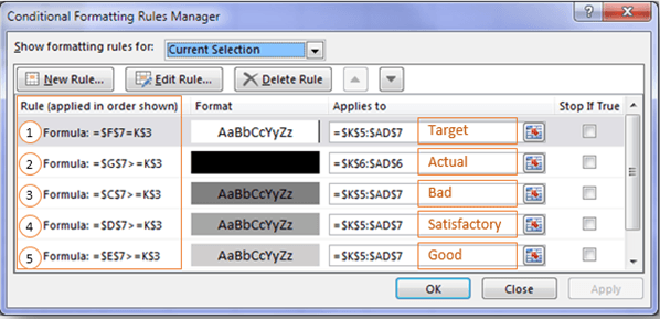
Step 3: Insert your Conditional Formatting Rules

There are 5 Conditional Formatting rules for each graph and they all use a simple logical test formula which compares the ‘Scaled Values’ in row 7 to the ‘Scale Workings’ in row 3:

Conditional Formatting Bullet Chart

To set up your Conditional Formats first select all the cells where your Bullet Graph will be inserted > go to the Home Tab > Conditional formatting > New Rule > from the ‘Select a Rule Type’ list choose ‘Use a formula to determine which cells to format’:

conditional formatting rules

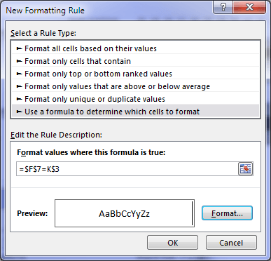
Enter your formula in the Rule Description field and set your format. Take particular care to set your absolute and relative references correctly. For more detailed instructions on setting up Conditional Formatting using formulas, including when to use absolute or relative references, see here.

  • Formula 1 =$F$7=K$3 applies the Target marker which is simply a right border.
  • Formula 2 =$G$7>=K$3 applies a black fill for the Actual bar – note this is only applied to the middle row (row 6), whereas the other formats are applied to all 3 rows. Select the cells in the middle row before creating this conditional format.
  • Formula 3 =$C$7>=K$3 applies the dark gray fill for the ‘Bad’ qualitative band.
  • Formula 4 =$D$7>=K$3 applies the mid gray fill for the ‘Satisfactory’ qualitative band.
  • Formula 5 =$E$7>=K$3 applies the light gray fill for the ‘Good’ qualitative band.

Note: the order of your formulas is somewhat important as this sets the precedence; for example, formula # 2 must be above the qualitative rules in the Rules Manager list otherwise it will be overridden by the other rules.

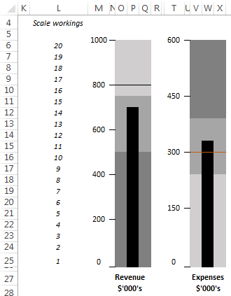
Vertical Bullet Graphs

While vertical bullet graphs are more easily achieved with the built in column charts, you can also create them using this Conditional Formatting technique by simply switching the layout from columns to rows:

vertical Bullet Chart example

Formatting Tips

  1. The graph title, scale and tick marks are simply entered in adjacent rows/columns. Merging cells or applying ‘Center across selection’ will allow you to align the scale values to the tick marks which are cell borders.
  2. Copy and paste a Linked Picture of your bullet graphs into your dashboard so that you don’t have to fuss about with column widths in your actual dashboard worksheet. You can then resize the linked picture easily using the pull handles (as seen below).

linked picture

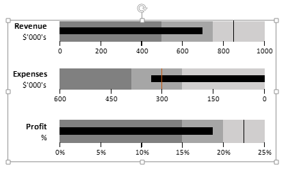
For Excel 2007 use the Camera Tool, or in Excel 2010 onwards use Copy and Paste Special > Linked Picture.

  1. You can easily add another marker to your graph, for example you might want to have a ‘Prior Year Actual’ marker. Simply add another value in your source data and apply another conditional format for it in a different colour.
  2. You can change the colours of the qualitative bands etc. but don’t go silly with it. Stephen Few makes some good points here on how too much colour can make your dashboard appear cluttered and visually overwhelming.

Thanks

I'd like to thank Peter Urbani for this technique. Peter originally shared the examples below with me which I thought were very clever.

I simply made a few cosmetic modifications like changing the target marker to a cell border so that it is a solid line instead of dashes.

Peter Urbani bullet charts

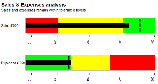
Chart Based Bullet Graphs

If you prefer to build bullet graphs using the Excel charting engine, then check out this technique from Clearly and Simply.

Excel Dashboards

If you'd like to learn more about building dashboards using Excel then take a few moments to check out my Excel Dashboard course here.

More Excel Charts Posts

picture fill excel charts

Picture Fill Excel Charts

Using a stylish picture fill in your Excel Charts is a simple way to make your data visualizations more captivating and memorable
excel speedometer charts

Excel Speedometer Charts

How to build Excel Speedometer Charts or Gauge Charts as they're also know, why they are BAD and what to use instead.
burn up burn down charts

Excel Project Management Burn Down and Burn Up Charts

Excel Burn Down and Burn Up Charts are easy to make with line or scatter charts. They are useful for monitoring the progress of a project.
wee people font charts

Excel WeePeople Font Charts

Excel WeePeople Font Charts are a nice change from generic shapes for waffle charts, bar/column charts and more.
excel dot map charts

Excel Dot Map Charts

Interactive Excel dot map charts are not built-in, but with some creative use of Excel’s built-in tools we can create something unique.
Excel S Curve Charts

Excel S-Curve Charts

Easy Excel S-curve Charts made with PivotTables for project management. Track progress by including budget amounts.
chart axis switch

Excel Chart Axis Switch

Use radio button form controls to create an Excel chart axis switch enabling you to toggle pannel charts between same axis and own axis.

Excel Charts with Shapes for Infographics

Excel Charts with Shapes for Infographic styling and increased interest in your charts. Easy to insert but there are a few tricks required.
excel pyramid chart

Excel Pyramid Charts

Excel Pyramid charts are useful for visualising demographic data across multiple categories. Let’s look at 3 ways we can build them in Excel.

Highlighting Periods in Excel Charts

Highlighting Periods in Excel Charts helps your users interpret them more quickly and or focus their attention on a point or area.


Category: Excel Charts
Previous Post:Excel Protect Ranges with Different Passwords
Next Post:Fix Excel Chart Axis with a Ghost Series

Reader Interactions

Comments

  1. Jef

    July 17, 2014 at 10:34 pm

    A great article and some excellent methods. Easy to implement. Thanks for sharing.

    Reply
    • Mynda Treacy

      July 18, 2014 at 9:23 am

      Hi Jef,

      Thanks. I liked this technique for its simplicity compared to the alternative. Although both have their downsides.

      Mynda

      Reply
  2. MF

    July 16, 2014 at 5:16 pm

    I prefer doing so by a Scatter Plot. ;p

    Reply
    • Mynda Treacy

      July 16, 2014 at 6:31 pm

      Hi MF,

      The scatter plot and bar chart mix is the method I teach in my dashboard course. I also like this as a simpler alternative .

      Cheers,

      Mynda

      Reply
      • MF

        July 17, 2014 at 3:11 pm

        icic. 🙂

        Reply

Leave a Reply Cancel reply

Your email address will not be published. Required fields are marked *

Current ye@r *

Leave this field empty

Sidebar

More results...

Featured Content

  • 10 Common Excel Mistakes to Avoid
  • Top Excel Functions for Data Analysts
  • Secrets to Building Excel Dashboards in Less Than 15 Minutes
  • Pro Excel Formula Writing Tips
  • Hidden Excel Double-Click Shortcuts
  • Top 10 Intermediate Excel Functions
  • 5 Pro Excel Dashboard Design Tips
  • 5 Excel SUM Function Tricks
  • 239 Excel Keyboard Shortcuts

100 Excel Tips and Tricks eBook

Download Free Tips & Tricks

Subscribe to Our Newsletter

Receive weekly tutorials on Excel, Power Query, Power Pivot, Power BI and More.

We respect your email privacy

Guides and Resources

  • Excel Keyboard Shortcuts
  • Excel Functions
  • Excel Formulas
  • Excel Custom Number Formatting
  • ALT Codes
  • Pivot Tables
  • VLOOKUP
  • VBA
  • Excel Userforms
  • Free Downloads

239 Excel Keyboard Shortcuts

Download Free PDF

Free Webinars

Excel Dashboards Webinar

Watch our free webinars and learn to create Interactive Dashboard Reports in Excel or Power BI

Click Here to Watch Now

mynda treacy microsoft mvpHi, I'm Mynda Treacy and I run MOTH with my husband, Phil. Through our blog, webinars, YouTube channel and courses we hope we can help you learn Excel, Power Pivot and DAX, Power Query, Power BI, and Excel Dashboards.

Blog Categories

  • Excel
  • Excel Charts
  • Excel Dashboard
  • Excel Formulas
  • Excel PivotTables
  • Excel Shortcuts
  • Excel VBA
  • General Tips
  • Online Training
  • Outlook
  • Power Apps
  • Power Automate
  • Power BI
  • Power Pivot
  • Power Query
microsoft mvp logo
trustpilot excellent rating
Secured by Sucuri Badge
MyOnlineTrainingHub on YouTube Mynda Treacy on Linked In Mynda Treacy on Instagram Mynda Treacy on Twitter Mynda Treacy on Pinterest MyOnlineTrainingHub on Facebook
 

Company

  • About My Online Training Hub
  • Disclosure Statement
  • Frequently Asked Questions
  • Guarantee
  • Privacy Policy
  • Terms & Conditions
  • Testimonials
  • Become an Affiliate

Support

  • Contact
  • Forum
  • Helpdesk – For Technical Issues

Copyright © 2023 · My Online Training Hub · All Rights Reserved. Microsoft and the Microsoft Office logo are trademarks or registered trademarks of Microsoft Corporation in the United States and/or other countries. Product names, logos, brands, and other trademarks featured or referred to within this website are the property of their respective trademark holders.