Dumbbells and Lollipop Charts
Excel Dot Plots, dumbbells and lollipop charts are good for comparing one, two or three points of data. For example, year on year, before or after or A vs B.
They make a nice change from a column or bar chart (like the one below) and are less cluttered:
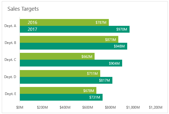
Column and bar charts also require the horizontal axis to begin at zero. This is because we instinctively compare the length of the columns/bars and make judgements based on the difference in size. If we don’t start the bar lengths at zero we can falsely exaggerate the difference and mislead our audience.
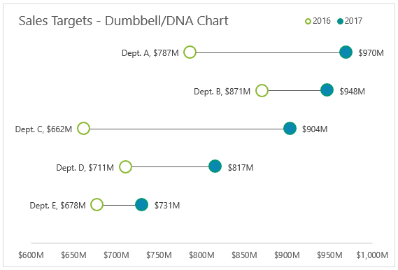
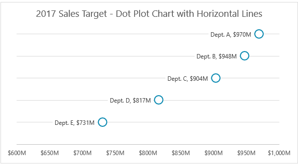
Take the following example where the horizontal axis starts at $600M:
Department A’s 2017 sales target appears to be double that of 2016, but in fact it’s only 23% more. Department C is even more misleading.
This is why we must always start bar and column chart axes at zero.
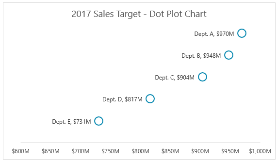
However, dot plots:
…and dumbbell charts (below), aren’t bound by this rule because the dots aren’t connected to the vertical axis base line:

And so, our eye isn’t drawn to make comparisons in the distance from the vertical axis. Instead we judge them based on the position along the horizontal axis.
This allows us to emphasise the difference between the dots, whether that be two points as in the dumbbell charts above, or the single points in the dot plot.
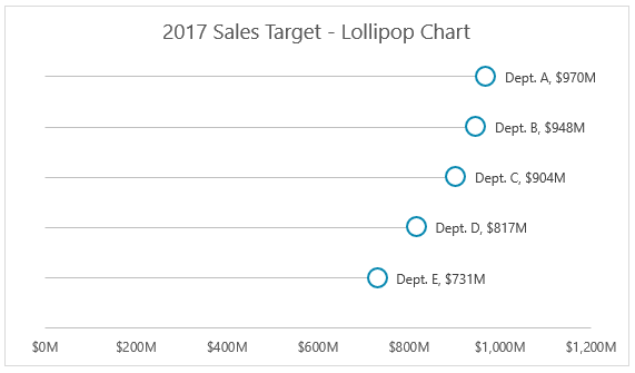
Lollipop Charts
Lollipop charts get their name from the leader line that draws your eye to the dot, and because of this I think you should start your axis at zero for the same reasons we do with bar and column charts:
Dot Plots, Dumbbells and Lollipops - Which is Best
All charts are useful, and your choice will depend on the points you want to emphasize:
Bar/Column Charts – quickly compare the size of one department to the next and compare from one period to the next within that department
Lollipop Charts – a less cluttered take on the bar chart. Make sure the axis starts at zero.
Dumbbell Charts – emphasize the change from one point to the next with some comparison between departments
Dot Plot Charts – allow comparison between departments with more emphasis on the difference
Watch the Video

Download the workbook
Enter your email address below to download the sample workbook.
Building Excel Dot Plot Charts
Start with your data structured like so:
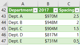
Tip: The spacing simply assigns each department to a row in your chart so they’re nicely vertically distributed. You can change the spacing to suit your needs.
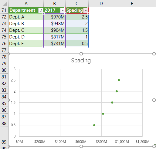
- Select the data in columns B and C > Insert tab > Scatter Chart. It should look like this:
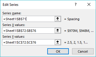
- Right-click the chart > Select Data > Edit the series name so it points to cell B71 that contains the year name:
- Edit the vertical axis (right-click > format or left-click > Ctrl+1) > Set the maximum to 2.5 (or to match the maximum spacing value in your data set).
- If you want to emphasize the difference between the dots you can set the horizontal axis minimum to something closer to the lowest value in your data set. I’ve set mine to $600M.
- Turn off the vertical axis (just select it and press DELETE).
- Turn off the vertical gridlines (select them and press DELETE). Optionally also turn off horizontal gridlines.
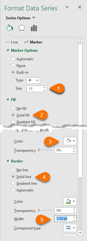
- Select the dots > CTRL+1 to format > Marker > Marker Options > set the marker options, type and size (see my settings below -# 1). Set the fill to white (#2 & #3) and make the border thicker (#4 & #5):
- Add labels > align them left and format them to display the X value. If you have Excel 2013 or Excel 2016 you can also include the Department names using the ‘Values From Cells’ reference as shown below:
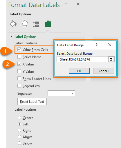
Note: If you have an earlier version of Excel then you can use the technique described by Jon Peltier here to assign your department names to the vertical axis labels.
Or you can get Jon's Excel add-in that can create dot plots and more:
Peltier Tech Chart Utility – available for PC and Mac
- If you want to keep the horizontal gridlines, then you can fill the labels with white (select labels > Format tab) so that the line doesn’t strike through the label:
Excel Lollipop Charts
Lollipop charts require the same steps as the Dot Plot, but you delete the horizontal gridlines and replace them with error bars. To add error bars:
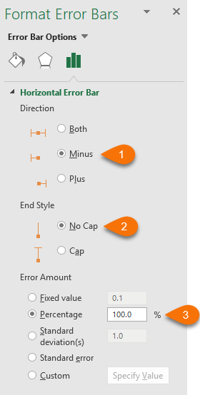
- Select the dots > Chart Tools > Design > Add Chart Element > Error Bars > Percentage. Then open More Error Bar Options from the same menu.
- Set the direction to Minus, End Style to No Cap and Error Amount is Percentage at 100%:
Excel Dumbbell Charts
Dumbbell Charts (sometimes called DNA charts), require the same steps as the Dot Plot. Then you simply add a second series:
- Right-click chart > Select Data > Add Legend Series
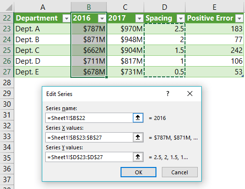
- Select the second set of data for the X series, in my case it’s 2016 data. The Y series are the Spacing values:
- Add error bars (note: the Error Bars are based on the difference between 2017 and 2016 and you can see the calculation in column E) – Select the 2016 dots in the chart > Chart Tools > Design tab > Error Bars > More Error Bar Options. This will open the Error Bar formatting dialog box or pane (shown below):
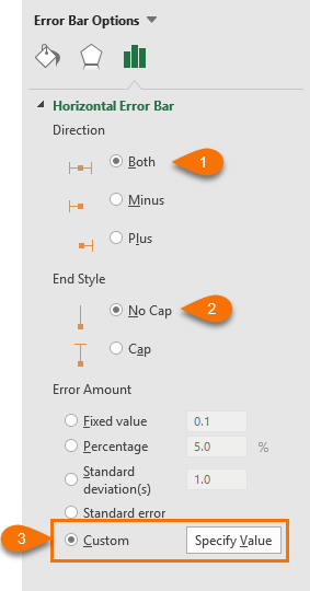
- Click on ‘Specify Value’ and select the Positive Error Values from the table:
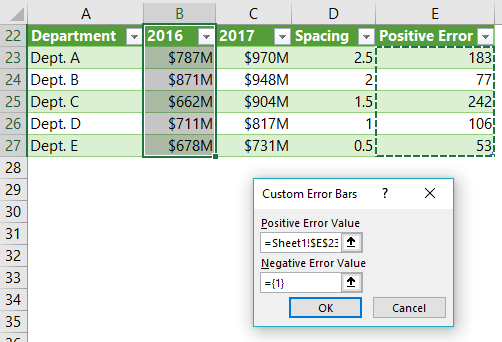
Tip: If you have negative error values (like the example below), then you’ll also need to add a column to your table to calculate them and then reference those cells in the ‘Negative Error Value’ field shown in the dialog box above.
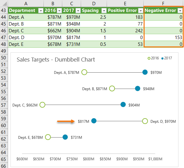
Be sure to download the Excel file to see the example above.
Camera Tool Alternative
If you’re familiar with Excel’s camera tool, then a quick and dirty way to create a dot plot is to insert a line chart with only markers and use the Camera tool to rotate it on it’s side.
However, often the image in the camera tool isn’t as crisp as you might like, and if you insert too many of them then Excel might have a tantrum and crash.
References
Jon Peltier: https://peltiertech.com/dot-plots-microsoft-excel/
Naomi Robbins: http://www.b-eye-network.com/newsletters/ben/2468
Stephanie Evergreen: http://stephanieevergreen.com/easy-dot-plots-in-excel/
Please Share
If you liked this please click the buttons below to share.


This is very helpful! Thanks for the detailed instructions, and demo file. I’d like to have my names (your Departments A,B,C,D), all on an axis (left or right) and not be a part of the dot label. Is there a way to trick excel into that?
Thanks, Karin. One way to have the labels on the left is to add another series with a value of zero and assign the labels to that (left aligned).
If both ends of my dumbbell chart are the same value, how do I make both circles visible? I currently have it set up as you do, so the outlined circle is on the left and the filled circle is on the right. When they are the same value, only the filled circle is visible. How can I make it so the outlined circle is layered on top, making them both visible?
Hi Bryce,
Try making the first dot smaller and a different filled colour so that the second dot is visible from behind.
Mynda
You’re missing a step. Once the first series is plotted you need to left-click to select all the data points and then click on the + sign on the top right side of the chart and click on “Error Bars”. Then you have to delete the vertical portion of the error bars.
Taking these steps will ensure that Excel doesn’t default to “Vertical Error Bar” box but will instead bring up the “Horizontal Error Bar” box.
Thanks for spotting this. I’ve edited that step to say:
Select the dots > Chart Tools > Design > Add Chart Element > Error Bars > Percentage. Then open More Error Bar Options from the same menu.
Choosing percentage ensures a horizontal error bar is inserted.
Cheers,
Mynda
In a excel table contains different column headings, but we need some column from table to be pasted some sheets and some column on other sheets. Some entire table in different sheets
Hi Kiran,
You can use a PivotTable to do this: https://www.myonlinetraininghub.com/excel-pivot-tables-to-extract-data
Mynda
Thanks Mynda,
This is great for showing actual and planned performance for a set of business units or sites. By using the ‘power’ of NA() and a couple of additional columns one can have dumbbell charts with positive performance ending in a green dot, negative in red.
This also does away with the need for a negative error column and also deals with the labeling issue Jerry Cook raised below.
I would have liked to have an arrow head at the end of the error bar to emphasize the direction of movement have not had time to figure that out yet…
Great work and hope that you and the family have enjoyed Christmas and all the best for 2018.
Thanks, Steve! Glad you’ll find it useful.
For the forward pointing arrow you could use an image type Marker and reference an image file of an arrow that you create. In the Marker Options > Built-in > Type; choose the image file.
Best wishes for 2018 🙂
Mynda
Excellent!! Thank you for this. I already have uses for this. I will also experiment with using this type of plot as an alternative to a Gantt chart. Great stuff as always. Thanks.
Happy Holidays
Tim Anderson
Thanks, Tim! Great idea for the Gantt chart alternative.
Happy holidays to you too 🙂
I love the simplicity and yet it covert all of the information
Thanks, Jo. Glad you liked the dot plots.
Mynda
Great tools! Quick question on the dumbbell chart with higher prior period. Did you manually change the label alignment on the “backward” item, or did you find a hidden method to automatically switch the alignment for negative error bars?
Happy Holidays!
Jerry
Hi Jerry,
Yes, I had to format that label manually. No tricks, sorry. Although, if you had many negative errors you could add those 2017 values/dots as a different series and then apply the formatting to that series. It would be slightly quicker, but would also require more set up in the table etc. Swings and round-a-bouts.
Mynda
Hi Jerry,
There is a way to have labels to be automatically positioned depending on the value of the series. Like Mynda said, you would have to do more set up in the table and add additional series to the chart, it seems complex but the trick is very simple.
I would like to leave (and if I may Mynda, of course) this video tutorial where I explain to how set up the series in order to get the label positioned correctly and automatically. (also when new data comes in, they will positioned accordingly to the values of the data.)
Link: https://www.youtube.com/watch?v=Rf_WF_F8VZU
I hope it is still useful. It a great chart, thanks Mynda for sharing this post!
Nice article. I’m glad you discussed the issue of starting plots at zero. Personally, I would have a hard time creating any graph without starting the axis at zero, simply because we so intuitively judge relative lengths and distances. If I were to create a visualization solely to compare differences (as in the dumbbell chart) I might want to just show the relative differences from a initial comparison point at zero, in other words, eliminate the absolute values, but show the difference, either as the actual number or as a percentage of the initial state.
Keep up the awesome work!
Thanks, Renny!