Plotting data over time can reveal patterns and trends, but often blips in the data require further explanation. We can help our user by labelling events in Excel charts to highlight key points in time that may explain those blips or patterns revealed in the data.
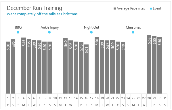
For example, the chart below monitors Phil’s average running pace per kilometre in mm:ss format. December was a busy social month and Phil “fell off the wagon”, a few times. We can see after each blip in his training routine that his average times suffer, and it takes quite a few days of training to get back on track.
Watch the Video Tutorial
| Please subscribe to my channel: |
Download the File
Enter your email address below to download the sample workbook.
Tricks for Labelling Events in Excel Charts
There are a few tricks to building this chart. I’ll summarise them here and then go into more detail:
- The ‘Events’ are a separate series plotted as a line chart with just the markers showing:
- The data is stored in an Excel Table so that as Phil adds to it, it automatically feeds through to the chart. Nothing to update.
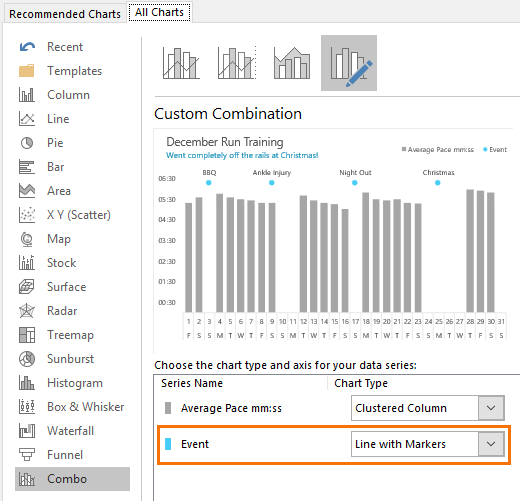
Chart Source Data
The first part to labelling events in Excel Charts is to set up the source data so that there are two numeric series; one for the average pace columns and another for the event markers. See image below:
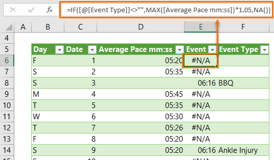
The Event Type column is where Phil makes a note of an event that may impact his run training. A night out, an injury, a special occasion, being lazy 😉 etc.
When he enters a value in the Event Type column (F), the formula in the Event column (E) detects an event and calculates the placeholder value. This placeholder value is based on the maximum average pace + 5%. Tip: I add 5% so that the label points sit above the columns. The formula is:
=IF([@[Event Type]]<>"",MAX([Average Pace mm:ss])*1.05,NA())
Note: Cell references used in the formula like [@[Event Type]] and [Average Pace mm:ss] are called Structured References, and are available when working with data stored in an Excel Table.
In English the formula above reads:
=IF( the Event Type cell is not empty, find the MAX([Average Pace mm:ss]) and multiply it by 1.05, otherwise return the #N/A error*)
* I use #N/A because these errors do not get plotted in the line chart, whereas a blank or zero would put a dot on the horizontal axis at zero.
Bonus Tip: I’ve used a nested horizontal axis so that the day letter (from column B) and date (from column C) are both displayed in the axis. This enables me to avoid long axis labels and gives context to the dates, so we can easily see when weekends are.
Building the Chart
When you insert a chart based on data in an Excel Table, Excel tries to detect the type of chart you might want based on the data in the table. However, it gets a bit confused with my data because I have two axis columns (Day and Date), as well as the Event Type column containing text.
Even if I choose just the Date and Average Pace columns (C and D) before inserting the chart, Excel 2016 still thinks it’s cleverer than me, I mean imagine that (!), and considers all of the columns when detecting the chart type and source data ranges. And what I end up with is a mess that looks like this:
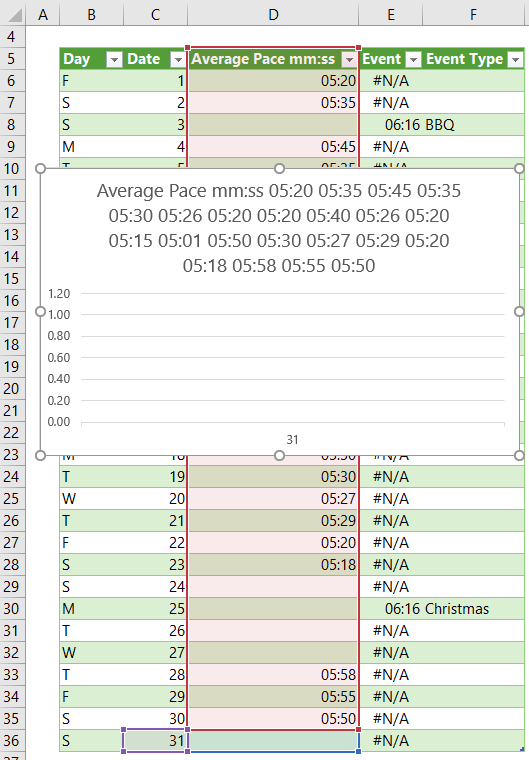
So, if your version of Excel thinks it knows better than you too, then this is how to fix it:
- Insert a Column Chart: Select cells C5:D36 > Insert Tab > 2D Column Chart
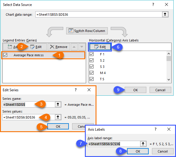
- Edit Source Data Ranges: Right-click the chart > Select Data > Edit the Legend Entries and Horizontal Axis Labels so they point to the correct ranges:
- Add the Event data to the chart: There are lots of ways to tackle this, here are three options:
- Copy the Event cells (E5:E36) to the clipboard (CTRL+C) > Select the chart > CTRL+V to paste or,
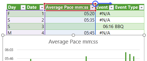
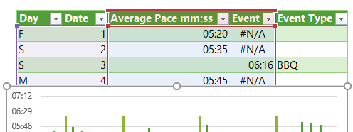
- Select the chart, which will activate the range boxes on the table > left-click and drag the red box pull handles to the right to include the Event column.
- Or, right-click the chart > Select Data > Add Legend Entry
Now it should look like this:
There’s no right or wrong, just use whichever method you prefer.
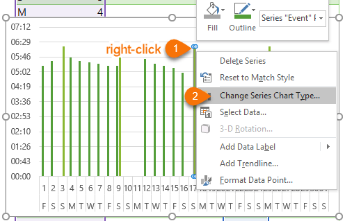
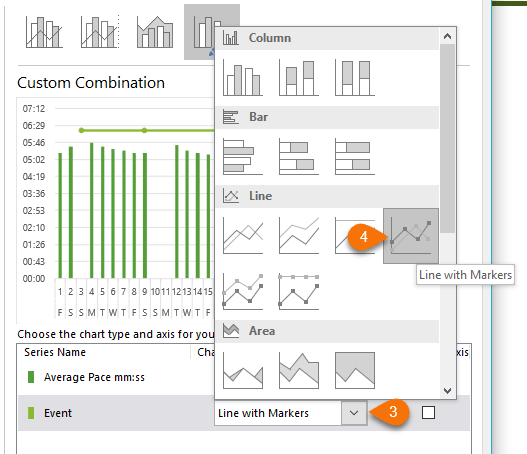
- Change Event Series to Line chart with Markers: Left-click any column to select it > right-click > Change Series Chart type:
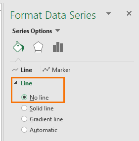
- Remove the Line: Right-click the line > Format Data Series. In the Format pane/dialog box set the line to ‘No Line’:
- Set the Marker formatting: These are my settings:
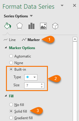
- Add Labels to the Markers: Select the Markers > right-click > Add Data Labels.
- Format the Labels: Select the Labels > right-click > Format Data Labels. In the dialog box/format pane set the Label position to ‘Above’ and if you have Excel 2013 or higher you can insert the Event Type using ‘Value From Cells’:
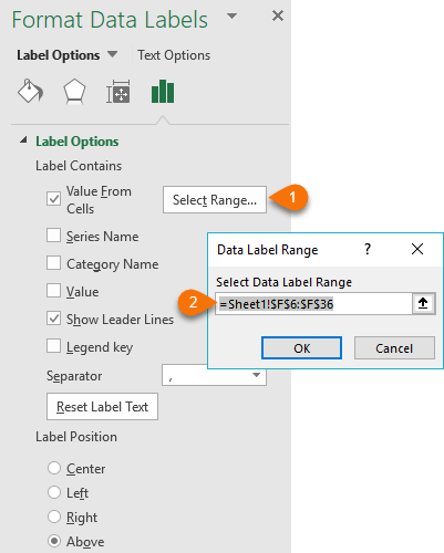
Deselect ‘Show Leader Lines’ and ‘Value’ from ‘Label Contains’.
Note: If you have Excel 2010 or earlier you can use the custom Chart Labels technique described here.
- Tidy up: Some final formatting tips:
- Reduce the gap width between the columns: right-click the columns > format data series > Series options > Gap width > 30%, or as desired.
- Add labels to the columns; Position them ‘Inside End’ and align the text -90 degrees. Note: I’ve included labels because the times vary by less than a minute and this detail is important. Ideally, I’d make the chart wider so the labels fit horizontally, but I only have 600 pixels of width to fit this image in!
- Now that we have labels we can remove the vertical axis; just left click on it and press DELETE
- While we’re at it, let’s remove the gridlines; left-click and press DELETE
- Add a chart title; include some commentary if relevant. In my title I mentioned how Phil ‘went completely off the rails at Christmas’ 😊
- Add a legend; I put mine at the top right and the chart title in the top left so they’re not taking up too much space.
Related Tutorials
| Label Excel Chart Min and Max | |
| Dynamically Label Excel Chart Series Lines | |
| Custom Chart Labels | |
| Chart Vertical Axis Text Labels | |
| Dynamic Text Labels |
Please Share
If you liked this please click the buttons below to share.





Can you use this functionality within Pivot Charts?
Hi Rick, not the way it is explained here, but you could try adding the Event field to your row/column labels so that it forms part of the horizontal axis. You’d want to hide the #N/As by returning blank instead of NA(). Mynda
Hi.
So glad that I’ve stumbled upon your website. This chart is exactly what I am after but I don’t know how to adjust the formula for my needs. I want to draw a line chart of a share price and then whenever there was an event on a particular day, I want that plotted on the chart and labelled as per your example.
This is how my data is currently plotted:
Date Price (cps) Event Event type
2015/12/28 30808
2015/12/29 31092
2015/12/30 30800
2015/12/31 30948
2016/01/04 29233
2016/01/05 29000
Hi Madeline,
Can you please upload sample file with your data? Use our forum to upload the file (create a new topic after sign-up), it will be easier to understand your situation and help.
Thanks
Regards,
Catalin