• Skip to main content
  • Skip to header right navigation
  • Skip to site footer

My Online Training Hub

Learn Dashboards, Excel, Power BI, Power Query, Power Pivot

  • Courses
  • Pricing
    • SALE 20% Off All Courses
    • Free Courses
    • Power BI Course
    • Excel Power Query Course
    • Power Pivot and DAX Course
    • Excel Dashboard Course
    • Excel PivotTable Course – Quick Start
    • Advanced Excel Formulas Course
    • Excel Expert Advanced Excel Training
    • Excel Tables Course
    • Excel, Word, Outlook
    • Financial Modelling Course
    • Excel PivotTable Course
    • Excel for Customer Service Professionals
    • Multi-User Pricing
  • Resources
    • Free Downloads
    • Excel Functions Explained
    • Excel Formulas
    • Excel Add-ins
    • IF Function
      • Excel IF Statement Explained
      • Excel IF AND OR Functions
      • IF Formula Builder
    • Time & Dates in Excel
      • Excel Date & Time
      • Calculating Time in Excel
      • Excel Time Calculation Tricks
      • Excel Date and Time Formatting
    • Excel Keyboard Shortcuts
    • Excel Custom Number Format Guide
    • Pivot Tables Guide
    • VLOOKUP Guide
    • ALT Codes
    • Excel VBA & Macros
    • Excel User Forms
    • VBA String Functions
  • Members
    • Login
    • Logout
    • Password Reset
  • Blog
  • Excel Webinars
  • Excel Forum
    • Register as Forum Member

Excel Custom Chart Labels

You are here: Home / Excel Charts / Excel Custom Chart Labels
Excel custom chart labels
January 5, 2015 by Mynda Treacy

Using Excel custom chart labels is a great way to create a more insightful chart without having to show a whole other series. Just take this chart below with custom labels showing the year on year % change:

Excel Custom Chart Label Example

Enter your email address below to download the sample workbook.

By submitting your email address you agree that we can email you our Excel newsletter.
Please enter a valid email address.

Download the Excel Workbook. Note: This is a .xlsx file please ensure your browser doesn't change the file extension on download.

Custom Chart Labels Excel 2013

In Excel 2013 we can easily insert custom chart labels using the new ‘Value From Cells’ option found in the Label Options menu:

Excel 2013 Custom Chart Labels

Unfortunately if you’re using Excel 2007 or 2010 you’re not so fortunate but fear not, I have a workaround.

Custom Chart Labels Excel 2010/2007

The Old Way:

I used to hijack the regular labels and replace them with links to cells containing the label I wanted, however there were three problems with this approach:

  1. They could only display numbers, which means I couldn’t do anything fancy like the up/down triangles in the chart above.
  2. It was tedious as they had to be linked one at a time and when you’ve got loads of labels….well, it gets boring fast.
  3. They didn’t dynamically update i.e. if the period of my chart changed I had to manually change my labels…double boring.

The workaround for this was to insert text boxes and link them to cells, however this also fell afoul of problems 2 and 3 above.

Bonus problem: aligning the text box labels wasn’t too bad if you wanted them along a straight line as you could just use the Alignment Tools, but if you want them staggered in line with the column height then you’ll be wasting valuable hours tediously moving boxes up and down. Yawn.

The New Improved Way:

Last week Karen asked me how to insert custom labels that dynamically update, so I spent a bit of time experimenting with the tools buried in the chart menus and figured out that I could hijack the horizontal category axis for my custom labels, and puff, just like that problems 1, 2, 3 and 4 are gone.

Here’s how: Set up your chart source data:

Excel Custom Chart Labels source data

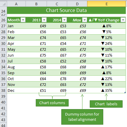
Take special note of columns D and E as these are required for the labels.

A brief word on the Max column: this column simply returns the MAX from columns B and C for each row. We use Max as a dummy series in our chart to dynamically position the labels just above the columns. Note: Excel 2013 onward also requires this step if you have more than one series you want to position your labels above.

Step 1: Select cells A26:D38 and insert a column Chart

Step 2: Select the Max series and plot it on the Secondary Axis: double click the Max series > Format Data Series > Secondary Axis:

Excel format data series

Step 3: Insert labels on the Max series: right-click series > Add Data Labels:

add data labels

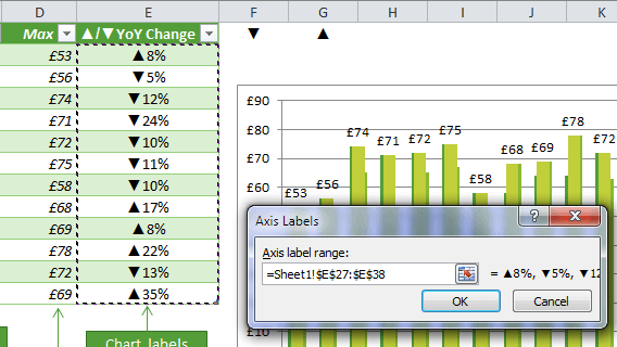
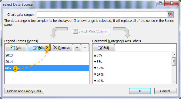
Step 4: Change the horizontal category axis for the Max series: right-click > Select Data > select ‘Max’ from the Legend Entries and then click ‘Edit’ under ‘Horizontal Axis Labels’:

change horizontal category axis

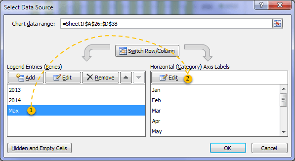
Select the Labels in cells E27:E38 and click OK (image below):

axis label range

Don’t worry if the chart doesn’t look any different yet.

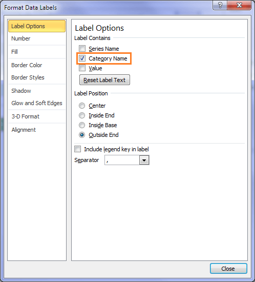
Step 5: Replace the default labels with your custom labels: right-click the labels > Format Data Labels:

replace labels with custom chart labels

From the ‘Label Contains’ list choose ‘Category Name’:

set category name

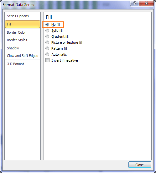
Step 6: hide the Max series columns by formatting them with ‘No fill’: double-click the Max columns in the chart to open the ‘Format Data Point’ dialog box and under the ‘Fill’ tab choose ‘No fill’:

hide series with no fill

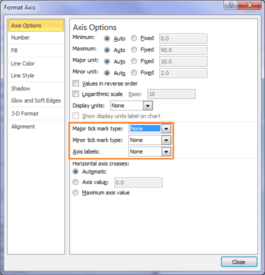
Step 7: Tidy up the chart:

  • Hide the secondary axis – double click it to open the Format Axis dialog box > Axis Options > Axis Labels, Major and Minor tick marks > set all to ‘None’:
  •  

    hide secondary axis

  • While in the Format Axis dialog box go to the ‘Line Colour’ tab > select No Line
  • Move the legend to the bottom: double click the legend > legend position > Bottom
  • Get rid of the gridlines – just select them and press the Delete key.
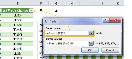
  • Format the legend point for Max to pick up the value in cell E26: right-click the columns > Select Data > select Max from the Legend Series list > Edit:
  •  

    fix legend label

    In the Series name field click on cell E26 > click OK:

    set series name

Celebrate! Your custom chart labels are complete:

Excel Custom Chart Label Example

Thanks

Thanks to Karen for prompting me to discover this workaround. Although, I'm sure I'm not the first to use this technique, I've not stumbled upon it before.

Excel custom chart labels

More Charts Posts

burn up burn down charts

Excel Project Management Burn Down and Burn Up Charts

Excel Burn Down and Burn Up Charts are easy to make with line or scatter charts. They are useful for monitoring the progress of a project.
wee people font charts

Excel WeePeople Font Charts

Excel WeePeople Font Charts are a nice change from generic shapes for waffle charts, bar/column charts and more.
excel dot map charts

Excel Dot Map Charts

Interactive Excel dot map charts are not built-in, but with some creative use of Excel’s built-in tools we can create something unique.
Excel S Curve Charts

Excel S-Curve Charts

Easy Excel S-curve Charts made with PivotTables for project management. Track progress by including budget amounts.
highlighting data in power bi visuals

Highlighting Data in Power BI Visuals

Learn several techniques to highlight or label important data points in your Power BI visuals. Sample file and code to download.
shape maps in power bi

Shape Maps in Power BI

Shape maps in Power BI can be used to show the distribution of a variable across geographic regions. Learn a trick to plot discrete data too.
using jitter to avoid over plotting

Using Jitter to Avoid Over Plotting in Power BI

Plotting data that has one variable where values are similar, can result in points that are plotted over each other. Use jitter to avoid this overplotting.
Sorting Excel Date Slicers

Sorting Excel Date Slicers

Slicers have some shortcomings when it comes to dates and sort order. This post explains a couple of ways to sort dates correctly in Excel slicers.
Charting Disparate Data in Excel – 3 Solutions and 1 Crazy Mess

Charting Disparate Data in Excel – 3 Solutions and 1 Crazy Mess

4 Charts – Same Data. Which do you think is best?

4 Charts – Same Data. Which do you think is best?

More Excel Charts Posts

excel speedometer charts

Excel Speedometer Charts

How to build Excel Speedometer Charts or Gauge Charts as they're also know, why they are BAD and what to use instead.
burn up burn down charts

Excel Project Management Burn Down and Burn Up Charts

Excel Burn Down and Burn Up Charts are easy to make with line or scatter charts. They are useful for monitoring the progress of a project.
wee people font charts

Excel WeePeople Font Charts

Excel WeePeople Font Charts are a nice change from generic shapes for waffle charts, bar/column charts and more.
excel dot map charts

Excel Dot Map Charts

Interactive Excel dot map charts are not built-in, but with some creative use of Excel’s built-in tools we can create something unique.
Excel S Curve Charts

Excel S-Curve Charts

Easy Excel S-curve Charts made with PivotTables for project management. Track progress by including budget amounts.
chart axis switch

Excel Chart Axis Switch

Use radio button form controls to create an Excel chart axis switch enabling you to toggle pannel charts between same axis and own axis.

Excel Charts with Shapes for Infographics

Excel Charts with Shapes for Infographic styling and increased interest in your charts. Easy to insert but there are a few tricks required.
excel pyramid chart

Excel Pyramid Charts

Excel Pyramid charts are useful for visualising demographic data across multiple categories. Let’s look at 3 ways we can build them in Excel.

Highlighting Periods in Excel Charts

Highlighting Periods in Excel Charts helps your users interpret them more quickly and or focus their attention on a point or area.
stacked bar waffle chart

Stacked Bar Excel Waffle Charts

Stacked Bar Excel Waffle Charts are an alternate to using conditional formatting to build waffle charts, and some say they're easier.


Category: Excel ChartsTag: charts
Previous Post:Excel Find Tool
Next Post:Excel Custom AutoFilter with WildcardsExcel AutoFilter

Reader Interactions

Comments

  1. Ndebeh soriba

    October 14, 2020 at 2:21 am

    This lesson is so interesting I must apprecite you ‘ but, I’m facing some problem with finding the formula for true or false

    Reply
    • Mynda Treacy

      October 14, 2020 at 10:15 am

      You’re welcome, Ndebeh! If you’re stuck please post your question on our Excel forum where you can also upload a sample file and we can help you further.

      Reply
  2. Ahmed

    June 6, 2020 at 6:48 pm

    Thanks Mynda for making our lives easier
    i am using excel 2010 and i have a stupid problem in step 4, when i select the max series there is no option to convert into horizontal, am i doing something wrong??

    Reply
    • Mynda Treacy

      June 7, 2020 at 10:08 am

      Hi Ahmed,

      In step 4 you’re not converting it to a horizontal axis, you’re simply giving it a different range of cells for the horizontal axis. Simply select the Max series, then click on the ‘edit’ button on the Hoizontal (Category) Axis Labels side of the dialog box as shown in the image.

      Mynda

      Reply
  3. Mario

    October 22, 2019 at 7:30 am

    [Color10]_( “â–²”_*0.0%;[Red]_(“â–¼”_*-0.0%

    Could you assist with changing the following format where anything over 100% is RED ??

    Reply
    • Mynda Treacy

      October 22, 2019 at 7:51 am

      Hi Mario,

      You can only colour code numbers based on positive, negative and zero values using custom number formats. If you want to colour code based on different thresholds, you need to use Conditional Formatting.

      Mynda

      Reply
  4. Joe

    September 9, 2019 at 1:58 am

    Hi Mynda,
    Always enjoy your lessons in excel and it has helped me tremendously. One question regarding this process: In the change column, my down arrow and percentage seem to be more spaced out than the up arrow and percentage. Is there a way I can get the down arrow and percentage closer together? Thanks Joe

    Reply
    • Mynda Treacy

      September 9, 2019 at 11:58 am

      Hi Joe,

      Maybe try some different fonts to see if you can get better results. The font in my example is Calibri (Body).

      Mynda

      Reply
  5. Sergey

    August 20, 2018 at 4:36 am

    Good day to you Mynda! Thanks for the post.Made a littlle improvement. There is a way to bypass the IF,ABS and TEXT function and referencing cells with arrow symbols.
    I mean creating custom cells format, inserting the needed symbols along with the percentage: [Green]â–²# ##0%;[Red]â–¼# ##0%;[Yellow]# ##0%.

    Added some colors just for fun)))
    Not sure if I wrote everything correctly, my English is not so good yet.

    Thanks again!

    Reply
    • Mynda Treacy

      August 20, 2018 at 9:29 am

      Thanks for sharing that tip, Sergey.

      Unfortunately the colour coding doesn’t flow through to the chart, but it does remove the need for the formula in the YoY Change column. More on custom number formats here.

      Reply
  6. Sam

    October 10, 2017 at 10:58 am

    This is a brilliant work and thought process. It is very innovative. I believe that Excel has everything that you need but someone like Mynda needs to show How-To otherwise you will feel lost.

    Reply
    • Mynda Treacy

      October 10, 2017 at 11:05 am

      Thanks, Sam! Glad you found it useful 🙂

      Reply
  7. Steve Tainton

    July 14, 2017 at 4:12 pm

    Hi Mynda just revisiting theis post and have made some modifications to your formula so that a third result could b shown to illustrate no change i.e. 0%

    =IF(C27>B27,$G$26&TEXT(ABS((C27/B27)-1),”#%”),IF(C27<B27,$F$26&TEXT(ABS((C27/B27)-1),"#%"),$H$26&"0%"&$I$26))

    Reply
    • Mynda Treacy

      July 14, 2017 at 4:47 pm

      Lovely, thanks Steve.

      Reply
  8. lea cohen

    May 21, 2017 at 4:46 pm

    And in the ABS formula how does it give the answer of 8%
    I copied the formula that was written in the sheet you attached and all received a score of 0
    I’d love to understand the calculation that makes up the percentage, thank you

    Reply
    • Mynda Treacy

      May 21, 2017 at 4:52 pm

      The formula that calculates the percentage is just the C28/B28-1. The ABS function just removes the negative sign for any negative percentages.

      Mynda

      Reply
      • lea cohen

        May 21, 2017 at 4:59 pm

        thank you

        Reply
  9. lea cohen

    May 21, 2017 at 7:50 am

    I would appreciate it if you could tell me how to create the icon of the 2 triangles in the F26 G26 cells and can I create more shapes?

    Reply
    • Mynda Treacy

      May 21, 2017 at 3:07 pm

      Hi Lea,

      The triangles are symbols (Insert tab > Symbol). The font is Arial and they are found in the Geometric Shapes group.

      Mynda

      Reply
      • lea cohen

        May 21, 2017 at 4:33 pm

        Thanks
        The shapes there are very limited
        The question is whether it is possible to use with the shapes from the webdings font
        Because when I added them and then I did = and clicked the sign I added
        He gave me another sign.
        What trick can you do to use a name with a larger selection of icons? there is something?

        Reply
        • Mynda Treacy

          May 21, 2017 at 4:53 pm

          You can’t use Wingdings or Webdings because you’d have to format the labels in the Wingdings font and that would turn your % numbers into Wingdings, which would be unreadable. You can use any shapes that aren’t generated by a font.

          Reply
  10. Sara S

    January 26, 2017 at 6:30 am

    I was so excited to see this post, this is something I absolutely need! However I gotten stuck on Step 4. All of my options are grayed out except for “switch row/column”. What am I doing wrong?

    Reply
    • Mynda Treacy

      January 26, 2017 at 3:29 pm

      Hi Sara,

      It sounds like you might have a Pivot Chart, not a regular Chart?

      Mynda

      Reply
  11. Jeff Weir

    January 13, 2015 at 6:57 pm

    Hi Mynda. An even simpler work-around for pre 2013 users is to simply download Rob Bovey’s excellent – and free – XY chart labeler. It’s misnamed really…it works on any chart type.

    http://www.appspro.com/Utilities/ChartLabeler.htm

    Reply
    • Mynda Treacy

      January 13, 2015 at 7:16 pm

      Great tip! Thanks, Jeff.

      Reply
  12. b. lawrence

    January 8, 2015 at 1:18 am

    love article – how do you get the symbols in the column E formula?

    Reply
    • Mynda Treacy

      January 8, 2015 at 10:48 am

      Thanks! The symbols can be inserted into a cells (in my spreadsheet they’re in cells F26 & G26), via the Insert tab of the ribbon then Symbol. You’ll find them under the Symbols tab, arial font, geometric shapes.

      You then use an IF statement in column E to choose which symbol is required. If you download the workbook you’ll be able to inspect the formula.

      Mynda

      Reply
      • MF

        January 10, 2015 at 5:34 pm

        or it can be input by ALT + 30, ALT + 31 on the numpad. 🙂
        given you are working on PC.

        Reply
        • Mynda Treacy

          January 10, 2015 at 9:04 pm

          Suppose you can, if you happen to remember the numbers for them… which I never can 🙂

          Reply
          • MF

            January 13, 2015 at 12:10 am

            You are absolutely right. I only remember a few, less than 5 indeed. 🙂

  13. James Michael Perry

    January 7, 2015 at 5:06 pm

    I’m using excel 2013 so many thanks for sharing
    #happy2015

    Reply
    • Mynda Treacy

      January 7, 2015 at 7:26 pm

      Cheers, James. Happy 2015 to you too 🙂

      Reply
  14. MF

    January 6, 2015 at 12:20 pm

    Hi Mynda,
    I like that new feature in Excel 2013. Thanks for sharing… I wish I have Excel 2013 to play around. 🙂
    As a lazy guy, I normally put the “% change” as part of the X-axis by putting column E to column A, followed by Month/2013/2014. In this way, same chart can be plot in normal way; and the “% change” will appear under the “Month” on the same X-axis.
    Here’s a screenshot using your sample data:
    https://wmfexcel.files.wordpress.com/2015/01/capture.png
    Cheers,

    Reply
    • Mynda Treacy

      January 6, 2015 at 1:55 pm

      Cheers, MF. I like that option too.

      Reply
      • Asif Hafeez

        January 7, 2015 at 1:59 am

        Nice article! So easy in Excel 2013 and thanks Mynda learning us such a nice trick in Excel 2007/2010 in a comprehensive and easy way.

        Reply
        • Mynda Treacy

          January 7, 2015 at 10:09 am

          Cheers, Asif. Glad you liked it.

          Mynda

          Reply
          • Gonzalo Torres

            June 22, 2015 at 12:12 pm

            Dear Mynda, how we can automatically change color in custom chart label. For example -3% (red) and +10% (blue).
            Thanks
            Gonzalo T.

          • Mynda Treacy

            June 22, 2015 at 10:27 pm

            Hi Gonzalo,

            The only way to format them different colours is to have two series on your secondary axis; one for the negative labels and one for the positive labels. You can then format each series in a specific colour. The negative labels will have blanks where the positive labels are and vice versa. You may also have to format the label box to have ‘no fill’ so that the labels at the bottom show through.

            Hope that makes sense.

            Mynda

Leave a Reply Cancel reply

Your email address will not be published. Required fields are marked *

Current ye@r *

Leave this field empty

Sidebar

More results...

Course Sale

mynda treacy microsoft mvpHi, I'm Mynda Treacy and I run MOTH with my husband, Phil. Through our blog, webinars, YouTube channel and courses we hope we can help you learn Excel, Power Pivot and DAX, Power Query, Power BI, and Excel Dashboards.

Subscribe to Our Newsletter

Receive weekly tutorials on Excel, Power Query, Power Pivot, Power BI and More.

We respect your email privacy

Guides and Resources

  • Excel Keyboard Shortcuts
  • Excel Functions
  • Excel Formulas
  • Excel Custom Number Formatting
  • ALT Codes
  • Pivot Tables
  • VLOOKUP
  • VBA
  • Excel Userforms
  • Free Downloads

239 Excel Keyboard Shortcuts

Download Free PDF

Free Webinars

Excel Dashboards Webinar

Watch our free webinars and learn to create Interactive Dashboard Reports in Excel or Power BI

Click Here to Watch Now

Blog Categories

  • Excel
  • Excel Charts
  • Excel Dashboard
  • Excel Formulas
  • Excel PivotTables
  • Excel Shortcuts
  • Excel VBA
  • General Tips
  • Online Training
  • Outlook
  • Power Apps
  • Power Automate
  • Power BI
  • Power Pivot
  • Power Query
trustpilot excellent rating
 

Company

  • About My Online Training Hub
  • Disclosure Statement
  • Frequently Asked Questions
  • Guarantee
  • Privacy Policy
  • Terms & Conditions
  • Testimonials
  • Become an Affiliate

Support

  • Contact
  • Forum
  • Helpdesk – For Technical Issues

Copyright © 2023 · My Online Training Hub · All Rights Reserved

Microsoft and the Microsoft Office logo are trademarks or registered trademarks of Microsoft Corporation in the United States and/or other countries. Product names, logos, brands, and other trademarks featured or referred to within this website are the property of their respective trademark holders.