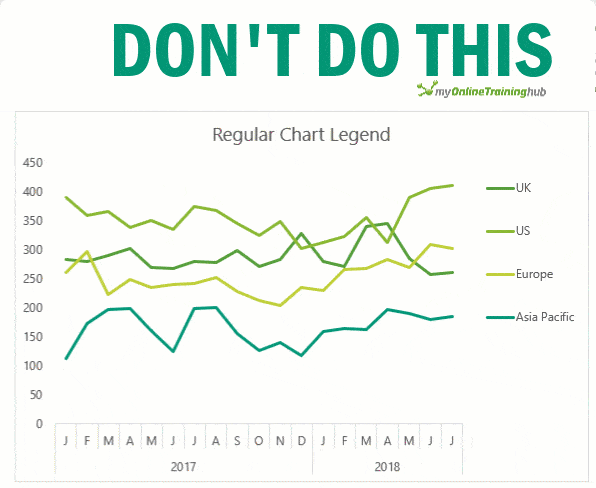
The default Excel chart legends can be awkward and time consuming to read when you have more than 2 series in your chart.
As your eye flits back and forth from legend to chart any ability to quickly interpret the data dwindles away. Just try it with the example below:

Presenting charts like this does your users a disservice and is far from best practice, yet I see it time and again, and in big name publications that should know better.
Just look at how much easier it is to interpret the chart below that has the legend aligned to the series, and color coded:

Now, it’d be nice if there was a setting we can flick on to dynamically label Excel chart series lines but alas, there isn’t. Don’t despair, there’s always a way we can wrangle Excel to do what we want [evil chuckle].
Watch the Video
Download the Workbook
Enter your email address below to download the sample workbook.
Label Excel Chart Series Lines
One option is to add the series name labels to the very last point in each line and then set the label position to ‘right’:

But this approach is high maintenance to set up and maintain, because when you add new data you have to remove the labels and insert them again on the new last data points. Ugh, tell me someone who has time for that?!
Dynamically Label Excel Chart Series Lines
So, let’s look at how we can set up series labels that dynamically update as new data gets added, like this:

Step 1: Duplicate the Series
The first trick here is that we have 2 series for each region; one for the line and one for the label, as you can see in the table below:
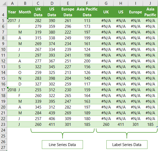
Select columns B:J and insert a line chart (do not include column A).
To modify the axis so the Year and Month labels are nested; right-click the chart > Select Data > Edit the Horizontal (category) Axis Labels > change the ‘Axis label range’ to include column A.
Step 2: Clever Formula
The Label Series Data contains a formula that only returns the value for the last row of data. You can see in the image below that the formula in cell G5 is: =IF(AND(C6="",C5<>""), [@[UK Data]],NA())
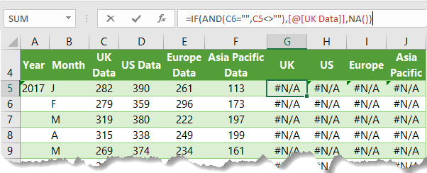
As new data is added the formula dynamically fills down because my data is formatted in an Excel Table, hence the [@[UK Data]] structured reference in the formula.
Note: the reason we test that C5 isn't empty and C6 is empty is to allow for data that's still growing. e.g. imagine you had Budget and Actual data like so:
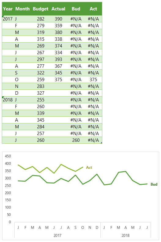
This formula ensures that the label for the Actual is at the end of the line, and as the data grows the label moves accordingly.
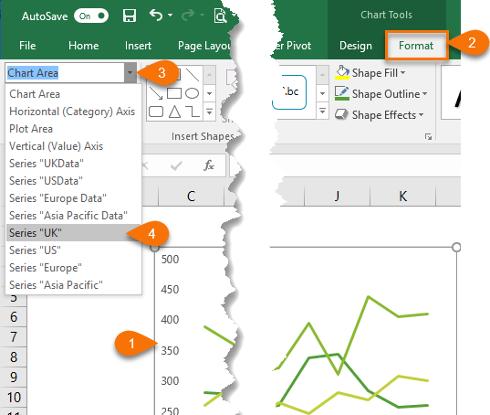
Step 3: Select the first label series
- Select the outer edge of the chart to expose the contextual Chart Tools ribbon tabs
- Select the Format tab (In Excel 2007 & 2010 it’s the Layout tab)
- Click on the drop down
- Select the first label series:
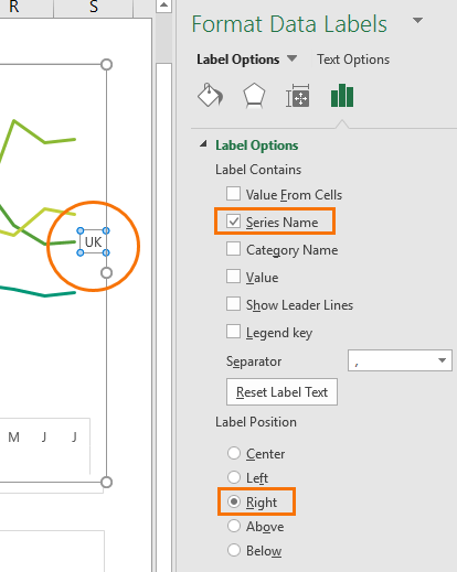
Step 4: Add the Labels
- Excel 2013/2016 Click the + icon beside the chart as shown below (Note: for Excel 2007/2010 go to Layout tab)
- Data Labels
- More Options

This will open the Format Data Labels pane/dialog box where you can choose ‘Series Name’ and label position; Right, as shown in the image below as shown in the image below for Excel 2013/2016 (Excel 2007/2010 has a slightly different dialog box):
Step 5: Set the font color
Select the label so the pull handles are displayed, then on the home tab set the font to bold and select the color to match the line.
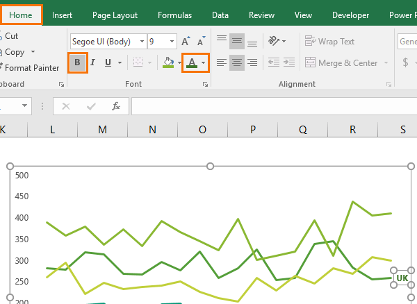
Tip: Select the font color one shade darker than the line to make light colors easier to read.
Rinse and repeat steps 3 through 5 for the other series lines. It takes a bit of effort to setup but once it’s done you don’t have to do anything to maintain it.
Thanks
I learnt this tip from fellow Excel MVP, Jon Peltier. There’s not much that Jon doesn’t know about charts!

Issue with the format of the labels. It all works great, but when the next set of data is entered, the labels revert to their default formatting (lose the colour/font/size that was set). Am I missing a trick here or is a way round it.
Hi Chris,
You can try changing the label formula to return a value in every cell, then apply the formatting and then change the formula back to display #N/A for all labels except the last. Hope that helps. If not, please post your question on our Excel forum where you can also upload a sample file and we can help you further.
Mynda
Hi Mynda,
Brilliant! That works like a dream. Thanks very much for this and all your tutorials.
Pleasure
Can you apply this same approach but to show the last value in a row instead of a column?
I’ve been trying it but I keep getting the #VALUE! error.
If I do it with columns works but not with rows, and I need it with rows.
Hi Amanda,
You need to adjust the formula so it references the columns rather than the rows e.g.
If you’re still stuck, please post your question on our Excel forum where you can also upload a sample file and we can help you further.
Mynda
Hi, I have just stumble upon your post and it is a good one!
And I would like ask a question about your the Year´s and Month´s labels on the chart: Would be possible to make them also dynamic on a “Last x months” chart?
I am building a chart that will eventually fall between years and that visual simplicity is awesome to have on it.
Thanks!
Diogo
Hi Diogo,
Yes, you can customise the lable to return anything you want. If you get stuck, please post your question on our Excel Forum where you can upload a sample Excel file and we can help you further.
Mynda
Dear Mynda:
Thanks for the great work.
I’m trying to replicate the same tricks. However, I’m facing a problem when expanding the size of the table. Everything works fine till adding a new row to the table.
Adding a new row at the end of the table by pressing the tab key is messing up the clever formula—=IF(AND(C6=””,C5″”), [@[UK Data]],NA())—in the row before the last. The formula in row n-1 refers to a cell outside of the table instead of referring to the end of the table.
Regards,
Hicham
Hi Hickam,
You can refer always to the same current row, but use an offset:
=IF(AND(OFFSET([@[UK Data]],1,0)=””,[@[UK Data]]<>“”), [@[UK Data]],NA())
This should never break…
Catalin
Thank You Catalin Bombea.
You’re a star.
Indeed, working with Excel’s structured references requires a complete change in thinking towards cells.
Nice tip with only one flaw – if the lines become at the same point on the graph (as UK and EUROPE do in February) then the labels overwrite each other. But otherwise very nice!
Yes, unfortunately there’s no easy formula to handle lines that end close together.
Hi Mynda
I tried to use the formula but it will not let me change UK Data to a name I want to use, how do I do this?
=IF(AND(C6=””,C5″”),[@[UK Data]],NA())
Thanks
Paul
Hi Paul,
You can remove everything including and between the square brackets and place your name in there e.g.:
The reference to UK Data [@[UK Data]] is a structured reference that tells Excel to pick up the cell in the UK data column and on the same row as the formula. Learn more about Excel Tables here.
Let me know if you still have problems.
Mynda
When I try this (copy, paste, ensure formatting is OK), it tells me there’s an error in my formula.
Hi Ben,
Are you copying the formula from the web page of from the downloaded workbook?
Make sure you retype any double quotes. In some countries, the formula might use semi-colon as a separator, instead of a comma.
Hi Catalin, thanks for the reply. Yes, I retyped the quote marks because I saw they were italicized. Changing the colons to semicolons didn’t help either (I’m in Spain). What I’m using is this: =IF(AND(C28=””,C27″”), Ben,NA())
Is that ”Ben” that shows up in value_if_true argument a valid name?
Hi Catalin,
I’m not sure what you mean by valid?
Is ”Ben” a named range? If not, you cannot use that text without double quotes, like “Ben” instead of Ben:
=IF(AND(C28="",C27=""), "Ben", NA()) instead of:

=IF(AND(C28="",C27=""), Ben, NA())
Hi Catalin, this was the problem, I think, as it works now. Thank you!
You’re welcome!
Thanks Mynda, another really useful practical post. I’ve applied this technique myself in the past but come unstuck a bit when trying using this trick on an interactive dashboard when the data updates and the labels start to overlap.
Have you ever seen any clever solutions that use formulas in a dummy label series to prevent the labels from overlapping? I’ve come close to being able to do this but it’s trickier than it seems even when limiting the chart to only four lines.
Grant
Hi Grant,
That’s a great question. I suppose I’d try to build in a check to see if any of the values were close to one another and then add/subtract enough points from the result so that they weren’t overlapping. I can imagine that this in itself could end up with overlapping! You could try alternating the labels, one on the first point, one on the last and so on, or switch the labels to the beginning of the line where they can be static and put the vertical axis to the right.
Mynda
Dear Mynda, thanks a lot for sharing this wonderful tip. But please how compatible is this trick with Power Pivot with slicers since the data is depended on the slicer selected. I am yet to give it try though.
Shadrack…
Hi Shadrack,
Great question. Pivot Charts won’t allow you to plot the dummy data for the label values in the chart as it wouldn’t be part of the source data, so the options are:
1. create a regular chart from your PivotTable and add the dummy data columns for the labels outside of the PivotTable. Not ideal if you’re using Slicers.
2. Use Hessel’s solution (see comments below), but you need Excel 2013 or later for this.
3. You could write some measures for the chart labels that only displayed the last value and errors for the others. I’ve not tested it though!
Mynda
I have rarely commented on your posts, but I cannot let this one pass without expressing my appreciation. An ideal example of the way this can be used especially when the labels are long and often need to be abbreviated. It also avoids clutter on the chart. I am so happy that this post came up now as I have to present a chart on a paper. Thank you so much for sharing. I will share with my other colleagues.
Aw, thanks Anne. I appreciate you taking the time to leave a comment and even better that this tip is going to be useful to you, and hopefully your colleagues as well.
Cheers,
Mynda
Mynda
As usual a nice, stylish presentation. I worked through and picked up some new techniques. Like Hessel I then set out to bypass the helper columns 🙂 but, in my case, with Excel 2010.
Aw, c’mon! There’s no shame in using helper columns, there’s plenty of room for them and they’re easy 😉
Glad you liked it, Peter!
Mynda
Hessel, I don’t see any line labels in your pictogram
That’s awesome !! Thanks
Glad you liked it, Pradeep 🙂
Hi Mynda – thanks for all your columns. You can use the Quick Layout function in Excel (Design tab of the chart) to do the labels to the right of the lines in the chart. Use Quick Layout 6. You may need to swap the columns and rows in your data for it to show. Then you simply modify the labels to show only the series name. I just happened to stumble on this a few days ago, but pretty handy – it accomplishes exactly what you mentioned. I add two blank columns to the right of my actual data, and if I include that in the data selection, it leaves enough white space to show the series names nicely. Happy to email my file to you if you like. It probably does only work in the current version of excel.
Hi Ramon,
That’s a nice tip to get labels set up quickly on the last point. The only limitation is that if you add data to your table the labels don’t move to the last point, so it’s great for static charts, but not for charts that will get updated.
Mynda
Thank you very much for sharing this valuable tip, Mynda! Now it is possible to insert data labels that are vertically aligned, which is difficult is they are inserted manually
Thanks, Juan! Glad you’ll find it useful.
Hello Mynda,
My example does the same but without additional columns. Just using names instead.
Excelpictogrammen.xlsx in https://drive.google.com/drive/folders/0B7HgkOwFZtdZVmhRQUZFM28yc1U
Thanks for sharing, Hessel. For the benefit of others, your example requires using ‘values from cells’ which is only available in Excel 2013 and 2016.
Cheers,
Mynda