Understanding your data and creating Excel charts has never been easier with Excel's Analyze Data (previously known as Excel Ideas and before that, Insights!).
Excel Analyze Data is an AI powered service that automatically identifies patterns in your data and provides you with charts you can insert into your workbook. You can also use ask it questions of your data and get answers in the form of PivotTables and Charts.
And because it is powered by machine learning it will provide increasingly advanced analysis as usage grows.
Note: This feature is available to Microsoft 365 subscribers in English, French, Spanish, German, Simplified Chinese, and Japanese.
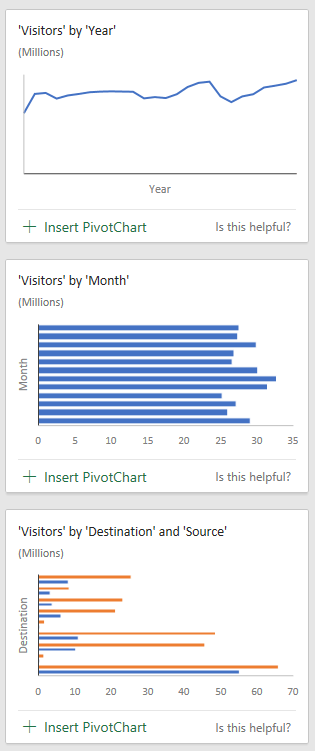
I tested it on some tourism data from Hawaii. In the image below, you can see the data on the left in the Excel Table and on the right, the Analyze Data pane with just a few of the different charts returned by Analyze Data.
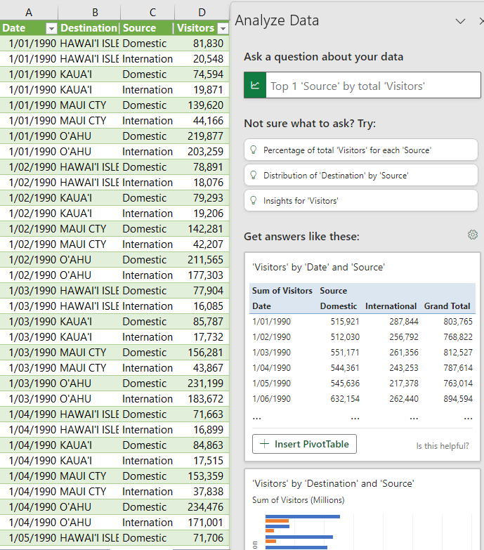
I can simply click on the '+ Insert ...' button below the PivotTables or charts to add them to my workbook. Note: Not all items are returned as PivotCharts, some may be regular charts or even formulas.
Download the Workbook
Enter your email address below to download the sample workbook.
Working with Excel Analyze Data
Analyze Data works best with data in a tabular format in an Excel Table. The more category type columns you have the more ideas you're likely to get returned. The categories will give Excel more opportunities to group the data and find interesting correlations, trends and patterns.
If you get the error "We couldn’t find any significant patterns in your data to show. Try using a larger dataset with more variation in it." This typically means you don't have enough columns for Excel to group and classify your data by in order to detect any patterns.
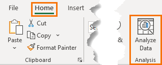
To generate Analyze Data, first select your data, or if your data is formatted in an Excel Table you can just click on one cell > Home tab > Analyze Data:
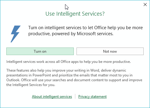
When first using Analyze Data you’ll be asked to turn on Intelligent Services (note: you'll need an internet connection for Excel to connect to said Intelligent Services):
The Analyze Data pane will then open on the right with a series of charts for you to peruse and insert into your workbook.
There are currently four classes;
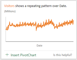
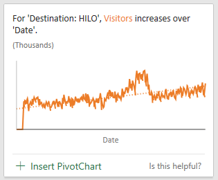
Trends – looks for patterns and trends over time series data:
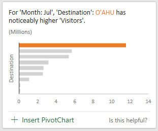
Rank – ranks and highlights items that are significantly larger than the rest of the items:
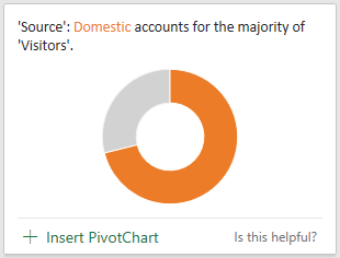
Majority – looks for categories that account for most of a total value:
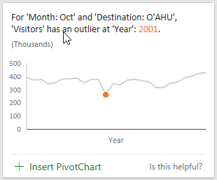
Outliers – identifies outliers in time series or correlated data:
Excel Analyze Data also returns data in recommended groupings (shown below), much like you'd find in Recommended Charts available through Quick Analysis:
Inserting Excel Analyze Data
When you find one you want to keep, simply click on the '+ Insert….' Link below the Analyze Data preview. Pivot Charts will be inserted into a new worksheet with the supporting PivotTable. Regular charts will be inserted into the sheet containing your source data.
You can cut and paste the charts to move them to another sheet, for example your dashboard sheet.
Once inserted they can be formatted like any other chart and the PivotTables can be modified.
Note: Analyze Data does not obey Colour Themes already set in your workbook, but the associated PivotTables do.
Once you have all the items you want in your workbook you can close the pane by clicking the X in the top right. You can always run Analyze Data again if required.
Quality Charts
Overall the quality of charts returned by Analyze Data is quite high, as you can see from the chart below:
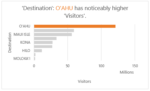
Which adopts the following data visualisation best practices:
- The bars are sorted in descending order with the largest bar highlighted in orange, drawing your attention to the key point.
- The chart title is descriptive and the use of orange for 'O'AHU creates a relationship between the bar and title, making it quick for the reader to interpret.
- The values are displayed in millions rather than displaying insignificant digits.
- The axis labels are in a grey colour, so they don't dominate the visual.
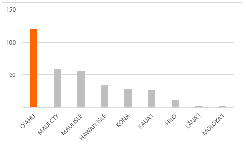
- The bar chart is ideal when working with long category labels, as we have for the island names, because they don't get rotated like they would with a column chart, as you can see below:
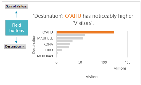
- Even though this is a Pivot Chart, the field buttons are hidden, which is the first thing I turn off on a PivotChart. Better to use Slicers for filtering than space sapping field buttons:
Analyze Data Limitations
- The custom chart titles and formatting do not update if the underlying PivotTables change. Any changes would need to be done manually.
- Analyze Data doesn't currently support analysing datasets over 1.5 million cells. Not all is lost. Try using filters to reduce the amount of data. Copy and paste it to a new sheet and try Analyze Data on the smaller dataset.
- Proper date serial numbers are required for Analyze Data to identify dates. Dates entered as text will be analysed as if they are text strings.
- Analyze Data only works with .xlsx, .xlsm or .xlsb file types. If your file is .xls use 'Save As' to save it as one of the compatible file types.
- Unique column headers are required. Also avoid headers with merged cells and header rows spread over two or more rows.
- Currently dates returned by Analyze Data in the chart titles are formatted mm/dd/yyyy irrespective of your regional settings. I've raised this with Microsoft and hopefully they'll improve that in future updates. It's easy enough to fix once you add the chart or PivotChart to your workbook. Just edit the chart title by left-clicking it once and then type in your preferred date format.

i want the idea which is to be in any data from that data i have to analyse the excel formulas?
Hi Sricharan,
I’m sorry, I don’t know what you mean.
Mynda
Microsoft demonstrates it’s AI power right the place on it’s own products.
Excelente, gracias por compartir.
De nada.