Excel Chart titles are often a wasted opportunity to connect with your audience and drive home your message. So, let’s look at some ideas for how we can leverage the chart title to help you and your audience get the most from the chart.
Watch the Video

Ideas for Excel Chart Titles
Keep in mind that you’re not limited to the default bold chart title. Consider splitting it into a title and subtitle. The title is short and snappy and introduces the chart, whereas the subtitle can be a little longer and expand the story or findings in the data. Or maybe you only need a longer subtitle.
Here are some ideas you can use for chart titles and subtitles:
- Tell a (short) story or narrative around the data.
- Define the key message you’re wanting to convey to your audience. Tell the story in words that your chart tells visually, thus reinforcing the message.
- Call out subtle trends or patterns instead of adding a trendline, especially if the chart is already busy. In the chart below it’s easy to see that the winter losses are increasing, but the decreasing summer losses is subtle. I’ve used the subtitle to make it clear and draw the reader’s attention to those points. I’ve also used colour to create relationships between the columns the subtitle is calling out.
- Often a colour coded subtitle can replace the need for a legend at all:
- Add context or detail not present in the chart, like the one below that states the percentage change in beekeepers since their peak:
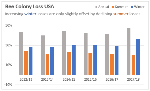
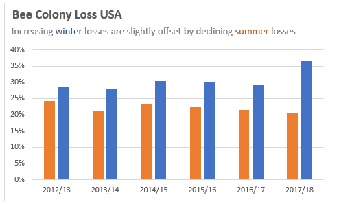
Tip: When removing the legend and relying on the title or subtitle colour coding keep in mind those with colour blindness and be sure to use colours that are easily distinguished. Making the coloured font bold will also help differentiate them from the rest of the text.
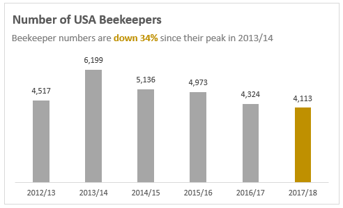
Data source used in Bee charts: https://beeinformed.org
How to Add a Subtitle to Excel Charts
We can use a Text Box to add a subtitle field to a chart. First select the chart > Insert tab > Shapes > Text Box:
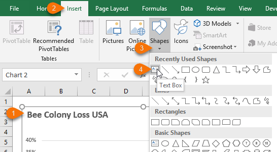
Draw the text box onto the chart below the Title. Tip: Type in your subtitle while the text box is active otherwise the text box will disappear if you click off the chart before entering any text.
Note: Selecting the chart before inserting the text box will automatically group the chart and text box together, which means if you move the chart the text box will come too.
Writing Good Excel Chart Titles
Just because something is clear to you doesn’t mean it will be clear to your audience. Consider using a tool like readable.io to test your titles and subtitles. It uses readability algorithms to identify what level of education someone will need to read a piece of text easily. It’ll help you refine and simplify your message so that it’s easier to read and understand.
More Chart Design Tips
Of course, there are lots of elements that go into good chart design. Here are some related tutorials:
Dynamic Text Labels - useful for charts and dashboards as they update automatically with changes in your data, however you can't colour code part of the text, as shown in the examples above. |
|
Excel Chart Colours – including formatting for colour-blind/colour vision deficiency. |
|
Plus, one of my favourite chart and design blogs is Ann K. Emery. Ann has loads of great ideas and examples including posts on PowerPoint presentations.
Please Share
If you liked this please click the buttons below to share.




Great charting tips.
Thanks Sandeep
One sharing here:
Instead of using chart title or textbox, I used to remove the chart title, and make the chart background transparent. Then input texts (or formula for dynamic titles) in the cells underneath the chart directly. However the title does not move with the chart.
Another great tip, MF! Thanks for sharing.
A good reminder that a good title/subtitle can really change a chart’s impact.
I try to use dynamic titles. Instead of typing the chart title into the text box, enter a formula that points to the cell that contains the title text (eg =Sheet1!$A$1). The cell that contains your title can include calculations based on your data used to drive the chart.
Thanks for reminding me, Robert. I like dynamic chart titles too 🙂
Dynamic chart titles can be great timesavers. It’s one of the things I always show on my courses. So for example…Number of visits to my website week ending 24 Aug 2018 is stored in a cell. That way you only have to change the cell contents and not the title text as well
Yep, me too, as you would have seen in my Dashboard webinars. The only limitation of them is that you can’t colour code part of the text in a dynamic text label as I have done in the examples above. You’d have to use separate text boxes for each component you want coloured differently. All doable if you’re willing to go to the hassle.
I would use picture-link if I have to have different color text in my title.
I would move the linked picture onto the chart and then group them.
Good tip, Sunny. I tend to avoid Picture Links because I can never get the font to display without distortion, but maybe I’m not patient enough to fiddle with it until I get it right 🙂
Just a little reminder that the formula must be entered via the formula bar and NOT directly into the text box itself.