I see the same innocent mistakes with Excel charts and data presentation over and over again. And a lot of them are easily avoided.
So, I'm going to share with you 30 easy to action tips on how to create better charts and dashboard reports in Excel, and the common pitfalls to avoid.
Download the Free 30 Chart Tips eBook
Enter your email address below to download the 30 Chart Tips eBook.
|
By submitting your email address you agree that we can email you our Excel newsletter.
Please enter a valid email address.
|
Less is More - KISS
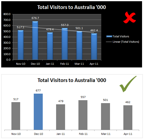
1. Just because Excel has loads of fancy formatting doesn’t mean you have to use it all. Leave out the ‘chart junk’.
Formatting like bevelled edges, gradient fills, 3D effects, multiple-colours and bold colour schemes merely act as a distraction to the reader.
2. If you’re trying to convey multiple messages in one chart consider more charts.
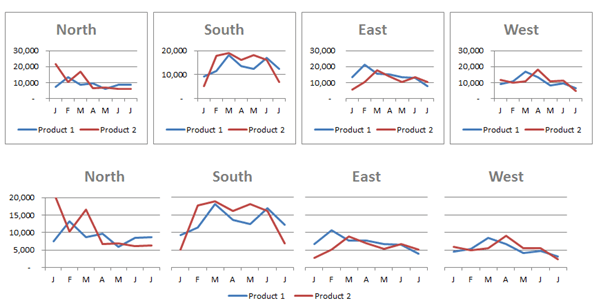
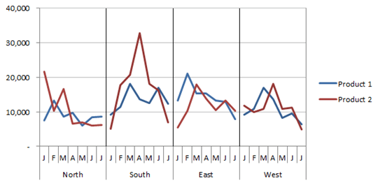
3. If you’ve got multiple charts with the same labels align the charts and label them once, once, once, once….
Alternatively a panel chart can work quite well:
4. Just because you have data on it doesn’t mean you have to put it in your report. Make sure it’s relevant to the overall objective and aids in interpretation.
Know Your Audience
5. If they don’t know a frequency polygon from a spherical polygon find a simpler alternative until you have educated them.
6. Know your message and match it to the right type of display, be it chart, table, or symbols.
Tip: a chart isn’t always the best method of communication, sometimes a table is better, especially when the information needs to be precise.
7. Know your objective for the dashboard and make sure you answer the relevant questions and lead the reader to the answers.
8. If your audience are internal employees then you can leave your company logo off. You know who you work for.
9. If the dashboard is going to be printed make sure it fits nicely onto one page, either portrait or landscape. Don’t forget to set the print settings including information in the footer about the source of the data, contact details and print date. If it’ll be viewed on screen make sure it fits without the need for scrolling.
Formatting
10. Put your most important data in the top left of your dashboard.
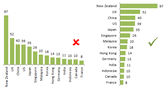
11. Link related data with common colours and conversely, don’t use the same colours to highlight unrelated data.
12. If you’re lacking in design genes (not designer jeans) use your company brand colours for inspiration, but if they’re bright and bold tone them down to pastel shades. Ann Emery has some great tips on the use of colour in her ‘Simple Strategies for Improving Any Chart’s Colors’ post.
13. If in doubt use shades of grey, not 50 though!
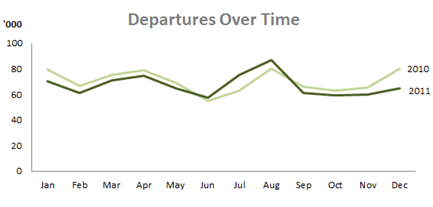
14. Consider a label for the lines on your Line chart instead of a legend.
15. If you’ve got labels on your charts you’ve made gridlines redundant. Just like gate crashers to a party, they aren’t wanted so get rid of them.
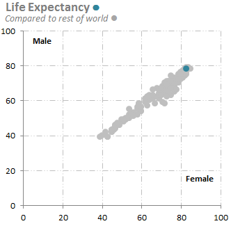
16. If you use gridlines or tick marks mute them to pale shades of grey and/or dashed/dotted lines.
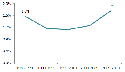
17. Make sure your labels aren’t obtrusive. Consider only labelling the first and or last, or highest and lowest.
18. You don’t need black borders around your charts to separate them. Instead simply leave some white space and align your charts/tables to create frames around the content.
19. Group related charts and tables together in your dashboard. Proximity, common formatting or even a subtle grey dividing line is enough to imply they are grouped.
20. You should bequeath the darkest colours to the most important information, which is usually the numbers in your tables or lines/columns/dots etc. in your charts. Use lighter shades for chart titles, axis labels and gridlines.
21. Use colour to make one piece of information stand out from the pack. For example, in interactive charts where the reader can select the region to focus on, highlight that series in a different colour to the rest.
22. Dark backgrounds might look nice but they distract from the message. White is the new black when it comes to dashboard reports.
23. Limit the number of fonts. Two is plenty. One for headings and one for the rest. Don’t forget you can use font sizing to differentiate, but again don’t go overboard.
And by the way, Comic Sans has no place in business so you can leave that for your kids' birthday invitations not your dashboard reports.
Good fonts to use are Calibri, Tahoma, Verdana, Helvetica and good ol’ Arial.
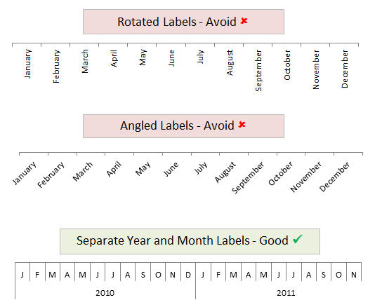
24. Don’t make people turn their head to read the axis labels. For example abbreviate months to J, F, M, A, M etc.
Or for nominal categories like department names, regions etc. change it to a bar chart so they can be easily read.
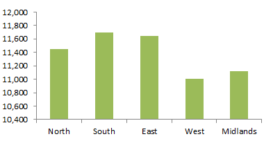
25. Bar and column chart axis should always include zero. Starting your axis above zero is like ‘beer goggles’ for your reader. It might make your chart look more attractive and dramatic but when the reader realises your deception you’re in trouble.
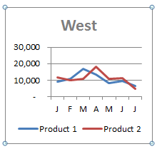
Just take the chart below; East appears to be double that of West, but if you check the scale it’s only about 5% more.
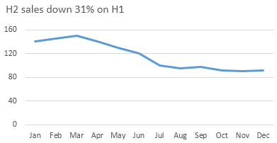
26. Chart titles don’t have to be boring. Use them to make a statement about the results in the chart.
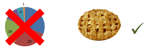
27. Pies are for eating. They have very limited place in your reports. Just take a look at my Dashboard Extreme Makeover that clearly demonstrates their downsides.
Excel Formatting Shortcuts
28. To select all charts (and objects) select one then press CTRL+A to select all.
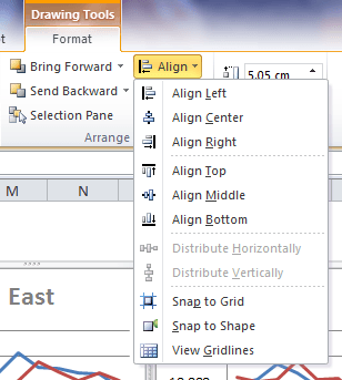
29. Use the Align tools to align the charts to one another. Select the chart or charts to reveal the Drawing Tools Format tab on the ribbon:
30. To move charts using your arrow keys simply hold down CTRL and left-click the outside of the chart. You’ll get 4 small circles that indicate the chart object is selected and you can now move it by pressing your arrow keys.
Thanks
Thanks to Jon Acampora of ExcelCampus.com for teaching me that last tip.
I’m also a big fan of data visualisation pioneers Edward Tufte and Stephen Few. For without their teachings on data visualisation and dashboard design I would most likely be making those same mistakes.
And I am grateful to Excel Chart Gurus like Jon Peltier and The Frankens Team who give me inspiration (and solutions) for what can be achieved with an Excel chart that goes way beyond what Microsoft had intended.
Want More?
Being able to present numbers visually is an incredibly valuable tool in today's market for consultants, analysts and managers.
Unfortunately Excel has a lot of visualisation traps (bad charts, unnecessary formatting etc.) and it doesn't have many plug-n-play interactive elements.
However there are some clever ways we can use drop down lists, combo boxes and more to allow the user to interact with our reports, which you often see built into dashboard reports.
I teach these cool techniques and more in my hugely popular Excel Dashboard training course.
The feedback from students is amazing. You can read some of their comments and find out pricing here.




Hi Mynda,
As to “13. If in doubt use shades of grey, not 50 though!”
Would you pls inform what does this “50” mean? Thanks.
Milo
Hi Milo,
It’s a reference to the movie ’50 Shades of Grey’
regards
Phil
Hi Philip,
Got it. Thanks.
Hi Mynda,
Can you share the excel file that contains these examples?
Thank you
Hi Juan,
I don’t have the files for sharing, but if you join my Excel Dashboard course you’ll get them, plus more.
Mynda
It is very useful
Hi,
Need to display a bar on bar chart when value is ‘0’. Been tricking Excel by adding any positive value to data to get display, not best practice.
Hi Prescott,
I’m not sure how you expect this bar to appear. Can you please post your question on our Excel forum and provide a sample file so we can see an example of what you’re working with.
Thanks,
Mynda
Pivot column chart formatting changes when I apply a slicer, in that the custom formatting changes with each change in the filter – how do I stop this from happening please?
Hi,
This is a known bug. The best you can do is create a template of your preferred format, then when you update with the Slicer either reset it to the template manually, or write a VBA routine to do it automatically.
Kind regards,
Mynda
Each series can be formatted differently, you may have to format all series then theyir format will be preserved when you use the slicer.
You can also try recording a macro to replace the formatting: support.microsoft.com
Excel is storing this data in a cache with all other chart properties. This means that it remembers the exact formatting I applied for the a specific selection only, and that is why the colors and formatting will change back to your settings when you select again the formatted selection.
Another option is to create a regular chart, based on that pivot table data.
Catalin
Thanks for the replies – not used VBA before… time to add a new string to the bow! Good to know its not my mistake though.
Thanks again.
Very nice and informative
Thanks, CM 🙂
Great Post. !!!!
Thanks, Ashish 🙂
Hi Mynda,
Great post! I was just thinking the other day about all of the features that Microsoft has now included in Excel 2013. The majority of them are overkill but they sure do like nice. As you’ve mentioned the problem is that it’s difficult to easily pull out the information that you are looking for when the chart is littlered with fancy formatting.
I like the idea of bolding the information that is important and lightening the information that is required but may not be as important.
Thanks for the tips.
Cheers,
Brad
Cheers, Brad. Glad you liked it.
I actually think there are some improvements to the default charts, for example; the chart borders, axis labels and title have a lighter colour scheme compared to previous versions, which saves some reformatting time.
But like you say, there are some new features too that perhaps aren’t so good.
Kind regards,
Mynda.
I am a big fan of Stephen Few — so the pie reference made me laugh. I have bookmarked this page. I am a speaker at a conference on HR Dashboards (not excel) early next year. You have some great ideas I may leverage for my presentation.
Do you see any of these tips as being the most critical? Or rather… are any of these the most common issues with people that you teach in your classes?
Rick Grantham
Hi Rick,
The most common problems I see are over formatting, pie charts and the wrong chart for the data type.
I’d like to think that people don’t make these mistakes after they take my class….if they do then I haven’t done a very good job! 🙂
Kind regards,
Mynda.
very much helpful.
Thanks, Bapai 🙂