A new feature in Excel 2013 is called Quick Analysis – it’s data analysis made easy, so easy my 6 year old could use it, you just point and click and Excel creates live previews and insights into your data using:
- Conditional Formatting
- Charts and Sparklines
- Summarise with Totals
- Tables and PivotTables
Just add data. No prior knowledge required.
The Quick Analysis toolbar appears anytime you select two or more cells containing data:
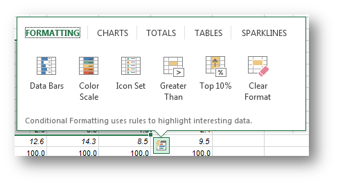
Clicking on the icon (or CTRL+Q) reveals 5 menus (Formatting, Charts, Totals, Tables and Sparklines):
Hovering over the icons in each tab gives you a preview of the different analysis options applied to your data.
Video Overview
I've even created a video so you can see it in action. You could say I've EXCELled myself 😉
Be sure to watch it in full screen HD for best results.
Excel Quick Analysis – What’s it good for?
- If you’re not sure how to visualise your data, you can quickly experiment using Quick Analysis without actually applying any formatting or creating any charts.
- If you’re not familiar with the data, it allows you to use a range of tools quickly to see if anything pops out that you’d like to investigate further.
- If you’re new to Excel or don’t know how to use Conditional Formatting, Charts, PivotTables etc. then Quick Analysis will do it all for you.
For this example we’re using data on the usual daily intake of fruit and vegetables for Australians aged 18 to 75+, sheesh, I didn’t realise we were such an unhealthy bunch. Anyway, I digress…. Quick Analysis was super useful in helping me understand the data, data that I’m not familiar with and don’t work with regularly.
Enter your email address below to download the sample workbook.
Formatting
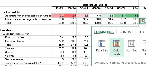
The Quick Analysis Formatting tab is all about Conditional Formatting.
Within seconds of hovering my mouse over the Colour Scale I could see that 25-34 year olds consume the least fruit and vegetables overall and then we slowly improve as we get older, but not nearly enough with less than 10% of us consuming adequate fruit and veg.
Anyway, we’re not here to actually analyse the data, let’s press on and look at some other applications of Quick Analysis.
Charts
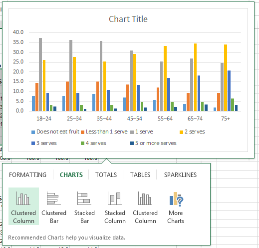
When you select the Chart tab you’re presented with some chart options that are suitable for your data. Hovering your mouse over the chart types gives you a quick preview:
And if you don’t like what you see you can click the ‘More Charts’ icon to see the full chart menu.
Totals
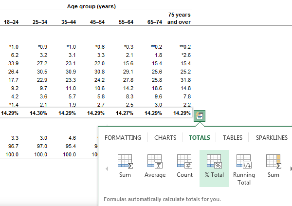
The Totals tab gives you a smorgasbord of options from Sum through to Running Total. You can also choose whether you want your totals for the columns or rows.
Tables
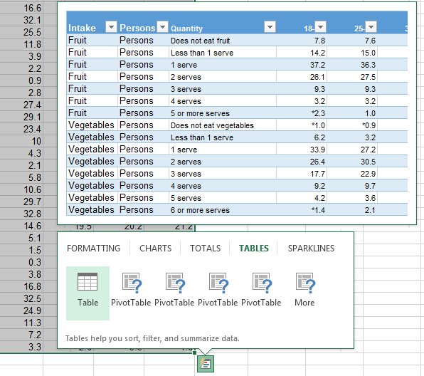
The Tables tab lets you format your data in a Table and gives you a preview:
I still prefer CTRL+T to insert my Tables, but I can see the benefit for those new to these features.
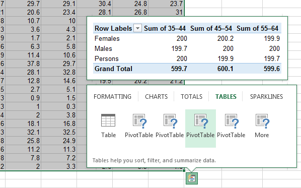
The PivotTable options are pretty cool too. You don’t even need to know how to Pivot to insert a fully-fledged PivotTable report. Hovering your mouse over the PivotTable icons gives you a preview of the completed report:
Sparklines
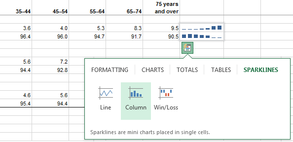
Lastly, Sparklines are another charting feature that inserts a mini chart in a single cell. Use them to show the trend of data over time or groups. You can choose from Line, Column or Win/Loss Sparklines:
Modifying Quick Analysis - The Catch
Once you’ve decided on your Quick Analysis weapon you might find it needs tweaking or removing. Now removing is as easy as CTRL+Z, but if you want to modify the Conditional Formats, Charts, PivotTables or Sparklines then you’ll need to know how to use those tools. Quick Analysis has done its job and it ends there.
Turn Quick Analysis Off
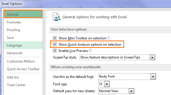
If you’re set in your ways (I sometimes am, and Phil is much worse!), and you find this Quick Analysis icon more of a distraction than helpful, then you can turn it off.
Simply go to File > Options > General > uncheck ‘Show Quick Analysis Options on selection’:


Love it!…Thanks for sharing…. off to have a play with it now!
Fantastic, enjoy.
Sorry….where’s the link to the video?
Hi Ksiskoy,
The video is embedded in the webpage right in the middle of the blog post, just under the heading ‘Video Overview’. Is this not showing on your screen?
Regards
Phil
Hi Ksiskoy,
Under the heading ‘Video’ there is an image with a play button that appears when you hover over it. Press it to play the video.
If you can’t see it then YouTube might be restricted where you work.
Mynda
Ecxellent tutorial. Thanks!
Thanks, Teresa 🙂
Good stuff Mynda. I sometimes find myself wasting time moving pivots for different views – this may be a good way to avoid that. I also haven’t played with sparklines but used some workarounds with the rept function to get the effect. This seems like a good initiation without the learning curves.
Cheers, Troy. Glad you’ll find it useful.
Mynda