Today I want to share with you an Excel secret. It’s so powerful that when you know this your Excel life will become much easier.
I say it’s a secret because I get A LOT of questions from people struggling to use Pivot Tables, and functions like SUMIFS, COUNTIFS etc.
Most of the time they’re struggling for one reason…
Their data is in the wrong format.
I’ve identified 5 main data format categories based on what I see most often.
Excel Data Layout Video

Download Workbook & Cheat Sheet
Use the workbook to play around with analysing the different formats. See how easily you can analyse the Tabular data compared to the other formats.
Grab your own copy of the Cheat Sheet as a handy way to remember what data formats not to use.
Enter your email address below to download the files.

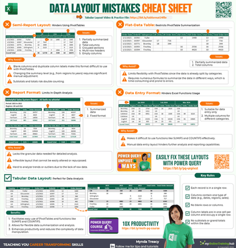
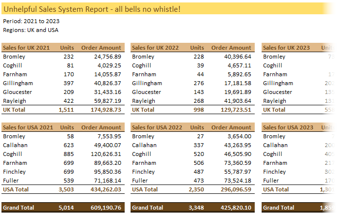
1. The Semi-report
A semi-report is data that has had some degree of summarising already applied.
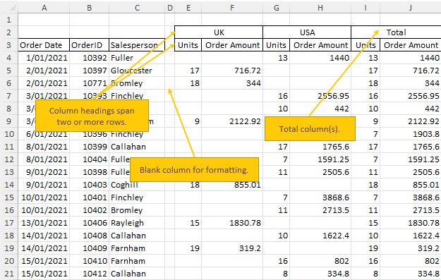
Like in the example below we can see that the data has been summarised into regions (UK and USA) as these have their own column labels:
Signs of a semi-report (some or all of these will be present):
- Column labels are on two rows.
- Column(s) for Totals.
- Columns for time periods (weeks, months, years) or other grouping of data.
- Blank rows or columns.
- Rows containing subtotals and or a Total.
What’s wrong with a Semi-report:
- You can’t use this data in a PivotTable because a PivotTable can’t have blank columns or duplicate column labels, and column labels must be on one row only. In the semi-report above row 3 has ‘units’ and ‘order amount’ repeated. Note: this can be fixed with a Flat Data table – more on that below.
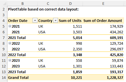
- You can’t easily change the way the data is summarised. For example what if your boss wanted you to change the view so that it was summarised by year like the example below?
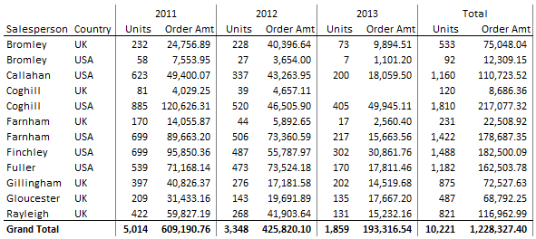
You can do this in a PivotTable in seconds when your source data is in a tabular format but it’s not as easy when it’s in a semi-report format…I’m not saying it’s impossible, it’s just more complicated than it needs to be.
2. Flat Data Table
A flat data table is similar to a semi-report in that it has some degree of summarisation already applied, however it doesn’t have blank columns or column labels on two rows, which means you can use the data in a PivotTable report.
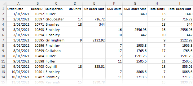
Signs of a Flat Data Table
- Column labels are on one row.
- Columns for time periods (weeks, months, years) or other summary levels like regions, departments etc.
- No blank rows or columns.
- No rows containing subtotals and or a Total.
While the flat data table can be used in a PivotTable, it still has limitations because there is already a degree of summarisation in the data.
That is; there is a limit to how much you can manipulate the data in your PivotTable. For example, you can’t create the PivotTable report below using the Flat Data table above, but you can when your data is in the correct format:
Note: you could use some complicated formulas to summarise the flat data table into the above report format, but why make your life difficult when there's an easier way?
3. Report Format
The worst type! Often 3rd party systems attempt to ‘help’ by providing you with a series of default reports, all nicely formatted of course!
Unfortunately these reports often fall short of what you actually need and manipulating them into a format so that you can further analyse the data can be time consuming.
If you have a system that spits out data in a report format and you end up spending hours manipulating it to get what you actually need, find out if there is a way to get the underlying transactional data out of the system and import it into Excel.
Rest assured it’ll be there (after all it’s creating reports for you from this very data), you just have to find a way to get it out.
Then you can use the tools God gave you, I mean Microsoft gave you and wield your Excel magic to get what you really want.
4. Data Entry Format
The data entry format gets its name due to the intuitive layout which makes it easy for the person keying in the data.
However it doesn’t give any consideration to further analysis of the data.
This is perhaps the most frequent mistake I see people make and the one which I get the most questions from because people try to use functions they think should work, like SUMIF(S) and COUNTIF(S) etc.
However when your data is in the wrong format you can't use the built-in functions the way they were intended.
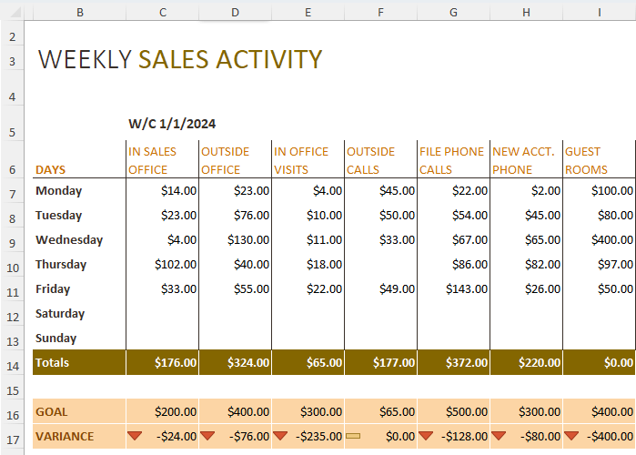
Just imagine this data tracks sales for each week of the year, that's 7 columns for every week! And your boss has asked you to tell them the total sales summarised by the sales categories in row 6.
You're looking at writing a lot of tedious, error prone formulas. However, if you'd recorded your data in the correct format, you could create this report in a matter of seconds using a PivotTable or SUMIFS formulas.
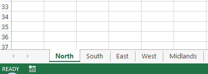
5. Multi-Sheet or Multi-Workbook
This is where you have a separate worksheet (tab) or workbook (file) for each month, year, region, department, salesperson etc.
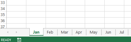
This is a back to front way to store your data because invariably you’ll want to summarise it, which is difficult to do when it's spread over multiple sheets. Whereas it’s easy to store your data in one sheet and then generate those separate sheets with the click of a couple of buttons.
Since Excel 2007 you have more than 1 million rows to play with. Excel can handle a fair bit of data in one sheet. You are only making things difficult if you split it over multiple sheets or workbooks.
Instead, add a new column to your source/raw data sheet for the date/region/salesperson, whatever the category is that you have separate sheets for, and put the information from the tab name in the cells of your new column.
If you split it into multiple workbooks you cause even more problems for yourself and often end up with bloated files full of links to external places.
Tip: If your source data isn't going to change then you don't need a live link to it. Just bring the data into your analysis file as a value and analyse it from there, or use Power Query to automatically get the data from the external files.
Excel Tabular Data - The Perfect Format
Ok, now that we've seen the pitfalls of various data layouts, it's time to reveal the correct way to store your data in Excel. And that is to use a tabular layout:
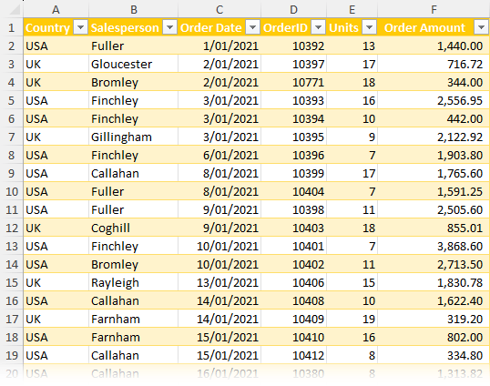
Tabular data is typically at a granular level of detail. Often transactional i.e. every row represents one transaction.
As is the case with the example above, where every row represents one order and has the related data for that order in a single row i.e. country, salesperson, units and amount.
When you start at this bottom level of detail it’s easy to summarise or slice and dice your data into any number of combinations with PivotTables, SUMIFS, COUNTIFS etc.
But when you skip this step and start with data that has already been summarised it is much more difficult to change the summary format, and it often means you can’t use a lot of the built-in Excel tools and functions in the way they were intended.
This kills productivity and causes a lot of headaches that can easily be avoided if you just set your data up correctly from the outset.
The rules for tabular data:
- Every record is housed on one row.
- Each Column contains a type of data e.g. date, order number, quantity, amount, salesperson, region etc.
- There are no blank columns or rows. Note: blank rows aren’t the end of the world, but they will make your life more difficult than it needs to be.
- Column labels are in one cell per column and located on the first row. Note: they don’t have to be on the first row, but they need to be in one row only. i.e. not split over multiple rows and definitely no merged cells.
- There are no subtotals interspersed in the data.
Tabular Data Alternatives
Excel was designed to work with data in a tabular format. Tools like PivotTables and many of the functions work best with tabular data.
This is the format I recommend to my dashboard course members when building dashboards, because when your data is in a tabular format you can easily build dynamic reports that are quick to update.
However, I know that often you have no choice but to make it easy for people to perform data entry tasks which prevents you from using a tabular layout. Or maybe you have legacy systems that simply won’t provide the data in any other format than their predefined reports.
In which case, rather than wrangling formulas to work with unstructured data, you can use Power Query to convert it into the correct layout for reporting. That way you can boost productivity by using PivotTables and formulas the way they were intended.

I need help writing a formula(s) that will convert flat data to tabular data. I am not able to upload or paste a picture illustrating my predicament, but I have one available. Can someone help me out? I’m willing to pay for a workable solution. Scott
Hi Scott,
I wouldn’t use a formula for this. You should use Power Query as explained here: How to unpivot data with Power Query.
Hope that points you in the right direction.
Mynda
I always tell people, they can spend five minutes with their data first, or spend five hours trying to make their chart conform to the wrong data layout. Thanks for your detailed explanations.
🙂 nicely put, Jon!
Hi,
thanks for sharing these excel information. Would like to know if we are able to convert data entry/ semi report in your examples into tabular format using power query?
Yes, you can see this video on Power Query Unpivot Scenarios.
I know this maybe a redundant point and you may have answered it in your Multi-sheet, so hopefully this will just add more clarity to that question. I thought it would be beneficial to pull out data that was overly redundant in one spreadsheet and then reference it, when needed, in another. For instance, the Salesperson is in the Technology Department and is in the Southwest Region. S/He has over a 1,000 records. Doesn’t it save space to have the Department and Region broken out and merged when needed?
Hi Matt,
If you’re using Power Pivot to model your data, then yes. If you’re using regular PivotTables or any other type of formula based analysis, then it’s more efficient to have the data included in the one table as a static value i.e. not a formula. One of the most common causes of file bloat is a VLOOKUP formula bringing data in from one table to another.
Mynda
Hi Sal,
I’m not sure what this comment has to do with this post.
Mynda
Hi Mynda – your dashboard course has been “life altering” for me and my teammates! I have shared your tutorials with so many folks, and my company is certainly reaping the benefits of your tips and tricks! I have something of a problem though – because I have too much data to take it to a tabular format. Also, the structure of our data and underlying architecture creates a grouping versus a summing need. Here are high level examples.
First, I have summary, “grouped products” in my data architecture. The Product level has a 1:M relationship with the Program level. And when a client has the Product, they also have all of the Programs. So Product 1 has Programs A, B, C. The client has 10 employees and all three programs are available to each. I need to count how many employees have Programs, but a “belly button” is a belly button – so I only ever have 10 employees eligible for Product 1, or Program A, B, C. Additionally, each client purchases 1:M Products (which can have a 1:M Program relationship too.) I really need the counts of employees grouped versus summed, and I’m having a hard time figuring out how to roll things up and down given the belly button count need.
Second, I have a scenario in my data like Norms. So there are natural summary categories associated with my clients – region, state, payment categories, client type. My company sells many types of products and I am trying to determine penetration rates by the summary categories, but again, the 1:M thing is causing me to get a multiplier effect in all my charts… I realize I can only accurately calculate penetration at the summary levels, so maybe if I can figure out how to count belly buttons at various levels, it will solve this challenge.
I would love to know what thoughts you might have, as I am certain you have run across this issue in the past. I have millions of rows of data per month, so bringing tabular data in at the one row one record level just isn’t feasible. Also, as a member of the Product organization, I can’t just drop the offending attributes from my data! Because we count the employees, and each client purchases 1 or more products and the employees are eligible for all of the purchased programs, I cannot summarize employees at any level but the lowest right now…and THAT doesn’t lend itself to analysis as I have ~300 programs!
Thanks for your thoughts – Beth
Hi Beth,
It’s great to hear we’ve been able to help 🙂
You need Power Pivot! Simple as that. And probably Power Query to convert the data into a tabular format and then load into Power Pivot, which is not constrained by the 1.5M row limit of Excel worksheets.
You absolutely must convert your data to tabular, from there you can use Power Pivot to create the summaries etc. that you need.
Kind regards,
Mynda
Thanks for the easy-to-understand explanation! Could you please give some advice how to clear data automatically that has empty rows or rows where not all fields are filled according to the tabular headers (some empty cells, then some scattered data, then empty rows, then a range of correctly filled in rows)?
Hi Nevena,
To automatically clean your data you need to use either VBA or Power Query. If you have some sample data you could post your question and Excel file on our forum where we can give you an example with Power Query.
Mynda
where do you get the tabular data ?
can u share the link or u can email me ? 🙂
Hi Sahat,
There is a link to the sample file containing the tabular data used in the example above at the bottom of the post under the heading ‘Download’.
Mynda
Mynda: this is a Great article .The main problem with people using excel is that they want to create outputs ( Final reports) instead of learning on how to work with data: Data needs to be tabular with rows and columns and not a single cell empty in the table. Excel becomes your worst enemy and it cannot do its magic if you create outputs and try to perform analysis your boss is expected to have the report ready in 2mins…Great insigth
Thanks, Luis. Glad you appreciate this article 🙂
Mynda
Some very useful information here. Only complaint was that the potentially brilliant Power Query will not work unless you have some obscure version of Office 2010 – why do Microsoft make what could be really useful tools incredibly inaccessible? 🙂
Hi Mark,
Power Query will work in all Excel 2010 desktop SKU’s. It’s Power Pivot that’s more difficult, and or Excel 2013.
You can download the free Power Query add-in here.
Kind regards,
Mynda
Muchas gracias, la información se expresa facil y es claro en el objetivo de mostrar informes.
Interesante y didactico.
Atte.
Manuel Quilodrán
Hola Manuel,
Me alegro de que haya encontrado esto útil.
Phil
Congratulations for your Spanish, Phil, perfect! 🙂
Thanks Juan. I did cheat a little though, thank you Google translate 🙂
Nice! Like you, I carry out Excel training and like you I STILL come across accounting and finance staff who neither know pivot tables nor excel tables. One delegate created a 31 worksheet workbook for his work that contained 30,000 (I kid you not) SUMIF formulas. That file recalculated for 15 – 20 seconds every time he pressed Enter. I deleted his 30 sheets, converted his input sheet to an excel table and then created a pivot table in the form he wanted. Finally I created the 30 sub reports in pivot tables using field pages.
It took he just five minutes to do what he spent hours doing every month!
This is just one of so many stories!
Duncan
🙂 I hear you Duncan.
Hi Mynda,
Great article! I think this is a really important concept when working with data, pivot tables, and tabular formulas, and is often overlooked. I wrote a similar article that explains an approach to converting semi-reports to tabular data using formulas. But I agree that the best way is to get the data in the proper format to begin with.
Thanks again!
Cheers, Jon 🙂
Actually there’s another data format I forgot to add: The multi-tab/multi-workbook format. I will have to update my list!
The data should be in a tabular format
if it’s not then you can use Power Query to Unpivot data
The Reverse Pivot method is also handy for converting data into a format for use in a PivotTable:
Reverse pivot table
Kind regards,
Mynda.