• Skip to main content
  • Skip to header right navigation
  • Skip to site footer

My Online Training Hub

Learn Dashboards, Excel, Power BI, Power Query, Power Pivot

  • Courses
  • Pricing
    • Free Courses
    • Power BI Course
    • Excel Power Query Course
    • Power Pivot and DAX Course
    • Excel Dashboard Course
    • Excel PivotTable Course – Quick Start
    • Advanced Excel Formulas Course
    • Excel Expert Advanced Excel Training
    • Excel Tables Course
    • Excel, Word, Outlook
    • Financial Modelling Course
    • Excel PivotTable Course
    • Excel for Customer Service Professionals
    • Multi-User Pricing
  • Resources
    • Free Downloads
    • Excel Functions Explained
    • Excel Formulas
    • Excel Add-ins
    • IF Function
      • Excel IF Statement Explained
      • Excel IF AND OR Functions
      • IF Formula Builder
    • Time & Dates in Excel
      • Excel Date & Time
      • Calculating Time in Excel
      • Excel Time Calculation Tricks
      • Excel Date and Time Formatting
    • Excel Keyboard Shortcuts
    • Excel Custom Number Format Guide
    • Pivot Tables Guide
    • VLOOKUP Guide
    • ALT Codes
    • Excel VBA & Macros
    • Excel User Forms
    • VBA String Functions
  • Members
    • Login
  • Blog
  • Excel Webinars
  • Excel Forum
    • Register as Forum Member

Excel Mini Charts

You are here: Home / Excel Charts / Excel Mini Charts
May 16, 2018 by Mynda Treacy

Excel mini charts are a great alternative to Sparklines.

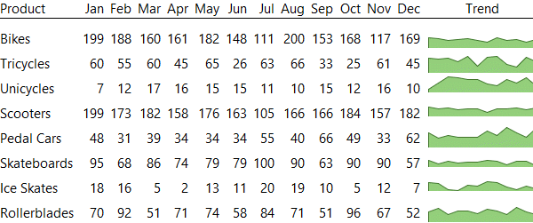
Mini charts are just regular charts made really small. You might consider using them instead of Sparklines when you want something other than column, line or win/loss charts. For example, the table below contains mini area charts:

Excel Mini area Charts Example

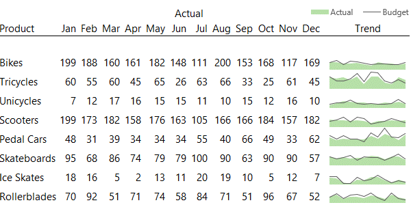
Ok, so an area chart isn’t much different to a line chart. But with Sparklines you can’t display two series in the one chart, like these budget and actual mini charts below:

Excel Mini Charts two series

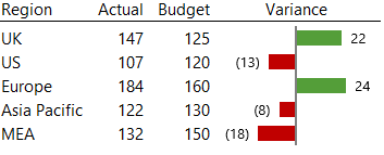
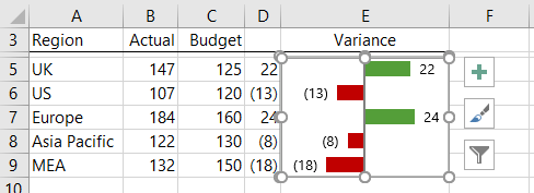
And there’s no Sparkline equivalent for this variance chart below:

Excel Mini Charts for variances

Excel Mini Chart Workbook Download

Enter your email address below to download the sample workbook.

By submitting your email address you agree that we can email you our Excel newsletter.
Please enter a valid email address.

Download the Excel Workbook. Note: This is a .xlsx file. Please ensure your browser doesn't change the file extension on download.

Watch the Video

Subscribe YouTube

Inserting Excel Mini Charts

There are a few tricks to creating Excel mini charts. Especially because we want them to resize automatically with the row and column height.

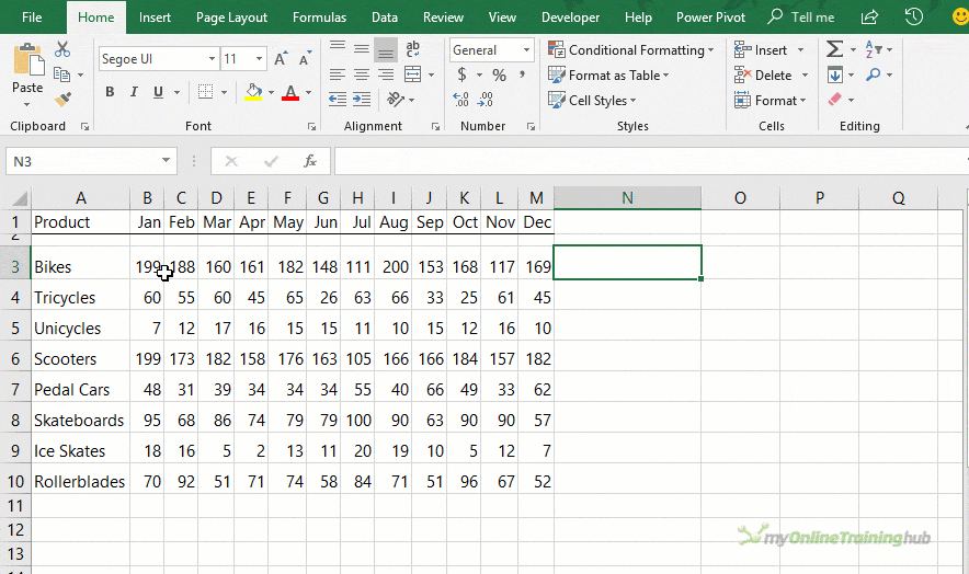
Step 1: Select the chart data > Insert tab > choose your chart.

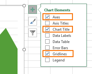
Step 2: Remove the title, axes and grid lines. Basically, you want to remove any clutter from the chart because you don’t have space to display it in a mini-chart:

remove chart elements

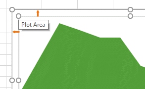
Step 3: Resize the plot area so that it extends to the outer edge of the chart area…you need every millimetre of space for the mini chart:

resize plot area

Step 4: Hold down the ALT key while you left click and drag the outer edge of the chart to the cell you want it in. Then resize the chart to fit in the cell while holding down ALT. This will snap the chart to the cell so that if you resize the row/column the chart will also resize.

Rinse and repeat for additional cells.

Below is an animated image of the steps listed above:

mini variance charts

The variance chart is slightly different in that it’s a single chart plotting just the variance values in column D:

mini variance charts

Update: to set the negative variance bars to red, select the series > Format Data Series > Fill; Invert if negative. See image below.

excel chart invert negative values

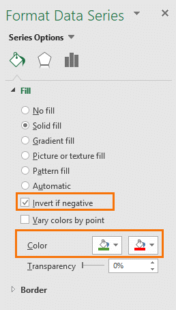
Big thanks to Jon Peltier, Excel MVP, for the 'Invert if negative' tip!

Tip: for presentation purposes you can hide column D and just use the chart to convey the variances.

Excel Mini Chart Tips

  • It doesn’t suit every chart type - while you can make any chart into a mini chart, not all charts are suitable for a small space.
  • Go easy on the formatting – you’ve got a small space so don’t clutter it with unnecessary formatting.

Related Tutorials

Sparklines

In-cell Charts

Chart Formatting Tips

More Excel Charts Posts

excel speedometer charts

Excel Speedometer Charts

How to build Excel Speedometer Charts or Gauge Charts as they're also know, why they are BAD and what to use instead.
burn up burn down charts

Excel Project Management Burn Down and Burn Up Charts

Excel Burn Down and Burn Up Charts are easy to make with line or scatter charts. They are useful for monitoring the progress of a project.
wee people font charts

Excel WeePeople Font Charts

Excel WeePeople Font Charts are a nice change from generic shapes for waffle charts, bar/column charts and more.
excel dot map charts

Excel Dot Map Charts

Interactive Excel dot map charts are not built-in, but with some creative use of Excel’s built-in tools we can create something unique.
Excel S Curve Charts

Excel S-Curve Charts

Easy Excel S-curve Charts made with PivotTables for project management. Track progress by including budget amounts.
chart axis switch

Excel Chart Axis Switch

Use radio button form controls to create an Excel chart axis switch enabling you to toggle pannel charts between same axis and own axis.

Excel Charts with Shapes for Infographics

Excel Charts with Shapes for Infographic styling and increased interest in your charts. Easy to insert but there are a few tricks required.
excel pyramid chart

Excel Pyramid Charts

Excel Pyramid charts are useful for visualising demographic data across multiple categories. Let’s look at 3 ways we can build them in Excel.

Highlighting Periods in Excel Charts

Highlighting Periods in Excel Charts helps your users interpret them more quickly and or focus their attention on a point or area.
stacked bar waffle chart

Stacked Bar Excel Waffle Charts

Stacked Bar Excel Waffle Charts are an alternate to using conditional formatting to build waffle charts, and some say they're easier.
Category: Excel Charts
Previous Post:Excel_Multi-colored_Line_Charts_thumbExcel Multi-colored Line Charts
Next Post:Real Time Data in Excelreal time data in excel

Reader Interactions

Comments

  1. Fatjon

    May 16, 2020 at 1:00 am

    Dear, you are amazing and your tutorials are easier to understand. I made 3 dashboard thru this e tutorial. But in one of them, I have e problem when I use slicer. I have connected 2 dashboards together in one file exel, one is Sales Performance and other Brands Performance. The problem is when I do slicer in one dashboard are two charts that change format, one from Monthly in Weekly and other changes name of format in weeks, but in pivot sheet data are as not changed (as i built in beginner charts) . How this happen and what to do that this two charts to not change raports from months in weekl and from name in weeks. Data are tooken direct from server.
    I would greatly appreciate your help in this matter, thank in advance Fatjon

    Reply
    • Mynda Treacy

      May 16, 2020 at 4:17 pm

      It’s great to hear you’re building your own dashboards! It’s difficult to troubleshoot the issues you’re experiencing without seeing your file. Perhaps you could delete the Slicers causing the problem, and insert them again. If that doesn’t fix it, please post your question and Excel file or screenshots on our forum where we can help you further.

      Reply
  2. hrieger

    March 20, 2019 at 2:24 am

    This is just what I was looking for – Thank you! I am wondering, though, is there a way to treat these cells with mini charts as part of a table so they sort and filter with the data adjacent to it? I have added a few to a table but they don’t sort with the table data.

    Reply
    • Mynda Treacy

      March 20, 2019 at 6:11 am

      Hi Holly,

      You’d be better off using Sparklines if you want the data to dynamically sort.

      Mynda

      Reply
  3. René Maagdenberg

    May 24, 2018 at 5:26 pm

    Hi Mynda,

    I love the idea! Great tip.

    Thanks,

    René

    Reply
    • Mynda Treacy

      May 24, 2018 at 7:52 pm

      Thanks, René!

      Reply
  4. Amy Cheau

    May 19, 2018 at 1:53 am

    Hi Miranda,

    thanks for the great article. I’ve tried following the steps on how to creat mini excel charts but i can’t seem to get rid of the box lines surrounding the mini chart? i’ve tried dragging out the chart so that it extends over the outer edge but i still get the box lines surrounding the mini chart? Any ideas what i’m doing wrong?!

    Thanks
    Amy

    Reply
    • Mynda Treacy

      May 19, 2018 at 11:44 am

      Hi Amy,

      All charts have a light grey border by default. You can remove the border in the chart formatting tab. Set it to ‘No border’.

      Mynda

      Reply
  5. SUNNY KOW

    May 16, 2018 at 11:42 am

    Hi Mynda

    Another great article on charts and a very relevant one in my opinion.
    Mini charts are my favorite as it allows me to fit many charts into a single sheet of paper to create my dashboard. I usually combine an area and a line chart to display both actual and budget figures.
    Another idea are mini bullet charts.The possibilities are endless.

    Although you cannot display 2 series on a Sparkline, it can still be “faked” by super-imposing a line Sparkline above a column Sparkline (for example) using paste-link image. Great care must be taken though on the scaling of the y-axis (may need a ghost series as described in your sample workbook)

    Again thanks for this excellent article.

    Reply
    • Mynda Treacy

      May 16, 2018 at 11:49 am

      Thanks, Sunny! Bullet charts would also work…it’s just a shame they’re so laborious to create.

      Reply

Leave a Reply Cancel reply

Your email address will not be published. Required fields are marked *

Current ye@r *

Leave this field empty

Sidebar

More results...

Shopping Cart

mynda treacy microsoft mvpHi, I'm Mynda Treacy and I run MOTH with my husband, Phil. Through our blog, webinars, YouTube channel and courses we hope we can help you learn Excel, Power Pivot and DAX, Power Query, Power BI, and Excel Dashboards.

Subscribe to Our Newsletter

Receive weekly tutorials on Excel, Power Query, Power Pivot, Power BI and More.

We respect your email privacy

Guides and Resources

  • Excel Keyboard Shortcuts
  • Excel Functions
  • Excel Formulas
  • Excel Custom Number Formatting
  • ALT Codes
  • Pivot Tables
  • VLOOKUP
  • VBA
  • Excel Userforms
  • Free Downloads

239 Excel Keyboard Shortcuts

Download Free PDF

Free Webinars

Excel Dashboards Webinar

Watch our free webinars and learn to create Interactive Dashboard Reports in Excel or Power BI

Click Here to Watch Now
  • Excel
  • Excel Charts
  • Excel Dashboard
  • Excel Formulas
  • Excel PivotTables
  • Excel Shortcuts
  • Excel VBA
  • General Tips
  • Online Training
  • Outlook
  • Power Apps
  • Power Automate
  • Power BI
  • Power Pivot
  • Power Query
 
  • About My Online Training Hub
  • Contact
  • Disclosure Statement
  • Frequently Asked Questions
  • Guarantee
  • Privacy Policy
  • Terms & Conditions
  • Testimonials
  • Become an Affiliate

Copyright © 2023 · My Online Training Hub · All Rights Reserved

Microsoft and the Microsoft Office logo are trademarks or registered trademarks of Microsoft Corporation in the United States and/or other countries. Product names, logos, brands, and other trademarks featured or referred to within this website are the property of their respective trademark holders.

Download A Free Copy of 100 Excel Tips & Tricks

excel tips and tricks ebook

We respect your privacy. We won’t spam you.

x