• Skip to main content
  • Skip to header right navigation
  • Skip to site footer

My Online Training Hub

Learn Dashboards, Excel, Power BI, Power Query, Power Pivot

  • Courses
  • Pricing
    • SALE 20% Off All Courses
    • Free Courses
    • Power BI Course
    • Excel Power Query Course
    • Power Pivot and DAX Course
    • Excel Dashboard Course
    • Excel PivotTable Course – Quick Start
    • Advanced Excel Formulas Course
    • Excel Expert Advanced Excel Training
    • Excel Tables Course
    • Excel, Word, Outlook
    • Financial Modelling Course
    • Excel PivotTable Course
    • Excel for Customer Service Professionals
    • Multi-User Pricing
  • Resources
    • Free Downloads
    • Excel Functions Explained
    • Excel Formulas
    • Excel Add-ins
    • IF Function
      • Excel IF Statement Explained
      • Excel IF AND OR Functions
      • IF Formula Builder
    • Time & Dates in Excel
      • Excel Date & Time
      • Calculating Time in Excel
      • Excel Time Calculation Tricks
      • Excel Date and Time Formatting
    • Excel Keyboard Shortcuts
    • Excel Custom Number Format Guide
    • Pivot Tables Guide
    • VLOOKUP Guide
    • ALT Codes
    • Excel VBA & Macros
    • Excel User Forms
    • VBA String Functions
  • Members
    • Login
    • Logout
    • Password Reset
  • Blog
  • Excel Webinars
  • Excel Forum
    • Register as Forum Member

Excel Factor 7 In Cell Charts

You are here: Home / Excel Formulas / Excel Factor 7 In Cell Charts
Excel Factor 7 In Cell Charts
July 25, 2012 by Mynda Treacy
This Excel Factor tip is from Dr Isaac Gottlieb, professor at Temple University in Philadelphia.

Words by Mynda Treacy

Excel In Cell Charts aren’t actually charts at all, insofar as you won’t find them in the Charts menu in Excel.

They’re actually a formula that you can insert in any empty cell, like you see in column C below:

Excel in cell chart

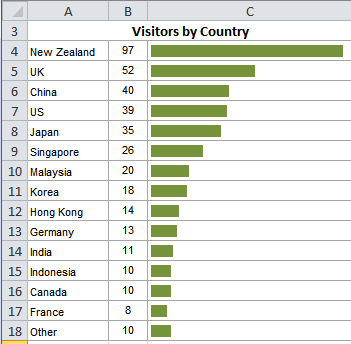
Yes, that is a formula.

The secret to an In Cell Chart is the REPT function. The following formula is in cell C4:

=REPT("|",B4)

When you format the pipe symbol (|) the right way you get a nice smooth bar.

I like to use Script font, Bold and 9pt, but you can play around with different font types to get different effects.

Scaling In Cell Charts

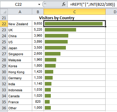
If you find your bar is too big to fit in the cell you can change the scale of your values by dividing them in half, or by 100, or 1000 etc. depending on their size.

=REPT(“|”,INT(B4/100))

Note: The INT function rounds the value down to the nearest integer.

For example, the data below is in the thousands but the bar still fits nicely in column C. See the formula in the formula bar.

Excel in cell chart

Likewise, you can increase the scale by multiplying the value in column B by 2, or 10, or 100 etc.

In Cell Charts are a handy tool to use in Excel Dashboard reports as they assist the reader in quickly understanding your data and you can format them quite small.

Excel Sparklines

Excel SparklinesOf course if you have Excel 2010 or later, you may know that you have access to a range of different In Cell Charts called Sparklines.

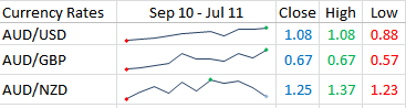
Sparklines were invented by Edward Tufte. He defines them as ‘Intense, Simple, Word-Sized Graphics’.

In Excel, Sparklines are mini charts that allow you to show trends in data, and highlight maximum and minimum values.

Like the trend of currency rates over time:

Excel Sparklines

Or revenues over a time:

Excel Sparklines

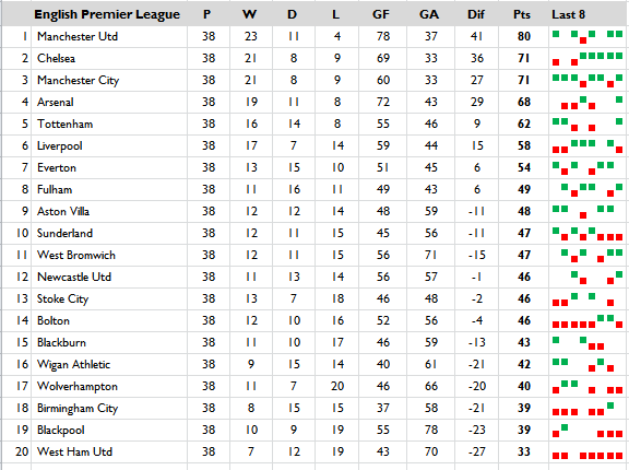
And Win/Loss charts which are useful for sporting results:

Excel Sparklines

Unlike charts, Sparklines are not objects that hover above your worksheet. They actually occupy a cell. In fact they are the background of the cell, which means you can also type in the cell containing the Sparkline.

Mind you, I don’t recommend you do that. You could apply cell formats like a coloured fill if you wanted to, but don’t go overboard and dilute your Sparklines with unnecessary formatting.

If you don’t have Excel 2010 or later, you can get an add-in from Bissantz called the Sparkmaker that will create Sparklines in Excel.

I teach In Cell Charts and Sparklines in my Excel Dashboard course.

Thanks to Isaac for suggesting In Cell Charts and Sparklines.

Dr Isaac GotliebDr. Isaac Gottlieb is a professor at Temple University in Philadelphia. Over 25,000 students and professionals have taken their Excel workshop with Dr. Gottlieb over the last 15 years. He taught this class at Columbia, NYU and other universities as well as in many corporations. He has written a book “Next Generation Excel: Modeling in Excel for Analysts and MBAs” - Wiley Finance. Dr. Gottlieb has 20 years industrial experience in addition to his academic background.

Vote for Isaac

If you’d like to vote for Isaac's tip (in X-factor voting style) use the buttons below to Like this on Facebook, Tweet about it on Twitter, +1 it on Google, Share it on LinkedIn, or leave a comment….or all of the above 🙂

Excel Factor 7 In Cell Charts

More Charts Posts

burn up burn down charts

Excel Project Management Burn Down and Burn Up Charts

Excel Burn Down and Burn Up Charts are easy to make with line or scatter charts. They are useful for monitoring the progress of a project.
wee people font charts

Excel WeePeople Font Charts

Excel WeePeople Font Charts are a nice change from generic shapes for waffle charts, bar/column charts and more.
excel dot map charts

Excel Dot Map Charts

Interactive Excel dot map charts are not built-in, but with some creative use of Excel’s built-in tools we can create something unique.
Excel S Curve Charts

Excel S-Curve Charts

Easy Excel S-curve Charts made with PivotTables for project management. Track progress by including budget amounts.
highlighting data in power bi visuals

Highlighting Data in Power BI Visuals

Learn several techniques to highlight or label important data points in your Power BI visuals. Sample file and code to download.
shape maps in power bi

Shape Maps in Power BI

Shape maps in Power BI can be used to show the distribution of a variable across geographic regions. Learn a trick to plot discrete data too.
using jitter to avoid over plotting

Using Jitter to Avoid Over Plotting in Power BI

Plotting data that has one variable where values are similar, can result in points that are plotted over each other. Use jitter to avoid this overplotting.
Excel custom chart labels

Excel Custom Chart Labels

Create dynamic Excel custom chart labels with this category axis hijack trick
Sorting Excel Date Slicers

Sorting Excel Date Slicers

Slicers have some shortcomings when it comes to dates and sort order. This post explains a couple of ways to sort dates correctly in Excel slicers.
Charting Disparate Data in Excel – 3 Solutions and 1 Crazy Mess

Charting Disparate Data in Excel – 3 Solutions and 1 Crazy Mess

More Excel_Factor Posts

Excel Factor Voting Roundup

Excel Factor Voting Roundup

Excel Factor 21 Hyperlink Triptych

Excel Factor 21 Hyperlink Triptych

Tips and tricks with hyperlinks to make them dynamically update as the selection in the sheet changes. Sample workbook available.
Excel Factor 20 Custom Number Format Disguise

Excel Factor 20 Custom Number Format Disguise

Excel Factor 19 Dynamic Dependent Data Validation

Excel Factor 19 Dynamic Dependent Data Validation

Excel Factor 18 Dynamic Hyperlinks and the Magic Hash

Excel Factor 18 Dynamic Hyperlinks and the Magic Hash

The Excel HYPERLINK function creates links to places inside or outside of your Excel file. I'll show you a shortcut for creating them that few people know.
Excel Factor 17 Lookup and Return Multiple Matches

Excel Factor 17 Lookup and Return Multiple Matches

Excel Factor 16 Dynamic Lookup

Excel Factor 16 Dynamic Lookup

Excel Factor 15 The Lazy Lookup

Excel Factor 15 The Lazy Lookup

Excel Factor 14 Interleave Data from Two Columns into One

Excel Factor 14 Interleave Data from Two Columns into One

Excel Factor 13 Handy Tips & Tricks

Excel Factor 13 Handy Tips & Tricks

More Excel Formulas Posts

top excel functions for data analysts

Top Excel Functions for Data Analysts

Must know Excel Functions for Data Analysts and what functions you don’t have to waste time learning and why.
excel advanced formula environment

Excel Advanced Formula Environment

Excel Advanced Formula Environment is a long awaited, new improved way to write, name and store Excel formulas.
Pro Excel Formula Writing Tips

Pro Excel Formula Writing Tips

Must know Excel formula writing tips, tricks and tools to make you an Excel formula ninja, including a new formula editor.
excel shaping arrays

New Array Shaping Excel Functions

The Excel Shaping Array Functions makes it easier than ever to reshape arrays and ranges using these purpose built functions
excel nested if functions what not to do

Excel IF Formulas and What Not To Do

Excel IF formulas can get out of hand when you nest too many IFs. Not only do they become unwieldy they’re difficult for anyone to understand
excel image function

Excel IMAGE Function

The Excel IMAGE Function enables you to embed images in a cell using a formula. It supports BMP, JPG/JPEG, GIF, TIFF, PNG, ICO, and WEBP files

Excel VSTACK and HSTACK Functions

New Excel VSTACK and HSTACK functions makes combining arrays of cells easy and with some clever tricks we can extend their capabilities.
identify overlapping dates and times in excel

Identify overlapping dates and times in Excel

How to identify overlapping dates and times in Excel with a formula that checks a range of cells. Works with Dates and Times.
New Excel Text Functions

TEXTSPLIT, TEXTBEFORE and TEXTAFTER Functions

TEXTAFTER, TEXTBEFORE and TEXTSPLIT are exciting new Excel Text functions. They’re fairly self-explanatory, however TEXTSPLIT has some cool features.

Top 10 Intermediate Excel Functions

Take your Excel skills to the next level with this top 10 intermediate Excel functions. These are must know functions for all Excel users.


Category: Excel FormulasTag: charts, Excel_Factor
Previous Post:Excel Factor 6 Auto Refresh PivotTablesExcel Factor 6 Auto Refresh PivotTables
Next Post:Excel Factor 8 Highlight Cells Containing FormulasExcel Factor 8 Highlight Cells Containing Formulas

Reader Interactions

Comments

  1. Gordon Miller

    May 18, 2018 at 4:40 am

    After many formatting attempts, I can’t get rid of the padding between the “|” symbols. The chart looks like… |||||||||||||||||||||||

    Reply
    • Mynda Treacy

      May 18, 2018 at 9:53 am

      Hi Gordon,

      What formatting did you try? Different fonts, different font sizes etc. Have you tried the Playbill font at 12pt?

      Mynda

      Reply
      • MZ

        December 4, 2020 at 2:24 am

        Playbill font did the trick for me, thanks.

        Reply
    • Paul Martin

      September 16, 2022 at 1:59 am

      If the ‘|’ character is too thin, consider using ‘g’ with Webdings font. It’s a solid cube, and gives solid colour, though much wider than using ‘|’.

      Reply
      • Mynda Treacy

        September 16, 2022 at 9:30 am

        Thanks for sharing, Paul!

        Reply
  2. Bryon Smedley

    July 25, 2012 at 10:33 pm

    You can also use a variety of ASCII characters to create some interesting bar types. Simply replace the “|” pipe symbol with an ASCII code. This is accomplished by holding the ALT key and typing in the applicable code number, i.e. ALT-254 (make sure to place this code in double quotes just like the pipe symbol.) Using a standard font like Arial or Calibri tends to work best.

    EXAMPLES:

    ALT-177 ▒ ▒▒▒▒▒▒▒▒▒▒▒▒▒▒▒▒▒▒
    ALT-178 ▓ ▓▓▓▓▓▓▓▓▓▓▓▓▓▓▓▓▓▓▓▓▓▓▓▓
    ALT-219 █ ███████████████
    ALT-220 ▄ ▄▄▄▄▄▄▄▄▄▄▄▄▄▄▄▄▄▄▄▄▄▄▄▄▄▄
    ALT-221 ▌ ▌▌▌▌▌▌▌▌▌▌▌▌▌▌▌▌▌▌▌▌▌▌▌
    ALT-222 ▐ ▐▐▐▐▐▐▐▐▐▐▐▐▐▐▐▐▐▐▐▐▐▐▐▐▐▐
    ALT-223 ▀ ▀▀▀▀▀▀▀▀▀▀▀▀▀▀▀▀▀▀▀▀▀▀
    ALT-240 ≡ ≡≡≡≡≡≡≡≡≡≡≡≡≡≡≡≡≡≡≡≡≡≡
    ALT-247 ≈ ≈≈≈≈≈≈≈≈≈≈≈≈≈≈≈≈≈≈≈≈
    ALT-251 √ √√√√√√√√√√√√√√√√√√√√√√
    ALT-254 ■ ■■■■■■■■■■■■■■■■■■■■■■■■

    BONUS: If you really want to make the bars change colors based on their lengths (ex: short bars RED, medium bars YELLOW, long bars GREEN), apply a conditional format logic to the bars.

    EXAMPLE:

    Suppose all the data is between 0 and 10 and you wish to apply the following color designations (first bar resides in cell A2):

    Numbers less than or equal to 3 = RED
    Numbers greater than 3 but less than 7 = YELLOW
    Numbers greater than or equal to 7 = GREEN

    Set the Conditional Format to “Formula Is” (2003 or earlier)
    or
    Set the Conditional Format to “Use a formula to determine which cells to format” (2007 or later)

    “=A2<=3" (set to RED) "=AND(A2>3,A2<7)" (set to YELLOW)
    "=A2>7″ (set to GREEN)

    Reply
    • Mynda Treacy

      July 26, 2012 at 7:07 am

      Hi Bryon,

      Thanks for those brilliant examples. I especially like the conditional format idea 🙂

      Cheers,

      Mynda.

      Reply
  3. Nobi Sawyer

    July 25, 2012 at 4:32 pm

    Love this! I need to show this off to someone at work!

    Reply
    • Mynda Treacy

      July 25, 2012 at 7:45 pm

      🙂 Cheers, Nobi.

      Reply
  4. Earl Dickerson

    July 25, 2012 at 3:34 pm

    The chart looks great. I don’t know how make these sparklines but maybe because I don’t have yet use Microsoft Excel 2010. Anyway, thanks for sharing your ideas.

    Reply
    • Mynda Treacy

      July 25, 2012 at 4:07 pm

      Cheers, Earl 🙂

      Reply
  5. Aejaz

    July 25, 2012 at 2:34 pm

    So simple, yet so appealing. Ready with a graphical representation in a jiffy. Fantastic, very powerful feature. Thanks for bringing out such features.

    Reply
    • Mynda Treacy

      July 25, 2012 at 2:45 pm

      Cheers, Aejaz 🙂

      Reply

Leave a Reply Cancel reply

Your email address will not be published. Required fields are marked *

Current ye@r *

Leave this field empty

Sidebar

More results...

Course Sale

mynda treacy microsoft mvpHi, I'm Mynda Treacy and I run MOTH with my husband, Phil. Through our blog, webinars, YouTube channel and courses we hope we can help you learn Excel, Power Pivot and DAX, Power Query, Power BI, and Excel Dashboards.

Subscribe to Our Newsletter

Receive weekly tutorials on Excel, Power Query, Power Pivot, Power BI and More.

We respect your email privacy

Guides and Resources

  • Excel Keyboard Shortcuts
  • Excel Functions
  • Excel Formulas
  • Excel Custom Number Formatting
  • ALT Codes
  • Pivot Tables
  • VLOOKUP
  • VBA
  • Excel Userforms
  • Free Downloads

239 Excel Keyboard Shortcuts

Download Free PDF

Free Webinars

Excel Dashboards Webinar

Watch our free webinars and learn to create Interactive Dashboard Reports in Excel or Power BI

Click Here to Watch Now

Blog Categories

  • Excel
  • Excel Charts
  • Excel Dashboard
  • Excel Formulas
  • Excel PivotTables
  • Excel Shortcuts
  • Excel VBA
  • General Tips
  • Online Training
  • Outlook
  • Power Apps
  • Power Automate
  • Power BI
  • Power Pivot
  • Power Query
trustpilot excellent rating
 

Company

  • About My Online Training Hub
  • Disclosure Statement
  • Frequently Asked Questions
  • Guarantee
  • Privacy Policy
  • Terms & Conditions
  • Testimonials
  • Become an Affiliate

Support

  • Contact
  • Forum
  • Helpdesk – For Technical Issues

Copyright © 2023 · My Online Training Hub · All Rights Reserved

Microsoft and the Microsoft Office logo are trademarks or registered trademarks of Microsoft Corporation in the United States and/or other countries. Product names, logos, brands, and other trademarks featured or referred to within this website are the property of their respective trademark holders.