• Skip to main content
  • Skip to header right navigation
  • Skip to site footer

My Online Training Hub

Learn Dashboards, Excel, Power BI, Power Query, Power Pivot

  • Courses
  • Pricing
    • SALE 20% Off All Courses
    • Free Courses
    • Power BI Course
    • Excel Power Query Course
    • Power Pivot and DAX Course
    • Excel Dashboard Course
    • Excel PivotTable Course – Quick Start
    • Advanced Excel Formulas Course
    • Excel Expert Advanced Excel Training
    • Excel Tables Course
    • Excel, Word, Outlook
    • Financial Modelling Course
    • Excel PivotTable Course
    • Excel for Customer Service Professionals
    • Multi-User Pricing
  • Resources
    • Free Downloads
    • Excel Functions Explained
    • Excel Formulas
    • Excel Add-ins
    • IF Function
      • Excel IF Statement Explained
      • Excel IF AND OR Functions
      • IF Formula Builder
    • Time & Dates in Excel
      • Excel Date & Time
      • Calculating Time in Excel
      • Excel Time Calculation Tricks
      • Excel Date and Time Formatting
    • Excel Keyboard Shortcuts
    • Excel Custom Number Format Guide
    • Pivot Tables Guide
    • VLOOKUP Guide
    • ALT Codes
    • Excel VBA & Macros
    • Excel User Forms
    • VBA String Functions
  • Members
    • Login
    • Logout
    • Password Reset
  • Blog
  • Excel Webinars
  • Excel Forum
    • Register as Forum Member

Excel Sparklines

You are here: Home / Excel Charts / Excel Sparklines
Excel Sparklines
July 23, 2015 by Mynda Treacy

Put some spark in your chart!

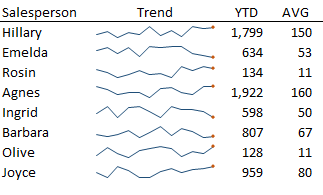
Excel Sparklines were introduced in Excel 2010 and are great for displaying the trend of data over time and making sense of a sea of numbers. Just take this before and after example:
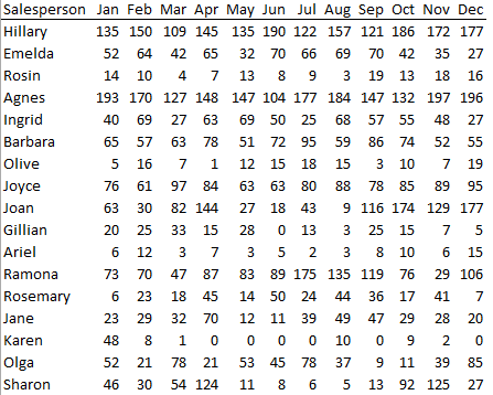
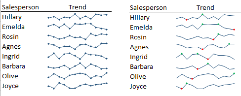
Before

A sea of numbers that would take a long time to analyse and compare:
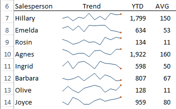
no sparklines

After

Instantly we can get a feel for the numbers without having to read each row and compare them against one another. In fact we don't even need to see the month values, just a total and an average per Salesperson would be enough to support the Sparklines.

with sparklines

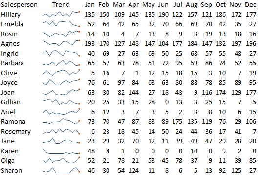
And because Sparklines fit in a single cell they’re ideal for dashboards, which have limited space.

The term Sparkline was coined by Edward Tufte and he describes them as "intense, simple, word-sized graphics".

Download the Workbook

Enter your email address below to download the sample workbook.

By submitting your email address you agree that we can email you our Excel newsletter.
Please enter a valid email address.

Download the Excel Workbook. Note: This is a .xlsx file please ensure your browser doesn't change the file extension on download.

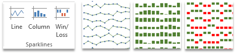
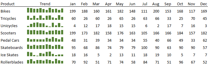
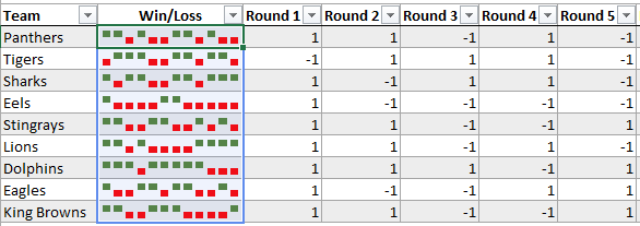
Excel Sparklines - Types

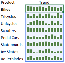
There are 3 Sparkline types to choose from including Line, Column and Win/Loss, which you’ll find on the Insert tab of the ribbon:

Types of Sparklines

Inserting Sparklines

how to insert a Sparkline

Excel Sparklines occupy a cell so the first thing you should do is select the cell, or cells, you want them inserted into (this will prepopulate the Location Range in the dialog box) > Insert tab > choose the Sparkline type you want.

This will open the β€˜Create Sparklines’ dialog box and you can select the range of cells containing the data for your Sparklines:
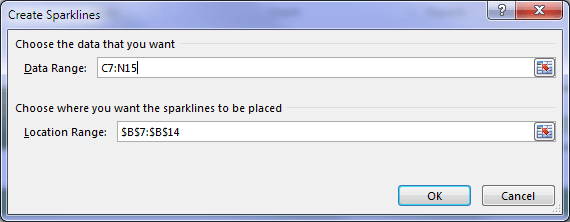
how to create a Sparkline

Notes:

  1. The data can be on different sheet to your Sparkline.
  2. You can change the Location Range if you forget to first select the cells where you want your Sparklines to go.
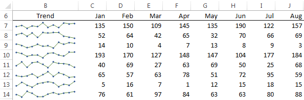
  3. Your Data Range can be organised horizontally or vertically, although I find it clearer if it’s arranged horizontally like in the example file.

Formatting Sparklines

Clicking on a Sparkline will activate the contextual Sparkline Tools tab for Design:

Sparkline contextual ribbon tab

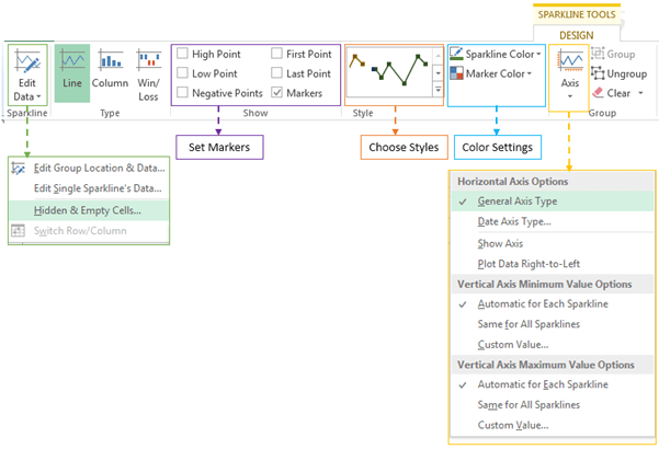
Here you can edit the location and source data, add markers for various points, choose from pre-set Styles, modify colours and axis settings.

To activate the Sparkline: Design contextual tab simply select a cell containing a Sparkline.

Grouping

When you select a range of cells before inserting them they are automatically grouped. You can tell they’re grouped because when you select one, those in the group have a blue border around them.

Group Sparklines

When they’re grouped any formatting changes are automatically applied to all Sparklines in the group.

Sparkline Tips

  • Less is more; While Sparklines occupy a single cell you can still use that cell to enter data, apply Conditional Formatting and other things you’d typically use a cell for, but don’t get carried away. Too much in the one cell could result in the message being lost.
  •  
  • Use adjacent cells for more detail as opposed to using the cell which contains the Sparkline. Instead, I think you’re better off using adjacent columns for any additional data like the YTD total or average etc.

    Sparklines tip

  • Use Markers sparingly; try highlighting the lowest or highest points if you think it will add value, but be careful it doesn't end up looking like a Christmas tree!

    keep it simple

  • Give them space – adjust the row height to give them more space and make it easier to read.

    give them space for clarity

  • Fix Axes – particularly with column Sparklines where comparisons from one set of sparklines to the next can be misleading if they all start from a different point. I recommend setting them to start at zero (assuming there aren’t any negative values in the data).

    Set Axis for Sparklines

  • Sparklines can also occupy columns in Tables, and when new rows are added to the Table the Sparkline also gets copied down automatically.

    insert Sparklines into Excel Tables

  • Copy & Paste; you can copy or cut and paste a Sparkline to other cells, and you can use the Fill Down tool to add more Sparklines.

Please Share

If you liked this or know someone who could use it please click the buttons below to share it with your friends on LinkedIn, Facebook and Twitter.

Excel Sparklines

More Excel Charts Posts

excel speedometer charts

Excel Speedometer Charts

How to build Excel Speedometer Charts or Gauge Charts as they're also know, why they are BAD and what to use instead.
burn up burn down charts

Excel Project Management Burn Down and Burn Up Charts

Excel Burn Down and Burn Up Charts are easy to make with line or scatter charts. They are useful for monitoring the progress of a project.
wee people font charts

Excel WeePeople Font Charts

Excel WeePeople Font Charts are a nice change from generic shapes for waffle charts, bar/column charts and more.
excel dot map charts

Excel Dot Map Charts

Interactive Excel dot map charts are not built-in, but with some creative use of Excel’s built-in tools we can create something unique.
Excel S Curve Charts

Excel S-Curve Charts

Easy Excel S-curve Charts made with PivotTables for project management. Track progress by including budget amounts.
chart axis switch

Excel Chart Axis Switch

Use radio button form controls to create an Excel chart axis switch enabling you to toggle pannel charts between same axis and own axis.

Excel Charts with Shapes for Infographics

Excel Charts with Shapes for Infographic styling and increased interest in your charts. Easy to insert but there are a few tricks required.
excel pyramid chart

Excel Pyramid Charts

Excel Pyramid charts are useful for visualising demographic data across multiple categories. Let’s look at 3 ways we can build them in Excel.

Highlighting Periods in Excel Charts

Highlighting Periods in Excel Charts helps your users interpret them more quickly and or focus their attention on a point or area.
stacked bar waffle chart

Stacked Bar Excel Waffle Charts

Stacked Bar Excel Waffle Charts are an alternate to using conditional formatting to build waffle charts, and some say they're easier.


Category: Excel Charts
Previous Post:excel form data validationExcel Form Data Validation
Next Post:Excel PivotTable Calculated Items by PositionPivotTable Calculated Items by Position

Reader Interactions

Comments

  1. Andrew Chorney

    September 11, 2021 at 2:46 am

    Hello!

    Any ideas on how to construct an “inverted” sparkline in which ascending and descending values are reversed? I have a spreadsheet with Billboard Top 100 music chart data by week, and I’m trying to figure out whether it’s possible to have the “maximum” value be 1 and the “minimum” value be 100. It doesn’t seem like that’s possible with the built-in function, but maybe I’m missing something. Or maybe there’s a chart-based workaround that can be quickly applied to thousands of rows…

    Reply
    • Mynda Treacy

      September 11, 2021 at 12:34 pm

      Hi Andrew,

      You can’t reverse the Sparkline, but you can multiple all your values by -1 so that they display the correct way in the Sparkline. You can also hide the sign using a custom number format that formats positive and negative values without a sign e.g. 0;0

      Hope that helps.

      Mynda

      Reply
  2. Greg

    September 26, 2017 at 1:26 am

    Hi Mynda,

    Really like the sparklines.
    Just a question. I’m running a macro in my spreadsheet that goes through a slicer and prints a pdf for every slicer item. The thing is that the sparklines are not changing, in every pdf the’re the same like in the first one. Is there a way to get this fixed?

    Thank you in advance.

    Reply
    • Mynda Treacy

      September 26, 2017 at 8:41 am

      Hi Greg,

      Are you able to share your file with me so I can see the set up? You can post your question and file on our Excel Forum. Anonymize the data if necessary.

      Mynda

      Reply
      • rocketfinger

        September 26, 2017 at 10:34 pm

        Hi Mynda,

        I added a new topic (Sparklines pdf printing with vba) in VBA and Macros, and attached a short version of my file.

        Thank you.

        Reply
  3. Winston Snyder

    August 14, 2015 at 10:07 am

    Also Sparklines with Pivot Tables: http://dataprose.org/spark-something-off-2/

    Reply
  4. Biji

    July 24, 2015 at 6:20 pm

    Really great tutorial. Appreciate the effort. I did not know that is so simple. Thanks

    Reply
    • Mynda Treacy

      July 24, 2015 at 7:55 pm

      Thanks, Biji. Glad you liked it.

      Mynda

      Reply
  5. MF

    July 24, 2015 at 12:49 pm

    HI Mynda,
    I totally agree on your second tips – Use adjacent cells for more detail
    Normally, I will put the sparkline in-between the starting and ending points so that reader can spot the trend as well as where do we come from quickly, without asking. πŸ™‚
    Cheers,

    Reply
    • Mynda Treacy

      July 24, 2015 at 12:54 pm

      Cheers, MF πŸ™‚

      Reply
  6. Chris Triplett

    July 24, 2015 at 3:45 am

    Mynda, as I was reading this article about sparklines, I began to understand the level of effort you put into doing your articles. I want to thank you for that effort, as I will use your suggestions in my daily work. I just want to give acknowledgement to the level of help you give to your readers.

    Thank you, and keep up your excellent work!

    Reply
    • Mynda Treacy

      July 24, 2015 at 8:34 am

      Thanks, Chris. It’s nice of you to take the time to say so πŸ™‚ I appreciate it.

      Mynda

      Reply

Leave a Reply Cancel reply

Your email address will not be published. Required fields are marked *

Current ye@r *

Leave this field empty

Sidebar

More results...

Course Sale

mynda treacy microsoft mvpHi, I'm Mynda Treacy and I run MOTH with my husband, Phil. Through our blog, webinars, YouTube channel and courses we hope we can help you learn Excel, Power Pivot and DAX, Power Query, Power BI, and Excel Dashboards.

Subscribe to Our Newsletter

Receive weekly tutorials on Excel, Power Query, Power Pivot, Power BI and More.

We respect your email privacy

Guides and Resources

  • Excel Keyboard Shortcuts
  • Excel Functions
  • Excel Formulas
  • Excel Custom Number Formatting
  • ALT Codes
  • Pivot Tables
  • VLOOKUP
  • VBA
  • Excel Userforms
  • Free Downloads

239 Excel Keyboard Shortcuts

Download Free PDF

Free Webinars

Excel Dashboards Webinar

Watch our free webinars and learn to create Interactive Dashboard Reports in Excel or Power BI

Click Here to Watch Now

Blog Categories

  • Excel
  • Excel Charts
  • Excel Dashboard
  • Excel Formulas
  • Excel PivotTables
  • Excel Shortcuts
  • Excel VBA
  • General Tips
  • Online Training
  • Outlook
  • Power Apps
  • Power Automate
  • Power BI
  • Power Pivot
  • Power Query
trustpilot excellent rating
 

Company

  • About My Online Training Hub
  • Disclosure Statement
  • Frequently Asked Questions
  • Guarantee
  • Privacy Policy
  • Terms & Conditions
  • Testimonials
  • Become an Affiliate

Support

  • Contact
  • Forum
  • Helpdesk – For Technical Issues

Copyright © 2023 · My Online Training Hub · All Rights Reserved

Microsoft and the Microsoft Office logo are trademarks or registered trademarks of Microsoft Corporation in the United States and/or other countries. Product names, logos, brands, and other trademarks featured or referred to within this website are the property of their respective trademark holders.