Excel multi-colored line charts are a little gimmicky, after all we don’t need color to tell if a line is going up or down. However, it can be useful for encoding data that is outside a threshold and can also speed up interpretation, especially if you use familiar traffic light color encoding.
We have a few different approaches available for creating Excel multi-colored line charts.
Excel Multi-colored Line Charts Workbook
Enter your email address below to download the sample workbook.
Watch the Video

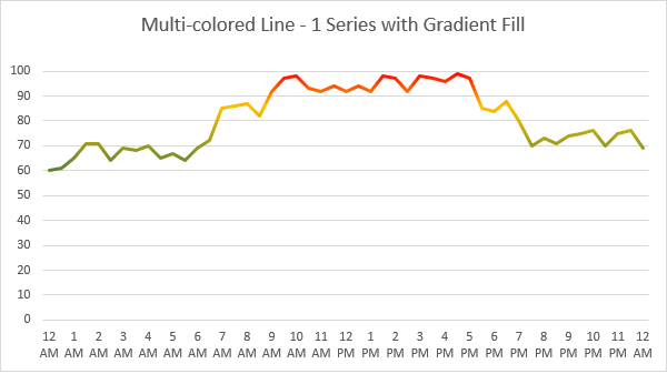
Option 1: Multi-colored line chart with Gradient Fill
The first is to use a gradient fill on the line. This is the simplest as it only requires a single series:
With the line selected press CTRL+1 to open the Format Data Series Pane. In the Format menu (bucket icon) for the line, choose ‘Gradient Fill’:
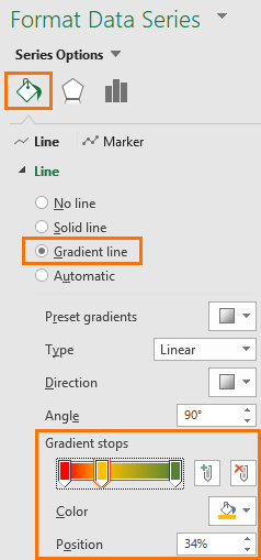
Adjust the gradient stops, adding and removing stops as required with the +/- icons to the right of the gradient bar. Select each stop to set the color.
The limitation with the gradient is that it’s based on percentages, as opposed to absolute values. Which means you can’t set values above or below a threshold with a specific color, and this makes updating the gradient stops for new data a (potentially) manual task. It really depends if you plan to update your chart with new data or not.
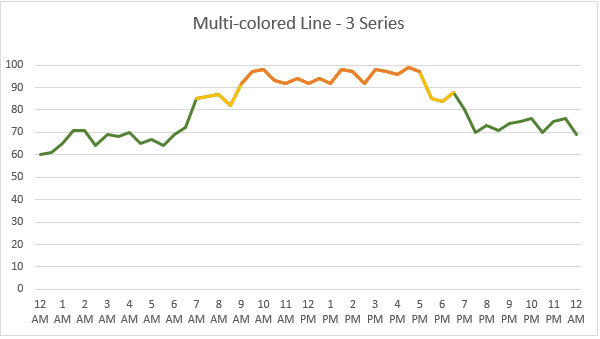
Option 2: Multi-colored line chart with multiple series
The second option for Excel multi-colored line charts is to use multiple series; one for each color. The chart below contains 3 lines; red, yellow and green. They are sitting on top of one another to give the appearance of a single line.
This requires your source data to be set up with each series in its own column, like so:
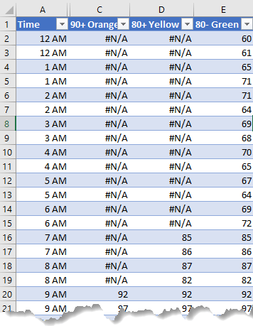
The #N/A values aren’t plotted and that allows the lines underneath to show through where appropriate.
To ensure a continuous line the series must overlap, hence row 16 above has the same value in both columns D and E. Without the value in column E, there would be a gap in the line.
For ease of calculation the green series plots every value, but it is covered by the yellow and orange series where appropriate. This requires the series to be in the right order in the legend entries (image below), with green at the top of the list, then yellow, then orange:
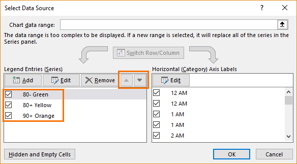
Tip: Use the up/down arrows to rearrange the order of each series as required.
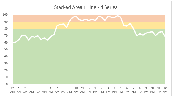
Option 3: Threshold bands with line
The third option uses a stacked area chart for the threshold bands, with a white line to show the position of the value at each interval:
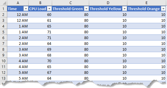
This requires 4 series; one for each band + the line (column B):
Insert a Stacked Area Chart to start and then right-click the series you want as the line > Change Series Chart Type…:
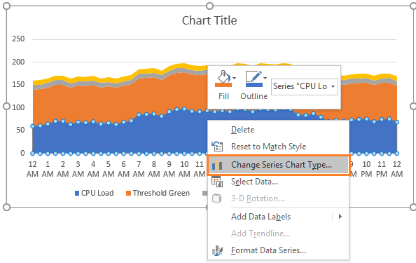
In the Change Chart Type dialog box set it to a Line chart:
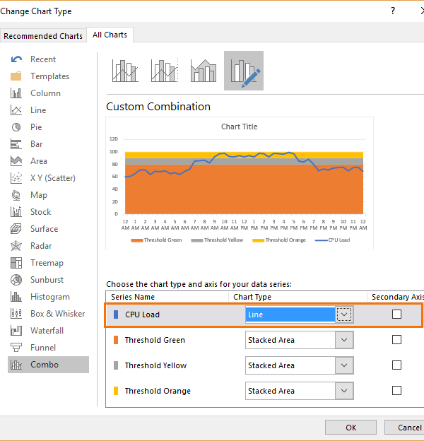
Then you can go about setting the line and area colors for each series.
Option 4: Multi-colored columns with multiple series
Ok, so it’s not a line chart, but it has a similar effect because we can easily get a feel for the trend from the height of the columns:
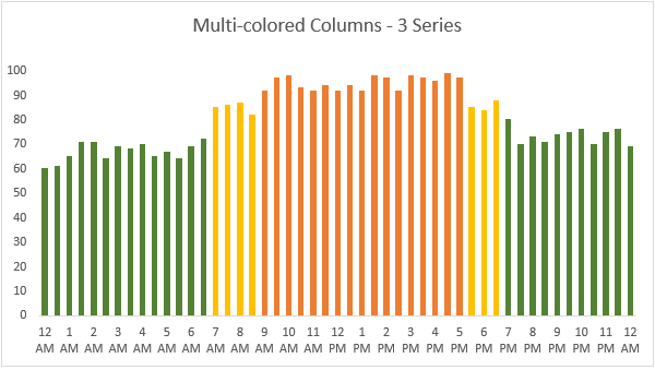
Again, like option two, this requires three series to support the different colored columns.
Warning
Don’t get carried away using gradient fills, multi-colored lines and columns etc. Please only use them where they aid interpretation otherwise they fall into the ‘Chart Junk‘ category. At best they can make you look unprofessional and at worst make it difficult for your audience to interpret the chart.
Please Share
If you liked this please click the buttons below to share.


My chart changes every three months due to it being done quarterly. With that being said, one month might go up, then the next month down, then the next month up, then the next month the same as the previous month, etc. Mine is a series formula to make it much easier to get the data updated. With all of that being said, is it possible to “atomically” have the colors change from point to point (month to month) with the following three colors: Red if it’s higher than the month before, yellow if it’s the same as the month before, and green if it’s less that the month before?
Also, I can’t seem to find a way to actually change between points. There are 12 measuring points (12 months). I can do a gradient like in your instructions, but that won’t do me any good for what I want as I just want it to be colored based on the trend (up (red), same (yellow), or down (green))
Thanks for any advice you can provide!
Hi Michael,
I assume you are talking about a line chart. I don’t know a way to change colors between 2 data points, you can only change the entire line color unfortunately.
Normally, for trends we can use a pivot table with conditional formatting with red-green-yellow icons to visually indicate the trend.
You have a great tutorial here:
https://www.myonlinetraininghub.com/how-to-use-excel-conditional-formatting
Unfortunately, no. This is a series formula which is:
=SERIES(Inc_Trend_1_2!$B$1,Inc_Trend_1_2!$C$28:$O$28,Inc_Trend_1_2!$C$25:$O$25,1)
So, to make it super simple to “redraw the chart” I am using C28 to O28 which contain whole numbers less than 30 which represent how many that month. With that being said, I have a macro built that’s assigned to a button which will “Move to next quarter” which basically gets rid of the first three months, then moves the next 10 months left three columns, thereby leaving the last three months blank.
To give you a simple example, lets say the 13 numbers are currently:
1 2 3 4 5 6 7 8 9 10 11 12 13
after that button is pressed, it will become:
4 5 6 7 8 9 10 11 12 13 empty empty empty
So, if I enter the new numbers (replacing empty’s with real numbers), it becomes:
4 5 6 7 8 9 10 11 12 13 14 15 16
After I manually enter the last three numbers it “automatically” draws the last three sections of the line. This is because the formula is based on C28 to O28 when populated. Does that make more sense?
Sorry, there is no way to change the line color between 2 data points.
The only chart that looks similar to what you want is a candlestick financial chart, only there up and down will have different colors.
OK, that may work. I have created that type of chart, but am unsure about how to make it look like the bottom half of what you sent. What I mean by that is that in the bottom half, if has up/down arrows that are what appears to be red going up and green going down. Mine has no arrows at all I haven’t been able to figure out how to make them look like yours does which should, in theory, work.
Thanks
Hi Michael,
Try our forum(open a new topic after sign-in), you’ll be able to upload a sample file there, will be easier to help you.
Is there a way to create a threshold bands with negative values? My line has negative values but if I try to create a 0 area or negative area I can’t get that lower level to highlight properly.
Thanks!
Hi Tyler,
Stacked area charts aren’t great with negative values, but this post has a workaround.
Mynda
excellent!! thank you so much
Glad you liked it, Brian 🙂
thank you very much
Thank you thank you thank you !!!! <3
🙂 my pleasure, Khatia!
Love it! You are so great at what you do. A true Excel master.
Thanks, Matt!
Hi,
On the column chart, in option four, how did you alternate colors on the bars that is associated with the time axis? Not sure how to do that. Thank you. Joe, Michigan.
Hi Joseph,
The same as option 2, each colour is a separate series, so you just colour each series separately. If you download the file you’ll see how it is structured.
Mynda
It is interesting to note that if you have an NA() or a “” in your range of values, line charts will join the line from the values just before and after the NA() even though we expect it to have a gap. It will also treat “” as 0 instead of a blank cell. This is unfortunate as we usually use formulas like IF(A1>100,A1,””) or IF(A1>100,A1,NA()).to create gaps when we need to create multiple series for multi-colored line chart. For example lines that is Green when the value increase and Red when the value is decreasing.
One workaround that is worth exploring is to plot the data as a Pivot Line Chart. You must use NA() instead of “” for the formulas. You will need to change the PivotTable-Options-Layout & Format-Format and tick the For Error Values Show as blank.
The Pivot Line Chart will now show a gap for NA() values.
In Excel 2016 we have the luxury of showing #N/A as an empty cell and then we can choose to show a gap, connect the line or zero:
Yes Mynda,I am aware of that. Too bad I am still stuck with Excel 2010 ☹☹☹
In option 3, it would be good if the line is transparent and the color bands are behind the chart.
This would allow the line to appear in different colors according to its threshold, something that option 1 is unable to produce because it is based on percentage.
I have experimented by copying the chart and paste-link as image and then set the line color to be transparent. This will allow me to place the linked image on top of some color bands (either on the sheet or images). It involves some adjustments but will work..
Very creative, Sunny. I like the idea. It’s a shame we have to use the ‘paste link as image’ option as it often doesn’t render clearly. The only other way I can think is to place two charts on top of one another and make the line 100% transparent with an outline. I’ve not tried, so may not be possible.
Mynda
Hi Mynda
I actually overlayed the line chart over a 100% stacked column chart making only the line to be transparent. Need to fix the y-axis of the line chart.
So far have not encountered any problem.
Sounds like a winner, Sunny. Maybe you can use a ghost series to ‘fix’ the Y axis.
Most definitely I will use a ghost series to “fix” the Y axis to make it more dynamic.
Beautiful… Excel makes it so simple.
Thanks, Chris! Glad you like it 🙂
Hi Mynda,
We face the coloured line issue frequently when charting health and safety data – particularly for dynamic charts which are updated monthly or for different businesses. Thus I was excited to get your email on this topic…
As you say it is pretty clear whether a line is going up or down but for us it is not always clear if up is good or bad. For example an increase in safety training hours per head would be positive so green but an increase in accident frequency would be negative so red.
I am working on accident frequencies so down is good = green.
Your comment about letting the green series plot every value is helpful, then overwriting with red where necessary. The problem comes where there are inflexion points (e.g. positive performance in one period followed by negative followed by positive) and the need to have the series overlapping.
To help make this work I have added a second green line, but I just cant get the logic to work in all change of direction scenarios.
I looked into Sunny Kows suggestion but am not quite certain whether he is referring to the same thing?
Any suggestions would be much appreciated!
Steve
Hi Steve,
Glad you found this topic relevant. Please post your sample Excel file and question on our Excel Forum and we’ll help you out.
Mynda
Right, in the sample workbook, on the Multi-colored Line – 3 Series chart I select a series, then go to the Format tab on the Excel ribbon and change the fill colour using the Shape Fill command but what attributes the change to either the negative or positive parts?
If instead, on the Multi-colored Columns – 3 Series chart I select a series then press CTRL+1 to open the Format Data Series Pane, in the Format menu (bucket icon) I see the option “Invert if negative” but I doubt that’s what I’m after. Are there any negative parts in the sample workbook so one can see the concept in action?
Also I’m a bit confused by the fact the source data for Option 2: Multi-colored line chart with multiple series, as shown in your explanation, doesn’t use the CPU load column while it does in the sample workbook.
Hi Giorgio,
For the 3 series multi-colored line chart (Option 2) the formulas in the source data (columns C:E) determine which values are color coded for which line. You can modify them to suit your data/needs. Essentially columns B (CPU Load) and column E (80-Green) are the same. I just tried to show the flow from source data to the 3 series.
In other words, you assign the values to a series (using formulas) and then color code the series accordingly.
Mynda
Thanks Mynda but what do you do to show the positive line in green and the negative part in red.(or what ever color)?
Hi Giorgio,
There are 3 lines in the chart. Just left click to select one at a time and go to the Home tab > Fill color and choose the color you want for the line. Or you can do this in the chart formatting pane, it’s the same end result.
Mynda
Consider one single line, if there’s some part of it that’s above zero and some below it, how do you format it so the positive section is, say, green and the negative one red?
Your only choice with a single line is the gradient fill example.
How do you set the colours for the negative and positive parts?
Hi Giorgio,
On the 3 series line and column charts you just select the series (left click with your mouse), then go to the Format tab and change the fill color.
Mynda
Some really good ideas (as usual), always nice to see some different thinking to spice up our output!
The final warning should be in big bold type at the top – PLEASE use effects like this sparingly
a few minor observations:
There is a danger in the 2nd method (3 line series) if there is a midday lull, then higher lines may “bridge the gap” (don’t know how to explain it better – try setting 12am to 75 to see the effect). Sorry, but I can’t see how to fix that one
The 4th method (multi columns) didn’t show on the e-mail/browser but, IMO, looks slightly better if you reduce the Gap width to zero but I think it’s a little garish (another, slightly gentler variant is to use an area plot)
Occasionally the am/pm indicator can look untidy by breaking on some x-axis labels and not others; you can force it to break by setting up a number format with a line feed (ascii character 0010) and then selecting that as the number format for the axis – can’t be created directly as the axis format (not in my version – 2010)
thanks for the ideas
jim
Hi Jim,
Thanks for your suggestions. I agree with your warning 🙂
Not sure what you mean by the midday lull. If you change the value in column B all the lines adjust accordingly.
Mynda
will send you an example
The example file is available for download above. I just changed the value in cell B28 on sheet ‘Line or Column’ to 75 and the line dips down in green. I guess if you don’t want the contiguous line you could change it to show markers only.
The gradient fill method can also be applied to show the positive line in green and the negative part in red.(or what ever color) although it may not be so elegant.
Sunny
Yes, good point, Sunny!
excellent idea, Sunny!
Thanks Jim