Excel 3D Maps in 2016, or Power Map as it’s known in Excel 2013, enable you to visualise data in, you guessed it, 3D!
No surprises there, however you may be surprised to discover insights you didn’t anticipate. Because unlike 2D maps or tables, with 3D maps we can quickly identify hot spots, anomalies, clusters etc. and connect them to the physical world.
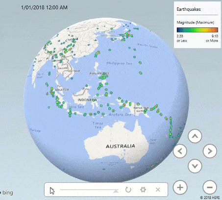
For example, the image below shows earthquake data revealed over time:
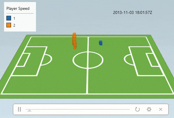
3D Maps aren’t limited to geographic data, we can also plot data on a custom map like this football pitch displaying 2 players as they move around the pitch. The height of the columns represents their speed:
Version Restrictions
Power Map is available in Excel 2013 ProPlus for Office 365 users.
3D Maps are available in all versions of Excel 2016 or Office 365 for Windows users. In other words, it’s not available for Mac users.
Note: Maps created in Excel 2016 cannot be opened in Excel 2013.
Tip: Power BI users have a similar custom map visualisation called Globe Map.
Download the Workbook
Enter your email address below to download the sample workbook.
The file contains separate maps of the earthquake data for Excel 2013 and 2016. If you want the football data you can download it from the link at the bottom of this post. It's a large file, which is why I haven't included it for download here.
Creating Excel 3D Maps
Excel uses the Bing map engine to plot your data on the map and so it needs a connection to the internet for Excel to ‘talk’ to Bing.
It requires data in a tabular format. You can work with data in an Excel worksheet, or data already in the Data Model/Power Pivot.
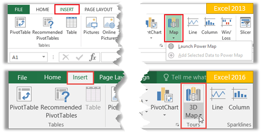
If your data is in an Excel worksheet then select your data range > Insert > Power Map/3D Map. Excel will load the data to Power Pivot/Data model and open the 3D Map window.
If your data is already in Power Pivot/Data model you can go straight to Insert > Power Map/3D Map.
The 3D Map window (below) opens independently of the Excel window. It has the familiar ribbon and tabs found in all Office products.
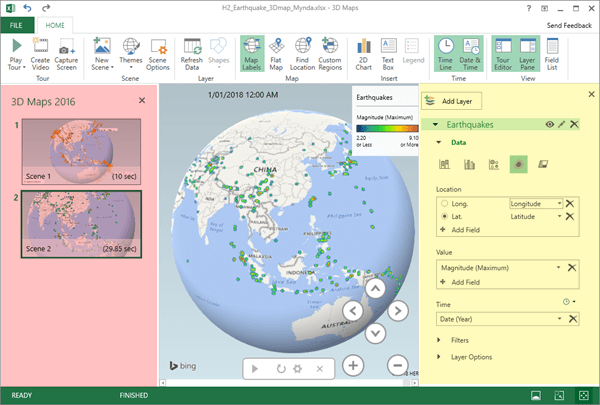
The left-hand Tours pane (highlighted in pink) is where you organise your scenes, which are the different views of your data.
The middle section is your map and the right-hand Layer pane (highlighted in yellow) is where you specify the fields and settings for your map data.
A close up of the Layer Pane is shown below:
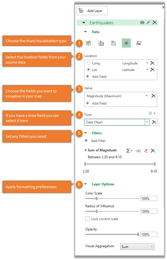
Layer Pane notes:
- The layer pane options vary slightly depending on the visualization type (1) you choose.
- The chart/visualisation types (1) available stacked column, clustered column, bubble, heatmap and custom regions (Custom Regions is available in Excel 2016/Office 365 only).
- Bing can work with various location attributes (2), as listed here:
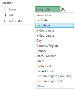
Note: the X and Y coordinates are for custom maps.
Excel 2013 Power Maps vs Excel 2016 3D Maps
For the most part the tools are the same. The most notable differences are that Excel 2013 doesn’t support custom maps, and you'll find some of the menus are a little different.
In Excel 2016 the right-hand Layer pane (shown earlier) contains all the setting options. Whereas the Excel 2013 layer pane is a little different, with tabs at the top to reveal different task panes.
The layer icon allows you to set the layer name, or add further layers:
The Field List icon is where you build your visualisation. It works much like the PivotTable field list:
And Layer Options and Scene Options are available under the gear icon:
Sharing Excel 3D Maps / Power Maps
We have three options for sharing 3D maps:
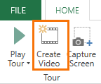
- Take a screenshot of the map. There’s a ‘Capture Screen’ icon on the ribbon to help you select the area you want:
- Create a tour video.
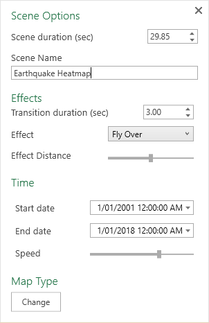
You can choose from various scene settings via the Scene Options icon in the Ribbon e.g. duration, and effects, even adding music if you want:
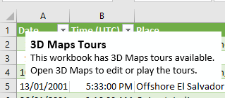
- Share the Excel file containing the 3D Map. When you insert a 3D map in your file, Excel adds a text box to alert the user that there is a 3D map in the file:
Updating 3D Maps
Clicking the Refresh icon in the ribbon (see image below) will refresh the connection to your source data:
And if your data is imported from an external source using Power Query it will also refresh that connection, bringing in any new data.
Learn Excel 3D Maps / Power Map
Learn tons of data visualisation techniques, including 3D Maps in detail, in my Excel Dashboard course.
Data sources
Earthquakes: https://en.wikipedia.org/wiki/List_of_21st-century_earthquakes
Football data: http://home.ifi.uio.no/paalh/dataset/alfheim/
Please Share
If you liked this please click the buttons below to share.


Hi.
It is possible to clear/delete the Field list? I want to clear all history from the model, but can’t find how to clear th Field list.
Regards
Nils
Hi Nils,
The field list reflects the data in the model, so you need to delete the data that you’ve loaded to the Power Pivot model.
Mynda
Thank you, but can you give me more details? How DO I delete that data? From the Spreadsheet itself? If so, how do I refresh the map to have the field list clear?
Thanks!
Hi Gary, If you want to delete everything then you’ll need to delete the source data in the worksheet itself, then refresh the Power Pivot model. If you just want to make some changes, then do so in the source data, then refresh the Power Pivot model.
Hi – Is it possible to assign a macro to custom maps or some sort of action when clicking on a map feature? I would like to build a custom 3D Map, then interact with it to send back info into to a worksheet as I click on map features…long shot? If not any idea how I might achieve this type of user functionality in excel? Cheers
Hi Rob,
I’m not sure if the object model extends to the 3D Map window. I suggest trying to record a macro in the 3D map window as that’ll tell you if it’s possible.
Mynda
I want 3D Map to show tenancies in our town starting and ending over a period of time so we can see the durations. I cannot see how to enter a duration or date-range into the Time field.
Hi Julia,
The time field is populated by a column/field in your source data that is formatted as a date/time that Excel recognises. You can’t enter dates and times as such.
If you’re still stuck, please upload a sample Excel file with your 3D map and data to our Excel Forum so we can see where you’re stuck and help you further.
Mynda
I am trying to map a large amount of US zip codes. The zip codes that start with 0 show up in different countries. How do I get those zip codes to map to the united states?
Hi Jared,
Have you qualified the zip codes with a column for the country so there is no ambiguity in regards to what country the zip codes relate to?
Mynda
Annotations can overlap and obscure each other. The only way I have been able to deal with this is using Edit Annotation -> PLACEMENT -> Left/Right, but if there are more than a few locations, annotations still overlap after switching between left and right. Is there any way to move the annotations so that they still point to the locations, but the annotation text boxes do not interfere?
Thank you.
Hi Michael,
The only other option is to adjust the height so that annotations that are close together aren’t overlapping.
Mynda
Hi
Just wondering, in relation to the football pitch, how do you go about getting the x y co-ordinates to line up with the image? Or does the application automatically give you the x and y based on the image and then you enter it for each entry or player position?
Hi Peter,
It automatically detects them but you can override this in the settings. Give it a go and you’ll see what I mean.
Mynda
This looks great. I’ve been playing around with the 3D maps. Any ideas on how I could get administrative borders layered onto a map? I’ve found a free .shp file that does it but do I put that as a separate layer or do it as a custom region? Thanks a mil as always. Anne
Hi Anne,
On the Ribbon choose ‘Custom Regions’. This will prompt you to ‘import a new set’. Then you choose the ‘Region’ visualisation in the Layer pane on the right.
Mynda