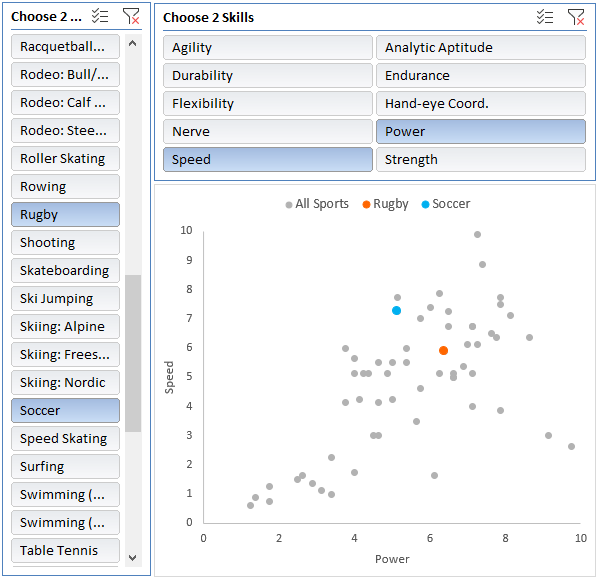
Ok, that title is a lie. There’s no such thing as an Excel Scatter Pivot Chart. It’s like mixing water and oil. They just don’t go. However, in this tutorial I’m going to show you a way you can defy Excel and trick it into building a scatter chart from a PivotTable. And not only that, it will maintain interactivity with the PivotTable through Slicers, as you can see below.
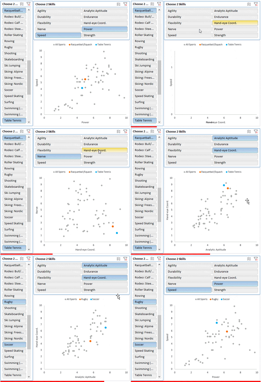
Before we start, the only reason to use this technique is if you want to retain the ability to use Slicers for the legend series. Because updating and aggregating the source data so it feeds through to the scatter chart can be done with Power Query. Yes, Power Query can Pivot data and you can plot Power Query data in a regular scatter chart without any trickery. But that’s a lesson for another day.
Building an Excel Scatter Pivot Chart
All we need to do is build a regular scatter chart and then redirect it to use the PivotTable as its data source. There a couple of ways to approach this. Option 1 is quick for those comfortable with charts, and option 2 is a little easier for those who are less so.
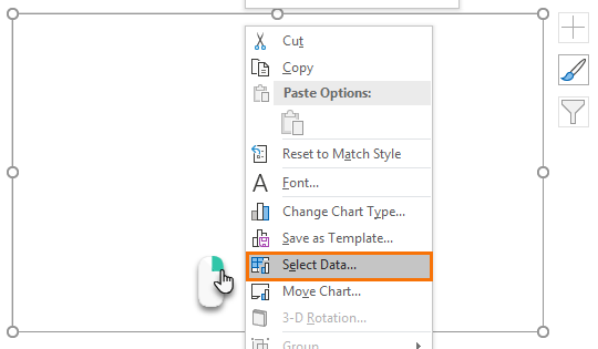
Option 1: Select an empty cell and then insert a scatter chart. The chart will be empty ready for you to add the series one at a time. Right-click the chart > Select Data:
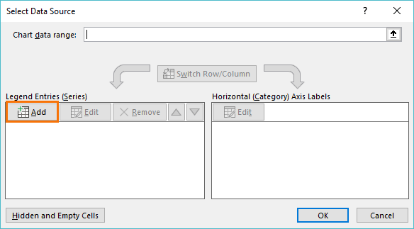
Click ‘Add’ to start adding the data to the chart:
Option 2: I prefer to copy my PivotTable and temporarily paste it as values into some empty cells. Then insert a scatter chart from the pasted values. I just find it easier to edit the series to point back to the PivotTable, than to add the series to an empty chart as per Option 1.
The image below shows the original PivotTable in columns A:C has been copied to columns E:G as values. I then inserted a scatter chart based on columns F:G:
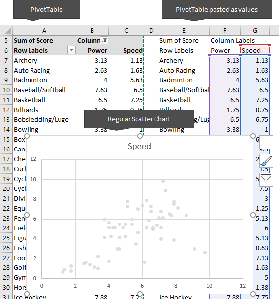
Now I can right-click the chart > Select Data and edit the series:
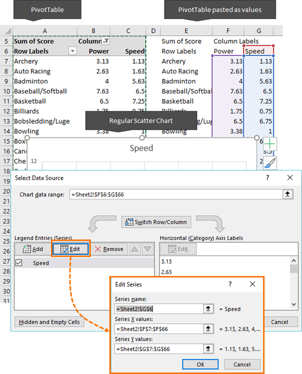
Edit the series cell references so they point to the PivotTable cells:
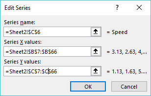
And now you can see the Scatter chart below references the PivotTable:
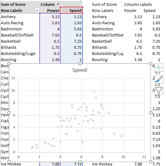
Now we can delete the data in columns E:G as it’s no longer required. You can also tidy up the chart, add axis titles etc.
Tip: If you need to allow for your PivotTable to grow, then you can build a regular chart and use dynamic named ranges for the chart data source that point to the PivotTable data.
Highlighting Data Points in Scatter Charts
If you want to highlight some data points in your Excel Scatter Pivot Chart, as I have with Rugby and Soccer below, create another PivotTable and set up an Excel Slicer for the PivotTable Sport field.
In the image below, you can see the second PivotTable in columns F:H. This is linked to the Sport Slicer.
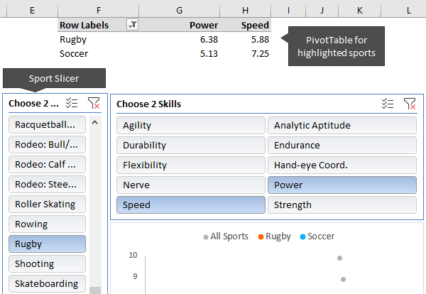
All you need to do is add these sports as two more series to the chart. Right-click the chart > Select Data > Add:
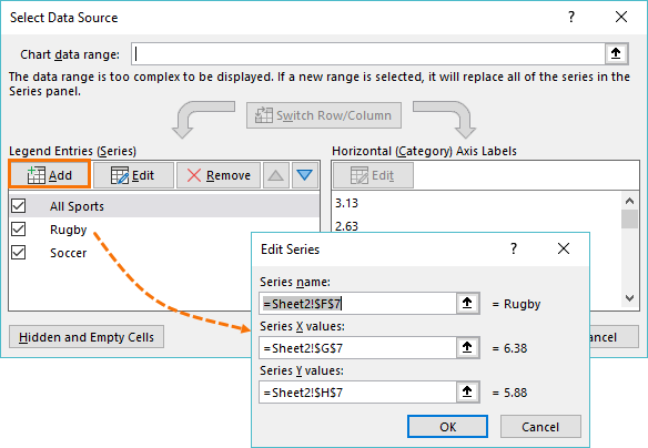
Important: Make sure the new series are at the bottom of the list of ‘Legend Entries’ (use the up/down arrows to arrange), as this will ensue their dots sit on top of the grey ‘All Sports’ series.
Tip: You can add more than two series/sports if you want.
You can now format the Rugby and Soccer dots in a different colour (one at a time). Select the dot > CTRL+1 to open the format pane shown below.
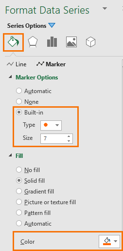
Tip: I made my coloured dots slightly bigger than the grey dots.
Slicers
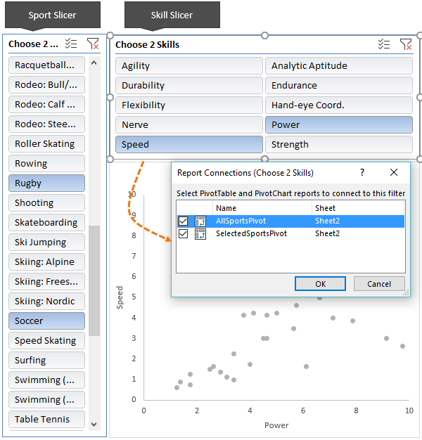
A final word on Slicers; you’ll notice that my Excel Scatter Pivot Chart has two Slicers; Sport and Skill. The Sport Slicer is connected to the small PivotTable in columns F:G and the Skill Slicer is connected to both PivotTables. The Skill Slicer allows the user to specify the x and y axis in the Scatter chart.
Too Much Hassle?
If all this manual work is too much, take a moment to check out fellow Excel MVP, Jon Peltier’s chart utility. It can convert PivotCharts to regular charts, auto-detect ranges, add series and a whole load more. It also has a range of different chart types not available in all versions of Excel including waterfall charts, Marimekko, box plots etc.

Download the Workbook
Enter your email address below to download the sample workbook.
Please Share
If you liked this please click the buttons below to share.


Very helpful post. How do you create the slicers to filter the x and y axis? I would think all skills categories are columns in your source data.
The data is in a tabular layout with one column containing the skills another for the sport and so on.