• Skip to main content
  • Skip to header right navigation
  • Skip to site footer

My Online Training Hub

Learn Dashboards, Excel, Power BI, Power Query, Power Pivot

  • Courses
  • Pricing
    • Free Courses
    • Power BI Course
    • Excel Power Query Course
    • Power Pivot and DAX Course
    • Excel Dashboard Course
    • Excel PivotTable Course – Quick Start
    • Advanced Excel Formulas Course
    • Excel Expert Advanced Excel Training
    • Excel Tables Course
    • Excel, Word, Outlook
    • Financial Modelling Course
    • Excel PivotTable Course
    • Excel for Customer Service Professionals
    • Excel for Operations Management Course
    • Excel for Decision Making Under Uncertainty Course
    • Excel for Finance Course
    • Excel Analysis ToolPak Course
    • Multi-User Pricing
  • Resources
    • Free Downloads
    • Excel Functions Explained
    • Excel Formulas
    • Excel Add-ins
    • IF Function
      • Excel IF Statement Explained
      • Excel IF AND OR Functions
      • IF Formula Builder
    • Time & Dates in Excel
      • Excel Date & Time
      • Calculating Time in Excel
      • Excel Time Calculation Tricks
      • Excel Date and Time Formatting
    • Excel Keyboard Shortcuts
    • Excel Custom Number Format Guide
    • Pivot Tables Guide
    • VLOOKUP Guide
    • ALT Codes
    • Excel VBA & Macros
    • Excel User Forms
    • VBA String Functions
  • Members
    • Login
  • Blog
  • Excel Webinars
  • Excel Forum
    • Register as Forum Member

Excel Line Charts vs Dot Plot

You are here: Home / Excel Charts / Excel Line Charts vs Dot Plot
line_vs_dots_thumb
November 1, 2018 by Mynda Treacy

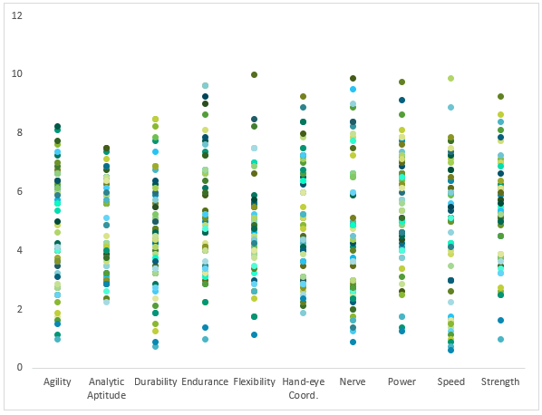
A common chart mistake is to use a line chart for the wrong type of data. An example of that is the chart below that has categories* along the horizontal axis:

using a line chart for the wrong type of data

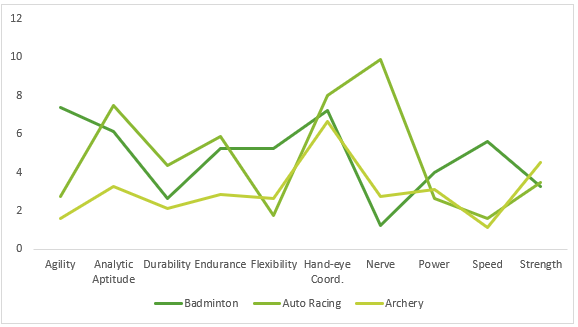
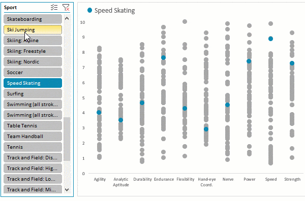
*This chart displays the degree of difficulty each sport requires for the categories above, as judged by a panel of 8 experts made up of sports scientists, Olympic Committee members and academics.

The categories are distinct from one another, whereas the line connecting them implies they are related. A typical use for line charts is to show trends in continuous data collected at equal intervals. For example, data over time, with time/dates on the horizontal axis.

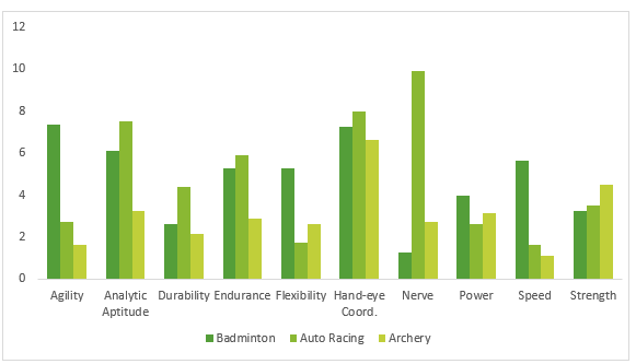
A better chart for nominal data, like categories, is a bar or column chart:

chart type to use for nominal data

But once you get to more than 3 or 4 series in one chart, they become too cluttered to make sense of:

3 or 4 series in one chart

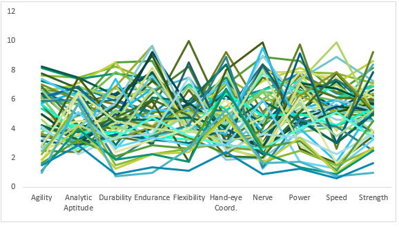
That said, if I remove the axis labels, I could probably sell it as abstract art. Sorry, I digress 😊

Download the Workbook

Enter your email address below to download the sample workbook.

By submitting your email address you agree that we can email you our Excel newsletter.
Please enter a valid email address.

Download the Excel Workbook. Note: This is a .xlsm file please ensure your browser doesn't change the file extension on download.

Watch the Video

Subscribe YouTube

When to Dot your Lines

When you have a lot of series to display you need to decide whether to separate your data into panel charts or Sparklines so you can clearly view each series. Or focus on one or two series and let the other series provide context.

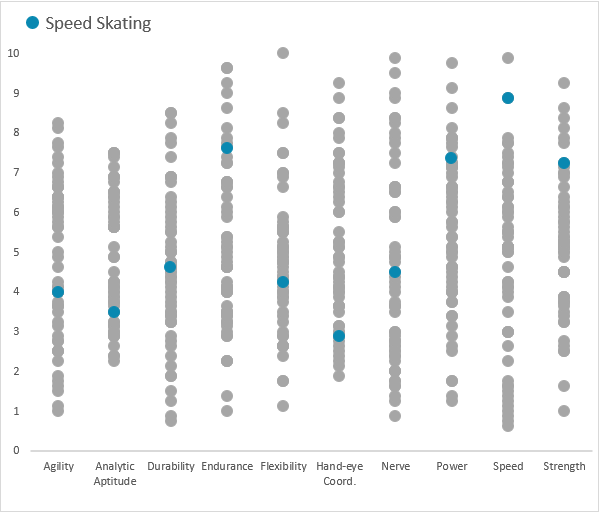
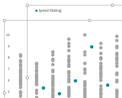
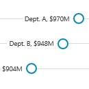
In the Dot Plot chart below, we’ve called out one sport, Speed Skating and the other sports show the range and distribution in each skill:

dot plot chart

I can also add a Slicer to allow the user to select a different sport to focus on:
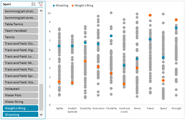
line vs dot slicer

Or multiple sports:

multiple sports in dot plot chart

Building Excel Dot Plot Charts

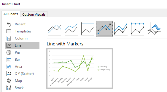
A vertical Excel dot plot chart can easily be built in Excel using a Line Chart with Markers.

use a line chart with markers

Then format each line to display ‘No Line’:

display no line

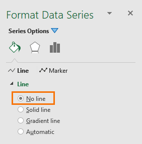
This leaves the markers behind and what you end up with is a vertical Excel dot plot:

vertical Excel dot plot chart

Next you need to set each series’ marker size slightly larger and set the colour to something subtle, like grey.

format marker size and colour

Warning, it’s a labour of love to set the marker for each series one by one. This post provides some VBA to quickly format the markers.

marker colour in grey

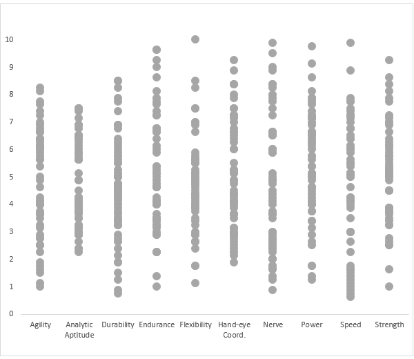
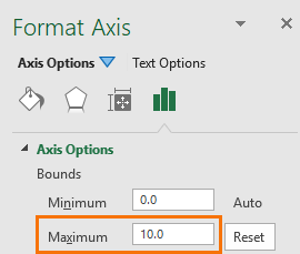
Note: I also fixed the vertical axis height to 10, which is the top score for each skill.

How to Highlight One Dot

Here’s the secret, there are actually two charts, one containing all of the sports displaying the grey dots and a separate one on top highlighting the selected sport in a different colour. You can see both charts in the image below:

how to highlight one dot

I used a PivotTable as my chart source data, so I can use a Slicer to select which sport to highlight. This means I need two charts; one for the grey dots displaying all sports, and a separate chart that displays the sport/s selected in the Slicer.

Tip: If you’re not using a PivotTable as your source data for the chart then you don’t need two charts. You can simply add another series to the chart and format that series in a different colour to the rest, as described here. Just be sure to put this series on top of all the other series in the chart so that it doesn’t get covered by the grey dots.

Top Chart Format

Make sure you set the vertical axis height the same in each chart:

same vertical axis height

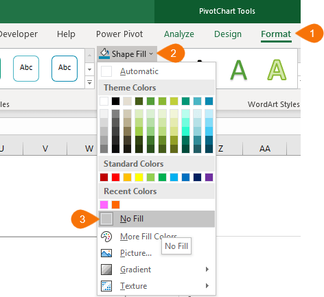
Then hide/remove the axis labels on the top chart and set the ‘Shape Fill’ to ‘none’ so the bottom chart shows through:

set the shape fill to none

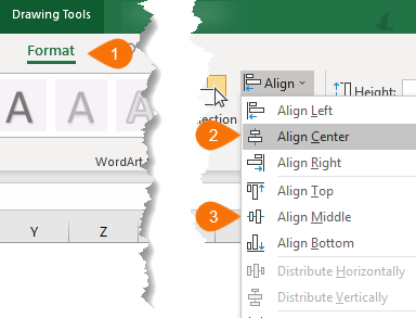
Then align them perfectly:

align the dots

Data Source: http://www.espn.com/espn/page2/sportSkills

Thanks

Thanks to Sunny Kow, our Excel forum superstar, for suggesting layering two charts. If you're going to share the file with others just check that they don't go all wacky on different PCs.

Related Tutorials

Ghost Series

Ghost series – if you create panel charts then you’ll want to fix your vertical axis height using a ghost series.

More Dot Plot Chart Examples

More Dot Plot Chart Examples – including dumbbells and lollipop charts
 

Please Share

If you liked this please click the buttons below to share.

email icon twittericon fb icon LI icon
line_vs_dots_thumb

More Excel Charts Posts

picture fill excel charts

Picture Fill Excel Charts

Using a stylish picture fill in your Excel Charts is a simple way to make your data visualizations more captivating and memorable
excel speedometer charts

Excel Speedometer Charts

How to build Excel Speedometer Charts or Gauge Charts as they're also know, why they are BAD and what to use instead.
burn up burn down charts

Excel Project Management Burn Down and Burn Up Charts

Excel Burn Down and Burn Up Charts are easy to make with line or scatter charts. They are useful for monitoring the progress of a project.
wee people font charts

Excel WeePeople Font Charts

Excel WeePeople Font Charts are a nice change from generic shapes for waffle charts, bar/column charts and more.
excel dot map charts

Excel Dot Map Charts

Interactive Excel dot map charts are not built-in, but with some creative use of Excel’s built-in tools we can create something unique.
Excel S Curve Charts

Excel S-Curve Charts

Easy Excel S-curve Charts made with PivotTables for project management. Track progress by including budget amounts.
chart axis switch

Excel Chart Axis Switch

Use radio button form controls to create an Excel chart axis switch enabling you to toggle pannel charts between same axis and own axis.

Excel Charts with Shapes for Infographics

Excel Charts with Shapes for Infographic styling and increased interest in your charts. Easy to insert but there are a few tricks required.
excel pyramid chart

Excel Pyramid Charts

Excel Pyramid charts are useful for visualising demographic data across multiple categories. Let’s look at 3 ways we can build them in Excel.

Highlighting Periods in Excel Charts

Highlighting Periods in Excel Charts helps your users interpret them more quickly and or focus their attention on a point or area.


Category: Excel Charts
Previous Post:web scraping multiple pagesWeb Scraping Multiple Pages from Websites
Next Post:Excel Scatter Pivot ChartExcel Scatter Pivot Charts

Reader Interactions

Comments

  1. Liz

    May 30, 2020 at 7:09 am

    Thanks! I really appreciated the tip for the line chart with no lines.

    Reply
    • Mynda Treacy

      May 30, 2020 at 9:49 am

      Glad you liked it 🙂

      Reply
  2. Tarzan Su

    March 18, 2020 at 6:45 pm

    Hi,Treacy!
    Thank you for your wonderful blog posts,give me a lot of inspiration
    I used this data to make a simple dashboard, I want to send it to you, you can download it from the following address,A secure web page(like Google Docs、Quip):
    https://shimo.im/docs/qrC3cKtWWwhpGj6Y/

    Looking forward to your comments and suggestions
    Thanks again
    Please excuse my poor English

    Reply
    • Mynda Treacy

      March 20, 2020 at 3:13 pm

      Hi Tarzan,

      Thanks for sharing your file. You have some interesting charts in there. Some better than others at displaying and allowing comparisons in the data.

      Mynda

      Reply
  3. Jorge Torres

    November 2, 2018 at 10:03 pm

    This Excel Line Dot Plot Chart is really helpful, Thanks.
    I wonder if it is possible to build in excel a chart where the radius would become the dependent variable (commonly the y axis) and the circle border would be the independent variable (commonly the x axis).
    This type of chart could be very good for describing seasonality or presenting periodic series.
    I tried to use the radar chart, but I couldn’t discover a good solution!!!

    Reply
    • Mynda Treacy

      November 3, 2018 at 3:01 pm

      Glad you liked it, Jorge.

      Not sure I can picture your example, so don’t have any ideas at this stage, sorry. Maybe you could post your question on our Excel forum with some example data.

      Mynda

      Reply
  4. Steve

    November 2, 2018 at 9:17 pm

    Like the chart type!! Neat way of displaying data. I made a simple range to experiment with and created a ‘manual’ graph: I found the highlighted Sport needs to be at the bottom of the Series list (I assume done last). I copied the range which I formatted as a Table. Spot of bother creating the pivot table for the pivot chart tho: I can get Sport on the X axis, 0-10 on the Y axis and Categories as the lines. Try as I might, I can’t seem to swap Categories and Sport. What fills the pivot table Report filter, Column labels, Row labels and Values boxes? Mine are: blank; Sport; Agility etc.; blank. Thanks, rgds

    Reply
    • Mynda Treacy

      November 3, 2018 at 10:37 am

      Hi Steve,

      Glad you liked the chart. It’s tricky to know what the problem is with your Pivot Chart without seeing it. It might be as simple as switching the Row/Column labels. If that’s not it, please post your Excel file and question on our forum where we can help you further.

      Mynda

      Reply
  5. Carlos Barboza

    November 2, 2018 at 4:16 am

    Excelent post Mynda, I confess that VBA is still my Achilles tendon… :(…. would it be possible to know the macro/VBA to cycle through setting the marker for each series and automatically apply the formatting? I see that you mentioned Phil might write a tutorial about it … ? : O

    Reply
    • Mynda Treacy

      November 2, 2018 at 10:01 am

      Thanks, Carlos. Hopefully Phil will write about VBA for formatting line charts soon.

      Reply
  6. Jacques SIMONNET

    November 1, 2018 at 9:39 pm

    Very good post, but unfortunately it is impossible to load the workbook, the link doesn’t work.

    Best regards.

    Reply
    • Mynda Treacy

      November 1, 2018 at 9:41 pm

      Sorry, Jacques. I’ve fixed the link now.

      Reply
  7. jim

    November 1, 2018 at 9:08 pm

    even if the source is a couple of pivot tables, I’d still want to plot them on the same chart instead of lining up different ones
    this “just” requires plotting a conventional chart from pivot charts, which is a different type of pain (I think you might have done an article on it)

    Reply
    • Mynda Treacy

      November 1, 2018 at 9:19 pm

      Hi Jim,

      Indeed I did write about creating regular charts from PivotTables. This post just shows an alternative.

      Mynda

      Reply

Leave a Reply Cancel reply

Your email address will not be published. Required fields are marked *

Current ye@r *

Leave this field empty

Sidebar

More results...

launch excel macros course excel vba course

Featured Content

  • 10 Common Excel Mistakes to Avoid
  • Top Excel Functions for Data Analysts
  • Secrets to Building Excel Dashboards in Less Than 15 Minutes
  • Pro Excel Formula Writing Tips
  • Hidden Excel Double-Click Shortcuts
  • Top 10 Intermediate Excel Functions
  • 5 Pro Excel Dashboard Design Tips
  • 5 Excel SUM Function Tricks
  • 239 Excel Keyboard Shortcuts

100 Excel Tips and Tricks eBook

Download Free Tips & Tricks

Subscribe to Our Newsletter

Receive weekly tutorials on Excel, Power Query, Power Pivot, Power BI and More.

We respect your email privacy

239 Excel Keyboard Shortcuts

Download Free PDF

mynda treacy microsoft mvpHi, I'm Mynda Treacy and I run MOTH with my husband, Phil. Through our blog, webinars, YouTube channel and courses we hope we can help you learn Excel, Power Pivot and DAX, Power Query, Power BI, and Excel Dashboards.

Blog Categories

  • Excel
  • Excel Charts
  • Excel Dashboard
  • Excel Formulas
  • Excel PivotTables
  • Excel Shortcuts
  • Excel VBA
  • General Tips
  • Online Training
  • Outlook
  • Power Apps
  • Power Automate
  • Power BI
  • Power Pivot
  • Power Query
microsoft mvp logo
trustpilot excellent rating
Secured by Sucuri Badge
MyOnlineTrainingHub on YouTube Mynda Treacy on Linked In Mynda Treacy on Instagram Mynda Treacy on Twitter Mynda Treacy on Pinterest MyOnlineTrainingHub on Facebook
 

Company

  • About My Online Training Hub
  • Disclosure Statement
  • Frequently Asked Questions
  • Guarantee
  • Privacy Policy
  • Terms & Conditions
  • Testimonials
  • Become an Affiliate

Support

  • Contact
  • Forum
  • Helpdesk – For Technical Issues

Copyright © 2023 · My Online Training Hub · All Rights Reserved. Microsoft and the Microsoft Office logo are trademarks or registered trademarks of Microsoft Corporation in the United States and/or other countries. Product names, logos, brands, and other trademarks featured or referred to within this website are the property of their respective trademark holders.