Often when you’re charting data it can be tricky to find the best chart for the job.
If you get it wrong at best it can be a waste of everyone’s time, and at worst it can be misleading.
That’s why you need to know the motivation for the chart up front. What is the question that the chart is supposed to answer?
Of course sometimes you will be analysing data to look for patterns and a story to tell. In either case, knowing which chart displays what type of information is important.
Here we’re going to look at 4 different ways to present the same data and the different questions each chart answers.
The Data
Below is some data which I found on The Science Goddess’s site, Excel for Educators.
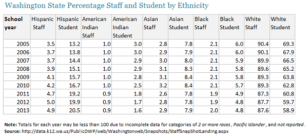
The Science Goddess used this data to show you how you can improve on the default charts that Excel spits out. It’s worth a read.
Caveat: Since I am not familiar with this data I don’t know what the ‘question’ is that we need to answer. Instead I'm going to look at the different charting options we have available for this type of data, and explain what questions each chart allows you to answer. As a result some of the charts may analyse the data in a way that wouldn't apply in reality. Just so you know 😉
Chart 1 – Panel Chart or Small Multiples
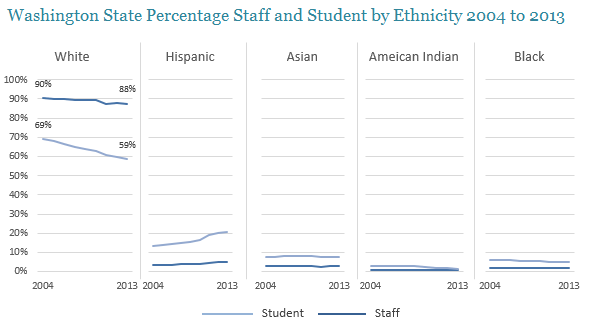
Panel Chart or Small Multiples Key Points
- Don’t repeat labels or axes. I have just one vertical axis on the first chart which serves all 5 charts.
- Likewise, if space is limited reduce axis labels where they can be implied, as I have done for my horizontal axes where I’ve only labelled 2004 and 2013 for each chart.
- Make sure all charts are the same size and colours are consistent. Note also that only 1 legend is required for all 5 charts.
- Fix all charts to the same minimum and maximum axis height and align them. It’s natural that people will compare one chart to the next so it’s imperative that each chart uses the same scale so you don’t mislead the reader or make it difficult to read.
- You can add data labels if you want, like I have done in the first chart. If you do this it’s a good idea to do it for every chart and then you can delete the vertical axis as it’s redundant.
- You can build these charts by creating 5 separate charts and then aligning them together, or you can create a ‘panel chart’ in Excel with some jiggery pokery.
Panel Charts or Small Multiples are good for
Allowing comparison of each category side by side (in this example, ethnicity and student/staff), enabling you to detect patterns in the data.
For example we can quickly see that Students outnumber staff in every ethnicity except for White. Asian, American Indian and Black have not changed significantly since 2004. Hispanic students have increased the most while White students and staff have both decreased.
This approach assumes there is a relationship between staff and student numbers, which may not be the case.
Sparklines
Sparklines are a new feature in Excel 2010. They can be used in a similar way to the Small Multiple charts although they take the ‘small’ idea further, in that they fit into a single cell.
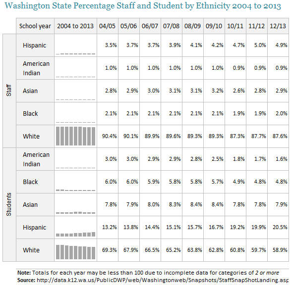
Sparkline Key Points
- They typically don’t show an axis.
- You can choose from line, column or win/loss Sparklines.
- You can use them to show trends in a series and highlight maximum and minimum values by applying markers to the Sparkline.
- They are applied to the background of the cell as opposed to being an object that floats above the worksheet like a regular chart.
Sparklines are good for
Enhancing a table of data, as patterns can be difficult to see in a mass of numbers. A Sparkline gives you a quick way to see a pattern thus giving the numbers context.
In the above example the reader is less able to make comparisons between the categories and so the message is focussed on the individual ethnic group’s pattern over time.
Line Chart
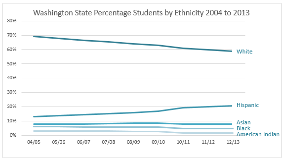
Line Chart Key Points
- Because there are quite a few lines in this chart it’s easier for the reader if you label each line as opposed to using a legend.
- This chart isn’t trying to do too much. It only plots Students. To include Staff would make it too cluttered.
Line Charts are good for
Seeing trends over time. The line implies there is a relationship from year to year.
Plotting each ethnic group in the one chart allows the reader to make comparisons between the groups. Who is biggest, second biggest etc. as opposed to making comparisons between student and teacher trends like we did in the first panel chart.
Bar Chart A
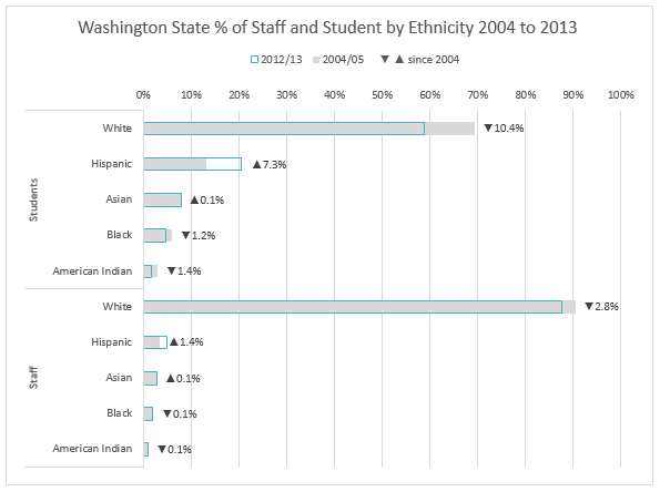
Bar Chart A - Key Points
- This bar chart removes the time category and instead focusses on two points in time (2004/05 vs 2012/13) and the overall change.
- By overlapping the two columns we’re able to make a quick visual comparison of then and now.
- The labels tell us the exact change with an upward facing triangle indicating a positive change and a downward facing triangle indicating a negative change.
- Sort the data to aid interpretation. For example we can easily see which ethnic group is biggest, second biggest etc. Note: if your data already has an implied order then sort by the implied order e.g. Highly Developed, Developed, Developing… etc.
- By segregating Students and Staff we imply that there isn’t a relationship between the two groups.
- A gap between each bar emphasises that the categories are discreet. Unlike a line chart which is continuous to indicate there is a relationship from one category (typically time) to the next.
Bar Charts are good for
Comparing a large number of classes or groups.
They are also good for displaying data with long titles as they avoid the need to angle or wrap them like you do with a column chart.
Bar Chart B
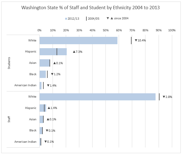
Bar Chart B - Key Points
- This is a variation of bar chart A; however instead of two columns, 2004/05 is represented by a marker.
- This chart is cleaner/less cluttered and slightly easier to read. Unfortunately inserting the marker requires a bit more effort (and possibly some Red Bull) than Bar Chart A with the two overlapped columns.
Summary
I hope I’ve illustrated (pun intended 😉 ) that there isn't a 'best' chart out of the ones above. It comes down to choosing the chart that best conveys your message.
By no means is this a comprehensive list of different ways to display this data visually. If you have an example you’d like to share please email it to me via the Help Desk and I’ll add it to this post, or leave me a comment below.
Enter your email address below to download the sample workbook.
Want More?
If you’d like to learn more about data visualisation and dashboards please consider my popular Excel Dashboard course.
I’ll teach you the fundamentals for data visualisation and I’ll show you the tricks I used to create the charts above, plus a load more.
And to give you a headstart download my free 30 Tips for Better Charts eBook here.
Data Visualisation Inspiration and Help
If you already know how to create amazing charts in Excel, but you’re not sure how to best display your data then Helpmeviz.com is a great place to ask your question and receive feedback, suggestions and examples from members of the data visualisation community.
Or just take a look at some of the previous posts for inspiration.


Hi Mynda,
Bar Chart B with marker is really awesome, just like the chart drawn by tableau. I have no idea how this marker is made. The default marker does not have this line option. Would you pls share more on the detail of the marker? Is this done by insert pictures?
Milo
Hi Milo,
They’re error bars. If you download the Excel file you can see how I did it.
Mynda
learned a lot from your sharing
wish you all the best
thanks
Great to hear!
Me again!
Many thanks for your valuable insights and suggestions Mynda. I have updated my file and my blog entry and all of your comments are there too. I have changed a few things and I have left my original Excel file AND my revised file for everyone to see and download.
I am impertinent I know but I suggested a FIFTH chart to consider: the Then v Now chart. Take a look! I think it helps with this data set very well.
I have taken more time this time and have got rid of my shoddy formatting: thanks for the push.
Best wishes
Duncan
Hi Mynda,
I like the idea of displaying the delta % in the bar chart. I do it a lot since I know how. 🙂
btw, for your consideration. Instead of using IF and CONCATENATE the ▲▼, I prefer to set it by custom format:▲0.0%;▼0.0%
We can color-code the figures in the way too.
cheers,
wmfexcel.wordpress.com
Great tip, MF. 🙂
I tend to forget about those custom formats. Thanks for the reminder.
I will upload my file to my own Excel blog soon Mynda.
You will see that I have created two conditional formatting charts: one based on the original table and another based on the transposed table.
In the meantime I have worked on your panel charts as well. I like the idea so thought I would see what I might do with it. What I did was to create a helper table of rates of change: eg, the % change from 2004 to 2005 for each category, then the % change from 2005 – 2006 for each category and so on.
I then copied your charts, keeping a standard vertical axis and changed absolute data to relative data: given the data you were working with, I think this chart is much more meaningful.
My connection is very slow so please bear with me as I try to create a new page on my blog, linked to this one and fully acknowledged and put a link to my version of your file. In that file you will see your work in tact and then where I have created something different there is an, eg, Small Multiples_dw tab.
Awesome. I’m looking foward to it, Duncan. 🙂
The first one is very clever.
The other chart I would create is a 100% stacked chart with the year on the x axis and the ethnicity in the various colors. For each year, it will give a visual view of the % breakdown by Ethnicity and a perspective of how it is changing over time.
A very useful graph in context of South Africa where there is a large focus on getting the distribution by race normalised in the various organisations
Thanks, Sanjiv.
I’m not a big fan of stacked bar charts. It makes it difficult to compare categories over time when they’re up and down year on year which makes the height each ethnic group starts at different, except the first group which is on the bottom.
Here are some clever solutions to that problem:
https://sites.google.com/site/e90e50fx/home/stacked-and-separated-dynamic-excel-charts
Kind regards,
Mynda.
They are all great charts. The first one amazed me.
You are geniuses. Thank you Mynda.
Aw, thanks Maxime 🙂 Glad you liked them.
I like the small multiples, they remind me of slopelines or slope graphs.
Sparklines are efficient
I didn’t like the line and bar charts.
Just today I was experimenting with conditional formatting for this kind of thing and it looked good: I was analysibg balance sheets over time but I made tge results almost chart like.
Hi Duncan,
I’d like to see your Conditional Formatting ‘charts’.
Cheers,
Mynda.