• Skip to main content
  • Skip to header right navigation
  • Skip to site footer

My Online Training Hub

Learn Dashboards, Excel, Power BI, Power Query, Power Pivot

  • Courses
  • Pricing
    • Free Courses
    • Power BI Course
    • Excel Power Query Course
    • Power Pivot and DAX Course
    • Excel Dashboard Course
    • Excel PivotTable Course – Quick Start
    • Advanced Excel Formulas Course
    • Excel Expert Advanced Excel Training
    • Excel Tables Course
    • Excel, Word, Outlook
    • Financial Modelling Course
    • Excel PivotTable Course
    • Excel for Customer Service Professionals
    • Excel for Operations Management Course
    • Excel for Decision Making Under Uncertainty Course
    • Excel for Finance Course
    • Excel Analysis ToolPak Course
    • Multi-User Pricing
  • Resources
    • Free Downloads
    • Excel Functions Explained
    • Excel Formulas
    • Excel Add-ins
    • IF Function
      • Excel IF Statement Explained
      • Excel IF AND OR Functions
      • IF Formula Builder
    • Time & Dates in Excel
      • Excel Date & Time
      • Calculating Time in Excel
      • Excel Time Calculation Tricks
      • Excel Date and Time Formatting
    • Excel Keyboard Shortcuts
    • Excel Custom Number Format Guide
    • Pivot Tables Guide
    • VLOOKUP Guide
    • ALT Codes
    • Excel VBA & Macros
    • Excel User Forms
    • VBA String Functions
  • Members
    • Login
  • Blog
  • Excel Webinars
  • Excel Forum
    • Register as Forum Member
  • Login

Charting Disparate Data in Excel – 3 Solutions and 1 Crazy Mess

You are here: Home / Excel Charts / Charting Disparate Data in Excel – 3 Solutions and 1 Crazy Mess
Charting Disparate Data in Excel – 3 Solutions and 1 Crazy Mess
January 23, 2014 by Mynda Treacy

Last week we looked at some different ways to plot the same data, with each chart enabling the reader to glean different information.

A by-product of that post was the observation that one series, the White, dwarfed the others, which made it difficult to get a feel for the trend and significance of the change for the smaller series, as you can see below.

line chart in Excel

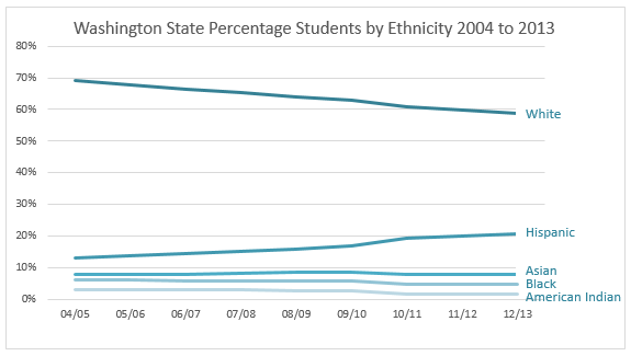
Now, this isn’t so much of a problem if the purpose of the chart is to allow you to compare the size of each series to one another and their general trend over time. The line chart above does an ok job of this.

However if you want to get a feel for the magnitude of change over time for each series then the line chart makes you work harder than you should have to.

For example, the Hispanic population have increased by 55% in 2012/13 compared to 2004/05 but the line chart doesn’t easily convey this message.

Let me be clear: in 2012/13 Hispanic Students account for 20.5% of the student population which is 55% more than 2004/05, which was 13.2%. Blimey those percentages of percentages can get confusing!

So, what charts can we use to emphasise this change?

Option 1 – Logarithmic Scale

logarithmic chart for disparate data in Excel

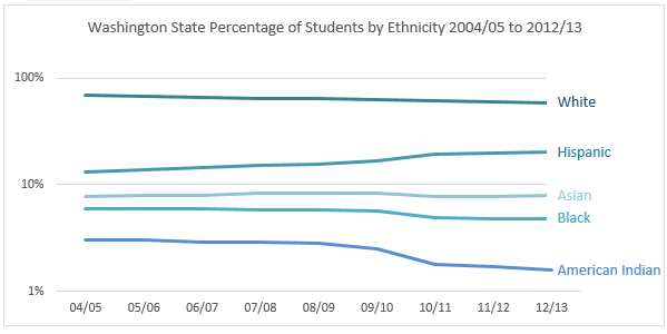
The logarithmic scale was born to present data that covers a large range of values like we have above (ok, ‘born’ might be a slight embellishment! I don’t think my high school math teacher would have described them like that).

The logarithmic scale uses intervals that correspond to orders of magnitude (in the chart above I’ve used a base of 10 to make it easier to understand, but 2 gives an even more defined change).

Each unit increase on the vertical axis represents an exponential increase in the underlying quantity. This effectively reduces the wide range of values to a more manageable size.

The Problem with Log Scales

They’re not intuitive to read and if you don’t have a math degree, or you were too busy passing notes in high school when they covered logs then you might make the wrong assumptions.

The bottom line is you need to know your audience when presenting charts that use log scales, or else be prepared to explain them.

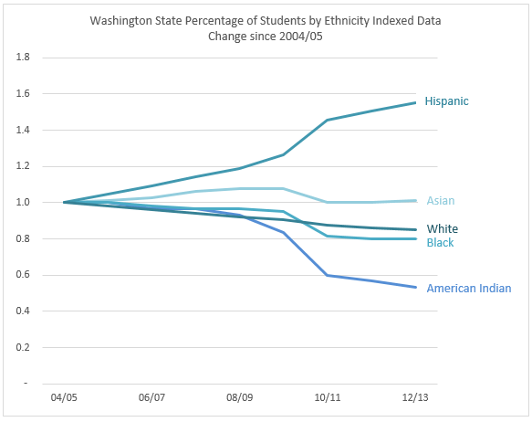
Option 2 – Indexing Change since 2004/05

indexed chart for disparate data in Excel

This suggestion was sent in by Bryan Metz. Thanks, Bryan 🙂

Indexing enables us to see how much a group changes over time in relation to its starting point.

What we are essentially saying is that in 2004/05 every group starts at 1 or 100%. Any change below 1 indicates a reduction and any change above 1 is an increase since 2004/05. The number after the decimal place in the vertical axis is the percentage change.

Easy to read, eh?

Calculating the Index

We calculate the index by dividing each group’s percentages by its initial percentage in 2004/05.

For example, if we take the source data below for Hispanic Students we would calculate the indexed value for 2006/07 by dividing 14.4% by 13.2% which gives us 1.09, or a 9% increase in 2006/07 over 2004/05.

table of indexed data

The Story it Tells

Interestingly in this chart we can see that in 2010/11 there is a spike in the degree of change and then it slows down again after that. This is not as clear in any of the other charts so far.

We can also quickly see that Hispanic Students have increased by nearly 60% since 2004/05, Asian increased for a while but are back at 2004/05 levels, White are on a steady decline, Black have reduced by 20% and American Indian by nearly 50%.

indexed chart highlights change

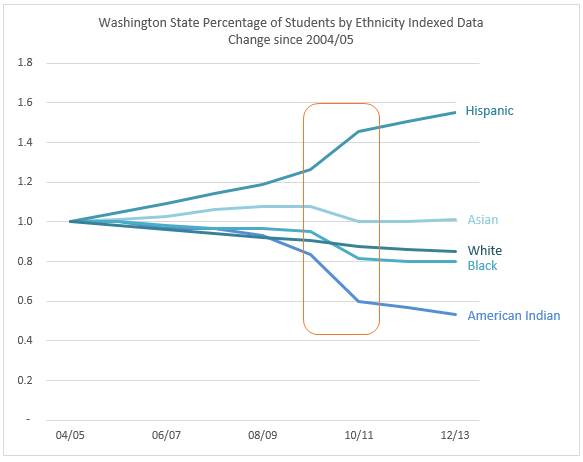
I like this method of indexing as it shows the trend over time. It’s intuitive; an upward line tells me the trend is upwards, likewise for the downward lines.

Another way to index is to do so year on year, or from one period to another, which brings us to our next option.

Smooth segue, eh? 🙂 Oh dear…. I think I spent too much time in Canada in December because ‘eh’ is becoming a habit.

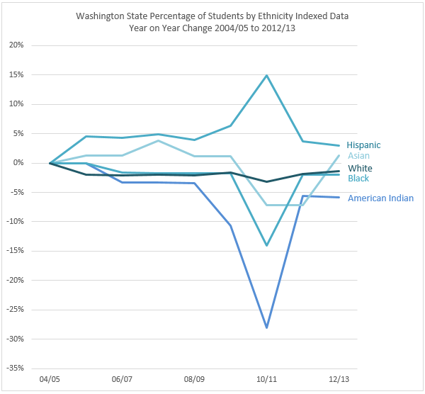
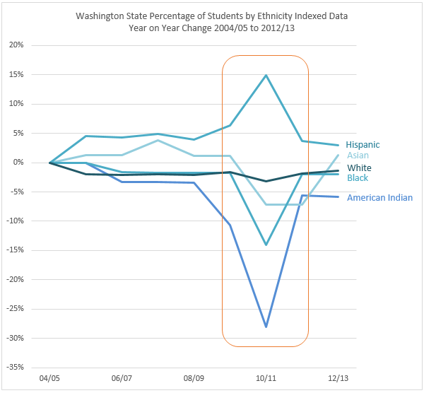
Option 3 – Indexing Change Year on Year

year on year indexed data

This suggestion was made by Duncan Williamson. Thanks, Duncan 🙂

Much like the previous chart, the total percentages have been indexed, however in this case they all start at 0%. A positive point on the chart indicates an increase on the previous year and a negative point indicates a decrease. So far, so good.

Calculating the Change

The indexing for each series in this chart is calculated by dividing the value for each year by the previous year to get the year on year percentage change.

For example the year on year change from 2004/05 to 2005/06 for Hispanic Students is =(13.8%/13.2%)-1 = 0.045 or a 4.5% increase.

The Story it Tells

This chart does a good job of highlighting the sudden change in 2010/11, and it does so more dramatically than the first Indexed Chart. It also clearly tells me the amount of growth each year, but for me it is less intuitive to read.

indexed year on year chart highlights change

And it's because in this chart a relatively horizontal line above zero indicates a constant upward trend, and horizontal line below zero indicates a constant downward trend but I have to think about this to ‘see’ it (because it's horizontal), whereas the first indexed chart instantly ‘shows’ me with the direction of the line.

Other Options

There are some other methods for indexing, like standardizing or z-scores. There’s even a function in Excel to STANDARDIZE data, but when I experimented with these numbers the resulting mash of crazy lines looked like someone had thrown down a pile of Pick-up Sticks on my chart. You can see it here:

standardized chart using Excel STANDARDIZE

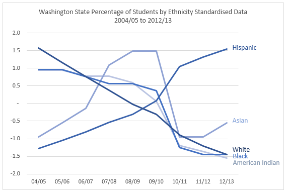
The angles of the lines are extreme, and for my liking they over emphasise the change. This risk with this chart is that the untrained chart reader will either panic (those lines look like serious problems), or switch off, as its meaning is too difficult to understand.

If you’re interested; the STANDARDIZE function takes the range of percentages for each series (ethnic group) and reduces them to a smaller scale by calculating a normalised value from a distribution characterised by the mean and standard deviation…..ZZZZzzzzz

Did you fall asleep? Sorry.

While z-scores have their place in statistics, I think they are best left for those with a Math Black Belt. For most of the data we’re likely to analyse the other options above will be more easily interpreted and relevant to our audience.

The Bottom Line

Just as in last week’s post, there’s no right or wrong chart. Each one has its own message. Which chart is best all depends on the question you are trying to answer and the audience you’re presenting to.

What about the Real Numbers

Bryan also said in his email to me:

“Comparing percentages is nice, and now that we've indexed it they are easy to compare, but they only tell part of the story. There's no way to tell why one race is increasing or decreasing relative to another. Are White student populations actually decreasing, or just not increasing as quickly as Hispanic populations (assuming, of course, that the total population is in fact increasing)? My second graph is a simple line graph of the absolute numbers (retrieved from the same source website). We hit the same issue here as with the initial graphs -- it's clear that the overall White enrollment is decreasing while the Hispanic is increasing, but the other populations are rather squished together.”

If you’d like to see Bryan’s additional analysis you can download the file here which also contains the charts above.

Enter your email address below to download the sample workbook.

By submitting your email address you agree that we can email you our Excel newsletter.
Please enter a valid email address.

Download the Excel Workbook. Note: This is a .xlsx file please ensure your browser doesn't change the file extension on download.

Want More?

If you’d like to learn more about data visualisation and charts please consider my popular Excel Dashboard course.

I’ll teach you the fundamentals for data visualisation and I’ll show you the tricks I used to create the charts above, plus a load more.

And to give you a headstart download my free 30 Tips for Better Charts eBook here.

Thanks

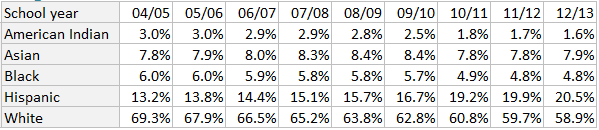
Thanks again to Bryan and Duncan for sharing their charts and ideas.

Charting Disparate Data in Excel – 3 Solutions and 1 Crazy Mess
Mynda Treacy

Microsoft MVP logo

AUTHOR Mynda Treacy Co-Founder / Owner at My Online Training Hub

CIMA qualified Accountant with over 25 years experience in roles such as Global IT Financial Controller for investment banking firms Barclays Capital and NatWest Markets.

Mynda has been awarded Microsoft MVP status every year since 2014 for her expertise and contributions to educating people about Microsoft Excel.

Mynda teaches several courses here at MOTH including Excel Expert, Excel Dashboards, Power BI, Power Query and Power Pivot.

More Charts Posts

burn up burn down charts

Excel Project Management Burn Down and Burn Up Charts

Excel Burn Down and Burn Up Charts are easy to make with line or scatter charts. They are useful for monitoring the progress of a project.
wee people font charts

Excel WeePeople Font Charts

Excel WeePeople Font Charts are a nice change from generic shapes for waffle charts, bar/column charts and more.
excel dot map charts

Excel Dot Map Charts

Interactive Excel dot map charts are not built-in, but with some creative use of Excel’s built-in tools we can create something unique.
Excel S Curve Charts

Excel S-Curve Charts

Easy Excel S-curve Charts made with PivotTables for project management. Track progress by including budget amounts.
highlighting data in power bi visuals

Highlighting Data in Power BI Visuals

Learn several techniques to highlight or label important data points in your Power BI visuals. Sample file and code to download.
shape maps in power bi

Shape Maps in Power BI

Shape maps in Power BI can be used to show the distribution of a variable across geographic regions. Learn a trick to plot discrete data too.
using jitter to avoid over plotting

Using Jitter to Avoid Over Plotting in Power BI

Plotting data that has one variable where values are similar, can result in points that are plotted over each other. Use jitter to avoid this overplotting.
Excel custom chart labels

Excel Custom Chart Labels

Create dynamic Excel custom chart labels with this category axis hijack trick
Sorting Excel Date Slicers

Sorting Excel Date Slicers

Slicers have some shortcomings when it comes to dates and sort order. This post explains a couple of ways to sort dates correctly in Excel slicers.
4 Charts – Same Data. Which do you think is best?

4 Charts – Same Data. Which do you think is best?

More Excel Charts Posts

interactive python charts in excel

Interactive Python Charts in Excel

How to build interactive Python Charts in Excel and regular charts with Slicers connected to data from Power Query.
Circle Progress Charts

Excel Progress Circle Charts

How to easily create dynamic Excel Progress Circle Charts, using doughnut charts and some wizardry, including Slicers to change the data.
professional vs amateur chart formatting

Pro Excel Chart Formatting

10 tell-tale signs that show you’re a chart amateur and the Excel chart formatting you should use instead.

Excel Scroll and Sort Table

Excel scroll and sort table using dynamic array formulas is far simpler than the old approach which required multiple tables, formulas and helper columns.
picture fill excel charts

Picture Fill Excel Charts

Using a stylish picture fill in your Excel Charts is a simple way to make your data visualizations more captivating and memorable
excel speedometer charts

Excel Speedometer Charts

How to build Excel Speedometer Charts or Gauge Charts as they're also know, why they are BAD and what to use instead.
burn up burn down charts

Excel Project Management Burn Down and Burn Up Charts

Excel Burn Down and Burn Up Charts are easy to make with line or scatter charts. They are useful for monitoring the progress of a project.
wee people font charts

Excel WeePeople Font Charts

Excel WeePeople Font Charts are a nice change from generic shapes for waffle charts, bar/column charts and more.
excel dot map charts

Excel Dot Map Charts

Interactive Excel dot map charts are not built-in, but with some creative use of Excel’s built-in tools we can create something unique.
Excel S Curve Charts

Excel S-Curve Charts

Easy Excel S-curve Charts made with PivotTables for project management. Track progress by including budget amounts.


Category: Excel ChartsTag: charts
Previous Post:4 Charts – Same Data. Which do you think is best?4 Charts – Same Data. Which do you think is best?
Next Post:Curse You Excel CursorCurse You Excel Cursor

Reader Interactions

Leave a Reply Cancel reply

Your email address will not be published. Required fields are marked *

Current ye@r *

Leave this field empty

Sidebar

More results...

Popular Content

  • 10 Common Excel Mistakes to Avoid
  • Top Excel Functions for Data Analysts
  • Secrets to Building Excel Dashboards in Less Than 15 Minutes
  • Pro Excel Formula Writing Tips
  • Hidden Excel Double-Click Shortcuts
  • Top 10 Intermediate Excel Functions
  • 5 Pro Excel Dashboard Design Tips
  • 5 Excel SUM Function Tricks
  • 239 Excel Keyboard Shortcuts

100 Excel Tips and Tricks eBook

Download Free Tips & Tricks

239 Excel Keyboard Shortcuts

Download Free PDF

mynda treacy microsoft mvpHi, I'm Mynda Treacy and I run MOTH with my husband, Phil. Through our blog, webinars, YouTube channel and courses we hope we can help you learn Excel, Power Pivot and DAX, Power Query, Power BI, and Excel Dashboards.

Blog Categories

  • Excel
  • Excel Charts
  • Excel Dashboard
  • Excel Formulas
  • Excel Office Scripts
  • Excel PivotTables
  • Excel Shortcuts
  • Excel VBA
  • General Tips
  • Online Training
  • Outlook
  • Power Apps
  • Power Automate
  • Power BI
  • Power Pivot
  • Power Query
microsoft mvp logo
trustpilot excellent rating
Secured by Sucuri Badge
MyOnlineTrainingHub on YouTube Mynda Treacy on Linked In Mynda Treacy on Instagram Mynda Treacy on Twitter Mynda Treacy on Pinterest MyOnlineTrainingHub on Facebook

Sign up to our newsletter and join over 400,000
others who learn Excel and Power BI with us.


Company

  • About My Online Training Hub
  • Disclosure Statement
  • Frequently Asked Questions
  • Guarantee
  • Privacy Policy
  • Terms & Conditions
  • Testimonials
  • Become an Affiliate
  • Sponsor Our Newsletter

Support

  • Contact
  • Forum
  • Helpdesk – For Technical Issues

Copyright © 2023 · My Online Training Hub · All Rights Reserved. Microsoft and the Microsoft Office logo are trademarks or registered trademarks of Microsoft Corporation in the United States and/or other countries. Product names, logos, brands, and other trademarks featured or referred to within this website are the property of their respective trademark holders.

Download A Free Copy of 100 Excel Tips & Tricks

excel tips and tricks ebook

We respect your privacy. We won’t spam you.

x