Excel Pivot Chart Drill down buttons are a new feature available in Excel 2016. You’ll find them in the bottom right of your Pivot Chart.
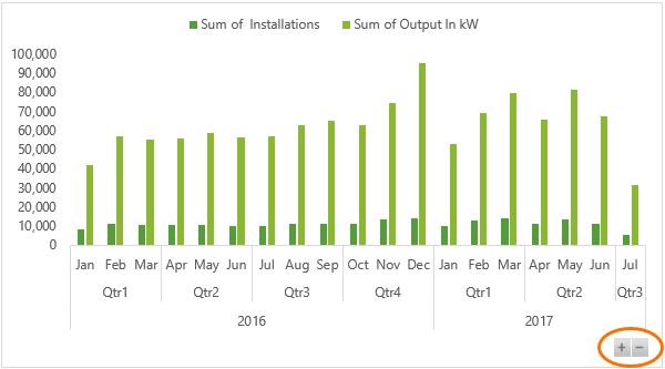
They’re available whenever you have more than one field in the Axis area of the Pivot Chart (which is the Rows area of your PivotTable). You can see below that I have 3 fields in my Axis area; years, quarters and date (which is month).
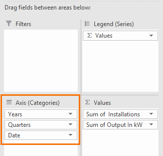
My fields are a result of grouping the date field in my PivotTable, but it isn’t limited to date hierarchies. You can add any fields to the Axis area and drill up/down.
Download the Workbook
Note: if you open this file in versions of Excel earlier than 2016 you won’t see the drill down buttons, but you can still use the double-click or right-click axis technique.
Enter your email address below to download the sample workbook.
Watch the Video

Enable Drill Down Buttons
If you can’t see the drill down buttons on your Excel Pivot Chart you can turn them on by selecting the chart > PivotChart Tools: Analyze tab > Field Buttons > Show Expand/Collapse Entire Field Buttons:
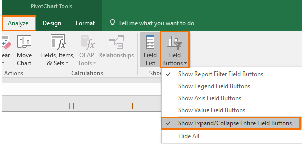
PivotCharts created in earlier versions of Excel will need the buttons enabled. PivotCharts created in Excel 2016 will simply not display them in earlier versions of Excel.
Using Excel Pivot Chart Drill Down Buttons
Drill Down buttons are an intuitive way for your users to drill up and down through a hierarchy:
As you do so the overall chart size remains the same, so it won’t mess up your report layout:
Each click drills up/down one level at a time.
They’re a nice new feature, especially for those of us who build Excel Dashboard reports, but what if you don’t have Excel 2016? Well, there’s a stealth way to drill down in PivotCharts that’s been around since (at least) Excel 2007.
Excel Pivot Chart Drill Down Pre-Excel 2016
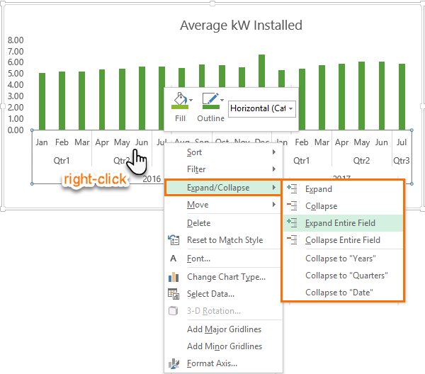
To drill up/down in PivotCharts in versions of Excel prior to 2016 you need to left click the axis to select it > then right-click > Expand/Collapse and from here you can choose from the options:
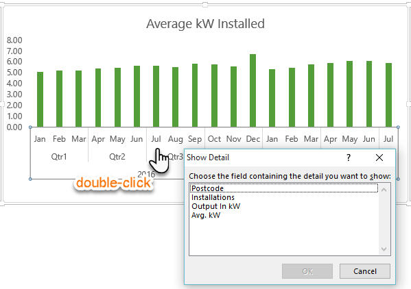
Another quick way to drill down is to left click the axis to select it, then double click to drill down one level at a time. Unfortunately, you can’t drill up or collapse with the double click, instead you must right-click and select Collapse.
If you double-click the axis and it’s already fully expanded you’ll get a list of fields that you can add to the rows area of the PivotTable. Anything you choose here will appear in the horizontal axis of the PivotChart:
The only downside of the drill down buttons is that they can only drill down on one chart at a time. It would be nice if you could link them to other charts, like you can with Slicers, to drill down multiple charts at the same time.


After a recent promotion I cannot thank you enough for your amazing YouTube videos. Have you done a video where you help show how to make a drill down from a pivot table refreshable? The reports we use requires us to constantly drill down daily and it is a massive waste of management’s time. I have tried many things but have been unable to make it refreshable as of yet. I am hoping to signup for May of the courses you offer soon.
Great to hear, Clint!
Instead of drilling down, create a PivotTable at the drilled down level of granularity, i.e. add all the necessary row labels you want to see and then filter for the view you want. Then set the PivotTable to auto-refresh which is available with Microsoft 365.
Mynda
That’s sounds too easy but I will definitely give it a go. Thank you for your quick response.
Having never used excel before I am currently self teaching through your fantastic videos. My dashboard went down very well and has been implemented by higher management 🙂
Following on from your answer, would the new Pivot from the drill down refresh when the original pivot is refreshed? The sheet in question is our WIP – Monthly outstanding jobs. So everyday they come down. The trouble I have is that when I Drill down, I leave comments on all the jobs but then the next day 30+ have been completed so I have to do it all again as the do not vanish on the drill down and therefore lose the comments I made.
The new PivotTable will refresh with the original if you click ‘Refresh All’ on the Data tab of the ribbon. However, comments could end up out of alignment as the PivotTable changes shape based on the new data because they automatically sort based on the first column of row labels.
A better way would be to keep your comments in a separate table for each job (have a column for the job number and a column for the comment), then use a lookup formula to bring the comment from your comments table into a column beside the PivotTable (use the job number in the PivotTable as your lookup key). That way you only enter the comment once and they always stay aligned to the relevant job.
Wow this website is amazing! I have learnt so much from this website. Thank you miss 🙂
So pleased to hear that, Ashmi! Thank you 🙂
Hello,
I have a pivot chart just like yours, indicating “years”, “quarters” and “date” fields for 2 years (2018 & 2019) of data, but when I drill down the deeper that I can go is “month” and not DAYS… how can I make the chart to display even the DAY data?
Regards.
Hi Oscar,
Right click a date/month/year cell in the PivotTable > Group. In the Group dialog add ‘Days’ to the grouping.
Mynda
Worked like a charm Mynda… thanks a lot!!!
Is there a way to allow users to use the +/- buttons on a locked (and protected) pivotchart?
Basis for my question: I don’t want the user to be able to (accidentally) reposition or resize the chart (as that messes up my “dashboard”), but i want them to be able to expand/collapse as needed.
If I leave the chart unlocked, then the layout is easily messed up.
If I lock the chart, then the +/- buttons cannot be accessed (even though associated Slicers can be accessed)
Note: in my case, the user does not have access to the Pivot Table itself. All they see are several Slicers, and the associated PivotChart. I have removed all other buttons from the chart, prefer to keep only the +/- buttons.
(using Office Professional Plus 2016 on Windows 10)
Hi Chuck,
No, you can’t protect the Pivot Chart object and still use the expand/collapse/filter buttons on the chart.
Mynda
Please replace drill down and drill up by expand and collapse, respectively. Drilling down or up is a similar yet different feature associated with the Online Analytical Processing (OLAP) cube or Data Model-based PivotTable hierarchy – see link below.
https://support.office.com/en-us/article/Drill-into-PivotTable-data-c1b11240-fc8f-4fdd-a697-629bf6f7ee0b
Hi Pieter-Jan,
Thanks for sharing the link.
While Microsoft have named the buttons/action ‘expand’ and ‘collapse’, I used the terms ‘drill up’ and ‘drill down’ because this is how most people think of this action.
Mynda
Thank you for taking time and putting forth the effort to provide these informative and useful examples of Pivot Table features. I’m learning new things from you every time I access your pages. What a blessing.
My pleasure, John. Great to know you’re finding them useful.
I look forward to trying that out in 2023 🙁
But the right-click tip is useful – thanks
🙂 hopefully you won’t have to wait that long!