• Skip to main content
  • Skip to header right navigation
  • Skip to site footer

My Online Training Hub

Learn Dashboards, Excel, Power BI, Power Query, Power Pivot

  • Courses
  • Pricing
    • Free Courses
    • Power BI Course
    • Excel Power Query Course
    • Power Pivot and DAX Course
    • Excel Dashboard Course
    • Excel PivotTable Course – Quick Start
    • Advanced Excel Formulas Course
    • Excel Expert Advanced Excel Training
    • Excel Tables Course
    • Excel, Word, Outlook
    • Financial Modelling Course
    • Excel PivotTable Course
    • Excel for Customer Service Professionals
    • Excel for Operations Management Course
    • Excel for Decision Making Under Uncertainty Course
    • Excel for Finance Course
    • Excel Analysis ToolPak Course
    • Multi-User Pricing
  • Resources
    • Free Downloads
    • Excel Functions Explained
    • Excel Formulas
    • Excel Add-ins
    • IF Function
      • Excel IF Statement Explained
      • Excel IF AND OR Functions
      • IF Formula Builder
    • Time & Dates in Excel
      • Excel Date & Time
      • Calculating Time in Excel
      • Excel Time Calculation Tricks
      • Excel Date and Time Formatting
    • Excel Keyboard Shortcuts
    • Excel Custom Number Format Guide
    • Pivot Tables Guide
    • VLOOKUP Guide
    • ALT Codes
    • Excel VBA & Macros
    • Excel User Forms
    • VBA String Functions
  • Members
    • Login
  • Blog
  • Excel Webinars
  • Excel Forum
    • Register as Forum Member
  • Login

Excel Heat Maps

You are here: Home / Excel Charts / Excel Heat Maps
December 7, 2016 by Mynda Treacy

Excel Heat maps can speed up interpretation of data and focus the reader’s attention to problem or key areas. And we can create them easily using Conditional Formatting. To be fair it’s less of a map and more a heat table, but nonetheless they’re referred to as heat maps.

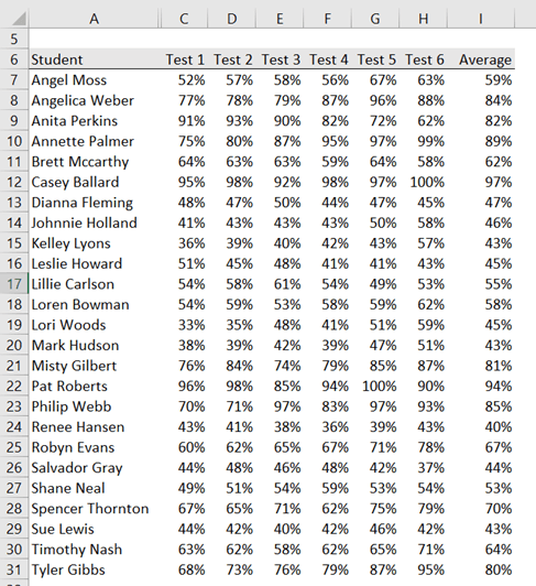
Let’s take this example of student test data. Presented as a table of numbers makes hard work for the teacher to quickly identify and focus on students who are below average.

student test data

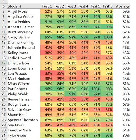
Whereas if I apply some Conditional Formatting I can instantly focus on the below average students as their test scores are in shades of red.

excel heat maps

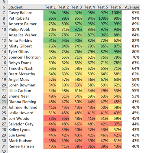
And if I sort the table in descending (or ascending) order on the Average column it becomes even easier.

sort the table in the Average column

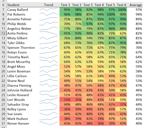
I can also add a Sparkline to show the trend of a student’s performance, which makes it quicker to see whether the trend of test scores is positive or negative.

add Sparkline to show trend

So you can see with just three techniques; Conditional Formatting, Sorting and Sparklines, we’ve taken a sea of numbers and made the instantly understandable.

Download the file

Enter your email address below to download the sample workbook.

By submitting your email address you agree that we can email you our Excel newsletter.
Please enter a valid email address.

Download the Excel Workbook. Note: This is a .xlsx file please ensure your browser doesn't change the file extension on download.

Excel Heat Maps with Conditional Formatting

To apply the Conditional Formatting simply select all the cells containing the test scores > Home tab > Conditional Formatting > Color Scales:

Apply Conditional Formatting

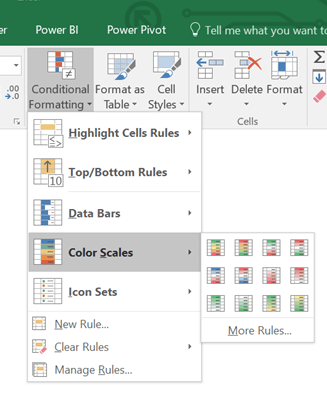
Tip: Hover over the icons to see a preview of the color scales applied to your data.

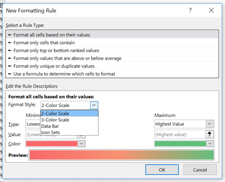
I’ve used the very first color scale icon, but you can set your own colors by clicking ‘More Rules’. This opens the Conditional Formatting dialog box below where you can choose from a 2 or 3 color scale:

2 color scale

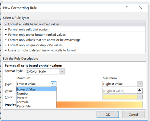
The default is to set the scale based on the lowest and highest values (see Type drop down in the image below), but you can change this to be a specific value, number, percentage, percentile or even based on a formula:

set scale to lowest value

Modifying Conditional Format Rules

If you apply a color scale and then change your mind, you can edit the rule by opening the Conditional Formatting Manager: Home tab > Conditional Formatting > Manage Rules:

conditional formatting rules manager

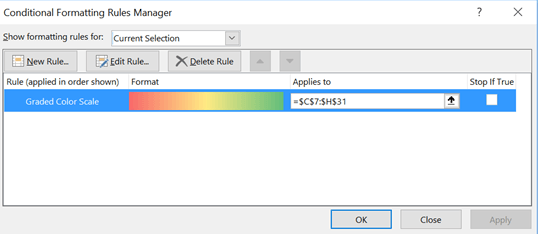
Select the rule from the list (I only have one), then click the ‘Edit Rule’ button at the top. Alternatively, you can delete the rule and start over.

Hiding Values in Excel Heat Maps

In the heat map below I have the 2016 daily solar exposure (which is the total solar energy for a day falling on a horizontal surface) for where I live:

2016 Daily Solar Exposure

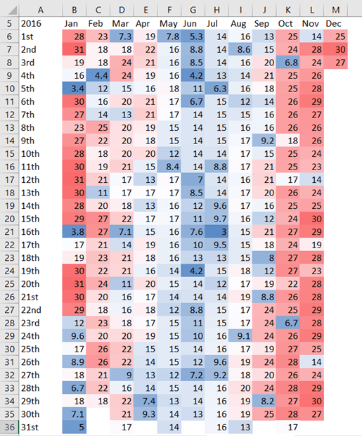
The heat map is effective in helping us to see patterns and trends, and even anomalies.

We could use a Custom Number format (;;;) to hide the values and allow the color scale to speak for itself like this:

hide values with Custom Number format

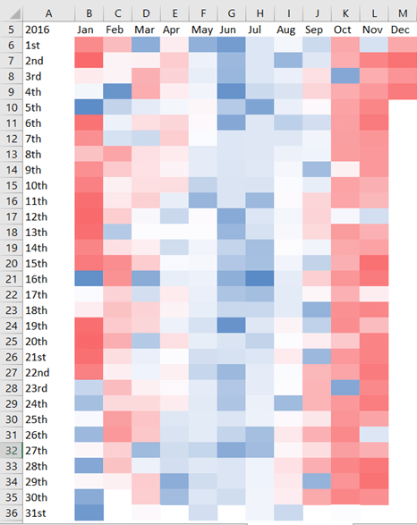
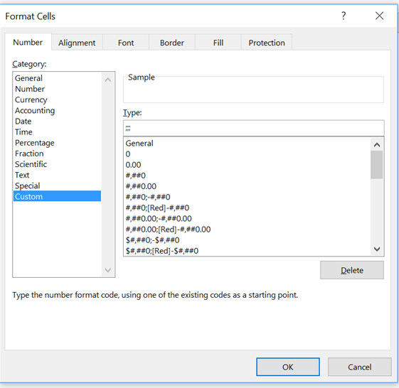
To apply the Custom Number format select cells B6:M36 > CTRL+1 to open the Format Cells dialog box > on the Number tab select the Custom category > in the ‘Type’ field enter three semi-colons as shown in the dialog box below:

custom number formatting

More Custom Number format examples: Custom Cell Formats

Choosing Colours

Your choice of color should consider the message and the data. For example, we instinctively associate red with bad and green with good. And in the daily solar exposure heat map above I used blue and red, as those colours are commonly associated with cold and hot.

Another consideration is for those with color vision deficiency, or color blindness. This post talks about the use of color in charts and has some resources for choosing colors, including colors for color vision deficiency.

More Conditional Formatting

Using Conditional Formatting to create a heat map is just one of many uses and features available. If you haven’t used Conditional Formatting before then read that post.

And once you’ve mastered the standard Conditional Formats available you can take it a step further and use formulas to set your conditional formats.

Mynda Treacy

Microsoft MVP logo

AUTHOR Mynda Treacy Co-Founder / Owner at My Online Training Hub

CIMA qualified Accountant with over 25 years experience in roles such as Global IT Financial Controller for investment banking firms Barclays Capital and NatWest Markets.

Mynda has been awarded Microsoft MVP status every year since 2014 for her expertise and contributions to educating people about Microsoft Excel.

Mynda teaches several courses here at MOTH including Excel Expert, Excel Dashboards, Power BI, Power Query and Power Pivot.

More Excel Charts Posts

interactive python charts in excel

Interactive Python Charts in Excel

How to build interactive Python Charts in Excel and regular charts with Slicers connected to data from Power Query.
Circle Progress Charts

Excel Progress Circle Charts

How to easily create dynamic Excel Progress Circle Charts, using doughnut charts and some wizardry, including Slicers to change the data.
professional vs amateur chart formatting

Pro Excel Chart Formatting

10 tell-tale signs that show you’re a chart amateur and the Excel chart formatting you should use instead.

Excel Scroll and Sort Table

Excel scroll and sort table using dynamic array formulas is far simpler than the old approach which required multiple tables, formulas and helper columns.
picture fill excel charts

Picture Fill Excel Charts

Using a stylish picture fill in your Excel Charts is a simple way to make your data visualizations more captivating and memorable
excel speedometer charts

Excel Speedometer Charts

How to build Excel Speedometer Charts or Gauge Charts as they're also know, why they are BAD and what to use instead.
burn up burn down charts

Excel Project Management Burn Down and Burn Up Charts

Excel Burn Down and Burn Up Charts are easy to make with line or scatter charts. They are useful for monitoring the progress of a project.
wee people font charts

Excel WeePeople Font Charts

Excel WeePeople Font Charts are a nice change from generic shapes for waffle charts, bar/column charts and more.
excel dot map charts

Excel Dot Map Charts

Interactive Excel dot map charts are not built-in, but with some creative use of Excel’s built-in tools we can create something unique.
Excel S Curve Charts

Excel S-Curve Charts

Easy Excel S-curve Charts made with PivotTables for project management. Track progress by including budget amounts.


Category: Excel Charts
Previous Post:Excel Slopegraphs
Next Post:Excel Charts for Surveys

Reader Interactions

Comments

  1. Peter Buyze

    December 7, 2016 at 11:38 pm

    I posted about it on the G+ Excel Tips page here https://plus.google.com/+PeterBuyze/posts/8YpV5jYmxrK

    Reply
    • Mynda Treacy

      December 8, 2016 at 7:11 am

      Thanks for sharing my tutorial, Peter!

      Reply

Leave a Reply Cancel reply

Your email address will not be published. Required fields are marked *

Current ye@r *

Leave this field empty

Sidebar

More results...

office scripts course

Popular Content

  • 10 Common Excel Mistakes to Avoid
  • Top Excel Functions for Data Analysts
  • Secrets to Building Excel Dashboards in Less Than 15 Minutes
  • Pro Excel Formula Writing Tips
  • Hidden Excel Double-Click Shortcuts
  • Top 10 Intermediate Excel Functions
  • 5 Pro Excel Dashboard Design Tips
  • 5 Excel SUM Function Tricks
  • 239 Excel Keyboard Shortcuts

100 Excel Tips and Tricks eBook

Download Free Tips & Tricks

239 Excel Keyboard Shortcuts

Download Free PDF

mynda treacy microsoft mvpHi, I'm Mynda Treacy and I run MOTH with my husband, Phil. Through our blog, webinars, YouTube channel and courses we hope we can help you learn Excel, Power Pivot and DAX, Power Query, Power BI, and Excel Dashboards.

Blog Categories

  • Excel
  • Excel Charts
  • Excel Dashboard
  • Excel Formulas
  • Excel Office Scripts
  • Excel PivotTables
  • Excel Shortcuts
  • Excel VBA
  • General Tips
  • Online Training
  • Outlook
  • Power Apps
  • Power Automate
  • Power BI
  • Power Pivot
  • Power Query
microsoft mvp logo
trustpilot excellent rating
Secured by Sucuri Badge
MyOnlineTrainingHub on YouTube Mynda Treacy on Linked In Mynda Treacy on Instagram Mynda Treacy on Twitter Mynda Treacy on Pinterest MyOnlineTrainingHub on Facebook

Sign up to our newsletter and join over 400,000
others who learn Excel and Power BI with us.


Company

  • About My Online Training Hub
  • Disclosure Statement
  • Frequently Asked Questions
  • Guarantee
  • Privacy Policy
  • Terms & Conditions
  • Testimonials
  • Become an Affiliate
  • Sponsor Our Newsletter

Support

  • Contact
  • Forum
  • Helpdesk – For Technical Issues

Copyright © 2023 · My Online Training Hub · All Rights Reserved. Microsoft and the Microsoft Office logo are trademarks or registered trademarks of Microsoft Corporation in the United States and/or other countries. Product names, logos, brands, and other trademarks featured or referred to within this website are the property of their respective trademark holders.