• Skip to main content
  • Skip to header right navigation
  • Skip to site footer

My Online Training Hub

Learn Dashboards, Excel, Power BI, Power Query, Power Pivot

  • Courses
  • Pricing
    • Free Courses
    • Power BI Course
    • Excel Power Query Course
    • Power Pivot and DAX Course
    • Excel Dashboard Course
    • Excel PivotTable Course – Quick Start
    • Advanced Excel Formulas Course
    • Excel Expert Advanced Excel Training
    • Excel Tables Course
    • Excel, Word, Outlook
    • Financial Modelling Course
    • Excel PivotTable Course
    • Excel for Customer Service Professionals
    • Excel for Operations Management Course
    • Excel for Decision Making Under Uncertainty Course
    • Excel for Finance Course
    • Excel Analysis ToolPak Course
    • Multi-User Pricing
  • Resources
    • Free Downloads
    • Excel Functions Explained
    • Excel Formulas
    • Excel Add-ins
    • IF Function
      • Excel IF Statement Explained
      • Excel IF AND OR Functions
      • IF Formula Builder
    • Time & Dates in Excel
      • Excel Date & Time
      • Calculating Time in Excel
      • Excel Time Calculation Tricks
      • Excel Date and Time Formatting
    • Excel Keyboard Shortcuts
    • Excel Custom Number Format Guide
    • Pivot Tables Guide
    • VLOOKUP Guide
    • ALT Codes
    • Excel VBA & Macros
    • Excel User Forms
    • VBA String Functions
  • Members
    • Login
    • Password Reset
  • Blog
  • Excel Webinars
  • Excel Forum
    • Register as Forum Member

Excel Charts for Surveys

You are here: Home / Excel Charts / Excel Charts for Surveys
December 15, 2016 by Mynda Treacy

Survey data can be tricky to display in a chart so in this post I’m going to give you some options.

Let’s start by looking at what you shouldn’t do, and that is a 100% stacked bar chart like this:

stacked bar chart

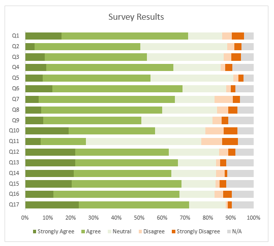
The above chart plots the 15 questions on the vertical axis and the responses colour coded in the stacked bars.

I’ll give it one thing, it looks nice and it’s eye catching, but the problem with all stacked charts is it’s very difficult to compare the series in the middle since the starting point is staggered for all but the series on either end.

And that means it’s going to be difficult to interpret for the reader.

Download the Workbook

Enter your email address below to download the sample workbook.

By submitting your email address you agree that we can email you our Excel newsletter.
Please enter a valid email address.

Download the Excel Workbook. Note: This is a .xlsx file please ensure your browser doesn't change the file extension on download.

Better Excel Charts for Surveys

Let’s look at some better charts for survey data. The first one uses in-cell charts, or you could use Conditional Formatting Data Bars if you prefer.

In-cell Charts or Conditional Formatting Data Bars

in-cell charts

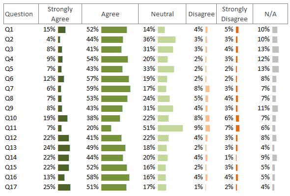
This chart is better than the first because the bars for each answer group start at the same point. It makes it quick and easy to compare the responses within a column. We also have the values for each question as opposed to an axis for scale.

We could improve this chart by sorting the answers in descending order for either ‘strongly agree’, or ‘strongly disagree’. This would prioritise or focus the reader’s attention, or even better, give the reader the ability to choose which column to sort on.

Converging Stacked Bar Chart

converging stacked bar chart

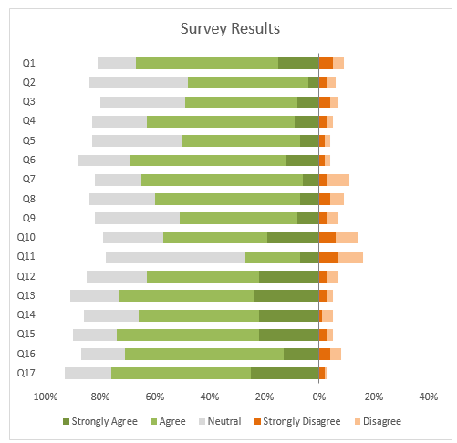
In the chart above I’ve omitted the N/A responses so each question won’t add up to 100%, but that’s ok because I’m really only interested in the responses that were applicable.

Fellow Excel MVP, Jon Peltier, calls this the ‘converging’ stacked bar chart because the strongest responses are on either side of the vertical axis. This chart enables the reader to see the ‘strong…’ responses and more easily compare them, although we could take it a step further.

Sorted Converging Stacked Bar Chart

sorted converging stacked bar chart

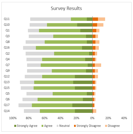
This chart is sorted in descending order on the ‘Strongly Disagree’ response, as it would be reasonable to assume that this is where you want to focus your attention.

But wouldn’t it be nice to allow the reader to choose what order to sort the chart in….

Custom Sorted Converging Stacked Bar Chart

excel charts for survey

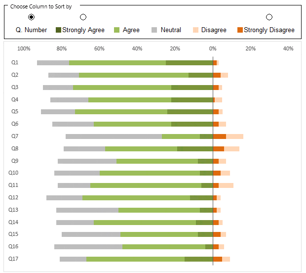
This chart allows the reader to choose whether to sort by question number, 'Strongly Agree' or 'Strongly Disagree'.

Building Converging or Diverging Stacked Bar Charts

A converging or diverging stacked bar chart is really just a stacked bar chart with a few tricks, which you can see in the Excel file available for download above. They are:

1. Change the values you want to display on the left of the vertical axis to negative numbers.

2. Use a custom number format for the horizontal axis labels (0%;0%;0%) so that the labels on both sides of the vertical axis are displayed as positive percentages.

Summary

The takeaway should be that changing the way your data is presented and sorted can alter the focus for the reader and more quickly convey a particular point.

More Charts

If you’re interested in reading more about different charts for survey data then check out this post by Jon Peltier. Warning, get supplies as it’s long!

And if you’d like to learn more cool chart ideas and tricks, including the sort button option above, please consider my Excel Dashboard course.

More Excel Charts Posts

picture fill excel charts

Picture Fill Excel Charts

Using a stylish picture fill in your Excel Charts is a simple way to make your data visualizations more captivating and memorable
excel speedometer charts

Excel Speedometer Charts

How to build Excel Speedometer Charts or Gauge Charts as they're also know, why they are BAD and what to use instead.
burn up burn down charts

Excel Project Management Burn Down and Burn Up Charts

Excel Burn Down and Burn Up Charts are easy to make with line or scatter charts. They are useful for monitoring the progress of a project.
wee people font charts

Excel WeePeople Font Charts

Excel WeePeople Font Charts are a nice change from generic shapes for waffle charts, bar/column charts and more.
excel dot map charts

Excel Dot Map Charts

Interactive Excel dot map charts are not built-in, but with some creative use of Excel’s built-in tools we can create something unique.
Excel S Curve Charts

Excel S-Curve Charts

Easy Excel S-curve Charts made with PivotTables for project management. Track progress by including budget amounts.
chart axis switch

Excel Chart Axis Switch

Use radio button form controls to create an Excel chart axis switch enabling you to toggle pannel charts between same axis and own axis.

Excel Charts with Shapes for Infographics

Excel Charts with Shapes for Infographic styling and increased interest in your charts. Easy to insert but there are a few tricks required.
excel pyramid chart

Excel Pyramid Charts

Excel Pyramid charts are useful for visualising demographic data across multiple categories. Let’s look at 3 ways we can build them in Excel.

Highlighting Periods in Excel Charts

Highlighting Periods in Excel Charts helps your users interpret them more quickly and or focus their attention on a point or area.


Category: Excel Charts
Previous Post:Excel Heat Maps
Next Post:Excel IconsExcel Icons

Reader Interactions

Comments

  1. Erdem Urasoglu

    August 23, 2019 at 12:27 am

    Hi Mynda,

    I was just trying to see the running macros behind those three buttons for sorting the columns and realized that there is no “edit macro” setting in assign macro menu.
    How can I see the codes? I only see the names of the macros as “OptionButton13_Click” for example..

    Thank you.

    Reply
    • Mynda Treacy

      August 23, 2019 at 8:47 am

      Hi Erdem,

      There aren’t any macros in the file. It’s a .xlsx file. The sorting is done with formulas.

      Mynda

      Reply
  2. Mike Hyne

    December 29, 2016 at 7:38 am

    On the Sorted Converging Stacked Bar Chart I see the data it’s using is under the chart and how it uses functions to grab the data located to the right. I see the GroupBox with the 3 radio buttons and how the selected radio button number is put in cell W110 and how X110 converts that to the number of the column to be sorted by. What I don’t see is what is using the value in X110 to do the sorting. I’m probably missing the obvious but need help to see it. Mike

    Reply
    • Mynda Treacy

      December 29, 2016 at 8:38 am

      Hi Mike,

      The value in X110 is used by CHOOSE and OFFSET in the formulas in column W to find the column containing the values to be ranked:

      =RANK(CHOOSE($X$110,Z112,AA112,AB112,AC112,AD112,AE112),OFFSET($Y$112,,$X$110,17,1),CHOOSE($W$110,1,0,0))

      Mynda

      Reply
  3. Ivars

    December 16, 2016 at 11:00 pm

    Great example of ranking. Thank you for sharing.

    Reply
    • Mynda Treacy

      December 17, 2016 at 7:53 am

      Thanks, Ivars. Glad you liked it 🙂

      Reply
  4. juanito

    December 16, 2016 at 10:15 pm

    Good article, thanks!

    On the dataviz (not Excel) side of this, there is a good blog article with expert commentary on Stephen Few’s site here.
    https://www.perceptualedge.com/blog/?p=2239

    About halfway down he discusses specifically the Likert scale issues your solutions variously address.

    Reply
    • Mynda Treacy

      December 16, 2016 at 10:23 pm

      Thanks for sharing the link, Juanito. It makes an interesting read.

      Reply
  5. Jacques Raubenheimer

    December 16, 2016 at 5:12 am

    Hi Mynda
    it is hard to tell without seeing the actual items, but these items use what is called a Likert scale rating. However, statistically speaking, there is a lot of misunderstanding about how Likert scales should be analysed, and without going into the complexities, it is worth pointing out that, as John Uebersax points out: “Common Error 1
    A Likert scale is never an individual item; it is always a set of several items, with specific format features, the responses to which are added or averaged to produce an overall score or measurement.”
    Thus, plotting individual scale counts for items like these may (may!) negate the actual statistical theory underlying how the scale as a whole should be treated. That is something that should be kept in mind and dealt with appropriately.

    Reply
    • Mynda Treacy

      December 16, 2016 at 1:47 pm

      Thanks for sharing the link, Jacques.

      Reply
  6. Glenn Case

    December 16, 2016 at 4:32 am

    Mynda:

    I enjoyed this tutorial, not so much for the discussion on charting as for the interesting way in which you generated the sort order for the charted values. Very neat way to do that!

    Reply
    • Mynda Treacy

      December 16, 2016 at 7:33 am

      Thanks, Glenn. Great to see you took time to download the workbook and look under the cover 🙂

      Reply
  7. Muhammad Fathy

    December 16, 2016 at 4:18 am

    Awesome Chart! : )

    Reply
    • Mynda Treacy

      December 16, 2016 at 7:33 am

      Thanks, Muhammad! Glad you liked it.

      Mynda

      Reply
  8. SunnyKow

    December 16, 2016 at 1:52 am

    My preference is to use either data bars or bar charts with each question having a single chart. I will be able to print the entire dashboard (12 questions and their results) in a single sheet of paper. For example:

    QUESTION 1
    Strongly Agree ||||||||| 30%
    Agree |||||||||||| 35%
    Neutral ||||| 20%
    Disagree ||| 15%
    Strongly Disagree || 5%

    It allows me to see the results more clearly.

    Reply
    • Mynda Treacy

      December 16, 2016 at 7:34 am

      Good point, Sunny. I guess it comes down to whether you want to look at each question individually or whether you want to compare them.

      Reply
  9. Anand Kumar

    December 15, 2016 at 5:18 pm

    Cool Mynda and Thanks for Share.

    But I am confused with two Bar Chart Formulae,

    First One – REPT(“|”,Cell/MAX(Array)*100) AND REPT(“|”,Cell*100)

    Could you please help which one is better to use and where.

    Reply
    • Mynda Treacy

      December 15, 2016 at 7:26 pm

      Hi Anand,

      The first formula normalises the values in the column; where the max value is 100 and everything else is a proportion of the max value. The second formual simply multiplies the cell value by 100. The first is the better formula as it ensures the longest bar is 100 pipe symbols long. The second formula is fine if the values in your cells aren’t that big, or as in the case above, the values add up to 100 or 100% anyway, so no need to normalise.

      Mynda

      Reply
      • Anand Kumar

        December 15, 2016 at 11:55 pm

        Thanks for your clarification ☺.

        Reply

Leave a Reply Cancel reply

Your email address will not be published. Required fields are marked *

Current ye@r *

Leave this field empty

Sidebar

More results...

Featured Content

  • 10 Common Excel Mistakes to Avoid
  • Top Excel Functions for Data Analysts
  • Secrets to Building Excel Dashboards in Less Than 15 Minutes
  • Pro Excel Formula Writing Tips
  • Hidden Excel Double-Click Shortcuts
  • Top 10 Intermediate Excel Functions
  • 5 Pro Excel Dashboard Design Tips
  • 5 Excel SUM Function Tricks
  • 239 Excel Keyboard Shortcuts

100 Excel Tips and Tricks eBook

Download Free Tips & Tricks

Subscribe to Our Newsletter

Receive weekly tutorials on Excel, Power Query, Power Pivot, Power BI and More.

We respect your email privacy

Guides and Resources

  • Excel Keyboard Shortcuts
  • Excel Functions
  • Excel Formulas
  • Excel Custom Number Formatting
  • ALT Codes
  • Pivot Tables
  • VLOOKUP
  • VBA
  • Excel Userforms
  • Free Downloads

239 Excel Keyboard Shortcuts

Download Free PDF

Free Webinars

Excel Dashboards Webinar

Watch our free webinars and learn to create Interactive Dashboard Reports in Excel or Power BI

Click Here to Watch Now

mynda treacy microsoft mvpHi, I'm Mynda Treacy and I run MOTH with my husband, Phil. Through our blog, webinars, YouTube channel and courses we hope we can help you learn Excel, Power Pivot and DAX, Power Query, Power BI, and Excel Dashboards.

Blog Categories

  • Excel
  • Excel Charts
  • Excel Dashboard
  • Excel Formulas
  • Excel PivotTables
  • Excel Shortcuts
  • Excel VBA
  • General Tips
  • Online Training
  • Outlook
  • Power Apps
  • Power Automate
  • Power BI
  • Power Pivot
  • Power Query
microsoft mvp logo
trustpilot excellent rating
Secured by Sucuri Badge
MyOnlineTrainingHub on YouTube Mynda Treacy on Linked In Mynda Treacy on Instagram Mynda Treacy on Twitter Mynda Treacy on Pinterest MyOnlineTrainingHub on Facebook
 

Company

  • About My Online Training Hub
  • Disclosure Statement
  • Frequently Asked Questions
  • Guarantee
  • Privacy Policy
  • Terms & Conditions
  • Testimonials
  • Become an Affiliate

Support

  • Contact
  • Forum
  • Helpdesk – For Technical Issues

Copyright © 2023 · My Online Training Hub · All Rights Reserved. Microsoft and the Microsoft Office logo are trademarks or registered trademarks of Microsoft Corporation in the United States and/or other countries. Product names, logos, brands, and other trademarks featured or referred to within this website are the property of their respective trademark holders.