Slopegraphs were first introduced by Edward Tufte in his book, The visual Display of Quantitative Information (1983) where he referred to them as Table Graphics. The more catchy term, “Slopegraphs”, came much later.
Slopegraphs are useful for comparing change over time.
For example, the Slopegraph below shows the change in long-term health conditions from 2001 to 2014-15 for Australia (note: I’ve modified the data slightly to make it easier to demonstrate Slopegraphs in Excel so don’t go making any business decisions based on the chart below):

Slopegraphs in Excel
Fortunately, Slopegraphs are very similar to a line chart that has just two points for each line. Unfortunately, the labelling of these two points, which is one of the main attributes of a Slopegraph, is not so easy.
I’ve found some ways to wrangle Excel to create Slopegraphs, and a shortcut if you’re happy with something that’s almost a Slopegraph, except the second set of series labels are listed with the series name first and then the amount.
Data for Excel Slopegraphs
Let’s start with the layout of our data:
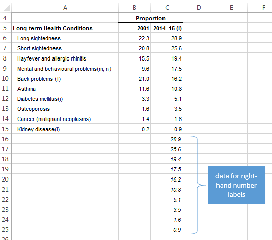
Did you notice rows 16:25 only have values in column C? This is the trick to having the labels on the right-hand side displayed as Value and then Series Name. It’s simply a repeat of the values in cells C6:C15. By repeating the series we can have separate value and series name labels on the right-hand side, and therefore force the order of the labels.
Now is probably a good time to disclose that this chart is a labour of love, because each label must be created one….. by….. one! I never said it would be easy.
If you can’t be doing with all that faffing around you can skip ahead to my shortcut, which basically uses the default label order: series name and then value on both ends of the line. Strictly speaking, it’s not the correct layout for the right-hand labels as per Tufte’s design, and while it’s not as easy to read, it’s not that much more work for the reader.
Download the workbook
Enter your email address below to download the sample workbook.
Creating Slopegraphs in Excel
Watch the video:
Step by Step written Instructions:
Step 1: Select cells A5:C15 (note: don’t select rows 16:25 that are empty in column A and B) > insert a 2D line chart.
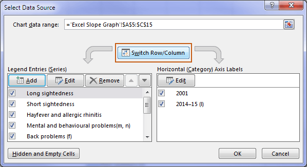
Step 2: Right-click the chart > Select Data > Switch Row/Column:
Step 3: Delete the legend, gridlines and vertical axis. Just left click them once to select and then hit the DELETE key.
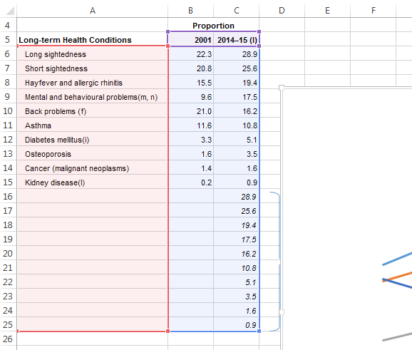
Step 4: Expand the chart range to include rows 16:25; to do this click just inside the border of the chart to select it (tip: don’t click on any of the lines or axis labels). This will put coloured borders around the cells in the worksheet that feed the chart. Left click and drag the blue square in the bottom right border of cell C15 to expand the range to row 25:
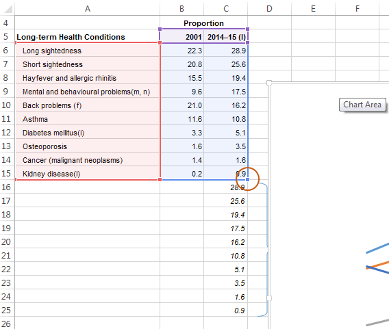
You shouldn’t notice any changes to your chart, but your highlighted range should now look like this:
Step 5: Labelling – this is where the fun begins. Get comfy.
See below for instructions for your version of Excel:
Excel 2007/2010: With the chart selected go to Chart Tools: Layout tab > Data Labels > More Data Label Options.
Apply the settings as per the dialog box in the screenshot below (Series Name, Value, left aligned and space separator):
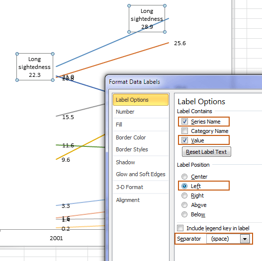
Tip: using the space separator will allow you to display the label on one line, i.e. without wrapping the text.
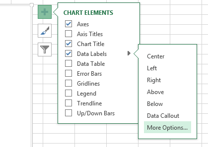
Excel 2013/2016: With the chart selected go to Chart Tools: Design tab > Add Chart Element > Data Labels > More Data Label Options. Alternatively, you can use the ‘+’ icon on the top right of the chart to access the Format Data Labels pane:
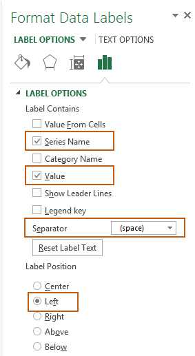
This will open the Format Data labels pane in the right-hand side of your Excel window. Apply the settings as per the screenshot below (Series Name, Value, left aligned and space separator and uncheck ‘Show Leader Lines’):
The annoying thing here is these settings are only applied to one line at a time! So, while the dialog box is still open, use your mouse or up arrow key to select the next label in the chart and apply the same settings.
Make your way through each line until they all have the same formatting. Get a snack if required.
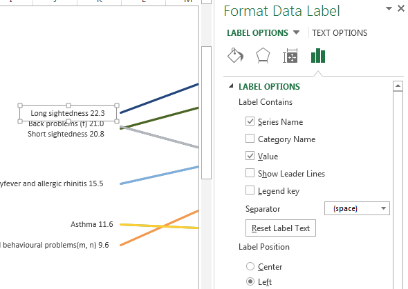
At this stage your left-hand side labels should consist of one label displaying the Series Name and Value for each line. In the screenshot below you can tell the selected label is a single label because it has a box surrounding both the series name and the value:
Step 6: Now for the right-hand side. You might like an amenities break before you tackle this side. This is where the two/duplicate series earn their keep.
Here we want to keep the value label from the dummy series (from rows 16:25), and keep the series name label for the other. This is because we want to display the value first and then the series name, and unfortunately we can’t change the order they are displayed in so instead we have to trick Excel into doing what we want.
For each label you need to click it twice to select just the right hand side, then uncheck ‘Value’ and set the label position to ‘Right’.
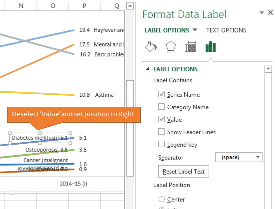
It should then look like the screenshot below with the series name on top of the value label:
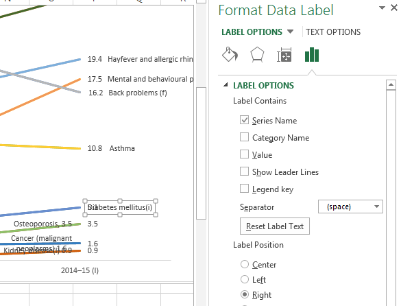
Now just left click and drag the label into position so it’s not overlapping the value label. Tip: hold down the SHIFT key while dragging to keep them horizontally aligned.
Step 7: Resize the chart/labels to prevent word wrapping.
In Excel 2007/2010 you can’t resize the label boxes so you have to make the chart really wide and then reduce the plot area on the right so the lines aren’t too wide:
Excel 2013/2016 resize the chart and left click the label boxes twice (slowly) to activate the square pull handles which allow resizing of the label boxes:
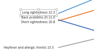
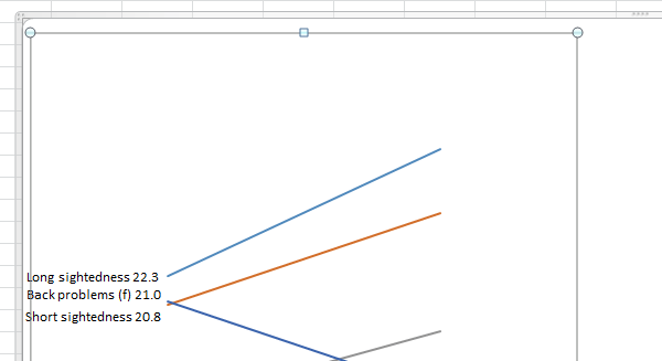
Step 8: Left click and drag to reposition any labels vertically that overlap. Make sure they’re in the correct order with the larger values above the smaller ones.
Step 9: Format the line colours to something neutral, like dark grey. Highlight one or two lines, but don’t make your chart look like a game of Pick Up Sticks!
Step 10: Give your chart a title.
Excel Slopegraph Shortcut
Follow these steps if you’re happy for your Slopegraph to have the series labels on the right-hand side displaying the series name and then the value like this:

Complete steps 1 through 3 above.
Skip step 4, then continue to step 5 above.
In addition to Step 5, you then need to align the right-hand labels to the right. To do this left click the right-hand labels twice (slowly) and then set the Label Position to right.
Skip step 6 and then complete steps 7, 8, 9, and 10.
Other Slopegraph Methods
If your Slopegraph is something you’ll want to regularly update then I recommend you use the Scatter Chart technique developed by E90E50, as this allows for more dynamic changes to the source data, including adding new data. It’s a bit more work to set up, but you’ll reap the rewards in the long run.

Great post Mynda! I really like how these charts make it easy to understand trends at a glance. It is definitely a labor of love, but the end result looks fantastic.
Cheers, Charlie. Glad you liked it. 🙂
Interesting, but too much work for me Mynda (although this is really only because of the large number of series you’ve included in the demo – I could probably manage less than five).
Picking up on a fleeting observation you made in the video, I’d call this type a “fiddlesticks chart”, being a reflection of how they look and the amount of fiddling around required to create one! 🙂
Yes, it’s a special occasion type of chart 🙂
HI Mynda, Your method is simple and clean! I made a dynamic slopegraph with Olympics data.
Thanks so much
Chandeep
Nice. Thanks for sharing, Chandeep.
Nice chart Chandeep.
You should also allow selection in column J.
That would be super 🙂
Sunny Kow
Hi Mynda
A very interesting chart. I use this type chart to compare rankings of sales by product between 2 periods. I would use a line chart with markers so that I can paste images onto the markers (yes, I know it is eye candy but many people like to see it). I only need to change the Set Value In Reverse Order for the vertical axis to “sort” the ranking from top to bottom.
As for the right labels, I normally leave it as it is (Series Name then Value). If I need the Value to be in front, I would create a helper column to concatenate the Value and Series Name. I would then link each of the right labels to the correct cell.
It is a lot of hard work but the outcome is worth it.
Sunny
Cheers, Sunny.
I like the helper column idea. Unfortunately you can only link to a range in Excel 2013 or 2016 chart labels and many people are still on Excel 2010 or earlier!
Hi Mynda
I am using Excel 2010. No problem in linking.
The other advantage in linking is if the figures change, the labels move with them.
If I change your example, the right “Value” labels did not move. Only the “Series” label moves. I guess this is the trade-off if people are unable to link labels to a range.
Cheers
Sunny
Oh, sure you can link one label at a time. I was thinking of the new ability to link to a range of cells in Excel 2013 onwards.