• Skip to main content
  • Skip to header right navigation
  • Skip to site footer

My Online Training Hub

Learn Dashboards, Excel, Power BI, Power Query, Power Pivot

  • Courses
  • Pricing
    • Free Courses
    • Power BI Course
    • Excel Power Query Course
    • Power Pivot and DAX Course
    • Excel Dashboard Course
    • Excel PivotTable Course – Quick Start
    • Advanced Excel Formulas Course
    • Excel Expert Advanced Excel Training
    • Excel Tables Course
    • Excel, Word, Outlook
    • Financial Modelling Course
    • Excel PivotTable Course
    • Excel for Customer Service Professionals
    • Excel for Operations Management Course
    • Excel for Decision Making Under Uncertainty Course
    • Excel for Finance Course
    • Excel Analysis ToolPak Course
    • Multi-User Pricing
  • Resources
    • Free Downloads
    • Excel Functions Explained
    • Excel Formulas
    • Excel Add-ins
    • IF Function
      • Excel IF Statement Explained
      • Excel IF AND OR Functions
      • IF Formula Builder
    • Time & Dates in Excel
      • Excel Date & Time
      • Calculating Time in Excel
      • Excel Time Calculation Tricks
      • Excel Date and Time Formatting
    • Excel Keyboard Shortcuts
    • Excel Custom Number Format Guide
    • Pivot Tables Guide
    • VLOOKUP Guide
    • ALT Codes
    • Excel VBA & Macros
    • Excel User Forms
    • VBA String Functions
  • Members
    • Login
    • Password Reset
  • Blog
  • Excel Webinars
  • Excel Forum
    • Register as Forum Member

Excel Chart Highlighting

You are here: Home / Excel Charts / Excel Chart Highlighting
Exceh chart highlighting
June 29, 2017 by Mynda Treacy

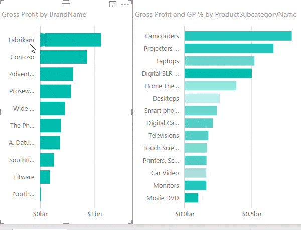
One of the cool features of Power BI is the ability to cross filter and highlight charts. With a simple click on a column or line in one chart we can instantly highlight the selected item in all other charts and tables in our report.

In the animated image below you can see that when I click on a bar in the Gross Profit by Brand Name chart on the left, the chart on the right highlights a portion of the bars to reflect the selected brand.

Power BI cross highlight

Excel doesn’t have the same functionality built in, but we can achieve similar results with Slicers or Radio Buttons, or VBA. Let’s take a look at some non-VBA examples using visitor data for Hawaii.

Download the workbook

Download the workbook and follow along (it will be easier to understand if you do). The workbook also contains links to tutorials explaining how to build these interactive charts.

Enter your email address below to download the sample workbook.

By submitting your email address you agree that we can email you our Excel newsletter.
Please enter a valid email address.

Click here to download the Excel Workbook. Note: This is a .xlsx file please ensure your browser doesn't change the file extension on download.

Data Source: HTA and DBEDT

Excel Chart Highlighting – Overlapping PivotCharts

The PivotChart below highlights visitors for the destination selected in the Slicer (darker green bars) as a proportion of the total visitors (lighter green bars).

excel chart highlighting with overlapping PivotCharts

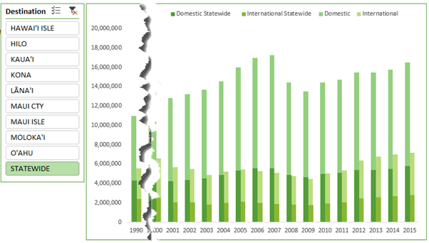
The PivotChart above actually consists of two PivotCharts, as you can see in the image below where I’ve moved the charts apart:

two overlapping PivotCharts

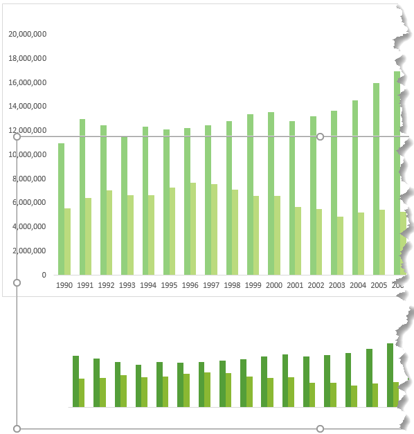
The first/bottom PivotChart is based on a PivotTable in columns A:C and displays the Total Visitors.

The second PivotChart sits above and is based on the PivotTable in columns E:G. It displays the visitors to the Destination selected in the Slicer.

The vertical axis for the second PivotChart is fixed to match the first PivotChart. The fill for this PivotChart area is set to 'None' so that the chart below shows through. Likewise, the vertical and horizontal axis fonts for the top PivotChart are set to 100% transparent.

The downside of this type of chart is the risk that the charts will not align perfectly when opened on other users’ PC’s and or other versions of Excel. Also, since the maximum for the second chart’s vertical axis is hard keyed, it runs the risk of being incorrect if the PivotTable source data changes.

For those reasons, this isn’t my preferred method.

Excel Chart Highlighting – Radio Buttons

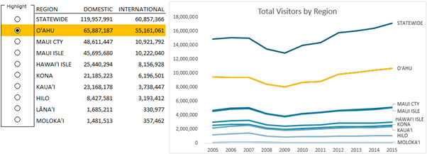
In the image below I’ve used radio buttons to allow the user to select which region they want to highlight in the chart. You can see that O’ahu has been selected and both the row in the table and the line in the chart are highlighted in yellow:

dynamic chart highlighting with radio buttons

Users can toggle through the different radio buttons to change focus. This is useful in line or scatter charts where there are many series.

Techniques Used

Radio Buttons - These allow the user to select which region to highlight in the chart. You’ll find radio buttons on the Developer tab > Insert > Form Controls. How to enable the Developer tab.

Cell F4 contains the radio button number that is selected.

radio buttons to select region

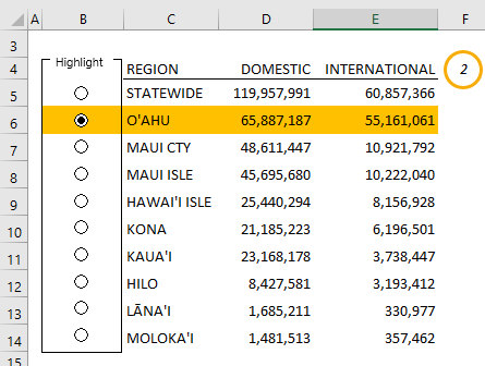
This value is used by the Conditional Formatting for the yellow fill in the selected region in cells B5:E14 and the INDEX formula in column AD.

The table of values in C5:E14 is built using the GETPIVOTDATA function and references a PivotTable in columns AF:AH.

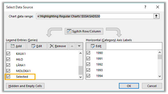
Highlight Selected Region’s Series in Chart - The selected region's line is highlighted in yellow. This is a duplicate series (called 'Selected) in the chart source data (contained in columns S:AD). This series sits on top of the original/selected region's line, which is why it is last in the list of Legend Entries in the Data Source dialog box below:

highlight select region

The INDEX formula in column AD of the chart source data (image below) contains the values for the 'Selected' series which changes based on the radio button that is selected.

index formula in column AD

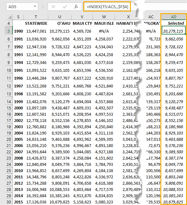
Image above - Chart Source Data

Tip: Use the GETPIVOTDATA function to get the values from your PivotTable, that way you can still benefit from the PivotTable functionality, but aren’t limited to PivotCharts. Of course, you could use the SUMIFS function to build your chart data source table if you prefer.

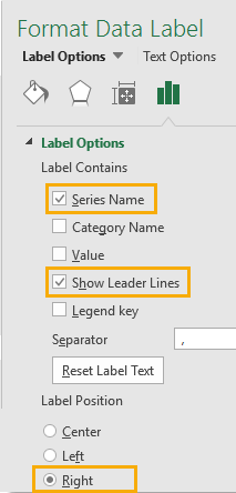
Label Lines instead of Legend - Charts that contain lots of lines are easier to interpret if you can label each line.

The trick here is to add labels to the last point in the chart and set the label to the 'Series Name' and position it to the 'Right'.

Tip: To add a single label you must first select the line with a single left click, then left click the last point again to select just it, then add labels.

Add leader lines to your labels if you need to position the label slightly above/below the line.

leader lines on data label

Want more?

These examples combine various techniques to create an interactive experience for the user, and there are many more ways we can provide this and similar forms of interactivity.

In my Excel Dashboard course, I aim to equip you with lots of skills and ideas like those above, but also give you the confidence to try new things and experiment with Excel’s tools to create custom solutions to your needs.

If you want to explore what Power BI is capable of, then please consider my Power BI course. Or become a data visualisation master and can get both courses in a discounted bundle available from the Power BI course page.

Exceh chart highlighting

More Excel Charts Posts

picture fill excel charts

Picture Fill Excel Charts

Using a stylish picture fill in your Excel Charts is a simple way to make your data visualizations more captivating and memorable
excel speedometer charts

Excel Speedometer Charts

How to build Excel Speedometer Charts or Gauge Charts as they're also know, why they are BAD and what to use instead.
burn up burn down charts

Excel Project Management Burn Down and Burn Up Charts

Excel Burn Down and Burn Up Charts are easy to make with line or scatter charts. They are useful for monitoring the progress of a project.
wee people font charts

Excel WeePeople Font Charts

Excel WeePeople Font Charts are a nice change from generic shapes for waffle charts, bar/column charts and more.
excel dot map charts

Excel Dot Map Charts

Interactive Excel dot map charts are not built-in, but with some creative use of Excel’s built-in tools we can create something unique.
Excel S Curve Charts

Excel S-Curve Charts

Easy Excel S-curve Charts made with PivotTables for project management. Track progress by including budget amounts.
chart axis switch

Excel Chart Axis Switch

Use radio button form controls to create an Excel chart axis switch enabling you to toggle pannel charts between same axis and own axis.

Excel Charts with Shapes for Infographics

Excel Charts with Shapes for Infographic styling and increased interest in your charts. Easy to insert but there are a few tricks required.
excel pyramid chart

Excel Pyramid Charts

Excel Pyramid charts are useful for visualising demographic data across multiple categories. Let’s look at 3 ways we can build them in Excel.

Highlighting Periods in Excel Charts

Highlighting Periods in Excel Charts helps your users interpret them more quickly and or focus their attention on a point or area.


Category: Excel Charts
Previous Post:List Files in Folder Using FILES XLMList Files in a Folder Using FILES XL Macro (XLM)
Next Post:Excel Chart Secondary Axis Alternatives

Reader Interactions

Leave a Reply Cancel reply

Your email address will not be published. Required fields are marked *

Current ye@r *

Leave this field empty

Sidebar

More results...

Featured Content

  • 10 Common Excel Mistakes to Avoid
  • Top Excel Functions for Data Analysts
  • Secrets to Building Excel Dashboards in Less Than 15 Minutes
  • Pro Excel Formula Writing Tips
  • Hidden Excel Double-Click Shortcuts
  • Top 10 Intermediate Excel Functions
  • 5 Pro Excel Dashboard Design Tips
  • 5 Excel SUM Function Tricks
  • 239 Excel Keyboard Shortcuts

100 Excel Tips and Tricks eBook

Download Free Tips & Tricks

Subscribe to Our Newsletter

Receive weekly tutorials on Excel, Power Query, Power Pivot, Power BI and More.

We respect your email privacy

Guides and Resources

  • Excel Keyboard Shortcuts
  • Excel Functions
  • Excel Formulas
  • Excel Custom Number Formatting
  • ALT Codes
  • Pivot Tables
  • VLOOKUP
  • VBA
  • Excel Userforms
  • Free Downloads

239 Excel Keyboard Shortcuts

Download Free PDF

Free Webinars

Excel Dashboards Webinar

Watch our free webinars and learn to create Interactive Dashboard Reports in Excel or Power BI

Click Here to Watch Now

mynda treacy microsoft mvpHi, I'm Mynda Treacy and I run MOTH with my husband, Phil. Through our blog, webinars, YouTube channel and courses we hope we can help you learn Excel, Power Pivot and DAX, Power Query, Power BI, and Excel Dashboards.

Blog Categories

  • Excel
  • Excel Charts
  • Excel Dashboard
  • Excel Formulas
  • Excel PivotTables
  • Excel Shortcuts
  • Excel VBA
  • General Tips
  • Online Training
  • Outlook
  • Power Apps
  • Power Automate
  • Power BI
  • Power Pivot
  • Power Query
microsoft mvp logo
trustpilot excellent rating
Secured by Sucuri Badge
MyOnlineTrainingHub on YouTube Mynda Treacy on Linked In Mynda Treacy on Instagram Mynda Treacy on Twitter Mynda Treacy on Pinterest MyOnlineTrainingHub on Facebook
 

Company

  • About My Online Training Hub
  • Disclosure Statement
  • Frequently Asked Questions
  • Guarantee
  • Privacy Policy
  • Terms & Conditions
  • Testimonials
  • Become an Affiliate

Support

  • Contact
  • Forum
  • Helpdesk – For Technical Issues

Copyright © 2023 · My Online Training Hub · All Rights Reserved. Microsoft and the Microsoft Office logo are trademarks or registered trademarks of Microsoft Corporation in the United States and/or other countries. Product names, logos, brands, and other trademarks featured or referred to within this website are the property of their respective trademark holders.