Something I've wanted to do easily in Excel is plot equations. If I have something like 2x2 + 3x + 2, I want to see a plot or graph of the curve that the equation produces.
I know there are ways to do this that involve producing a set of data points, and then using those to create a chart, but I want to be able to just say, here's my equation, plot it.
I turned to Python to do this as it has the capability to plot equations quite easily. The issue was how do I get Python to run in Excel?
Python in Excel
There are a number of packages that allow you to run Python in Excel: xlwings, PyXLL, and DataNitro are three options.
xlwings is free and open source.
DataNitro offers a 30 day free trial, but will keep working after this. If you purchase one of their membership options you get added benefits like ongoing support and updates, and the ability to write UDF's in Python.
PyXLL also offer a 30 day free trial, and then paid options after that.
For this, I chose to look at DataNitro, but will look at the others in the future.
Python
Python is a powerful, easy to learn programming language - I've started helping my 11 year old son learn it.
It is used in myriad fields like web and internet development, databases access, scientific and numeric work, and software and game development. That is a very short list of examples of what it is capable of.
These days it is mentioned a lot in relation to data science and machine learning. Microsoft have thrown their support behind Python with a product called Machine Learning (ML) Server that supports both Python and R. ML Server is built in to SQL Server 2017.
Visual Studio also has great support for developing in Python.
But let's not get too far ahead of ourselves. Microsoft's adoption of Python (and R) is fantastic and I for one feel like a kid in a candy store.
Installing DataNitro
Unfortunately the documentation for DataNitro is a bit out of date and I had a few issues installing and getting it to work.
When I tried to run some Python scripts it complained that the NumPy library was missing. NumPy is a software package for Python that includes mathematical and scientific functions.
I knew it wasn't missing as I had Python already installed on my PC with NumPy and other libraries included. However, reinstalling NumPy fixed the issue.
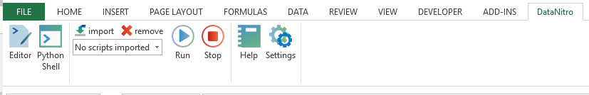
Once it was up and running I really liked the way the thing works. DataNitro installs as an add-in in Excel and will appear on your Ribbon.
Running Python Scripts
To run a Python script you first need to import the script to Excel. From the Data Nitro area of the Ribbon, click on the import icon, locate your script and then click on Run to, uh, run it 🙂
Once you've imported the script you can click Run to run it again, no need to import it more than once.
Plotting Equations
What I really wanted to do was to have a Python script where I could just write out my equation, and have Python plot it.
Here's the Python code, you can see I've written y = 3*x**2 + 4*x + 2 for my equation.
In Python if you want to raise a number/variable to a power e.g. x2, you write it as x**2.
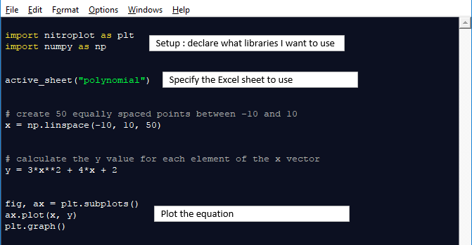
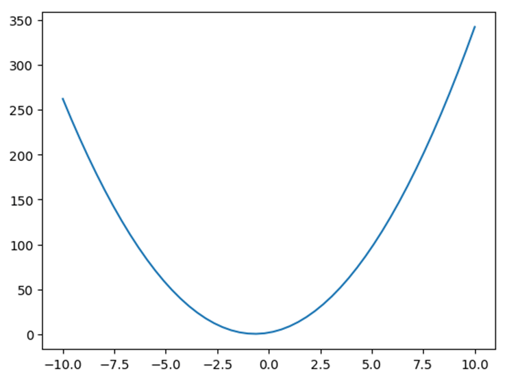
Here's the graph this produces, which is inserted as an image in the worksheet called polynomial.
I can click on the Editor icon in the Ribbon which allows me to edit the Python code. Changing and saving the code allows me to run that changed code right away in Excel.
If I change my equation to 2*x**3 - 3*x**2 + 4*x + 2, I get this
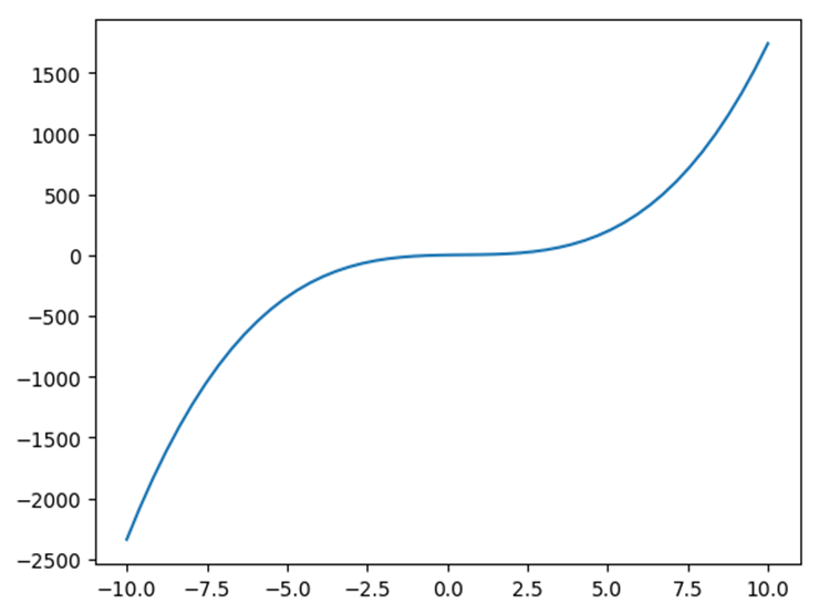
To plot a different equation it's as simple as changing one line of code and re-running the Python script.
So if I wanted to plot Sin(x) my equation is simply y = np.sin(x) and I get this plot
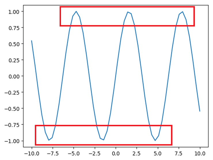
You'll notice that the peaks and troughs of the curve are a little jagged. This is because I've only specified 50 points along the length of the curve between the values -10 and 10.
x = np.linspace(-10, 10, 50)
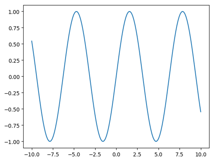
If I increase the number of points (to 150) then the curve will look smoother
x = np.linspace(-10, 10, 150)
which gives me this
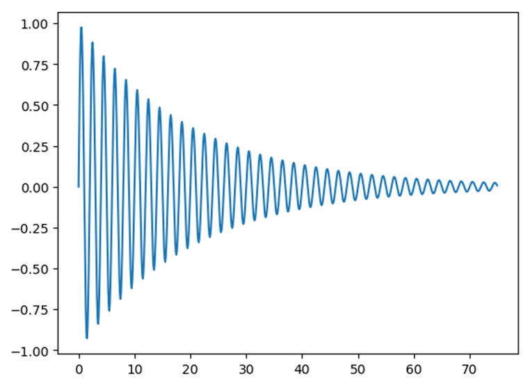
Something a Little More Complicated
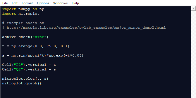
Let's say we want to plot a sine wave that decays over time. We'll use this Python code
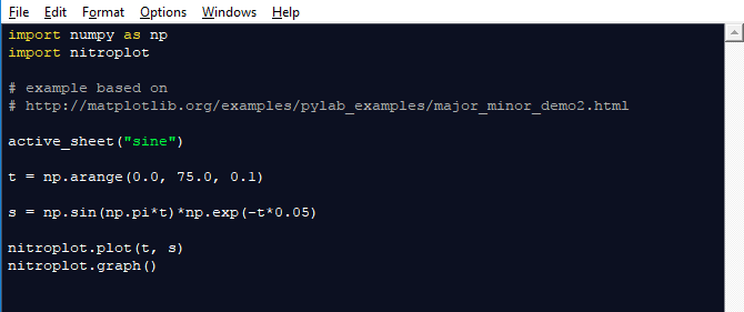
The code that describes the decaying sine wave is s = np.sin(np.pi*t)*np.exp(-t*0.05) which means sin(π*t) * e(-t*0.05)
The curve we get is
We can write the values we're plotting to the Excel sheet with a couple of lines of code. To see the values for t we write Cell("P2").vertical = t and for s we write Cell("Q2").vertical = s.
This will list the values for t in column P starting at P2. The values for s will be in column Q starting at Q2.
The code looks like this
I've only scratched the surface of what you can do with Python in Excel.
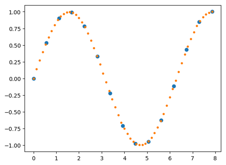
A couple of things that I was looking at but didn't include in this post are, given a fixed set of points, interpolating a curve to fit that data. In this plot the data points are blue and the interpolated points are orange.
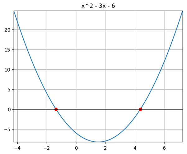
and finding the roots of polynomials.
Formatting of Plots
The plots you see here haven't had any fancy formatting, labels etc applied to them. But this is all possible. If you've never used Python, or just used it a bit, I encourage you to explore what it's capable of.
Or if you are an old hand at Python, try linking it to Excel and see what you can do.
Either way, if there's anything you'd like me to look at, let me know.
Python Code
All the Python code I have used has either come from the DataNitro examples, or from the matplotlib site.
I have modified them and you can download these modified files, and the workbook I used below.
Don't forget you'll need to install something like DataNitro to be able to run the Python code.
Enter your email address below to download the Python code and Excel workbook.
Download This Blog Post as a PDF
You can download this post as a beautifully formatted PDF.
Just enter your email above and the download link will appear.


Couple of points:
xlwings now incorporates Excel-Python, and will also do UDFs these days (in fact I use the UDF approach almost exclusively).
You can actually plot a graph from a function in Excel without Python (or even VBA):
https://newtonexcelbach.wordpress.com/2010/12/15/charting-a-mathematical-function-with-defined-names/
There are a lot of things you can do with Python that you can’t do direct with Excel of course, including connecting to Matplotlib, so it’s well worth looking at.
Thanks Doug.
I was aware of the defined names method of plotting and it works quite well if a bit fiddly to set up.
xlwings looks good and I’ll look at that next
Cheers
Phil
These are some great examples, thanks for sharing. will you by any chance be reviewing the other tools? Given that xlwings is an open source product – it would be nice to see something similar to what you did with Nitro.
Hi Manny,
Yes I’ll look at xlwings and PyXLL too.
Regards
Phil