
August 17, 2011
Create a Pivot Table Direct From Access
Did you know you can analyse data from an Access database in an Excel Pivot Table without importing the data
Read More
August 17, 2011
Did you know you can analyse data from an Access database in an Excel Pivot Table without importing the data
Read MoreAugust 10, 2011
So, you’ve analysed your data and plotted your chart but the axis labels are all skewey (technical term). Let’s look
Read More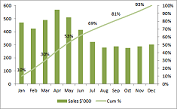
August 3, 2011
One of the Excel questions I get asked often is; how do I add a secondary axis to my chart?
Read More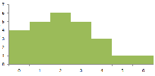
July 20, 2011
A Histogram, also known as a frequency distribution, is a chart that illustrates the distribution of values that fall into
Read More