A Histogram, also known as a frequency distribution, is a chart that illustrates the distribution of values that fall into groups.
Since my 5 year old is big into his football (soccer) we’ll take goals scored as an example…even though in 5 year old's football matches you’re not supposed to count the goals scored!
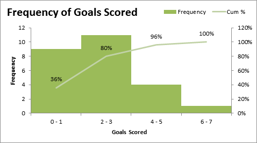
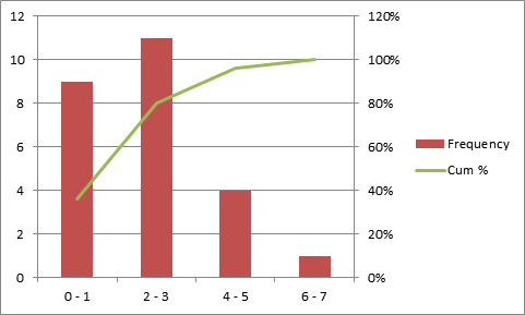
Below is the end result. I've added a cumulative percentage to this chart to aid with further interpretation of the data, but the histogram itself is the column chart.
From the histogram we can see that we've scored 2-3 goals in 11 matches. And from the cumulative percentage we can see that in 80% of matches between zero and three goals are scored.
We could also use this type of chart to plot:
- Distribution of student grades
- Performance of salespeople e.g. groups might be units sold
- Distribution of salaries across headcount
- Plus various scores, ratings and other data you want to see the frequency distribution of.
How to create a Histogram Chart
The first thing we need to do is compile our data into a table that can feed our chart.
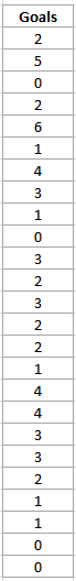 On the left we’ve got a list of the goals for the last 25 matches. The first thing we need to do is specify our groups, or bins as they are often referred to.
Since our data range is only small (between zero and 6 goals) our bins will be small: 0 – 1, 2 – 3, 4 – 5 and 6 – 7. In fact we could just as easily have a bin for each number from 0 to 6, but I want to show you how to use the FREQUENCY function so we’ll have small groups.
Next we need to set up a table that will feed our histogram chart like this:
Frequency Table Explained
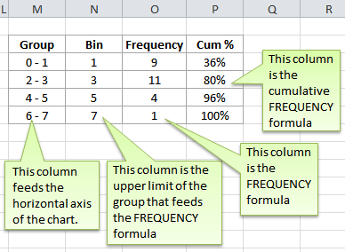
Group Column
These are simply the groups that will appear on the horizontal axis of the chart.
Bin Column
The bins are the upper limits of the groups and are used by the FREQUENCY formula. You can see that the bin value for the group '2-3' is 3.
Frequency Column
The Frequency Column contains the FREQUENCY formula. The FREQUENCY function is actually an array formula which means it needs to be entered using CTRL+SHIFT+ENTER.
The syntax for the FREQUENCY function is:
=FREQUENCY(data_array, bins_array)
and our formula is:
{=FREQUENCY(K5:K29,N5:N8)}
Note: the curly brackets are entered by Excel when you press CTRL+SHIFT+ENTER to enter the formula.
Tip: select all the cells that will contain your FREQUENCY formula (in our case O5:O8), then enter the formula, then press CTRL+SHIFT+ENTER and your formula will automatically be entered in all the required cells with the curly brackets.
Note: since this range containing the FREQUENCY formula (O5:O8) is an array you can only edit the whole array. Excel will give you an error if you try to modify a part of the array on its own.
Cum % Column
This is simply a cumulative percentage of the frequency. To calculate this, the formula in the first cell is:
=SUM($O$5:O5)/SUM($O$5:$O$8)
Tip: The first cell reference in the above formula, $O$5, is what is called an absolute reference and the second, O5, is a relative reference. This is so that when you copy the formula down the remaining cells it will automatically update to include the next cell in the formula, and thus calculates a cumulative percentage.
Enter your email address below to download the sample workbook.
Now that we have our frequency table ready we can plot our Histogram chart.
How to create a Histogram Chart
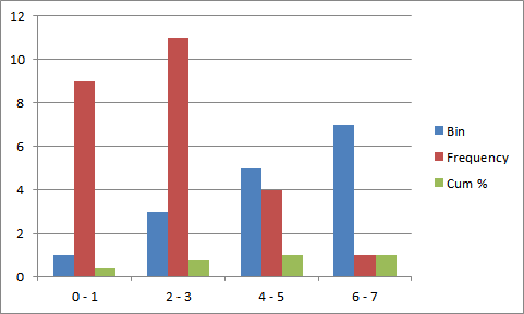
- Highlight the frequency data table (cells M4:P8)
- From the Insert tab of the ribbon select Column > 2-D column. You should end up with something like this.
- Remove the Bin data from the chart. Select the blue bin data columns (just click on one of the columns) and press the delete key to delete them.
- Change the Cum % to a line chart. Select the Cum % column, right click and select Change Series Chart Type.
- Select a line chart.
- Move the Cum % to a Secondary Axis. Select the Cum % line on the chart, right click and select Format Data Series.
- In the Series Options tab select Secondary Axis. It should look like this now:
- Remove the gap between the bars. Select the Frequency bars on the chart and right click and select Format Data Series.
- In the Series Options tab reduce the Gap Width to 0%.
- Add labels and format. Select the chart and from the Layout Tab on the ribbon add a chart title and axis labels. Click inside the labels to add your text.
- Reposition your legend to the top right of the chart. Click on the legend and drag the outer edge of the box to the top. Resize the box using the pull handles so that the data is side by side rather than stacked. This will make it fit better at the top of your chart.
- Remove gridlines. Click on the horizontal gridlines and press the delete key to remove them.
- Resize chart. Click inside the chart area so that the pull handles are visible (see squares and circles on the outline of the chart in the image below) and resize it by grabbing the mid pull handle on the right hand side, and dragging it to the right to resize it and fill the gap left from the legend.
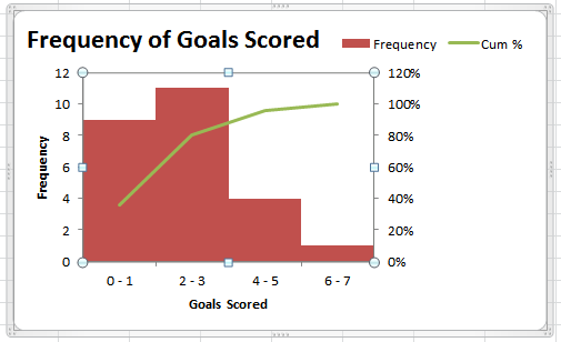
- Add data labels to line chart. Select the line in your chart and from the Layout tab on the ribbon select Data Labels > Above.
- Change bar colour. Select the Frequency bars and from the Format tab on the ribbon and select a new colour from the Chart Styles section.
Your chart should now look like this:
While this may seem like a lot of steps, once you get to grips with formatting charts you can do all this in about a minute.
Our premium training has comprehensive video tutorials on Excel Charts. Click here to sign up for our Excel Training.

Whoa,,,! Thanks so much for the vital information on how to contract frequency table and histogram charts.
I actually tried one of the samples and it really helped me with my project.
kind regard.
Moses Mawi
Glad you found it helpful, Moses 🙂
How we can draw a histogram having a frequency of zero?
Hi Roman,
Just make the first bin size zero.
Mynda
Straight to the point explanation and exploration guide.
Thanks a lot.
You’re welcome Uche, thank you for your feedback 🙂
Thank you so much!!
You just saved my life.
🙂 you’re welcome, Faisal. All in a day’s work.
THERE’s an EASIER way. It uses PivotTables (far more flexibility) that have a drag and drop interface. The trick is to put the field with the numbers (like grades) in both the row labels and the values labels. Then you can group (aka bin) the data by any number you want. Also works well with dates. If you want custom groupings, you can manually do that too.
Hi Jonathan,
Nice Info right there.
Thanks for sharing.
Cheers,
CarloE
Is there anyway to move the cumulative frequency line to the right of the graph?
Hello Natalie,
Nope, Excel won’t allow it. Also, moving the line graph to the right would defeat the purpose of presenting the cumulative frequency in the graph. This kind of presentation is actually called “Pareto Chart” used for quality control in companies and businesses around the world. You might want to create two separate charts though if you want the two chart types to be beside each other.
Thanks!
Mike
Hi, WOW!! – was my expression- once i actually could complete it myself with a different example. Additionally, in this tutorial i learnt how to use frequency function in arrays.
As usual – Simply Awesome!!!
Cheers, Raghu 🙂
Thanks for the tip. I’ve been trying to do this using Excel for Mac (Office 2011). One thing I’ve noticed is that once I enter the equation:
{=FREQUENCY(F12:F10011,Z11:Z22)} and then press control-shift-enter, it seems to work for the first cell, but the subsequent cells increment row numbers (e.g., {=FREQUENCY(F13:F10012,Z12:Z23)}).
This gives me different results and does not seem consistent with what your worksheet shows (where the rows do NOT increment). Have I done something differently?
Hi Peter,
You need to select all the cells that will contain your FREQUENCY formula, then enter the formula, then press CTRL+SHIFT+ENTER and your formula will automatically be entered in all the required cells with the curly brackets.
You don’t actually copy it down. Is that what you are doing?
Kind regards,
Mynd.
Can you do the same with time stamps like 16/05/2012 00:00:00 or it it just limited to number ranges ..?
Hi Tom,
Yes, just change the bins to use a time/date format and set your bin sizes to suit your data. As long as your bins are not text values it will work.
Kind regards,
Mynda.
very useful
Very nice initiative
I’ve looked for lots of resources on making a histogram in Excel and they are all pretty similar to this one. This is helpful if you are manually entering in all your data but what happens when you have, say… 40,000 data points that you’d like to make into a histogram?
Hi Lynn,
It doesn’t matter how many data points you have (as long as you don’t exceed the number of rows/columns available in Excel) since you use the FREQUENCY function to group your data into bins. You would never have 40,000 bins, you’d group those data points into bins just as I have done in the example.
I hope that makes sense, and your 40,000 data points are no longer insurmountable.
Kind regards,
Mynda.
Thank you for the post.
My pleasure, Vikas. Glad you liked it.
Kind regards,
Mynda.