One of the Excel questions I get asked often is; how do I add a secondary axis to my chart? It’s actually quite easy but there is a trick to it.
Excel Secondary Axis Trick Step 1
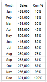 Let's take this data. Now, the first thing you want to do is simply insert your chart. Insert > Charts > Select Line Chart.
I hear you…you might not want a line chart, but trust me this is the easiest way to perform the secondary axis manoeuvre. You can change it to the chart type you want after you’ve inserted the secondary axis.
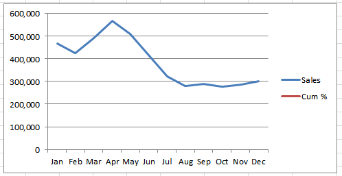
Now, what you may find is that you can’t even see the data you want to move to the secondary axis since it’s on a massively different scale.
As you can see in the example below the percentages are so small you can’t even see the line for them. Note: this is in Excel 2010, but in Excel 2007 you can typically always see the line at the bottom.
Tip: as a general rule the line that you want to plot on the secondary axis is generally the data on the smaller scale. So in this example it’s the cumulative percentage.
Excel Secondary Axis Trick Step 2
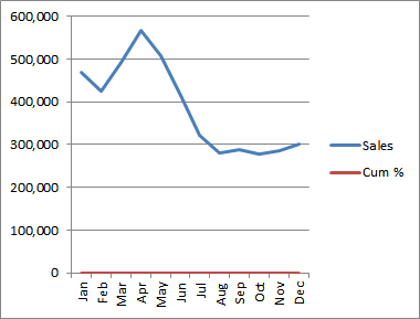
If you can’t see the line you want to plot on the secondary axis at the bottom of your chart simply squash the chart until it comes into view. Click the chart > grab the handle on the right side and drag to the left.
Voila! Now your chart should show the second line at the bottom like this:
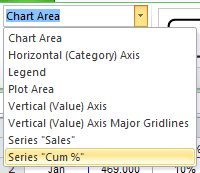
Alternatively you can select it via the Chart Tools: Format tab, in the 'Current Selection' group click on the drop down list to reveal all of the chart components:
Excel Secondary Axis Trick Step 3
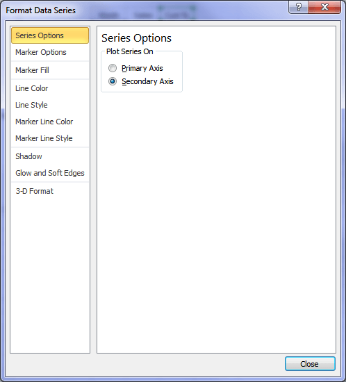
Click on the line you want to plot on the secondary axis > Right-click > Format Data Series > Series Options > Secondary Axis.
Tip: If you’ve got Excel 2010 you can double click the line to open the Format Data Series dialog box. That’ll save you a few clicks 🙂
Now your chart will look like this. Ugly! But now that you have your secondary axis you can go about fixing the formatting and change the chart type for the Sales value to your preferred chart etc.
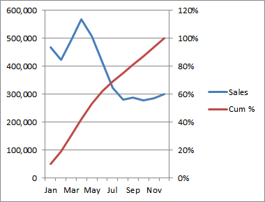
Here’s what I’ve done:

What can I interpret from my chart?
- Monthly sales are higher in the first half of the year.
- Over 50% of my sales are achieved by May
- Over 80% of the annual sales are made with only 2/3rds of the year gone.
If you tried to get that same insight from a plain table of numbers it would take you a lot longer than the few seconds you can look at a chart and understand what’s going on.
The chart formatting steps I took:
- Removed the grid lines.
- Widened the chart.
- Changed my sales data to a column chart.
- Changed my number format to thousands.
- Modified my legend to show ‘Sales $’000’.
- Moved my legend to give space for my axis labels so they aren’t vertical aligned.
- Changed my secondary axis maximum to 1.
- Added data labels to my secondary axis to aid with interpretation.
- Removed every second data label to reduce clutter.
- Changed the colours of my chart to allow labels to be more easily read.
Those 10 steps took me less than 2 minutes.
Enter your email address below to download the sample workbook.
If you’d like to learn the exact steps to make these changes you’ll find comprehensive video tutorials in our Premium Excel Training. Click here to sign up.

These are great ideas but I’m looking to add in a line to separate sections of a chart. I’ve tried adding an xy line but it’s working as I want it (it won’t go where I want it to!). Can it be done?
Hi Deirdre,
You can add error bars to your XY scatter chart for vertical separators. It’s a bit complicated to explain step by step here, but if you get stuck you can post your question and Excel file on our forum where we can help you further.
Mynda
Thx, but i’m looking for how to add a title to the secondary axis. Haven’t been successful yet..
Hi Rick,
I’ll assume you have Excel 2010: click on the chart > Chart Tools: Layout tab > Axis Titles. There you’ll find the options to turn on/off the secondary axis title.
Let me know if you get stuck or have a different version of Excel.
Kind regards,
Mynda
What a great post. Can you please show step by step of how you removed the data labels to every other. thanks
regards
Rock
Hi Rock,
To delete select labels you click on the labels once and then click the one you want to delete again. This will select just one of the labels and you can then press the DELETE key to remove it 🙂
Kind regards,
Mynda
Wow, thank you so much
Regards,
rock
Hi Mynda,
Thanks for the very useful explanation.
The question I’m going to ask has already been asked, but I could not find the answer here, hence asking the same question.
1. My Primary Axis has numbers.
2. My Secondary Axis has % – almost the same as in your example, except that my Primary Axis has negative numbers. The % in secondary axis is cumulative, hence positive only.
My issue is that Primary axis’s “0” and Secondary axis’s “0%” is not on same lines. How could I do this?
This is how it is:
3 _______________ 50%
2 _______________ 40%
1 _______________ 30%
0 _______________ 20%
-1 _______________ 10%
-2 _______________ 0%
This is how i want:
3 _______________ 30%
2 _______________ 20%
1 _______________ 10%
0 _______________ 0%
-1 _______________
-2 _______________
Thanks & Regards
Thiyagu
Hi Thiyagu,
Thanks for providing an example.
In order to align the zeros on both axes at the same level you need to fix the Minimum and Maximum for both axes to the same range of values. e.g. the Primary axis must have a max of 6 and min of -3 and the secondary axis will have a max of 60% and min of -30%.
You will find that the zero will then be on the same line.
To set your Min and Max select the primary axis > right-click > format axis > Axis Options – set min and max. Repeat for Secondary Axis.
Kind regards,
Mynda
Hi Mynda,
I never thanked you for the immediate and wonderful response to my query. For many months now I have been using the tip you had given me to adjust and align the primary and secondary axis.
My hearfelt thanks to you.
Warm Regards
Thiyagu.
Hi Thiyagu,
Thank you for your kind words. You’ve made my day 🙂
Mynda
Hi Mynda,
I’m trying to created a two sided two column chart but in excel 2010 one column gets hidden behind the other. I can see that the column/line combination works but do you have a suggestion for two colums side by side?
Thanks
Hi Alison,
It sounds like the Series Overlap is set to 100%. To change it right-click on the series > format data series > change Series overlap to -40% of to the desired effect.
Kind regards,
Mynda
This is an excellent description of ways to add a secondary vertical axis in Excel 2010. However, what I am seeking to know is whether there is a way to add a secondary vertical axis for the same data?
I have a single set of lines in a line graph, and on the primary vertical axis (left y-axis) I have one set of units. I would like a different set of units on the secondary axis (right y-axis) which are used to showcase the same set of data.
For example, m3 on the primary vertical axis and acre-feet on the secondary vertical axis; as m3 are substantially larger than acre-feet, the primary vertical axis would have less space between each tick mark while the secondary vertical axis would have more space between each tick mark.
Excel 2010 seems to want to plot a second set of data for the secondary axis. There are no data sets to serve as a secondary set, just the original data displayed for different end-users who use different units.
Any help on this matter is much-appreciated. Thank you.
-Brandon
Hi Brandon,
That’s an interesting question. I’d say you have to add a second series of data for your acre-feet axis (you can use a simple formula to convert the m3 to feet).
Once the series is added you can then plot it on then secondary axis and then hide it by formatting the fill/line (depending on your chart) with no colour.
I hope that helps.
Kind regards,
Mynda.
dear treacy,
could you please help. I need to draw a diagram from a table but i need to have a choice of what i need to be in the X axis and Y axis. thanks in advance
Hi Mourad,
I’m not sure what you mean by ‘draw a diagram’ using a chart, but you can switch the axes by right clicking on the chart > select data > Switch Row/Column.
I hope that helps.
Kind regards,
Mynda.
Mynda,
I really thank you. It is 7.00 AM in the morning and I have to submit a report with graphics like above. I didn’t know how to make it before, and I came to your website.
You’re welcome, Poltak 🙂 Glad I could help.
very helpful & useful tips..
Thanks, Venkatraman 🙂
I totally track with this and it all makes sense but the only option in the Series Options for me is Gap Depth, no ‘Plot Series On’ option.
Hi Amy,
If you have further questions,
try sending it with us : HELP DESK.
Cheers.
CarloE
Hi,
THanks for this. I have followed your steps and my graph works, but my secondary axis contains some negative numbers. I’d like the horizontal axis to hit zero on both the the primary and secondary axis (so the secondary axis and the negative numbers should hang below the graph, if you know what I mean). I have tried setting the min and max and also tried changing the horizontal axis cross but none of these options seem to work – instead I have a graph with the secondary axis information “floating” in mid air, which I think is much more difficult to read, and just looks a bit daft. Any ideas?
Hi Helen,
Let’s address this one at a time.
1) Regarding the “negative” issue, You must use the set of values with some negative ones with your primary axis.
2) If you mean you want your lines/series touch the vertical axis, you must format your horizontal axis:
Format Axis, Position Axis: On Tick Marks.
Of course, I couldn’t really diagnose this without seeing your file.
Why don’t you send it to HELP DESK.
Cheers.
CarloE
Hello
I can plot my two data sets onto a line chart to produce two lines but when i click on one data series (series 2) and create a secondary axis, the secondary axis appears but my series 1 data disappears and I cant find out how to get both lines on with a secondary axis added! Hope this makes sense
Please help
thanks
Ignore that previous comment!
i worked it out, the scale was wrong so as soon as i changed that, the line appeared along the bottom 🙂
thanks anyway
Glad you figured it out, Kat 🙂
Dear Sir,
How can I move secondary axis?
Thanks
Hi Farah,
I’m not sure where you want to move it to. Perhaps you want a different chart style? Alternatively all axis options can be found on the Layout tab in the Chart Tools on the Ribbon.
Kind regards,
Mynda.
Thanks this was really good.. and I could get me work soon.
Regards,
Nidhi
Cheers 🙂
To add two or more axes to Excel, try Multy_Y or EZplot from Office Expander (www.OfficeExpander.com).
There is a free demo version to try.
Cheers.
Thanks for sharing, Wendit.
Thanks!
You’re welcome, Stuart 🙂
I want to create a chart say for following data:
Ldg Rate ttl cgo Time in Hrs
2000 2000 1
5000 7000 2
5000 12000 3
5000 17000 4
5000 22000 5
5000 27000 6
5000 32000 7
5000 37000 8
5000 42000 9
5000 47000 10
5000 52000 11
2000 54000 12
0 1hr 2hr 3hr 4hr 5hr 6hr 7hr 8hr
———x——–x——-x——–x——x——-x——-x——x—-[Cargo 1]
———x——–x——-x——–x——x——-x-[Cargo 2]
———x——–x——-x——–x——x-[Cargo 3]
0 2K 7K 12K 17K 22K 27K 32K 37K
But I want to show Ttl cgo and time on X-Axis. In short, I want one bar representing value of Cgo corrosponding to Time in Hrs. Is it possible??? I had spent enough time on this. Pls help.
Hi Naresh,
You can use a bar chart with a secondary axis for the time.
You only need the last values for each cargo load. Your data table will look like this:
Load Amount Time
Cargo 1 37000 8
Cargo 2 32000 7
Cargo 3 47000 10
Set the minimum and maximum values for each axis as follows:
Amount min: 0, max: 47000
Time min: 0, max: 10
I hope that helps.
Kind regards,
Mynda.
Great info presented clearly! Thank you!
Thanks BSJ 🙂
QUITE INFORMATIVE, THANKS FOR THE SERVICE
You’re welcome 🙂
How do you do the same thing but have the secondary axis be horizontal (X-axis). I can not seem to find a place to change vertical to horizontal (Excel 2010 Mac)
Thanks!
Hi Elisha,
If you want two horizontal axes you can use a Bar Chart and then plot one of your series on a secondary axis. Essentially you still have one X axis and two Y axes but the Y axes are horizontal. I’m not sure how to do this on a Mac, sorry.
Kind regards,
Mynda.