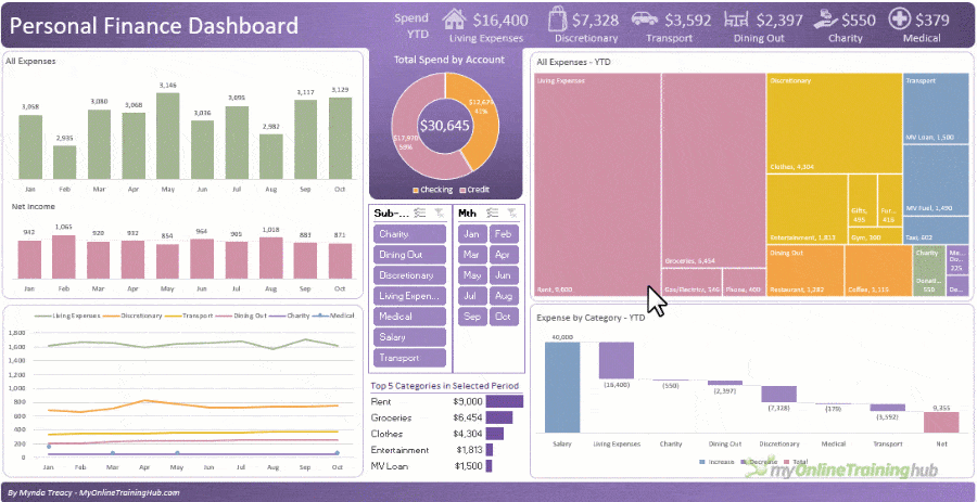
Manage and monitor where your money goes with this personal finance dashboard.
Even if you’re not interested in building your own interactive personal finance dashboard, in this step by step tutorial you’ll learn a load of tips, tricks and techniques you can apply to any dashboard you build.
There are no fancy tools or add-ins required, just regular Excel.
Watch the Video

Download the Excel Dashboard
Enter your email address below to download the sample workbook.
By submitting your email address you agree that we can email you our Excel newsletter.
Please enter a valid email address.

Download the Dashboard. Note: This is a .xlsx file please ensure your browser doesn't change the file extension on download.
Techniques Used to Build Personal Finance Excel Dashboards
- PivotTables – to summarise the data for the charts
- Pivot Charts – to visualise your data
- Slicers – allow filtering of the charts
- Icons – add graphics to help quick interpretation (available in Excel 2019 onward)
- Excel Tables – allows you to update the dashboard with one click
- Data Validation – ensures data entry is consistent and quick
- XLOOKUP or VLOOKUP or INDEX & MATCH – automatically apply category and sub-categories
- Conditional Formatting – for data bars which are mini in-cell charts
- IFS or Nested IF – for multiple logical tests
- TEXTJOIN – Join a variable number of text strings together to create dynamic labels that update with your reports. This function is available in Excel 2019 onward. There are no alternatives to this function for earlier versions.
- Dynamic Text Labels – more examples of creating dynamic text labels.
Learn More
The topics above are a great start, but if you’d like to take your Excel skills further, please consider my Excel Dashboards Course – A comprehensive course designed to give you the skills to build dashboards for any industry.

Hi there,
I’ve added in my own categories, and transaction data, so now when I go to Refresh All on th Dashboard and Analysis sheets, it gives me the following error message:
‘We couldn’t complete the action for the Pivot Table “PTLineChart” in the sheet “Analysis” because there’s already a PivotTable “PTTreemap” there. Make space and try again.’
Once this is working, could you also please tell me how to change the Pie chart on the Dashboard to display categories instead of accounts?
Thanks so much!
Hi Amelia,
The error message explains the problem and solution: “We couldn’t complete the action for the Pivot Table “PTLineChart” in the sheet “Analysis” because there’s already a PivotTable “PTTreemap” there. Make space and try again.
i.e. insert some rows below the PivotTable called PTLineChart so it has space to return the data. You can see the PivotTable names on the far left of the PivotTable Analyse tab.
Mynda
Thank you for the video. Please where can I find the data set for practice?
Under the heading “Download the Excel Dashboard” in the post above.
Under the subscribe button in red above there is some text in large blue saying Download the Excel Dashboard
and under that is an underlined bit of text that says ” Download the Dashboard ”
and that is the actual link which if you press it will immediately download the dashboard to your normal download location ( to find this use keyboard combination <><> ; I.e. command J
Thanks
I liked the video and would love to start tracking my Finances.
Great to hear. Hope you find it useful.
Hey Mynda,
Thank you for both the Personal Finance Dashboard. I’ve completed it and it had seemed to be working well. However when I refresh data after entering new information, the dates that I grouped into months in the pivot tables change back to individual days and the same is reflected in the bar charts and slicers. Please advise
Hi Ken, it sounds like the new data contains dates that are formatted as text. This post explains how you can test if dates are text or proper dates.
Mynda Treacy
May 6, 2023 at 7:32 pm
It’s hold CTRL and left click. This selects the box. Then you can press the delete key. Let me know if you’re still stuck.
How do you do this on a Mac? (fn, control, option nor command keys work)
Thanks.
Hold the Option button and click the outer edge of the text box. This selects the box, then press Delete.
Is there a way to add another year to the template? Such that you can change it based on what year it is? Thank you. It looks amazing tho!
Yes, add the next year’s data to the ledger and then group the PivotTable dates by year and month. You can also add a Slicer for the Year field if you want.
I Cannot get rid of the blue Text Box covering the Dashboard no matter how many times AI press Ctrl, right click, Delete. Frustrating that such a basic thing doesn’t work….
I’ll move on …
It’s hold CTRL and left click. This selects the box. Then you can press the delete key. Let me know if you’re still stuck.
Hi, is it just me or can I just not find the download link?
Hi Stefan,
Look after this text:
“Download the Excel Workbook and follow along.” This is actually a link, even if it’s not properly highlighted as expected.
Thank you!
Can’t find it
The workbook download? Not sure how you can miss it, it’s right under the video?
Can’t find it either !
It’s under the heading ‘DOWNLOAD WORKBOOK’ which is under the video. You just have to enter your email address to get it.
Hi thank you for this, it’s amazing!
For the tree map, how do you handle if new categories come into your transactions data? Do you need to relink to the tree map PT each time a new new category is added?
Hi Jackie,
You can simply reference empty cells below your data to allow for new categories to be added in the future. Treemap charts don’t display anything for empty cells.
Mynda
Oh thank you, that makes perfect sense!
This is a great dashboard!! I was wondering if there’s anyway to include budgeting and not just expenses? I mean if we could have a status or alert that we are going off budget planned?
Yes, absolutely.
Good afternoon I trying the download of file but don’t work.
Hi Michael,
Try right clicking the link, choose the option: Save Linked content as… (.xlsx)
Thanks for sharing wonderful excel workbooks. Appreciate your effort.
Could you help any idea or suggestions in importing Mint Transactions as i keep track of all income/expenses via mint.com. I really appreciate if you could help me with steps or suggestions, so that i can import transactions data every week or month to use your workbook to analyze my personal finance
Hi Nanda,
I’m not familiar with Mint, but presumably you can export the data from Mint to an Excel, .txt or .csv file and then bring it into your dashboard workbook.
Mynda
Hello,
I enjoyed your tutorial video and downloaded your dashboard. Thank you for making the file available.
However, I cannot get the tree map or the waterfall to display at all. Has anyone else had this problem? I am using Excel 2013.
Thank you for your time.
Glad you liked it, Eric! Unfortunately, those charts aren’t available in Excel 2013.
Hi, Thank you for the wonderful workbook. I want to use this for myself but cannot seem to clear your example data and enter my own in the Transactions tab. I tried doing F5 and then choosing Specials… but after I clear all constants, the date is not displaying correctly in the Dashboard (I use the format “2022/01/11 and it displays the date like that and not JAN as your example). Is there something I am missing?
Hi Richard,
The transactions tab should display the date in whichever format you prefer, as long as it’s a proper date serial number. In the PivotTable the dates are then grouped into months.
Hope that clarifies things.
Mynda
Hi Mynda,
Thank you for your reply. The date format I have selected is exactly the same one in the screen shot of the “proper date serial number” link above. It is not working. If I add an extra record at the bottom of Transactions tab, it works perfectly. As soon as I remove your example data, it breaks.
Hi Richard, please post your question on our Excel forum where you can also upload a sample file and we can help you further.
Hello, would you have this dashboard made in Google Sheets?
No, sorry, Justin. I don’t use Google Sheets. You can try recreating it in Google Sheets, but I’m not sure if they have the waterfall and treemap charts.
Thanks! This Excel dashboard looks amazing!!
Thanks, Justin!
Mynda,
Nice dashboard and workbook. It’s a good start, but I think it needs a little more.
I did a lot of corporate reporting over the past 20 years and I got many requests to create new reports. I often then had to ask the requesters what they planned to do with their new reports, i.e.: what actions might they to take based on the reported data?
This was often followed by more questions about what indicators were needed to help identify when and what kind of actions might be needed. How were the results trending over time compared to the users’ goals? Also, what did success and failure look like?
The word “goals” often stumped them, but without goals it can be very difficult to tell whether results are good or whether they indicate issues to be addressed.
This was sometimes followed by the user suggestions that they could just examine the results based on their familiarity with the metrics being measured. They didn’t need goals. The users would just know what to do.
Yeah, that doesn’t work. By the time users got their third report, they mostly skimmed the results and then missed significant issues. There were simply too many trees in the forest and it took too much time and mental effort to determine whether any had issues.
Unfortunately, I find myself asking similar questions here. Essentially, how can we make it easier for a user to determine whether their results the represent success or failure? How can we make this report more actionable?
At a minimum, this report needs to include some goal values, along with visual comparisons of the results to those goals. Charts can work, though you may have other tools, too.
Take care and keep up the good work.
Hi Dave,
Thanks for sharing your experience and ideas. This was less of a lesson on managing finances and more about how to use Excel tools to visualise data. I focused on understanding where your money is going rather than budgeting and comparing to targets. It’s good for people to be reminded that understanding is the start of the process and depending on your situation, you may need more than that to get on top of your finances.
Thanks again!
Mynda