• Skip to main content
  • Skip to header right navigation
  • Skip to site footer

My Online Training Hub

Learn Dashboards, Excel, Power BI, Power Query, Power Pivot

  • Courses
  • Pricing
    • SALE 20% Off All Courses
    • Free Courses
    • Power BI Course
    • Excel Power Query Course
    • Power Pivot and DAX Course
    • Excel Dashboard Course
    • Excel PivotTable Course – Quick Start
    • Advanced Excel Formulas Course
    • Excel Expert Advanced Excel Training
    • Excel Tables Course
    • Excel, Word, Outlook
    • Financial Modelling Course
    • Excel PivotTable Course
    • Excel for Customer Service Professionals
    • Multi-User Pricing
  • Resources
    • Free Downloads
    • Excel Functions Explained
    • Excel Formulas
    • Excel Add-ins
    • IF Function
      • Excel IF Statement Explained
      • Excel IF AND OR Functions
      • IF Formula Builder
    • Time & Dates in Excel
      • Excel Date & Time
      • Calculating Time in Excel
      • Excel Time Calculation Tricks
      • Excel Date and Time Formatting
    • Excel Keyboard Shortcuts
    • Excel Custom Number Format Guide
    • Pivot Tables Guide
    • VLOOKUP Guide
    • ALT Codes
    • Excel VBA & Macros
    • Excel User Forms
    • VBA String Functions
  • Members
    • Login
    • Logout
    • Password Reset
  • Blog
  • Excel Webinars
  • Excel Forum
    • Register as Forum Member

Tour de France Excel Dashboard

You are here: Home / Excel Dashboard / Tour de France Excel Dashboard
Tour de France Excel Dashboard
July 23, 2013 by Mynda Treacy

Since Phil is somewhat of a cycling fan I have been subjected to late night TV of le Tour.

Personally I don’t understand all the complexities of it, what with different jerseys (some of which I must say are a little feminine), how the team aspect works, why crazy fans are allowed to jump out in front of riders and the other shenanigans that go on.

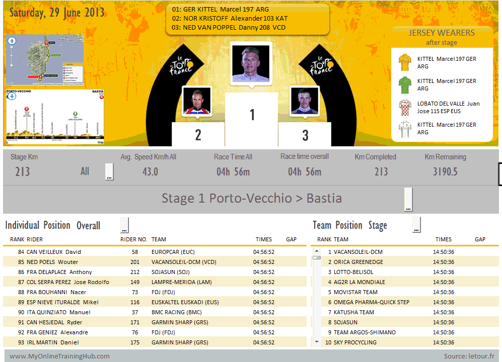
However, being an Excel fan I saw an opportunity to crunch some data, so I thought it’d be fun to put together an interactive Excel dashboard.

Voila

Don’t worry, I’m not going all French on you 🙂

Click to enlarge the image.

Excel Dasbhoard of Tour de France 2013

Click here to learn how to build Excel Dashboard reports like this.

Techniques Used

I really enjoyed putting this dashboard together as it gave me an opportunity to use a lot of different techniques, namely:

  • Picture links for the podium images and maps.
  • Linked Text boxes for the stage statistics summary.
  • Active X Combo Boxes for the stage selection list.
  • Scroll Bar Form Controls for the Individual and Team position tables.
  • Tables to house the source data, and Structured References to build formulas quickly. The other benefit of using Tables was as each stage finished I just pasted the new data under the existing data and it was automatically incorporated into my formulas. Voila, alright!
  • Named Ranges to help with audit trails and ease of building formulas.
  • Shapes for Jersey Wearer table.
  • Custom Number formats to hide zeros and show a + symbol before the gap times.
  • VBA for the image zoom
  • Plus quite a few different Excel Formulas:
    • IF, IF and OR, IFERROR to hide acceptable errors.
    • SUMIFS in the Individual and Team position tables.
    • VLOOKUP to return information about the rider.
    • OFFSET to create a dynamic range that updates when the scroll bars are clicked.
    • INDEX & MATCH to return the Jersey Wearers data.
    • Array formulas

And since all of the data came from the letour.fr website it needed substantial tidying up, and for this I used Text to Columns and a few formulas to rearrange the times that came in as text:

  • MID, LEFT and RIGHT to pull it apart, and
  • TIME to put it back together.

Dashboard Formatting

The formatting I used here is a bit flashier than I’d recommend for a management information style of report but since it’s for a sporting event I thought I’d have some fun with it.

Notice I still stayed in keeping with the colours of the race though.

Challenges

One of the biggest challenges was deciding what information to display. Of course it helped that the official website gave me some clues as to what stats are important. Remember, I am not a cycling fan.

But I needed to fit everything on one page (one of the golden rules of a dashboard), and yet there was so much data.

That’s where the interactive elements allowed me to cheat a little, as they enable me to share a lot more information in one report than I could on one static page.

The primary purpose of this report was to showcase Excel’s Dashboard report capabilities as opposed to a useful report for Tour de France fans, but if I’ve achieved both then très bon, I’ve unexpectedly excelled myself 🙂

Improvements

There’s a list of things I think I could do to improve the report, but time was against me.

For example:

  1. Have the photos change to show top 3 places overall as well as for the stage depending on the selections (Stage or Overall), made in the position tables.
  2. Make information about the teams and riders available from the Position tables or top 3 for each race.
  3. Include images of the country flags for each rider and team.
  4. Include the key moments from each race.
  5. Include some charts that depict the gaps in the riders and teams.

The above are just a handful that come to mind. The great thing about this dashboard is now that the bulk of the hard work is done that I can update and improve it year on year.

Do you have any suggestions? Please leave them in the comments and I can consider them for the 2014 Tour.

Download the Excel File

Enter your email address below to download the sample workbook.

By submitting your email address you agree that we can email you our Excel newsletter.
Please enter a valid email address.

Here is a password protected version in a .zip file.(5.6MB)

If you'd like an unprotected version of the file you can get one free with my Excel Dashboard course.

If you’d like to know how to build interactive Excel Dashboards like this, and more, please take a few moments to check out my course.

Credits

All of the data in the report came from letour.fr.

Special thanks to Jon Acampora for the image zoom idea.

If you know any Tour de France fans or Excel fans please use the buttons below to share this with them on LinkedIn, Twitter or Facebook, or leave a comment below and tell me what you think.

Tour de France Excel Dashboard

More Charts Posts

burn up burn down charts

Excel Project Management Burn Down and Burn Up Charts

Excel Burn Down and Burn Up Charts are easy to make with line or scatter charts. They are useful for monitoring the progress of a project.
wee people font charts

Excel WeePeople Font Charts

Excel WeePeople Font Charts are a nice change from generic shapes for waffle charts, bar/column charts and more.
excel dot map charts

Excel Dot Map Charts

Interactive Excel dot map charts are not built-in, but with some creative use of Excel’s built-in tools we can create something unique.
Excel S Curve Charts

Excel S-Curve Charts

Easy Excel S-curve Charts made with PivotTables for project management. Track progress by including budget amounts.
highlighting data in power bi visuals

Highlighting Data in Power BI Visuals

Learn several techniques to highlight or label important data points in your Power BI visuals. Sample file and code to download.
shape maps in power bi

Shape Maps in Power BI

Shape maps in Power BI can be used to show the distribution of a variable across geographic regions. Learn a trick to plot discrete data too.
using jitter to avoid over plotting

Using Jitter to Avoid Over Plotting in Power BI

Plotting data that has one variable where values are similar, can result in points that are plotted over each other. Use jitter to avoid this overplotting.
Excel custom chart labels

Excel Custom Chart Labels

Create dynamic Excel custom chart labels with this category axis hijack trick
Sorting Excel Date Slicers

Sorting Excel Date Slicers

Slicers have some shortcomings when it comes to dates and sort order. This post explains a couple of ways to sort dates correctly in Excel slicers.
Charting Disparate Data in Excel – 3 Solutions and 1 Crazy Mess

Charting Disparate Data in Excel – 3 Solutions and 1 Crazy Mess

More Excel Dashboard Posts

ai dashboard design

AI Dashboard Design

AI dashboard design can give you some great ideas for design and color combinations, but it’s not smart enough to create useful reports…yet!
dark theme dashboards

Dark Themed Excel Dashboards

Dark Themed Excel Dashboards enable you to use formatting techniques that make your data pop and get your audience's attention.
excel dashboards custom backgrounds

Custom Excel Dashboard Backgrounds

Custom Excel Dashboard Backgrounds bring a level of polish and professionalism to reports and they’re super easy to create using PowerPoint

Embedding Excel Dashboards in a Web Page

Embedding Excel Dashboards in a Web Page from files on SharePoint or OneDrive for Business or OneDrive Personal.
excel student performance dashboard

Excel Student Performance Dashboard

How to build an Excel student performance dashboard from scratch. Download the completed Excel file for reference.
5 Pro excel dashboard design tips

5 Pro Excel Dashboard Design Tips

Excel Dashboard Design Tips you can use in both Excel and Power BI to ensure your reports and quick and easy to read.
excel interactive personal finance dashboard

Interactive Personal Finance Dashboard

Excel Interactive Personal Finance Dashboard to help you visualise and keep track of and manage where you’re spending your money.

Non-financial Excel Dashboards

Step by step how to build Excel Dashboards with non-financial data. Uses Power Query and Power Pivot to visualise NASA data.

Secrets to Building Excel Dashboards in Under 15 Minutes

Learn how to build interactive, clean and focussed dashboards that communicate the important information you want readers to know.
personal share portfolio dashboard

Personal Stock Portfolio Dashboard

Monitor your stocks with this personal share portfolio dashboard built with Excel using the refreshable STOCKHISTORY function and data types.


Category: Excel DashboardTag: charts
Previous Post:Excel Formulas Not Working?Excel Formulas Not Working?
Next Post:Excel Pivot Tables to Extract DataExcel Pivot Tables to Extract Data

Reader Interactions

Comments

  1. janasev

    May 24, 2018 at 6:12 pm

    Good job

    Reply
    • Mynda Treacy

      May 24, 2018 at 7:52 pm

      Thank you!

      Reply
  2. Michael Ogden

    August 23, 2016 at 9:08 pm

    Do you have a 2016 update of this dashboard?

    Reply
    • Mynda Treacy

      August 23, 2016 at 9:45 pm

      No, sorry, Michael. I haven’t updated it recently.

      Mynda

      Reply
  3. Ateny Ajak

    January 16, 2015 at 10:49 am

    Excellent program I have ever seen in my life.

    Reply
    • Mynda Treacy

      January 16, 2015 at 11:28 am

      🙂 wow, thanks Ateny.

      Reply
  4. Diana

    July 29, 2013 at 11:56 pm

    Awesome dashboard! Just wondered if the images made the file so large, or if it was something else. I’m designing a dashboard but need to keep the file relatively small.

    Thanks!
    Diana

    Reply
    • Mynda Treacy

      July 30, 2013 at 9:48 am

      Hi Diana,

      Thanks. Glad you liked it. Yes, the images are what makes this file large, but formulas can do it too, especially array formulas.

      Kind regards,

      Mynda.

      Reply
  5. Meni Porat

    July 24, 2013 at 4:06 pm

    Hi Mynda,

    This is really a masterpiece.

    Amazing….

    Best Regards,
    Meni Porat

    Reply
    • Mynda Treacy

      July 24, 2013 at 6:21 pm

      Wow, thank you very much. I’m grateful for your kind words.

      Mynda.

      Reply

Leave a Reply Cancel reply

Your email address will not be published. Required fields are marked *

Current ye@r *

Leave this field empty

Sidebar

More results...

Course Sale

mynda treacy microsoft mvpHi, I'm Mynda Treacy and I run MOTH with my husband, Phil. Through our blog, webinars, YouTube channel and courses we hope we can help you learn Excel, Power Pivot and DAX, Power Query, Power BI, and Excel Dashboards.

Subscribe to Our Newsletter

Receive weekly tutorials on Excel, Power Query, Power Pivot, Power BI and More.

We respect your email privacy

Guides and Resources

  • Excel Keyboard Shortcuts
  • Excel Functions
  • Excel Formulas
  • Excel Custom Number Formatting
  • ALT Codes
  • Pivot Tables
  • VLOOKUP
  • VBA
  • Excel Userforms
  • Free Downloads

239 Excel Keyboard Shortcuts

Download Free PDF

Free Webinars

Excel Dashboards Webinar

Watch our free webinars and learn to create Interactive Dashboard Reports in Excel or Power BI

Click Here to Watch Now

Blog Categories

  • Excel
  • Excel Charts
  • Excel Dashboard
  • Excel Formulas
  • Excel PivotTables
  • Excel Shortcuts
  • Excel VBA
  • General Tips
  • Online Training
  • Outlook
  • Power Apps
  • Power Automate
  • Power BI
  • Power Pivot
  • Power Query
trustpilot excellent rating
 

Company

  • About My Online Training Hub
  • Disclosure Statement
  • Frequently Asked Questions
  • Guarantee
  • Privacy Policy
  • Terms & Conditions
  • Testimonials
  • Become an Affiliate

Support

  • Contact
  • Forum
  • Helpdesk – For Technical Issues

Copyright © 2023 · My Online Training Hub · All Rights Reserved

Microsoft and the Microsoft Office logo are trademarks or registered trademarks of Microsoft Corporation in the United States and/or other countries. Product names, logos, brands, and other trademarks featured or referred to within this website are the property of their respective trademark holders.