• Skip to main content
  • Skip to header right navigation
  • Skip to site footer

My Online Training Hub

Learn Dashboards, Excel, Power BI, Power Query, Power Pivot

  • Courses
  • Pricing
    • SALE 20% Off All Courses
    • Free Courses
    • Power BI Course
    • Excel Power Query Course
    • Power Pivot and DAX Course
    • Excel Dashboard Course
    • Excel PivotTable Course – Quick Start
    • Advanced Excel Formulas Course
    • Excel Expert Advanced Excel Training
    • Excel Tables Course
    • Excel, Word, Outlook
    • Financial Modelling Course
    • Excel PivotTable Course
    • Excel for Customer Service Professionals
    • Excel for Operations Management Course
    • Excel for Decision Making Under Uncertainty Course
    • Excel for Finance Course
    • Excel Analysis ToolPak Course
    • Multi-User Pricing
  • Resources
    • Free Downloads
    • Excel Functions Explained
    • Excel Formulas
    • Excel Add-ins
    • IF Function
      • Excel IF Statement Explained
      • Excel IF AND OR Functions
      • IF Formula Builder
    • Time & Dates in Excel
      • Excel Date & Time
      • Calculating Time in Excel
      • Excel Time Calculation Tricks
      • Excel Date and Time Formatting
    • Excel Keyboard Shortcuts
    • Excel Custom Number Format Guide
    • Pivot Tables Guide
    • VLOOKUP Guide
    • ALT Codes
    • Excel VBA & Macros
    • Excel User Forms
    • VBA String Functions
  • Members
    • Login
    • Password Reset
  • Blog
  • Excel Webinars
  • Excel Forum
    • Register as Forum Member
  • Login

Excel Chart Axis Switch

You are here: Home / Excel Charts / Excel Chart Axis Switch
chart axis switch
March 24, 2022 by Mynda Treacy

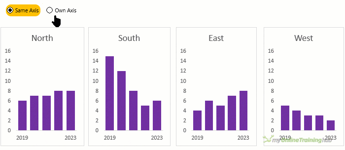
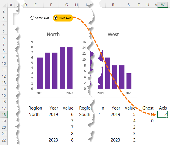
When working with small multiple charts or panel charts as they’re also known, it’s handy to be able to switch the chart axes between the same axis for each chart and their own axis. Using the same axis enables you to compare the data between the charts because they all use the same scale. Whereas using their own axis is useful when there are large variances from one chart to the next which can result in charts with lower values being difficult to read.

chart axis switch

Watch the Excel Chart Axis Switch Video

Subscribe YouTube

Download Workbook

Enter your email address below to download the sample workbook.

By submitting your email address you agree that we can email you our Excel newsletter.
Please enter a valid email address.

Download the Excel Workbook and follow along. Note: This is a .xlsx file please ensure your browser doesn't change the file extension on download.

Excel Chart Axis Switch Set Up

Note: watch the video for detailed instructions.

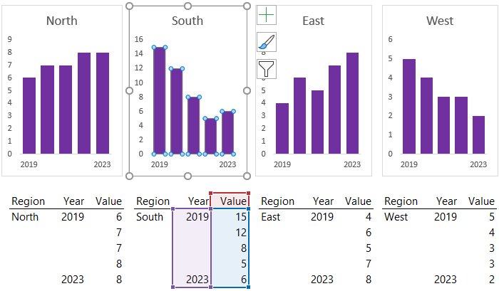
Firstly, each chart has its own dataset:

chart axis switch datasets

Radio buttons are used for the switch, which are form controls that have been around forever:

chart axis switch form controls

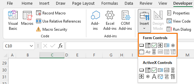
Note: If you don’t have the developer tab where Form Controls are stored, click here to learn how to enable it.

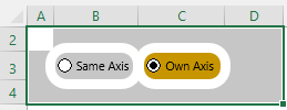
Unfortunately, you can’t format radio buttons unless you use the ActiveX version which require VBA and I like to avoid VBA whenever possible. However, I’ve applied some conditional formatting to the cells behind the form controls and used shapes to make them look more like buttons. You can see it best when the cells around the radio buttons are selected:

chart axis switch buttons

The switch buttons are linked to cell W18 in the worksheet. Excel detects which button is selected (button 1 or button 2) and enters the number in the cell. I can then reference this cell in formulas to choose which axis to display.

radio button linked cell

The axis to display is handled by a ghost series which is an additional hidden series in each chart that plots the minimum and maximum overall values.

chart ghost series

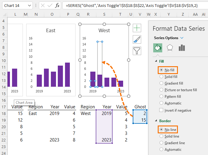
When the ‘Same Axis’ button is selected the values in the Ghost Series simply return the minimum and maximum values overall using IF formulas in cells V18 and V19:

Cell V18 - Minimum: =IF(W18=2,0,MIN(G18:G22,K18:K22,O18:O22,S18:S22))

Cell V19 - Maximum: =IF(W18=2,0,MAX(G18:G22,K18:K22,O18:O22,S18:S22))

In English the formulas read, if the switch button selected is number 2 (own axis), then return zero, otherwise find the MIN or MAX values of all charts.

When plotting these values, the vertical axis automatically adjusts to accommodate the largest value in the chart.

Note: In this example I don’t need the minimum value because there are no negative values in the data and therefore all vertical axes should start at zero. However, I’ve kept it in for datasets that contain negative values, or if you’re using line charts which can start above zero.

chart axis switch
Mynda Treacy

Microsoft MVP logo

AUTHOR Mynda Treacy Co-Founder / Owner at My Online Training Hub

CIMA qualified Accountant with over 25 years experience in roles such as Global IT Financial Controller for investment banking firms Barclays Capital and NatWest Markets.

Mynda has been awarded Microsoft MVP status every year since 2014 for her expertise and contributions to educating people about Microsoft Excel.

Mynda teaches several courses here at MOTH including Excel Expert, Excel Dashboards, Power BI, Power Query and Power Pivot.

More Excel Charts Posts

interactive python charts in excel

Interactive Python Charts in Excel

How to build interactive Python Charts in Excel and regular charts with Slicers connected to data from Power Query.
Circle Progress Charts

Excel Progress Circle Charts

How to easily create dynamic Excel Progress Circle Charts, using doughnut charts and some wizardry, including Slicers to change the data.
professional vs amateur chart formatting

Pro Excel Chart Formatting

10 tell-tale signs that show you’re a chart amateur and the Excel chart formatting you should use instead.

Excel Scroll and Sort Table

Excel scroll and sort table using dynamic array formulas is far simpler than the old approach which required multiple tables, formulas and helper columns.
picture fill excel charts

Picture Fill Excel Charts

Using a stylish picture fill in your Excel Charts is a simple way to make your data visualizations more captivating and memorable
excel speedometer charts

Excel Speedometer Charts

How to build Excel Speedometer Charts or Gauge Charts as they're also know, why they are BAD and what to use instead.
burn up burn down charts

Excel Project Management Burn Down and Burn Up Charts

Excel Burn Down and Burn Up Charts are easy to make with line or scatter charts. They are useful for monitoring the progress of a project.
wee people font charts

Excel WeePeople Font Charts

Excel WeePeople Font Charts are a nice change from generic shapes for waffle charts, bar/column charts and more.
excel dot map charts

Excel Dot Map Charts

Interactive Excel dot map charts are not built-in, but with some creative use of Excel’s built-in tools we can create something unique.
Excel S Curve Charts

Excel S-Curve Charts

Easy Excel S-curve Charts made with PivotTables for project management. Track progress by including budget amounts.


Category: Excel Charts
Previous Post:dax editor keyboard shortcutsDAX Editor Keyboard Shortcuts
Next Post:TEXTSPLIT, TEXTBEFORE and TEXTAFTER FunctionsNew Excel Text Functions

Reader Interactions

Comments

  1. David N

    March 27, 2022 at 12:29 am

    If the chart is a combo or otherwise too complex to be represented by a simple SERIES formula, then Jon Peltier offers a technique where a UDF is able to adjust the min, max, or scale of a chart.

    https://peltiertech.com/chart-udf-control-axis-scale/

    Reply
  2. Ken McMillan

    March 25, 2022 at 12:03 am

    Thanks

    Reply

Leave a Reply Cancel reply

Your email address will not be published. Required fields are marked *

Current ye@r *

Leave this field empty

Sidebar

excel dashboards course

power bi course

More results...

Popular Content

  • 10 Common Excel Mistakes to Avoid
  • Top Excel Functions for Data Analysts
  • Secrets to Building Excel Dashboards in Less Than 15 Minutes
  • Pro Excel Formula Writing Tips
  • Hidden Excel Double-Click Shortcuts
  • Top 10 Intermediate Excel Functions
  • 5 Pro Excel Dashboard Design Tips
  • 5 Excel SUM Function Tricks
  • 239 Excel Keyboard Shortcuts

100 Excel Tips and Tricks eBook

Download Free Tips & Tricks

239 Excel Keyboard Shortcuts

Download Free PDF

mynda treacy microsoft mvpHi, I'm Mynda Treacy and I run MOTH with my husband, Phil. Through our blog, webinars, YouTube channel and courses we hope we can help you learn Excel, Power Pivot and DAX, Power Query, Power BI, and Excel Dashboards.

Blog Categories

  • Excel
  • Excel Charts
  • Excel Dashboard
  • Excel Formulas
  • Excel Office Scripts
  • Excel PivotTables
  • Excel Shortcuts
  • Excel VBA
  • General Tips
  • Online Training
  • Outlook
  • Power Apps
  • Power Automate
  • Power BI
  • Power Pivot
  • Power Query
microsoft mvp logo
trustpilot excellent rating
Secured by Sucuri Badge
MyOnlineTrainingHub on YouTube Mynda Treacy on Linked In Mynda Treacy on Instagram Mynda Treacy on Twitter Mynda Treacy on Pinterest MyOnlineTrainingHub on Facebook

Sign up to our newsletter and join over 400,000
others who learn Excel and Power BI with us.


Company

  • About My Online Training Hub
  • Disclosure Statement
  • Frequently Asked Questions
  • Guarantee
  • Privacy Policy
  • Terms & Conditions
  • Testimonials
  • Become an Affiliate
  • Sponsor Our Newsletter

Support

  • Contact
  • Forum
  • Helpdesk – For Technical Issues

Copyright © 2023 · My Online Training Hub · All Rights Reserved. Microsoft and the Microsoft Office logo are trademarks or registered trademarks of Microsoft Corporation in the United States and/or other countries. Product names, logos, brands, and other trademarks featured or referred to within this website are the property of their respective trademark holders.

Download A Free Copy of 100 Excel Tips & Tricks

excel tips and tricks ebook

We respect your privacy. We won’t spam you.

x