• Skip to main content
  • Skip to header right navigation
  • Skip to site footer

My Online Training Hub

Learn Dashboards, Excel, Power BI, Power Query, Power Pivot

  • Courses
  • Pricing
    • SALE 20% Off All Courses
    • Free Courses
    • Power BI Course
    • Excel Power Query Course
    • Power Pivot and DAX Course
    • Excel Dashboard Course
    • Excel PivotTable Course – Quick Start
    • Advanced Excel Formulas Course
    • Excel Expert Advanced Excel Training
    • Excel Tables Course
    • Excel, Word, Outlook
    • Financial Modelling Course
    • Excel PivotTable Course
    • Excel for Customer Service Professionals
    • Multi-User Pricing
  • Resources
    • Free Downloads
    • Excel Functions Explained
    • Excel Formulas
    • Excel Add-ins
    • IF Function
      • Excel IF Statement Explained
      • Excel IF AND OR Functions
      • IF Formula Builder
    • Time & Dates in Excel
      • Excel Date & Time
      • Calculating Time in Excel
      • Excel Time Calculation Tricks
      • Excel Date and Time Formatting
    • Excel Keyboard Shortcuts
    • Excel Custom Number Format Guide
    • Pivot Tables Guide
    • VLOOKUP Guide
    • ALT Codes
    • Excel VBA & Macros
    • Excel User Forms
    • VBA String Functions
  • Members
    • Login
    • Logout
    • Password Reset
  • Blog
  • Excel Webinars
  • Excel Forum
    • Register as Forum Member

Excel Slicer Trick

You are here: Home / Excel Charts / Excel Slicer Trick
Excel Slicer Trick
October 13, 2015 by Mynda Treacy

That’s a rubbish title, I know. I couldn’t think of a succinct way to describe what I’m about to show you.

I’ve combined a few techniques to create this interactive PivotTable and PivotChart using Slicers:

Excel Slicer Trick

Probably the easiest way to understand how I’ve put this together is to download the file, which you can do here:

Enter your email address below to download the sample workbook.

By submitting your email address you agree that we can email you our Excel newsletter.
Please enter a valid email address.

Download the Excel Workbook. Note: This is a .xlsx file please ensure your browser doesn't change the file extension on download.

Excel Slicer Trick Techniques Used

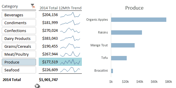
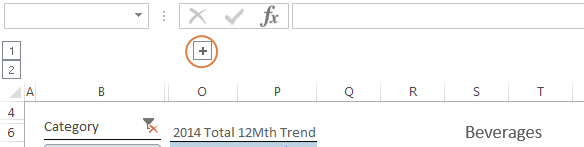
  1. PivotTables – In columns B:O is a PivotTable (called Category_Pivot). I’ve actually hidden all but column O of the actual PivotTable. Clicking on the + symbol below the formula bar will reveal the full PivotTable:

Slicer Buttons

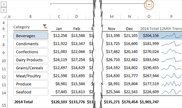
Tip: I’ve used the Group tool on the Data tab to group the month columns together. I can then easily hide/unhide them with the +/- buttons, as opposed to right-click > Hide to hide columns.

You can see the separate columns in the expanded view below. These month columns feed the Sparklines in column P:

PivotTable expanded view

  1. Slicers - I’ve positioned the Slicer over the top of the PivotTable row labels, as you can see in the image below where I’ve moved the Slicer out of the way to reveal the row labels in column B:

Slicer reveals row labels

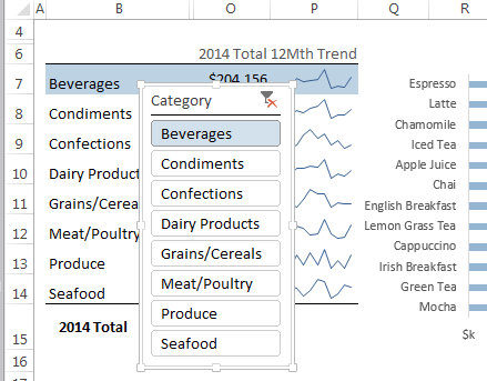
I used the formatting options of the Slicer to align the buttons with the row labels behind.

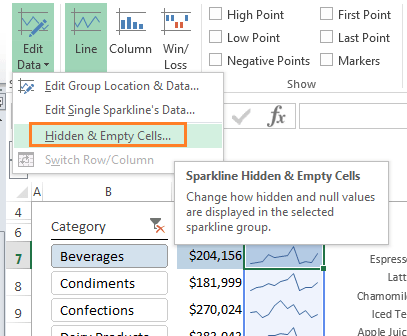
  1. Sparklines – I’ve inserted Sparklines in an empty column (P) to the right of the PivotTable, that references the hidden month columns.

Tip: Set the handling of the hidden data in the Sparklines Design tab so that they still display when the columns are hidden:

Sparklines

  1. PivotCharts – I have another PivotTable hidden out of sight in columns Y and Z (called Product_Pivot). This is linked to the Slicer and feeds the PivotChart that displays the Product level of detail for the Category selected in the Slicer:

PivotChart

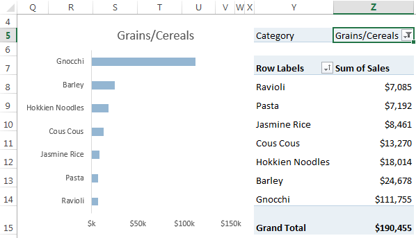
Tip: The Slicer does not control the first PivotTable (Category_Pivot) that you see in the animation, it only controls the Product_Pivot Table which feeds the PivotChart.

  1. Conditional Formatting – Lastly I’ve set up some Conditional Formatting rules to fill the cells in columns P and O in a light blue to match the selection in the Slicer.

Conditional Formatting

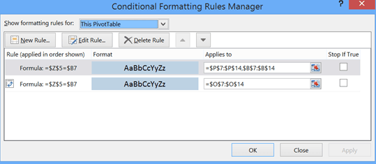
The rules check if the value in the second PivotTable filter (cell Z5 above) matches the row label in the first PivotTable. If they match, it fills the cell colour in a light blue to match the Slicer button and chart bar colour.

Tip: Conditional Formatting in the PivotTable Values area is applied differently to Conditional Formatting of the Row labels.

Tutorials on Techniques used:

Visit the links below to learn more about the techniques used in this example.

  1. PivotTables
  2. Slicers
  3. Sparklines
  4. PivotCharts
  5. Conditional Formatting PivotTable Values Area
  6. Conditional Formatting PivotTable Row Labels

Want More Excel Superstar Skills?

When you have a broad range of Excel skills you can combine them to create innovative solutions like I've show above. And this is exactly what I aim to do in my Excel Dashboard course where I cover a range of topics which can be used individually, or combined to provide slick reporting solutions that will be the envy of your colleagues.

If you want to learn more cool techniques like this so you can impress your boss and stand out from the crowd, then please take a moment to check out my Excel Dashboard course.

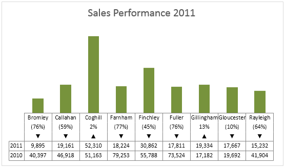
You can also watch a short sample video from the course which shows a clever use of Symbols in charts, like you see here in the chart X axis labels:

dashboard chart with symbols

Excel Slicer Trick

More Slicers Posts

Symbols in Excel Slicers

Symbols in Excel Slicers is a fun way to make your reports more interesting. Here are some tricks to getting wingdings and symbols to display in Slicers.
Slicer Controlled Interactive Excel Charts

Slicer Controlled Interactive Excel Charts

Slicer Controlled Interactive Excel Charts can open up a huge range of possibilities and the best part is you can use Slicers to control regular charts too.
slicer selection in formula

Use Excel Slicer Selection in Formulas

How to use Excel Slicer selection in formulas to control charts and tables. Download the workbook and follow along.
Excel Slicers for Fiscal Years

Excel Slicers for Fiscal Years

Inseting Excel Slicers for Fiscal Years is easy but requires a bit of DIY date classification.
Excel Slicer rolling periods

Excel Slicers for Rolling Periods

Creating Excel Slicers for rolling periods is easy with this IF formula. Download the workbook and watch the video.
Single Slicer for Year and Month

Create a Single Excel Slicer for Year and Month

How to create a single Excel Slicer for Year and Month fields. Includes written instructions, video and workbook download.
Excel Slicers

I’ll Have a Slicer That!

How to insert and use Excel Slicers. Includes video and step by step written instructions. Use Excel Slicers to create interactive Charts and PivotTables.
Sorting Excel Date Slicers

Sorting Excel Date Slicers

Slicers have some shortcomings when it comes to dates and sort order. This post explains a couple of ways to sort dates correctly in Excel slicers.

More Excel Charts Posts

excel speedometer charts

Excel Speedometer Charts

How to build Excel Speedometer Charts or Gauge Charts as they're also know, why they are BAD and what to use instead.
burn up burn down charts

Excel Project Management Burn Down and Burn Up Charts

Excel Burn Down and Burn Up Charts are easy to make with line or scatter charts. They are useful for monitoring the progress of a project.
wee people font charts

Excel WeePeople Font Charts

Excel WeePeople Font Charts are a nice change from generic shapes for waffle charts, bar/column charts and more.
excel dot map charts

Excel Dot Map Charts

Interactive Excel dot map charts are not built-in, but with some creative use of Excel’s built-in tools we can create something unique.
Excel S Curve Charts

Excel S-Curve Charts

Easy Excel S-curve Charts made with PivotTables for project management. Track progress by including budget amounts.
chart axis switch

Excel Chart Axis Switch

Use radio button form controls to create an Excel chart axis switch enabling you to toggle pannel charts between same axis and own axis.

Excel Charts with Shapes for Infographics

Excel Charts with Shapes for Infographic styling and increased interest in your charts. Easy to insert but there are a few tricks required.
excel pyramid chart

Excel Pyramid Charts

Excel Pyramid charts are useful for visualising demographic data across multiple categories. Let’s look at 3 ways we can build them in Excel.

Highlighting Periods in Excel Charts

Highlighting Periods in Excel Charts helps your users interpret them more quickly and or focus their attention on a point or area.
stacked bar waffle chart

Stacked Bar Excel Waffle Charts

Stacked Bar Excel Waffle Charts are an alternate to using conditional formatting to build waffle charts, and some say they're easier.


Category: Excel ChartsTag: slicers
Previous Post:Excel Aggregate functionExcel AGGREGATE Function
Next Post:Combine Excel Worksheets with Power QueryPower Query Append

Reader Interactions

Comments

  1. Eddie K

    August 28, 2020 at 7:03 pm

    Some sure useful tips and instructions – thank you sooooo much!
    I’m in the process of building a product selection tool – we have many products with some complex parameters but thanks to pivot tables and slicers I have been able to present a simple tool to help customers find what they need.
    i’m fine tuning some of the data at the moment and I’m wondering if there is such a thing as a “Clear All Filters” button I can add so that the individual slicers don’t need to be reset?
    I’m using excel in Office 365.
    Cheers,
    Eddie

    Reply
    • Mynda Treacy

      August 29, 2020 at 2:40 pm

      Great to hear, Eddie! There is a clear button in the ‘Sort & Filter’ group on the Data tab of the ribbon which clears all filters on Tables and PivotTable. You can add this to the Quick Access toolbar or assign the command to a macro button in your worksheet. Hope that points you in the right direction.

      Reply
  2. Michael Toon

    October 21, 2015 at 6:12 am

    I would have gone to Pivot table options and turned off Autofit column widths on update. That would look better

    Reply
    • Mynda Treacy

      October 21, 2015 at 8:57 am

      Hi Michael,

      I did for the main PivotTable that’s visible in the report (see animated image). The PivotTable in columns Y and Z should really be on another sheet ‘hidden out of view’ and therefore the column width changing doesn’t matter. I only put it on the same sheet for the purpose of the tutorial.

      Cheers,

      Mynda

      Reply
      • Michael Toon

        October 21, 2015 at 9:15 am

        Whoops got it!

        Reply
        • Mynda Treacy

          October 21, 2015 at 9:38 am

          No worries, Michael. You weren’t the first to think the second PivotTable was part of the report. I should have made it clearer.

          Mynda

          Reply
  3. Jeff

    October 18, 2015 at 12:19 am

    The key, at least for me, is the second pivot table. I know this because it just occurred to me that a second PT could have saved me enough time to earn that PhD in philosophy I’ve always wanted 🙂

    Awesome as always, Mynda. I wish your courses were qualified to earn CPE credit for licensing of US CPAs.

    Thanks always for sharing your brain,
    Jeff

    Reply
    • Mynda Treacy

      October 18, 2015 at 8:36 am

      Aw, thanks, Jeff 🙂

      We’re planning on working on CPE accreditation next year, but it’s a long road!

      Mynda

      Reply
  4. Kim

    October 17, 2015 at 4:13 am

    What a great idea to combine all these functions – very clever. A nice clear and clean report.

    Reply
    • Mynda Treacy

      October 17, 2015 at 8:57 am

      Cheers, Kim 🙂 Glad you like it.

      Mynda

      Reply
  5. Karen Williams

    October 17, 2015 at 12:45 am

    Excellent. You alway share excellent examples and they are very easy to follow. I plan to share a few of these features to my students.
    Can’t wait to test the link on Excel Slicer Trick…… that is how I will spend the next couple of hours. 🙂

    Side note:
    Do you have any examples, tutorials on INDEX and MATCH?

    Reply
    • Mynda Treacy

      October 17, 2015 at 8:59 am

      Thanks, Karen. Enjoy playing around with it. I’m sure there are many variations of how you could use Slicers and PivotTables.

      You can read this INDEX and MATCH tutorial: https://www.myonlinetraininghub.com/excel-index-and-match-functions

      Mynda

      Reply
  6. GP

    October 16, 2015 at 7:39 am

    Wow! What a great use of a number of handy little tricks! Learned a lot from this post.

    Reply
    • Mynda Treacy

      October 16, 2015 at 2:42 pm

      Cheers, GP. Glad you enjoyed it 🙂

      Reply
  7. Julie Connor

    October 16, 2015 at 6:13 am

    Used this on our ytd financials. Category included Compensations, PP&E, Supplies, Travel etc. and the categories within them included Salaries, Wages, airline travel, lodging, Leases, machine maintenace, etc.

    VP loved it. But, now to make it more valuable, I would like to incorporate 2014. Will this mess it all up?

    thank you so very much for this. 🙂

    Reply
    • Mynda Treacy

      October 16, 2015 at 10:35 am

      Hi Julie,

      Wonderful to know you have already used this tip.

      You can incorporate prior year data, but you’ll obviously have to play around with the formatting. It shouldn’t be too hard to put the Years in separate columns and have them as separate series in the chart.

      Let me know if you get stuck.

      Kind regards,

      Mynda

      Reply
  8. Roger Govier

    October 16, 2015 at 2:27 am

    Hi Mynda

    As always an excellent article.

    However, being a “nitpicker”, I would format Product_Pivot Report Layout as “show in Tabular form”, then it would show Product, rather than “Row Labels” as the heading.
    Equally, I would sort the PT Descending by Product Sales.

    Then, to ensure that the Order in the Chart, matched the order of the PT, I would format the Vertical Axis as Categories in Reverse Order, and set the Horizontal Axis to cross at Maximum category.

    Look forward to seeing you in Seattle again in just over two weeks!!

    Regards
    Roger

    Reply
    • Mynda Treacy

      October 16, 2015 at 10:33 am

      Hi Roger,

      As a PivotTable expert you’re allowed to nitpick 🙂

      Actually the Product_Pivot is supposed to be out of sight so the formatting and ‘row labels’ heading didn’t matter to me, but a great tip for those who might want to show the PivotTable as well as the PivotChart. Likewise the sorting.

      See you soon.

      Mynda

      Reply
      • Roger Govier

        October 16, 2015 at 6:35 pm

        Hi Mynda

        Just after I posted, I realised that you meant the Second PT to no be visible (hence the columns it was in), so the formatting of that would not be relevant.

        However, my comments did address the later concerns of Michael.

        Reply
  9. Jason

    October 16, 2015 at 1:23 am

    Love that! Makes data look good and simple to understand. Win win

    Reply
    • Mynda Treacy

      October 16, 2015 at 9:33 am

      Cheers, Jason 🙂

      Reply
  10. Michael Fate

    October 16, 2015 at 12:17 am

    Hi Mynda,

    The information is illuminating as always.

    I noticed the information in the chart is sorted in descending order while the information in the pivot table (columns Y-Z) is sorted in ascending order. This is distracting to the viewer who is trying to understand the information presented to them in the spreadsheet.

    Is there anyway to make the chart and pivot table sort the same as each other?

    Thanks,
    Michael

    Reply
    • Mynda Treacy

      October 16, 2015 at 9:33 am

      Hi Michael,

      The PivotTable in columns Y-Z would normally be on another sheet out of site as it’s sole purpose is to feed the PivotChart. I only put it on the same sheet for the purpose of the tutorial.

      That said, you can align the sort order of the chart and PivotTable by editing the Chart Axis: right-click > format axis > Axis Options > Values in reverse order.

      Kind regards,

      Mynda

      Reply
  11. Tricia

    October 16, 2015 at 12:09 am

    Hi Mynda,
    This was so cool. I like that your explanations and visuals are so clear. I’m already dreaming of ways I can use these tips to apply to my work. I’m sure it will take some practice. Now if I can just free up a bit of my workload to play around with it. 🙂 Thanks!
    Tricia

    Reply
    • Mynda Treacy

      October 16, 2015 at 9:31 am

      Thanks, Tricia. Glad you’ll find it useful…if you can find the time 🙂

      Reply
  12. Nate O

    October 15, 2015 at 10:46 pm

    Nice stuff. Thanks for sharing!

    Reply
    • Mynda Treacy

      October 16, 2015 at 9:30 am

      Thanks, Nate 🙂

      Reply
  13. SHOVAN

    October 15, 2015 at 10:35 pm

    How can I minus(-) from cell A1 and automatically add(+) in B1? If A1=10 and B1=12 then I enter 7 in A1 then B1 will show 15.

    Reply
    • Catalin Bombea

      October 16, 2015 at 1:30 pm

      Hi Shovan,
      You can’t do that without vb programming, excel never keeps the old values to be added to the new values, any formula will refer only to the current value of cells. You have to rethink the way you input data, for example, you can enter the values in A1, then A2, A3, and so on, and B1 will be : =SUM(A1:A10). This way, B1 will collect all values from column A.
      Cheers,
      Catalin

      Reply
  14. Oz du Soleil

    October 14, 2015 at 6:59 am

    Very nice!

    Reply
    • Mynda Treacy

      October 14, 2015 at 8:18 am

      Cheers, Oz 🙂 Glad you like it.

      Mynda

      Reply
  15. Little Fish

    October 14, 2015 at 2:49 am

    What Excel version is this for?

    Reply
    • Mynda Treacy

      October 14, 2015 at 8:17 am

      Hi Little Fish,

      Excel 2010/2013/2016. Unfortunately if you have Excel 2003/2007 you don’t have Slicers.

      Mynda

      Reply

Leave a Reply Cancel reply

Your email address will not be published. Required fields are marked *

Current ye@r *

Leave this field empty

Sidebar

More results...

Course Sale

mynda treacy microsoft mvpHi, I'm Mynda Treacy and I run MOTH with my husband, Phil. Through our blog, webinars, YouTube channel and courses we hope we can help you learn Excel, Power Pivot and DAX, Power Query, Power BI, and Excel Dashboards.

Subscribe to Our Newsletter

Receive weekly tutorials on Excel, Power Query, Power Pivot, Power BI and More.

We respect your email privacy

Guides and Resources

  • Excel Keyboard Shortcuts
  • Excel Functions
  • Excel Formulas
  • Excel Custom Number Formatting
  • ALT Codes
  • Pivot Tables
  • VLOOKUP
  • VBA
  • Excel Userforms
  • Free Downloads

239 Excel Keyboard Shortcuts

Download Free PDF

Free Webinars

Excel Dashboards Webinar

Watch our free webinars and learn to create Interactive Dashboard Reports in Excel or Power BI

Click Here to Watch Now

Blog Categories

  • Excel
  • Excel Charts
  • Excel Dashboard
  • Excel Formulas
  • Excel PivotTables
  • Excel Shortcuts
  • Excel VBA
  • General Tips
  • Online Training
  • Outlook
  • Power Apps
  • Power Automate
  • Power BI
  • Power Pivot
  • Power Query
trustpilot excellent rating
 

Company

  • About My Online Training Hub
  • Disclosure Statement
  • Frequently Asked Questions
  • Guarantee
  • Privacy Policy
  • Terms & Conditions
  • Testimonials
  • Become an Affiliate

Support

  • Contact
  • Forum
  • Helpdesk – For Technical Issues

Copyright © 2023 · My Online Training Hub · All Rights Reserved

Microsoft and the Microsoft Office logo are trademarks or registered trademarks of Microsoft Corporation in the United States and/or other countries. Product names, logos, brands, and other trademarks featured or referred to within this website are the property of their respective trademark holders.