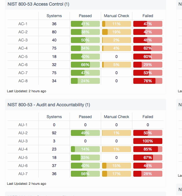
Hi
Looking for assistance in starting and identifying best way to display the attached data, its just a subset of approx 12 Domains. but gives an idea, theres a few validation columns, maturity Low has slight different validation to medium and high for example.
Initially I was thinking Microcharts (attached is an idea that I seen) - but cant figure out how to display. Appreciate some workings and ideas to get me going especially handling the validation items.

Hi Mike,
You can use Conditional Formatting to create the data bars (microchart) effect. You might also consider adding a numeric scale to some of the fields so you can visualise them with icons. In the attached file I've added columns G and L. You'll see that these columns contain numbers that represent the Domain Implementation and Automation Levels which are then used to support the icons.
More on Conditional Formatting in the Dashboard Course 'Optional Related Lessons - session 9'.
Note: I've set the scale for the data bars to a number with minimum 0 and maximum 1. You'll see this if you edit the format.
I hope that points you in the right direction.
Mynda
Mynda
Thats what I was looking for big thank you - how do I make the icons dynamically change if the adjacent cell changes - so NO to YES should give a full ICON. Same as the Bar chart icons ? That way I can then add numeric values to others once I figure that out.
You're welcome!
I just typed the values in, but you could use a lookup table that lists the status and the value in a corresponding column. Or you could write a nested IF formula. I'd go with the lookup table, then you can use VLOOKUP to find the status in the list.
Mynda
Hi Mynda
The VLOOKUP worked - thank you . Although I have left myself in a challenging next phase.
The problem - I have a dashboard/sheet attached as previous, If I send the sheet out to say 10 countries for their responses, how do I dynamically update this sheet with each countries data based on country/state especially when dont have country or state in my tables, or the tables that were sent out ? I cant add their sheets to the existing table as its the same table just completed specifically for each country. IS it possible to get each countries display and a consolidated version of all countries ?
Appreciate your help on this challenge - this is a bit more than my confused brain can work out being a complete newbie. Appreciate any examples as a guide to the attached again (sorry - thought it was easy in my head design)
Again, much appreciated in advance.
Hi Mike,
I would add columns for the country and state information you also need to capture. You could hide the columns and use formulas to link the cells in those columns to two cells (country and state) that you ask the users to enter by selecting from a data validation list (to ensure data integrity). Whatever you do, make sure you maintain a tabular format.
You can use Power Query to consolidate the separate sheets into a single table, or from files in a folder.
Once your data is consolidated you can use Slicers to filter the table as desired, or PivotTables to extract subsets of the data, which can then be filtered with Slicers.
I hope that helps. Next time, please start a new thread for a new question so that the topic is relevant to the post.
Cheers,
Mynda
