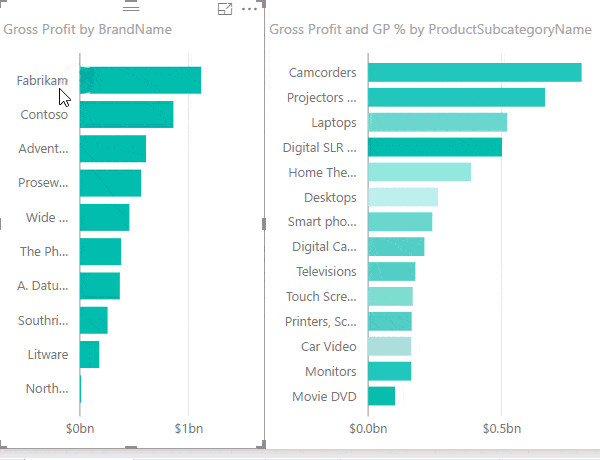
One of the cool features in Power BI is the ability to cross highlight from one chart to another by clicking on a column in one chart and instantly highlight the selected item in another, as shown below:
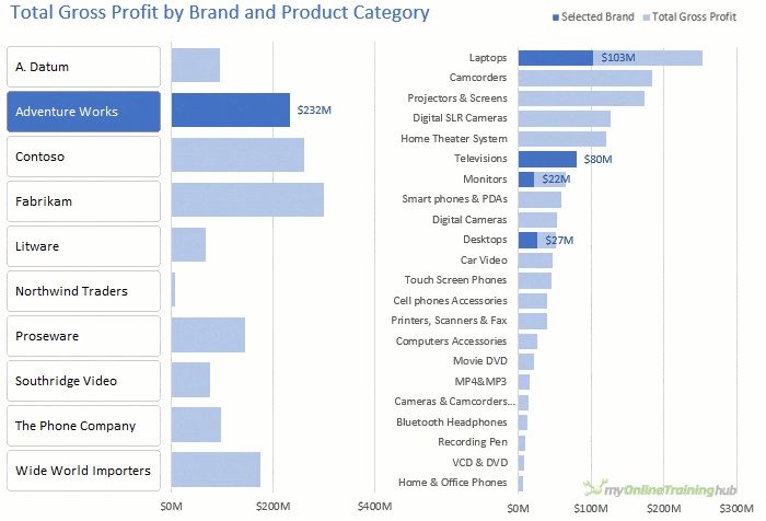
We can also cross highlight Excel charts in almost the same way and without the need for VBA, as you can see below:
This technique requires a version of Excel that has Power Pivot, which is all Microsoft 365 licenses, Excel 2019, 2021 and selected earlier versions. Click here to see if your version of Excel has Power Pivot.
What if you don’t have Power Pivot?
If you don’t have Power Pivot you can still create this effect using formulas linked to PivotTables and regular charts, it just requires a few more steps and some wrangling of Excel charts. You’ll find an example of this in the file downloadable from the link below.
Watch the Video

Download Workbook
Enter your email address below to download the sample workbook.

Cross Highlight Excel Charts Anatomy
Before we look at the steps for building this chart, let’s understand the main components:
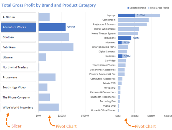
As you can see from the labelled image above, there are 3 main components: the Slicer which provides the interactivity, the Pivot Chart by Brand and the Pivot Chart by Product Category. And with some clever formatting of the Slicer and alignment of the charts they appear as one. Easy!
Tip: There is no limit to how many charts you link to the Slicer, I’ve only used two because of space limitations.
Cross Highlight Excel Charts Data
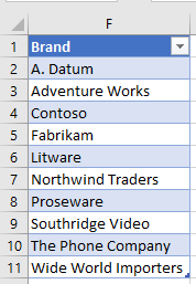
This example uses an extract of the Microsoft Contoso sample data (shown below), which is included in the file that you can download from the link under the ‘Workbook Download’ heading above.
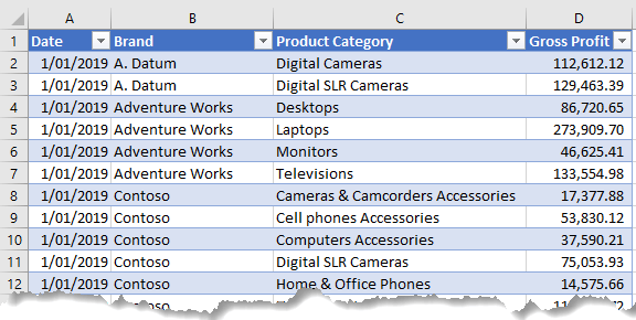
It is gross profit data by brand and product category. Notice it is formatted in an Excel Table (named Data), which is required for loading into Power Pivot in this example.
There’s also a table (named Brands) containing a distinct list of the brands:
Step 1: Load Data to Power Pivot
Select a cell in the Data table > Power Pivot tab > Add to Data Model:
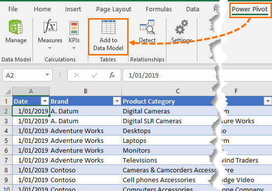
Repeat for the Brands table.
Step 2: Create Relationships
Go to the Design tab > Create Relationship and set up an inactive relationship between the Brand field in the Data table and the Brand filed in the Brands table. Be sure to uncheck the ‘Active’ box in the bottom left:
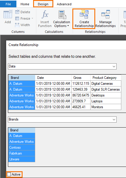
It’s this inactive relationship that allows the Slicer selection to be ignored in one of the measures (DAX Formula).
You can close the Power Pivot window now, the work here is done.
Step 3: Create the DAX Measures
Measures are the Power Pivot equivalent of a regular PivotTable Calculated Field. With Power Pivot we use the DAX formula language to write measures. You can learn more about DAX in my Power Pivot course, so I’m not going to go into detail on it here. However, you’ll see below that the formulas and functions are very similar to Excel, which makes them relatively easy to learn.
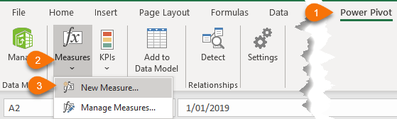
On the Power Pivot tab > Measures > New Measure…
Total Gross Profit:
= SUM( Data[Gross Profit] )
Selected Brand:
= CALCULATE( [Total Gross Profit], USERELATIONSHIP( Brands[Brand], Data[Brand] ) )
Notice that the Selected Brand measure activates the relationship between the Brand and Data tables with the USERELATIONSHIP function. You’ll see why this is important in the next steps.
Step 4: Build the PivotTables
PivotTable 1: Gross Profit by Brand
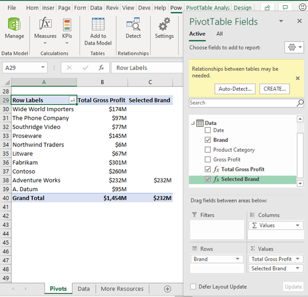
IMPORTANT: The ‘Brand’ field in the PivotTable must come from the Data table, not the Brands table.
Note: You can ignore the ‘Relationships may be needed’ warnings.
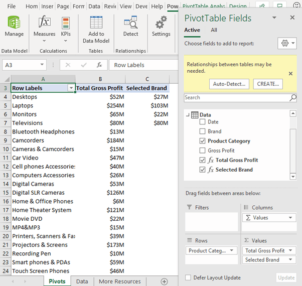
PivotTable 2: Gross Profit by Product Category
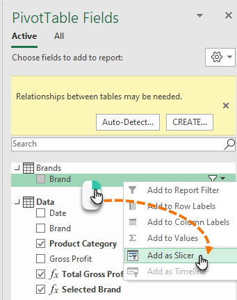
Step 5: Insert Slicer
The Slicer filters the brands, but it’s important that you insert the Slicer for the Brands table Brand field, not the Data table Brand field. Right-click the Brands field in the Brand table > Add as Slicer.
Tip: Click the ‘All’ tab at the top of the field list if you can’t see the Brand table listed.
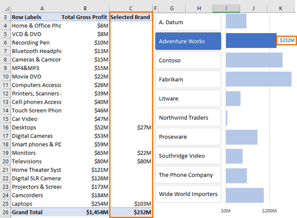
Remember back in step 2 we created an inactive relationship between the Brand and Data tables, then in step 3 we created the ‘Selected Brand’ measure that uses this relationship. Here is the measure again:
= CALCULATE( [Total Gross Profit], USERELATIONSHIP( Brands[Brand], Data[Brand] ) )
Note that the PivotTables use the Brand field from the Data table, but the Slicer uses the Brand field from the Brands table. As a result, when a brand is selected in the Slicer it only filters the ‘Selected Brand’ measure, as shown below:
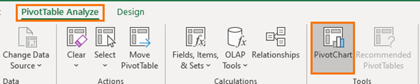
Step 6: Insert Pivot Charts
Select one of the PivotTables > PivotTable: Analyze tab > Insert PivotTable:
Choose a bar chart as this allows space for the long labels.
Repeat for the other PivotTable.
Step 7: Formatting
Now that you have the Slicer and Pivot Charts set up, the fun of formatting begins. Below is a list of the changes I’ve made, but for detailed instructions please watch the video tutorial.
Slicer Formatting:
- Create a custom style with the border removed and selected button set to the same dark blue as the selected bars in the charts
- Adjust button size to overlap the Gross Profit by Brand chart vertical axis labels
- Hide Slicer header
PivotTable Formatting:
- Format the Gross Profit fields to Millions with a custom number format
- Sort the Gross Profit by Product Category chart values in ascending order
These formats will feed through to the Pivot Charts.
Chart Formatting:
- Remove the chart area borders
- Set ‘Total Gross Profit’ series bars to light blue and ‘Selected Brand’ series bars to dark blue
- Add data labels to the ‘Selected Brand’ series and format their font one shade darker than the dark blue bars (one shade darker makes the font easier to read)
- Set the bar overlap to 100% so the dark blue bars sit on top of the light blue bars.
- Insert a text box for the chart title
- Take a screenshot of the legend and move it to the top of the Gross Profit by Product Category chart
- Group all objects (charts, Slicer, text box and legend image) so they’re easy to move as one object

Hi ,very helpful Following along with this. When you have the slicer and apply the filter, your filter just fills in information for the brands that have products and leaves the rest of the products visible but with no value. My filter hides every product that has no entries for that brand. Have I missed a setting somewhere?
If you right-click the Slicer > Settings, you’ll find options to hide or display items with no data.
This tutorial is very useful, thank you! I couldn’t get the pivot table to work right and found in the directions Under Step 3 for creating the Selected Brand DAX measure it incorrectly shows calculate Sum of Gross Profit instead of Total Gross Profit in the calculate statement:
= CALCULATE( [Sum of Gross Profit], USERELATIONSHIP( Brands[Brand], Data[Brand] ) )
I watched the video and it showed this, which worked:
= CALCULATE( [Total Gross Profit], USERELATIONSHIP( Brands[Brand], Data[Brand] ) )
Thank you for showing the custom number formatting for rounding Millions, I’d not seen that before either.
Ah yes, if you haven’t already put the Gross Profit field in the PivotTable the ‘sum of’ version won’t work. My bad. I’ve corrected it now.
You forgot to mention that the bar chart series overlap should be 100, which may not be obvious to people less familiar with charts than you or I.
Also, I got errors using your formula for Selected Brand. I changed it to this and the errors went away and the model worked nicely:
=CALCULATE( [Total Gross Profit], USERELATIONSHIP( Brands[Brand], Data[Brand] ) )
Yes, thanks for mentioning that. Fixed now.
good work
Glad you liked it, Ahmed!
Hi Mynda,
I noticed in your workbook “Regular Pivottable Solution”, the array formula ends at row 23 when “laptops” are row 24? =HLOOKUP($A$18,J2:S24,ROW(2:23),0).
When trying to replicate this and entering =HLOOKUP($A$29,J3:S25,ROW(3:24),0) I get #REF errors. If I amend to =HLOOKUP($A$29,J3:S25,ROW(3:23),0) I get results with the exception of VCD&DVD which is #N/A. Can you please help?
Best regards,
Colin
Hi Colin,
The purpose of the ROW function is to return the HLOOKUP row_index_num argument as an array of values from 2 to 23, because the data we want returned starts on the second row of the lookup range: J2:H24 and there are 23 rows in that range. It isn’t perfectly correlated to the row numbers in the worksheet because the PivotTable data range starts on the second row.
I hope that clarifies things, but you can learn more about the ROW function and its uses here.
Mynda
When I create the relationship between the two tables and brand columns in Power Pivot I am definitely unchecking the ‘Active’ box. However, when I insert my slicer and select a brand, it hides the Total Gross Profit figures for all the other brands. I know something is wrong because I am not getting any of the ‘Relationships may be needed’ warnings. I cannot figure out where I am going wrong having watched your video and repeating the process several times. Is it possible that a step has been missed out? I am on Office 365 version of Excel.
Hi Matt,
I suspect the deselection of ‘Active’ didn’t stick. If you edit the relationship you should see the Active box is still checked. Uncheck it and everything should work as intended.
Mynda
Brilliant!
I can certainly do this but its unlikely I’d have had the initial inspiration to think of doing so
I will try to use Dynamic Arrays instead of pivots, so refreshing for new data is unnecessary, when I shamelessly copy this idea for my own use (you will, of course, get credit)
jim
Thanks, Jim! Glad you’ll have a use for it.
Following along with this. When you have the slicer and apply the filter, your filter just fills in information for the brands that have products and leaves the rest of the products visible but with no value. My filter hides every product that has no entries for that brand. Have I missed a setting somewhere?
It sounds like you maybe haven’t set up the relationship as inactive.