If you are going to use animation in your charts, you should do it to enhance the story your data is telling.
Famous examples of this are the presentations made by Hans Rosling.
So the animation will be useful if it shows in a meaningful way how the data changes over time.
In this post I'll be looking at how the positions of teams in the English Premier League have evolved over the course of this season. Though there's hasn't been much change at the top, YNWA 🙂
NOTE 1: You'll need dynamic arrays for the formulae in this post to work for you.
NOTE 2: The charting and animation features in Excel aren't as slick as those provided by some JavaScript libraries. So the following animation may not be as smooth as something you've seen on the web.
Download the Workbook With Sample Code
Enter your email address below to download the workbook with the data and code from this post.
Planning
The steps listed in this post to create the animated chart weren't considered in isolation from the others. I had to think about the whole process. What raw data do I need? How will that be aggregated to show what I want? Do I need to do any further processing of the aggregated data before it is charted? What type of chart to use? What data (and other information) would be useful to the viewer? What VBA do I need to automate all of this?
All of these things need to be thought about, and at least a rough answer found, before ploughing ahead. If you don't think the whole process through, you might find you get to brick wall where something just won't work as you hoped.
Gathering the Data
The first thing to do is decide what data needs to be displayed and to then gather it together.
It's pretty easy to work this out since I know that to show a team's position in the league table I need to calculate their points scored from either winning or drawing (a tied game).
As a tie breaker, if teams have equal points, you first work out their goal difference (goals scored - goals conceded), then look at goals scored.
So if 2 teams have stats like this
| Team | Played | Win | Lose | Draw | Scored | Conceded | GD | Pts |
|---|---|---|---|---|---|---|---|---|
| United | 4 | 3 | 0 | 1 | 12 | 6 | 6 | 10 |
| Wanderers | 4 | 3 | 0 | 1 | 9 | 3 | 6 | 10 |
Both have won 3 games. It's 3 points for a win so that's 9 points.
Both have drawn 1 game , it's 1 point for a draw. So their total is 10 points.
To decide which team is higher on the table you now need to look at goal difference (GD) and if that is the same, then goals scored.
Both teams have a goal difference of 6, so we need to look at goals scored.
United have scored 12 and Wanderers have scored 9, so United are above Wanderers.
The formula I use to work out the position is
Points + (GD * 0.001) + (GS * 0.0001)
For United this is
10 + 0.006 + 0.0012 = 10.0072
and for Wanderers
10 + 0.006 + 0.0009 = 10.0069
United with the larger number are ranked higher in the table.
You'll see later why working this out is important, and why I chose scaling factors of 0.001 and 0.0001.
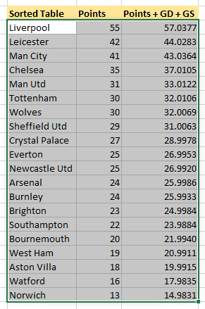
Now it's a case of entering the weekly data into a table.
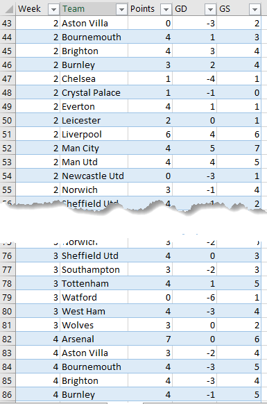
This is in a tabular format so that I can use a PivotTable to generate the data I need for my chart.
Creating a PivotTable
A PivotTable is perfect for his situation and summarises the data exactly as I need it for my chart.
Teams are in alphabetical order, I'll sort that out later before charting, and we can see their points, goal difference and goals scored.
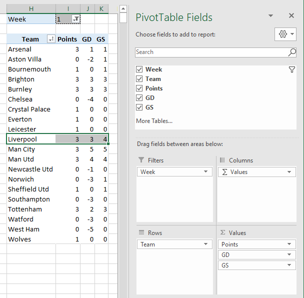
The filter is the week number so by changing that, the PivotTable shows the data for that week of the season.
Creating the Data to Chart
Obviously the chart needs to show the points each team has. But as I already mentioned, it also needs to be able to distinguish which team is higher in the table based on goal difference and goals scored.
I'd also like to use each team's club crest to indicate the data related to that club.
Using a clustered bar chart I can do all of this. Series 1 will be the actual points scored by a club. Series 2 will be the adjusted points accounting for goal difference and goals scored, and I can use the club crests as the labels for this series.
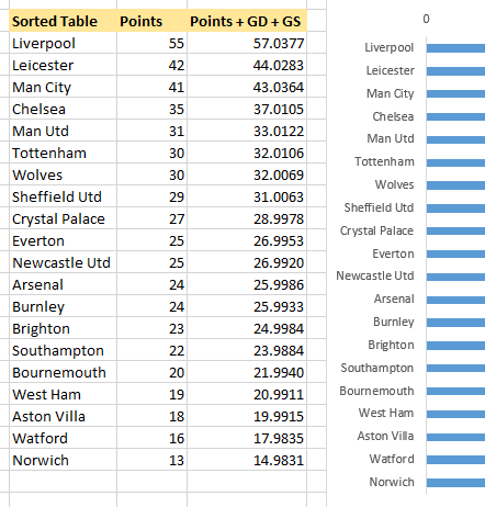
To create the data I need, I create a table that uses GETPIVOTDATA to grab the values from the PivotTable. At this stage the table is still ordered alphabetically by club name.
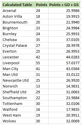
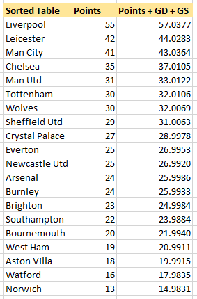
Then using SORT I can get a table correctly sorted based on the 3rd column (points + goal difference + goals scored).
You'll notice that the Points and the integer part of the Points + GD + GS are not the same.
If I was only using the formula
Points + (GD * 0.001) + (GS * 0.0001)to calculate the value for the 3rd column you'd expect Liverpool to have 55 and 55.0377.
But because I'm plotting two series on the chart, and I don't want the labels for each series to overlap, I'm adding a small value to Points + GD + GS to nudge it along the x-axis a bit so it doesn't sit on top of the Series 1 label which will be the points for each team.
So the actual formula I'm using for Points + GD + GS is
Points + (GD * 0.001) + (GS * 0.0001) + ($I$1*0.1)where $I$1 holds the week number.
NOTE: I mentioned earlier that I chose small scaling factors for GD and GS. This is because I don't want to have values that visibly alter the length of the bars on the chart. I just need a very small difference to allow teams on the same points to be separated.
Creating and Formatting the Chart
There are quite a few steps involved in this. Let's go through each one.
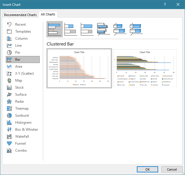
1. Select the data to chart
2. Choose the Clustered Bar Chart
From the Ribbon : Insert -> Recommended Charts -> All Charst Tab and choose the Clustered Bar
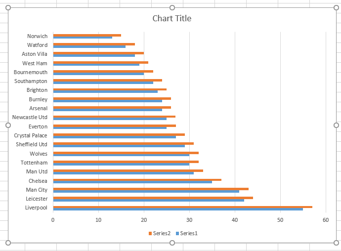
We get the default chart which looks like this
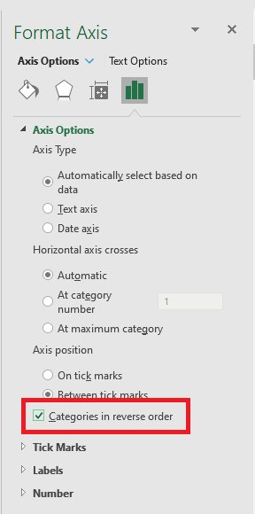
3. Reverse Category Order
Select the axis labels, right click -> Format Axis.
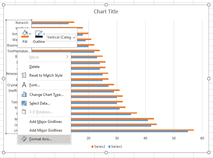
Check Categories in reverse order
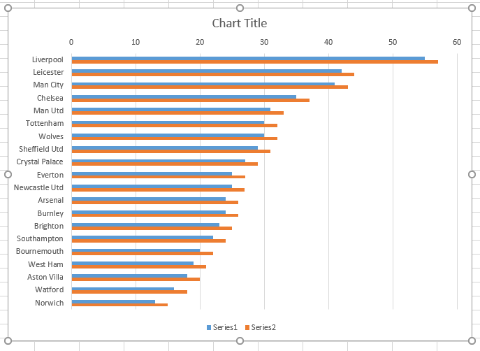
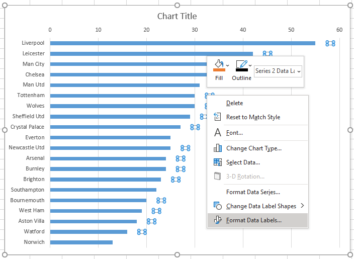
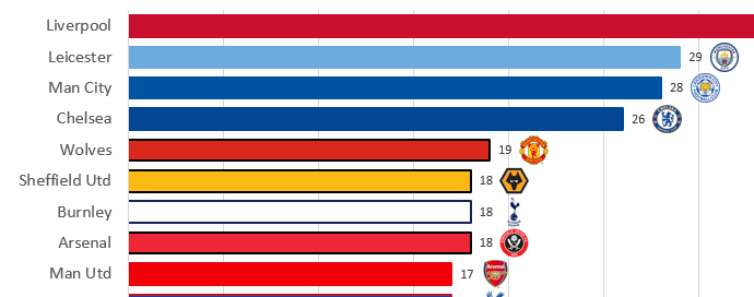
The chart now looks like this. Series 1 (in blue) will show the points for each team. The Series 2 bars are longer than Series 1 bars and will be used to display the club crests.
4. Delete the Legend.
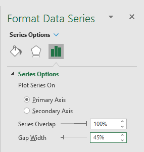
5. Format Series 2
Click on the orange data series, then Right Click -> Format data Series.
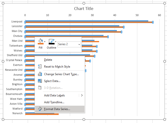
Set to No fill and No Line.
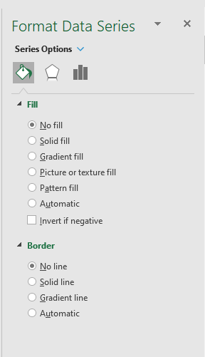
In Series Options, set Series Overlap to 100% and Gap Width to 45%
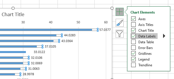
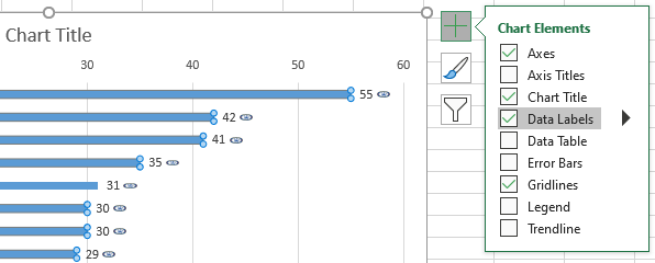
6. Add Labels for Series 2
Close the formatting pane from the previous step, and with Series 2 still selected, check Data Labels to add them.
7. Hide Text in Series 2 Data Labels
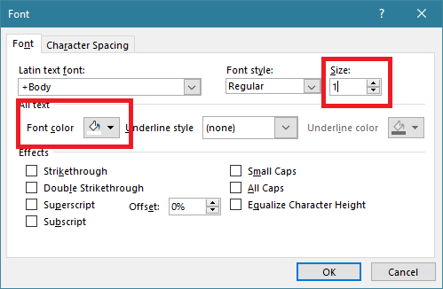
Right click on one of the Series 2 labels then click on Font.
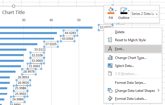
Set the font color to white and the font size to 1. This effectively hides the numbers in the label so they don't obscure the club crests we'll be using.
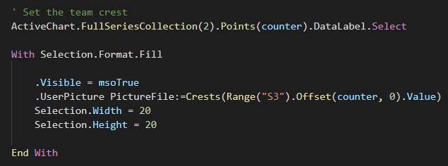
8. Set an Image for Series 2 Labels
With the Series 2 labels still selected, right click on one of them then click Format Data Labels
Select Picture or texture fill
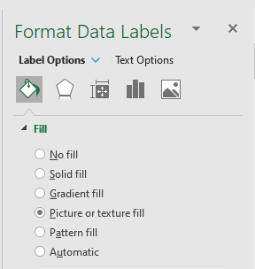
The team crests will be added later with VBA.
9. Format Series 1
With the chart selected, use the drop down in the top left of the Format section of the Ribbon to Select Series 1.
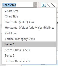
With Series 1 selected, click to Add Data Labels. These will show the number of points for each team.
That's the main formatting done for the chart.
VBA to Drive the Animation
Now we turn to the VBA needed to make this all work.
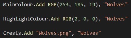
I want each bar to use the team colours. In some cases, for example Wolves, the bar will be their main colour - Old Gold - and the outline of the bar will be their highlight colour which is black.
A team like Liverpool will just have a red bar because their kit is all red.
Team crests are images stored in the same folder as the workbook.
To store all this data I'm using three Collections. The colour collections store the RGB values for the team's main colour and their highlight colour, and the third collection stores the name of the crest image file.
To create the animation the code needs to chart each week's data. To feed the selected week's data into the tables and hence into the chart, the code changes the filter on the pivot table. This filter is the value in cell I1 of our sheet.
So the data from the pivot table flows into the Calculated Table, which in turns feeds into the Sorted Table. The chart plots the data from the Sorted Table.
The order of teams in the Sorted Table is of course the same order as they are shown in the chart. As the code progresses through each week, the charted data changes and the axis labels correctly reflect the league table.
But formatting applied to a bar remains with that bar, it doesn't change just because the position of a team changes.
You can see in this image that Leicester and Man City have swapped positions from last week, but the bars associated with those teams are wrong. Leicester has Man City's sky blue and Man City's club crest, and vice versa.
Wolves has Man Utd's bar formatting, Sheffield Utd has Wolves bar formatting etc.
To fix this, the VBA has to reformat every bar, every week. But this is actually quite straight forward to do.
Using the Sorted Table, the code knows that the top-most team in that table is the top team in the chart. The 2nd team in the table is 2nd in the chart etc.
By working through each bar in turn from top to bottom, andusing the order of teams from the Sorted Table, we can apply the correct colours and crest to each bar.
There are 20 teams in the league so the code uses a variable counter to work through each one from 1 to 20.
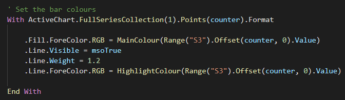
Starting with Series 1, which shows the team's points, Fill Color is set to the team's main colour.
The team name can be retrieved from the Sorted Table in Column S using
Range("S3").Offset(counter, 0).Value
The team name is the key to get the the RBG color value from the MainColour collection. The bar outline color is returned in the same manner from the HighlightColour collection.
Then with the Series 2 labels, the code uses the team name to return the name of the crest image file from the Crests collection.
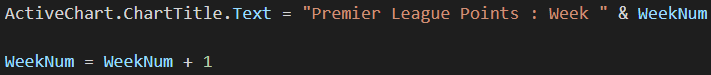
Once that is done the chart title can be updated and WeekNum, which tracks what week we are displaying data for, is incremented, then the code loops around and does it all again.
This is what it looks like.
NOTE: The chart only shows 31 weeks of data because at time of writing only 31 weeks of the season have been played.
Finishing Touches
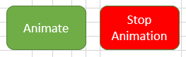
By clicking the 'Animate' button, the chart will display all available week's data. You can stop the animation by clicking on the 'Stop Animation' button.
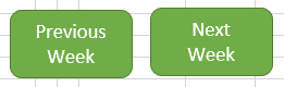
I've also added 'Previous Week' and 'Next Week' buttons that will display the previous week's data, and the next week's data. So you can step through each week and examine the league table in a little more detail.
Summary
Animation is not for the sake of it. If you are going to use it make sure it adds to the understanding of the message the data is telling.
In this case, you would normally see each week's league table in isolation and have to keep track in your mind of a team's position from week to week. This animation helps you visualize the changes in a team's fortunes more easily.
All copyrighted material belongs to the respective copyright holders. Used here for educational purposes.

Hi
when i click on animate or next week button i see err 13 and change value of sorted table to #NAME? how can i fix this err?
Hi Hassan,
Not sure why you are getting that, it works fine for me.
Can you start a topic on our forum and attach the Excel file please.
Regards
Phil
I need help with Wedding event reservation with calendar in excel, I can pay for the service.
Hi Ishaq, we don’t build templates, but I recommend you have a look at Vertex42.com as they have a few different wedding template resources. Mynda
Hi Phil,
did you use a data feed to get the raw data?
I used to use Statto to get this but since its demise, I’ve been unable to find a good alternative
jim
Hi Jim,
If I had the time I’d have used Power Query or written some scraping code to grab all the data, but I didn’t have the time. So I had to go through each week’s table and manually enter it into Excel! I got the data from the fantasy PL site.
Cheers
Phil
When I click the ‘Animate’ button, I get ‘Run time error 13 – type mismatch’ in the AnimatePLChart procedure.
The problem seems to be I don’t have the SORT function, which is used in T4:U23 on the ‘Data’ tab.
I have Office 365 through work, but I guess you have to be an ‘Insider’ to get the SORT function, and that’s blocked by our Administrator, because it might lead to more efficiency, and we can’t have that.
(I can’t be bothered with MS Office on my home computers: I’ve been switching to Linux Mint and use LibreOffice there.)
PS…since it uses VBA anyway, simple solution would be to sort with VBA–eg, bubble sort an array, or use an ArrayList, which is sortable.
Or just put the S:U data in a table and use VBA to re-sort the table each time…
Hi Phillip,
The numerous channels and different timetables for release of things like dynamic array functions does cause a few headaches like this 🙁
Phil
Dear all,
for the below line of the code I receive a run-time error 13 – TYPE Mismatch.
I am using MS Office 365.
What could be the reason?
.Fill.ForeColor.RGB = MainColour(ds.Range(“S3”).Offset(counter, 0).Value)
Thanks in advance for your help.
Hi HB,
Whatever is in MainColour(ds.Range(“S3”).Offset(counter, 0).Value) isn’t a valid RGB value.
What is in cell S3?
Did you get this error the very first time you ran the code or sometime later?
Did you move the chart to another sheet?
Without seeing the workbook and running the code it’s hard to say any more. If you can start a topic no the forum and post the workbook I’ll take a look.
Regards
Phil
.Fill.ForeColor.RGB = MainColour(ds.Range(“S3”).Offset(counter, 0).Value)
run-time error 13 – TYPE Mismatch.
What is wrong?
Hi Jiri,
Hard to say without seeing your code.
In this piece of code
MainColour(ds.Range(“S3”).Offset(counter, 0).Value)
what are the values of counter and ds.Range(“S3”).Offset(counter, 0).Value ?
Regards
Phil