When you have data that spans a long period of time that you want to plot in a chart, the dates in the horizontal axis in a line or scatter chart can get very cluttered. With this clever workaround that Jim Fitch shared with me we can trick Excel into showing data correctly spaced over time and only label specific Excel Chart axis dates.
The scatter chart below illustrates the before:
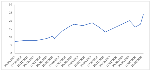
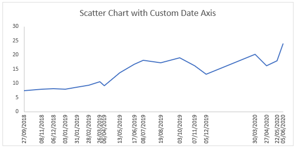
Compared to after when we only label specific dates in the axis:
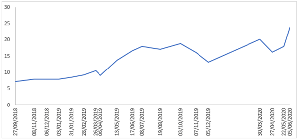
Watch the Video

Download Workbook
Enter your email address below to download the sample workbook.
Steps to Label Specific Excel Chart Axis Dates
The trick here is to use labels for the horizontal date axis. We want these labels to sit below the zero position in the chart and we do this by adding a series to the chart with a value of zero for each date, as you can see below:
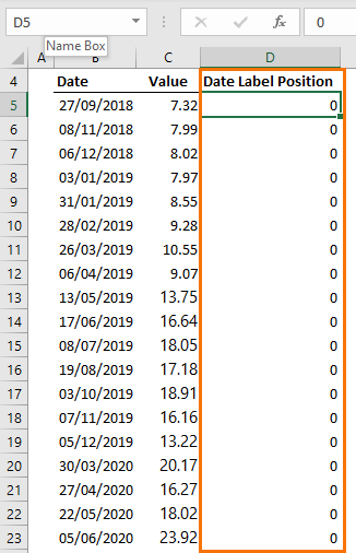
Note: if your chart has negative values then set the ‘Date Label Position’ to a value lower than the minimum negative value so that the labels sit below the line in the chart.
Step 1 - Insert a regular line or scatter chart. I’m going to insert a scatter chart so I can show you another trick most people don’t know*.
Step 2 - Hide the line for the ‘Date Label Position’ series:
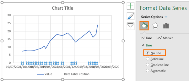
Step 3 – Set the desired minimum and maximum dates (Scatter Charts Only)
Tip*: the dates are shown in their date serial number format, but you can simply enter the new date in your regional date format (d/m/y or m/d/y) and Excel will convert it to the date serial number for you after you press enter:

Step 4 – Hide the horizontal axis labels:
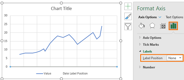
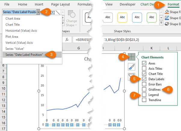
Step 5 – Add Data Labels to the 'Date Label Position' Series.
Use the drop-down list on the Chart Format tab to select the ‘date label position’ series as it’s no longer visible in the chart. While you’re adding elements (4 in image below) also remove the gridlines and legend if required (6 & 7 in image below):
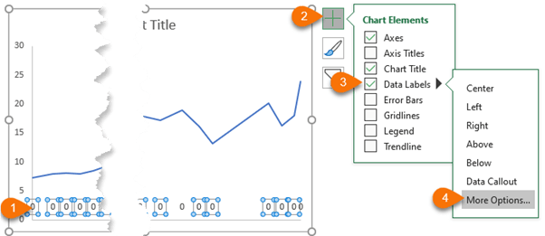
Step 6 – Change labels to dates
Select the zero labels > Data Labels > More Options:
Check the box ‘Value from cells’ (available in Excel 2013 onward), then select the range of dates:
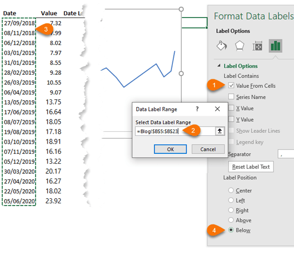
Set the label position to ‘Below’.
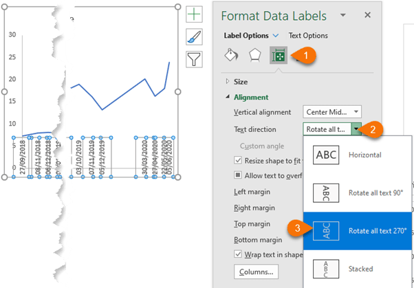
Step 7 – Rotate the Text
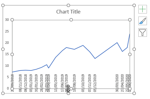
Step 8 – Resize Plot Area to allow room for date labels.
Step 9 – Chart Title
Give the chart a title and resize as required:
Thanks
A big thanks to Jim Fitch for sharing this clever idea.


Dear Mynda,
Thanks a lot for this useful tip and the detailed explanation. I have in fact incorporated this idea at my workplace in one of the scatter charts depicting sales trend. However I am facing an issue in case of negative values (cases of revenue reversals/shift of revenue from one business unit to another). The negative values are plotted below the date axis. I want the date axis to always display at the bottom with all values including the negative ones plotted above it. Any idea on how I can achieve it?
Thanks,
Rajiv
Hi Rajiv, set the date axis position to ‘low’.
Just a note that if the dates in question were the only dates where the values could have been taken/measured, then a line chart works fine. But if the dates were merely discrete sampling points, and we don’t truly know what did or didn’t happen in between (did the value drop before it climbed again while we were not looking?), then a column or bar chart with the dates as the category axis migth be a better choice. Of course your idea somewhat blends those two ideas by calling out the moments from which the values came such that the viewer can more easily realize that everything in between are interpolations.
Since the real point of this post was demonstrating the use of a hidden series with custom labels, then I don’t think that distinction matters. So I’ll just leave it to other readers to choose the best option for their individual situations.
Yes, good points, David.