Gantt charts are handy for planning and managing project tasks over time. They give a visual representation of the whole project, displaying progress to date and work to come. In this tutorial you'll learn how to build an Excel Gantt chart using Conditional Formatting. We’ll also look at how we can highlight tasks that are overdue, and the current date.
Watch the Video

Excel Gantt Chart Workbook Download
Enter your email address below to download the sample workbook.

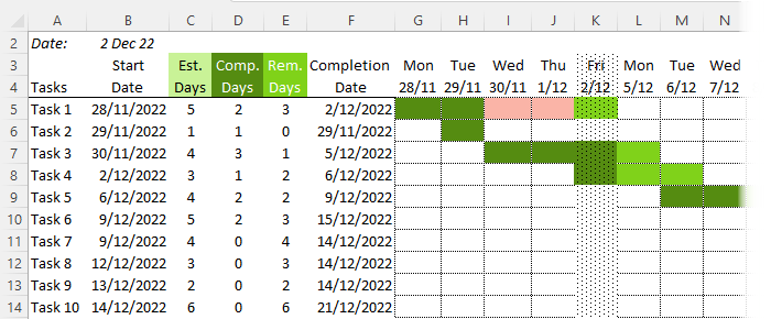
Completion Date Calculation - WORKDAY.INTL
Before we can apply the conditional formats, we need to calculate the completion date in column F. I’ll use the WORKDAY.INTL function as this enables me to specify which days my weekend falls on.
If you’ve got Excel 2007 or Excel 2003, you can use the WORKDAY function instead.
This ensures Excel doesn’t calculate a Saturday or Sunday as the completion date.
The syntax for WORKDAY.INTL is:
WORKDAY.INTL(start_date, days, [weekend], [holidays])
My formula in column F is:
=IF(ISBLANK(B5),"",WORKDAY.INTL(B5-1,D5+E5,1))
Which in English reads:
If B5 is blank then return a blank (this is because if I haven’t put a start date in for a task I don’t want it returning some crazy date in column F), otherwise take the start date in B5 less 1 day (so it doesn’t think the start date is already over), plus the completed days + remaining days, and by the way, we have Saturday and Sunday off so be sure to skip them.
Note: I’ve left the [holidays] argument blank but you can also reference a list of holidays you’d like Excel to skip.
Now for the Conditional Formatting….
Conditional Formatting for Gantt Chart
I'll be colour coding the cells as follows:
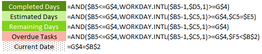
The rules are applied to the date columns G:Z in the following order.
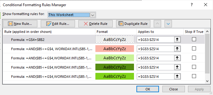
Remember, Conditional Formatting formulas must evaluate to TRUE or FALSE. A TRUE outcome applies the format, whereas FALSE doesn’t.
When you enter your rule you enter it from the perspective of the first cell in your range. In my case this is G5. This is important when considering when to absolute or relative a reference, or part thereof.
Translated into English my formulas read:
Completed Days:
=AND($B5<=G$4,WORKDAY.INTL($B5-1,$D5,1)>=G$4)
Check that the Start Date (in B5) is less than or equal to the first date (in G4), AND calculate the days completed to date by taking the start date (in B5) less 1 + the Completed days (in D5) and check it’s greater than or equal to the first date (in G4). If both of these arguments are TRUE, colour the cell in dark green.
Estimated Days:
=AND($B5<=G$4,WORKDAY.INTL($B5-1,$C5,1)>=G$4,$C5=$E5)
Check that the Start Date (in B5) is less than or equal to the first date (in G4), AND calculate the end date by taking the start date (in B5) less 1 + the Estimated days (in E5) and check it’s greater than or equal to the first date (in G4), AND check that the Estimated number of days is = to the Remaining days. If all of these arguments are TRUE, colour the cell in light green.
Remaining Days:
=AND($B5<=G$4,WORKDAY.INTL($B5-1,$C5,1)>=G$4)
Check that the Start Date (in B5) is less than or equal to the first date (in G4),AND calculate the end date by taking the start date (in B5) less 1 + the Estimated days (in C5) and check it’s greater than or equal to the first date (in G4). If both of these arguments are TRUE, colour the cell in medium green.
Overdue Tasks:
=AND($B5<=G$4,WORKDAY.INTL($B5-1,$C5,1)>=G$4,$F5<$B$2)
Check that the Start Date (in B5) is less than or equal to the first date (in G4),AND calculate the end date by taking the start date (in B5) less 1 + the Estimated days (in C5) and check it’s greater than or equal to the first date (in G4). And check that the completion date is less than today's date in cell B2. If both of these arguments are TRUE, colour the cell in medium green.
Current Date:
=G$4=$B$2
Check that the current date in cell G4 is equal to today's date in B2. Tip: you could replace the reference to B2 with the TODAY function which will automatically return the current date based on your PC's clock, like so:
=G$4=TODAY()
Conditional Formatting Formulas Tips
Testing: I like to test my formulas in the workbook before creating my conditional formats. This allows me to quickly see if it's going to evaluate correctly by displaying the TRUE/FALSE outcomes.
Try it out when you download the workbook. Simply copy the formula from the Rules Manager into cell G5 and then copy it to the remaining cells in the chart (one at a time) to see how each one evaluates.
Perspective: As I said above, remember when you enter your new rule you enter it from the perspective of the first cell in your range when making references absolute.
Order: Another point to mention is that the order of the rules being applied is important. Rearrange their order in the Name Manager and see what happens.
You can learn more on how to work with formulas in Conditional Formatting here.
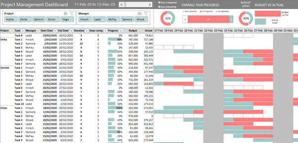
Project Management Dashboard
Take your skills one step further and learn how to create this Project Management Dashboard (click link for tutorial) using PivotTables, Conditional Formatting and Slicers for interactivity:
Feedback
If you liked this please show me by sharing it with your friends and colleagues on LinkedIn, Twitter, Facebook (or all of them 😉 ), or leave a comment below and tell me what you think. I read and reply to them all.

Can you use this in a Table?
Yes, you can modify it to work with a table rather than a PivotTable.
Hello, This is a great Excel Conditional Formatting Gantt Chart.
Where we three columns and colours to indicate Completed Days, Estimated Days & Remaining Days, But can we have one more colour and column which will have due days and colour will change after the actual date.
For E.g. Start Date is 10Th June 2021 and say Est Dt: is 10 Days, So the completion Date will be 20th June 2021, But after 21st June 21, the cell colour should change as per the current to another colour indicating due days.
I tried the formulas, but was not successful, can you or anyone help.
Tejas Desai
[email protected]
Hi Tejas,
Please post your question on our Excel forum where you can also upload a sample file that illustrates what you’ve tried and we can help you further.
Mynda
Your formula does not seem to work for months since months have different number of days. Calendar is in months over multiple years. There is a start date & finish date. But since months end on 28, 29, 30 or 31 the formula does not seem to be so straightforward. Can you tell me how to construct your formula to work with months. Thank you.
Hi Rene,
It’s not just a formula that needs to be changed, you might need to make more related changes.
Can you please upload a sample file with your desired structure? Use our Forum to create a new topic and upload the file.
Regards,
Catalin
Thank you for the information
Is there a way to calculate half days ?
As of now if I put a half day it will calculate only 2.
If there is no way , then is there a way it should rather count it as 3 if the duration contains a half day.
(Basically putting a condition on the B5-1 ,if it should – or not)
Thank you
Hi Marc,
It is possible, of course. The layout will be different. What you want to see in columns? Hours? You will have to prepare a sample file with your desired outcome, the formulas needs to be adjusted and it will work.
You can upload your sample file on our forum, don’t forget to describe what you want.
Sign-up on our forum, create a new topic and upload your file, we will help you solve this one.
Catalin
I am having great difficulty in understanding how this works when all I can use is a start date, duration in weeks and percentage complete with dates that end in friday of each week. I need the duration in one color and the percentage complete in another color.
Your help would be most appreciated.
D Douglas Gruver
Hi Douglas,
Can you please upload a file with a sample of your data to our forum? (create a new topic). It will be easier to understand your situation and to provide a personalized answer.
Catalin
Dear Mynda Treacy,
Thanks a lot !!!
Could you please instruct how to make the conditional format NOT paint the 2 weekend days ?
Thanks again
Hi Jeff,
I’d cheat and add another Conditional formatting rule that filled the cells white if they were a weekend date. You can use this formula to check if the date in row 4 is a Saturday or Sunday:
Make sure this new rule is at the top of the list of rules in your Conditional Formatting Manager.
Mynda
Hi,
Great post!
Is there a way to build a gnatt chart that displays multiple time periods for each task?
For example, Task 1 would have start date 1 end date 1, start date 2, end date 2, and so on. I would be tracking duration by days.
Then, how would you setup conditional formatting so each task would have a unique color in the shaded graph?
Thanks in advance!
Hi B,
Yes, you could split your tasks over multiple rows or colour code components of different durations. This post explains how to use formulas in conditional formatting. Hopefully that’ll point you in the right direction so you can set up your rules as you want.
Kind regards,
Mynda
Thanks for the tip on color coding!
As for my other question, I guess I wasn’t clear enough.
Gannt charts can gaph a single tast and date on a single row.
My problem is I have a single task, but I need to graph multiple dates on a single row for the single task.
Is that possible?
Hi B,
As I said in my previous reply “Yes, you could split your tasks over multiple rows or colour code components of different durations“, meaning on the same row. Just as this example uses Conditional Formatting to create the chart, you’d do the same but you’d have to modify the Conditional Formatting rules to colour code different parts of the task in different colours.
For example, instead of using different colours for ‘estimated days’, ‘completed days’ etc., you’d use different colours for your multiple date components.
Mynda
Hi Mynda,
I’m still a little lost here.
How would you get the chart to graph client “Ams” on a single line if the data looks like this?
Client Start Duration End
As 3/21/19 730 3/20/21
Ams 3/21/19 91 6/20/19
Ams 3/21/20 91 6/20/20
Ams 2/21/21 27 3/20/21
Ams 3/21/22 91 6/20/22
Ns 3/21/19 91 6/20/19
OPEN 6/21/22 272 3/20/23
And, thanks for your patience! This is making my head hurt, don’t know how you do it!
B
Hi B,
If you want the conditional formatting on a single line then you need your data on a single line too. You’ll need to insert more columns so you can fit multiple start and end dates on the same row. For example, you’ll have columns for:
Client
Start 1
Duration 1
End 1
Start 2
Duration 2
End 2
Start 3
Duration 3
End 3
etc.
You then need to set your conditional formatting rule for each duration with separate colour coding. You can hide the start/duration/end columns when you want to print/view the chart.
You should bear in mind that Excel is not a project management system, so if you want something complicated then maybe you should consider a proper project management application. e.g. Microsoft Project.
Mynda
“B”… you are a real ungrateful jerk and moron. Mynda is going out of her way to show you something that is quite remarkable and all you can do is moan and groan. She’s giving you this info for free. No one has what she has in this example… jeez!
Dear sir,
this is awesome, could you let me know what if I also want to put saturday and sunday as well? please help to advise and teach how to change the formula
Hi Rochim,
All you have to do is to replace the formula for Completion Date column:
=IF(ISBLANK(B5),””,WORKDAY.INTL(B5-1,(D5+E5),1))
with:
=IF(ISBLANK(B5),””,B5+D5+E5)
Also, those 3 conditional formatting rules must be updated, you have to replace the WORKDAY formula:
=AND($B5<=G$4,WORKDAY.INTL($B5-1,$D5,1)>=G$4)
with:
=AND($B5<=G$4,$B5+$D5>=G$4)
Same adjustment must be made for each rule.
Catalin
Hi, I am looking for a way to reflect a workflow of let’s say 10 tasks, like the one you had in your post, with a gantt chart like graphic, my drawback is that although the workflow is linear, a task can just happen one or more times, and I want that to be reflected, meaning, the whole process to be reflected, of course, not repeating the row for the repeated tasks, but just coloring the corresponding dates on the same row.
Do you see a way to do such thing?
Thanks!
Hi Igor,
If you can prepare a sample workbook with your data layout, it will be a lot easier to understand your situation and to provide a useful answer, rather than a generic answer.
You can open a new ticket on our Help Desk.
Cheers,
Catalin
Beautiful Gantt chart. It does exactly what I need. Easy to add rows and columns. Thanks so much!
Thanks, Marti. Glad you found it useful 🙂
hello. you seem to be the excel expert. I am looking to set up a gannet chart but having a week timeframe vs daily. I want to make my input based on the specific day then have the conditional format formula apply the color code in the appropriate week. help please.
Hi Lori,
Please use our Help Desk system to upload a sample file with your data. Don’t forget to include detailed informations, to help us understand your situation.
Thanks for understanding
Catalin
Hi,
Thank you very much; at first before reading your training material I had problem with Excel Formatting Gantt Chart, but now so far so good.
Thank you,
Devlin
That’s great to know, Devlin. Glad we could help.
You made my learning about gantt charts in excel easier and fun. Thanks for this post Mynda.
Cheers, David.
Hi, Mynda. You do some fabulous things with Excel. I’m trying to create a technology roadmap to span a 5-year time period. So I’m interested in years and months rather than weeks and days.
Can you tell me how I might be able to convert your sample Conditional Gantt chart to reflect years and months instead of weeks and days?
Very much appreciated,
-John
Hi John,
Thanks for your kind words 🙂
The formulas in my Gantt chart use the WORKDAY.INTL function to increment time by days excluding weekends and holidays. If you want to increment your time/dates by months and years you don’t need to be as exact and can increment time by months/years.
Instead of entering ‘days’ in columnds C, D and E you can enter months and in the formulas simply add 365/12 days for each month instead of using the WORKDAY.INTL function.
Here a few functions that might also be of use to you:
EOMONTH
EDATE
DATEDIF
I hope that gives you some direction. Please let me know if you have any specific questions on implementing it.
Kind regards,
Mynda.
Hi Mynda,
Thank you very much for everything that you have contributed to make Excel an more useful tool! I am a pretty experienced user and invariably pick up something new from your applications, which I thoroughly enjoy.
On the Gantt Chart topic, a closely-related issue is monitoring the execution of your planned project, so you ideally need both planned and actual bars in your graph. Added on top of that the requirement to be able to capture dependencies between the tasks, then you can easily see why dedicated project management software such as MS Project is there.
But there is one application that I have done in Excel that is quite useful (I teach project management at University), and that is to construct a “Planned vs Actual” cumulative hours graph, which would typically be proportional to the cost expenditure on the project – it looks like these “worm” graphs of the cumulative runs scored by the two teams in a cricket match.
I have made it to be generic, so you can enter your own set of tasks and planned vs actual durations and hours, and then it sums across these tasks at the end of every week to produce the graphs.
I have deliberately stayed away from macros, but there is quite a neat application of array formulas in there to calculate the split when tasks “straddle” a week-end.
I will be happy to send this to you to see if you want to share it on your hub if you would supply me with a direct e-mail address?
Regards
Neels
Hi Neels,
Thanks for your kind words 🙂
Your planned vs actuals graph sounds interesting. I’d love to see it.
You can send it to me via the help desk.
Kind regards,
Mynda.
Hi,
Just downloaded this s/sheet and it’s given me some great ideas as to how to solve some of my issues but i’m still hitting one problem that evades me.
When producing the gantt chart how can I colour code the blocks to identify the weekends as different to the week days?
I’ve tried all sorts of routines but nothing is consistent.
Hi Jeff,
You can use the WEEKDAY function to identify the day number of the date and then test whether that day number is the day for Saturday or Sunday like so:
Where A2 contains your date being tested.
I hope that helps.
Kind regards,
Mynda.
Hi,
Thanks for this article. I’m not sure if the text and formulas match,
In text, the reference is for E5 for estimated and remaining days, but the formula reads C5, Is this a typo? But the example download doesn’t seem to show errors.
I haven’t had time to look into further!
Hi Anand,
I’m not sure which formula you’re referring to. The Estimated days has references to both E5 and C5. Can you please be more specific?
Cheers,
Mynda.
I have created a simple library excel spreadsheet for my childs Kindy and I am trying to add a few smarts to it. I have added a calendar control to populate active cells with dates however I am trying to populate a “Book Status” column with “IN”, “OUT” or “Overdue” based on whether certain date formulas are met. i.e if the “Borrowed Date” is blank or the “Return Date” is less than the “Return Due Date” then I require the “Book Status” cell to be populated with “IN”. If the “Return Due Date” is greater than the “Borrowed Date” then I require the “Book Status” cell to be populated with “Overdue”.
Hi Jack,
My apologies if you have read my first comment.
I thought I read “I have some smarts added to it”
instead of “I am trying…”.
Anyways, you may use a nested IF function for this one which is more or less like this one:
based on the assumed data:
references:
IF FUNCTIONS
NESTED IF FUNCTIONS
Cheers,
CarloE
Thanks a for this interesting post.
Thanks Pavel, some interesting charts on your site.
Cheers
Phil
Thanks a lot for this post
You’re welcome, Lin 🙂
Hi Lynda,
Thanks a lot for your inspiring work and enthusiasm.
I have changed some dates in your chart, but the color did not change accordingly; for example, first line, if you replace 27/05 by 02/06 or 07/06, the two first cells remained unchanged whiel they should become light green.
I could send you my Gantt chart more sophisticated than that, because a % of a task in not necessarily calculated on the basis of a number of day, but based on some specific indicators. However, working language in Senegal is French, so I guess that many readers would not understand it !
Again thanks for your time, reactivity and thoughts,
Etienne
Hi Etienne,
Thanks for your comments.
When I change the date in my chart to 2nd June or 7th June it changes for me. Could it be that your computer date format is mm/dd/yy whereas mine is dd/mm/yy? Although your computer should convert the dates when you open the file.
As I mentioned in my tutorial, my chart was really for the purpose of teaching how you could use Conditional Formatting to create a Gantt style chart and I’m sure you can make improvements or tailor it to your needs. Like you suggest, one improvement might be to use % completion of task indicators if days completed/remaining aren’t what you use to measure a project’s status.
I’d love to see your chart although I’m not sure my version of Excel will be able to translate the language but it’s worth a try if you want to share it.
Kind regards,
Mynda.
You are awesome and never cease to amaze me.
Aw, thanks Franee 🙂