• Skip to main content
  • Skip to header right navigation
  • Skip to site footer

My Online Training Hub

Learn Dashboards, Excel, Power BI, Power Query, Power Pivot

  • Courses
  • Pricing
    • Free Courses
    • Power BI Course
    • Excel Power Query Course
    • Power Pivot and DAX Course
    • Excel Dashboard Course
    • Excel PivotTable Course – Quick Start
    • Advanced Excel Formulas Course
    • Excel Expert Advanced Excel Training
    • Excel Tables Course
    • Excel, Word, Outlook
    • Financial Modelling Course
    • Excel PivotTable Course
    • Excel for Customer Service Professionals
    • Multi-User Pricing
  • Resources
    • Free Downloads
    • Excel Functions Explained
    • Excel Formulas
    • Excel Add-ins
    • IF Function
      • Excel IF Statement Explained
      • Excel IF AND OR Functions
      • IF Formula Builder
    • Time & Dates in Excel
      • Excel Date & Time
      • Calculating Time in Excel
      • Excel Time Calculation Tricks
      • Excel Date and Time Formatting
    • Excel Keyboard Shortcuts
    • Excel Custom Number Format Guide
    • Pivot Tables Guide
    • VLOOKUP Guide
    • ALT Codes
    • Excel VBA & Macros
    • Excel User Forms
    • VBA String Functions
  • Members
    • Login
  • Blog
  • Excel Webinars
  • Excel Forum
    • Register as Forum Member

Excel Gantt Chart

You are here: Home / Excel Charts / Excel Gantt Chart
Excel Gantt Chart
May 22, 2013 by Mynda Treacy

Gantt charts are commonly used in project management and while Excel doesn’t have a native Gantt chart in its chart library we can easily create one.

Don’t get too excited, it’s a very basic one.

Gantt Chart Excel

If your job involves complex project management then you probably need a more sophisticated tool like Microsoft Project.

However, for fairly straight forward projects an Excel Gantt chart can be a great visual tool to understand the workflow and timing of your project.

How to Create a Gantt Chart in Excel

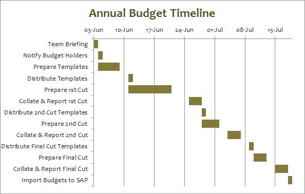
Set up your data. Here is mine:

Gantt Chart Excel

Note: you don’t need the End Date to create your chart, but I think it’s helpful for the planning process.

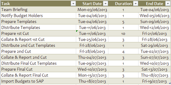
Select any cell in your table and on the Insert tab of the ribbon choose 2D Bar Chart > Stacked Bar Chart:

Gantt Chart Excel

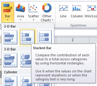
It should look a bit like this:

Gantt Chart Excel

Now the Trickery Begins

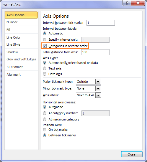
Right click and select the X axis containing the task names and select Format Axis (or if you have Excel 2010 you can just double click the X axis to open the Format Axis dialog box).

Note: in a bar chart the X and Y axis appear to be reversed with X being the vertical axis and Y being the horizontal axis.

Under Axis Options check the ‘Categories in reverse order’ box:

Gantt Chart Excel

Now select the first series in your chart (in mine it’s the grey/gray bars), and on the Home tab of the ribbon select ‘no fill’. This will make this section of the bars invisible.

Gantt Chart Excel

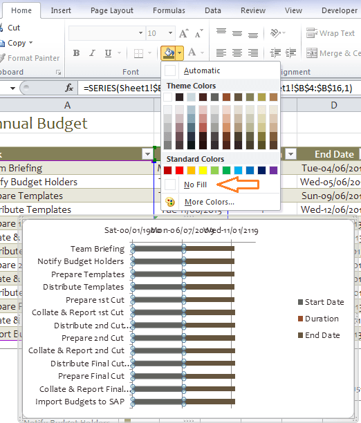
Now click on the brown section of the bar chart that represents the End Date and press the delete key to delete it. While you’re there you can delete the legend too.

Your chart should be taking shape and look a bit like this:

Gantt Chart Excel

Now let’s fix the dates.

First find out the serial number for the start and end dates of your project.

To do this simply format the dates in your table as General and make a note of the serial numbers for the first and last date, then change the formatting back to date.

Note: My dates are formatted ddd-dd/mm/yyyy.

Gantt Chart Excel

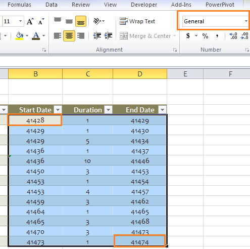
My start date is 3rd June 2013 which has a serial number of 41428 and my end date is 19th July 2013 which has a serial number of 41474.

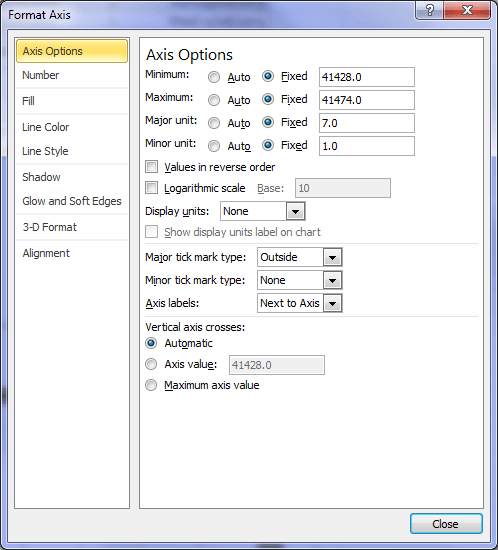
Now right click (or double click if you have Excel 2010) on the Y axis and select Format Axis >Axis Options and make the following changes:

  1. Enter your start date serial number as the minimum
  2. Enter your end date serial number as the maximum
  3. Set your major unit to 7 (to group it into 1 week bands)
  4. Set your minor unit to 1

Gantt Chart Excel

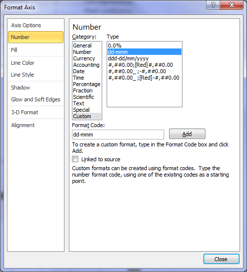
While still in the Format Axis dialog box select the Number tab and change your date format to dd-mmm or mmm-dd if that’s how you format your dates.

Gantt Chart Excel

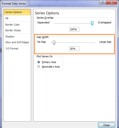
For a finishing touch you can reduce the gap width on your bars to make them a bit bigger. To do this right click on one of the bars > Format Data Series > Series Options. I’ve set mine to 30%:

Gantt Chart Excel

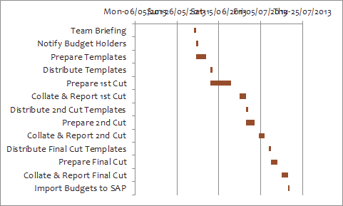
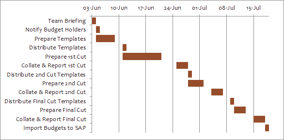
Now your chart should look something like this:

Gantt Chart Excel

Another way to create a Gantt chart in Excel is to use Conditional Formatting, but that’s a topic for another day.

What Do You Think?

If you liked this please use the buttons below to share it with your friends and colleagues on LinkedIn, Facebook, Twitter, +1 on Google or leave me a comment below. I read them all.

Excel Gantt Chart

More Charts Posts

burn up burn down charts

Excel Project Management Burn Down and Burn Up Charts

Excel Burn Down and Burn Up Charts are easy to make with line or scatter charts. They are useful for monitoring the progress of a project.
wee people font charts

Excel WeePeople Font Charts

Excel WeePeople Font Charts are a nice change from generic shapes for waffle charts, bar/column charts and more.
excel dot map charts

Excel Dot Map Charts

Interactive Excel dot map charts are not built-in, but with some creative use of Excel’s built-in tools we can create something unique.
Excel S Curve Charts

Excel S-Curve Charts

Easy Excel S-curve Charts made with PivotTables for project management. Track progress by including budget amounts.
highlighting data in power bi visuals

Highlighting Data in Power BI Visuals

Learn several techniques to highlight or label important data points in your Power BI visuals. Sample file and code to download.
shape maps in power bi

Shape Maps in Power BI

Shape maps in Power BI can be used to show the distribution of a variable across geographic regions. Learn a trick to plot discrete data too.
using jitter to avoid over plotting

Using Jitter to Avoid Over Plotting in Power BI

Plotting data that has one variable where values are similar, can result in points that are plotted over each other. Use jitter to avoid this overplotting.
Excel custom chart labels

Excel Custom Chart Labels

Create dynamic Excel custom chart labels with this category axis hijack trick
Sorting Excel Date Slicers

Sorting Excel Date Slicers

Slicers have some shortcomings when it comes to dates and sort order. This post explains a couple of ways to sort dates correctly in Excel slicers.
Charting Disparate Data in Excel – 3 Solutions and 1 Crazy Mess

Charting Disparate Data in Excel – 3 Solutions and 1 Crazy Mess

More Excel Charts Posts

excel speedometer charts

Excel Speedometer Charts

How to build Excel Speedometer Charts or Gauge Charts as they're also know, why they are BAD and what to use instead.
burn up burn down charts

Excel Project Management Burn Down and Burn Up Charts

Excel Burn Down and Burn Up Charts are easy to make with line or scatter charts. They are useful for monitoring the progress of a project.
wee people font charts

Excel WeePeople Font Charts

Excel WeePeople Font Charts are a nice change from generic shapes for waffle charts, bar/column charts and more.
excel dot map charts

Excel Dot Map Charts

Interactive Excel dot map charts are not built-in, but with some creative use of Excel’s built-in tools we can create something unique.
Excel S Curve Charts

Excel S-Curve Charts

Easy Excel S-curve Charts made with PivotTables for project management. Track progress by including budget amounts.
chart axis switch

Excel Chart Axis Switch

Use radio button form controls to create an Excel chart axis switch enabling you to toggle pannel charts between same axis and own axis.

Excel Charts with Shapes for Infographics

Excel Charts with Shapes for Infographic styling and increased interest in your charts. Easy to insert but there are a few tricks required.
excel pyramid chart

Excel Pyramid Charts

Excel Pyramid charts are useful for visualising demographic data across multiple categories. Let’s look at 3 ways we can build them in Excel.

Highlighting Periods in Excel Charts

Highlighting Periods in Excel Charts helps your users interpret them more quickly and or focus their attention on a point or area.
stacked bar waffle chart

Stacked Bar Excel Waffle Charts

Stacked Bar Excel Waffle Charts are an alternate to using conditional formatting to build waffle charts, and some say they're easier.
Category: Excel ChartsTag: charts
Previous Post:VLOOKUP Multiple Values in Multiple ColumnsVLOOKUP Multiple Values in Multiple Columns
Next Post:Excel Conditional Formatting Gantt Chartexcel conditional formatting gantt charts

Reader Interactions

Comments

  1. Youjay Frank

    July 11, 2017 at 9:46 pm

    Very exciting tutorial on preparing Gantt Chart. How can I insert a vertical bar on the chart to show the progress date?

    Reply
    • Catalin Bombea

      July 14, 2017 at 12:29 am

      Hi Frank
      You can try a conditionally formatted row, in the image below I set Start dates in F13 to R13, then a conditional formatting formula to that range:
      =F13https://1drv.ms/i/s!AjfS33R8yoG9jIpoRRCIDutc6Gt9tg
      The date axis will be filled based on today date.
      Catalin

      Reply
  2. Mike

    April 19, 2017 at 11:56 pm

    How can do multiple start and end dates on the same line? For example: A person completes the same task for 20 days, 40 days, and 50 days with in a 1 year period.

    Reply
    • Mynda Treacy

      April 24, 2017 at 7:53 am

      Hi Mike,

      Yes, you can. You just need to calculate the gap i.e. the number of days between the end date and the new start date. And calculate the second duration. Add both of these columns to the chart and set the gap part of the bar to no fill.

      Mynda

      Reply
  3. Andrea

    April 5, 2016 at 7:46 am

    This is great! Is there a way to add an additional data point and apply conditional formatting so that the bars are different colors based on that additional data point? For example, I have a project plan and different actions for different audiences (employees or managers) and I want the bars for employees to be one color, and the bars for managers to be a different color.

    Reply
    • Catalin Bombea

      April 5, 2016 at 9:04 pm

      Hi Andrea,
      Depends on your layout, but in theory, it can be done. You can upload a sample file, if you need more help on this, on our Help Desk (open a new ticket).
      Cheers,
      Catalin

      Reply
  4. marghay13

    March 29, 2016 at 5:32 pm

    Thanks – that’s really helpful. Think I’ve got it now. Didn’t get the series number before but it makes sense now. I also found it was better to ignore the chart wizard icon.

    Reply
  5. Henny

    August 25, 2014 at 4:22 am

    Thanks. It works well with 2011.

    Reply
    • Mynda Treacy

      August 25, 2014 at 7:49 am

      🙂 Glad I could help, Henry.

      Reply
  6. Maria Schneider

    July 9, 2014 at 11:43 pm

    That’s a nice little tool … even if I just started to pull my hair out because I never got to see the “bar” I wanted, the duration. Until I read for the 100th time and saw that I have to DELETE the “end date”.

    So my question: why add them in the first place when creating the chart? Just because you selected the whole table, and you did the “selection” afterwards? Or is there a deeper meaning behind, that I don’t get?

    Otherwise I must say that excel had some difficulties to create the chart right from the start with 900 task lines (never looked like what you got) … ^^ … so I created it for about 100 and added the rest afterwards via the “select data” option.

    Anyway, I am really glad to have been able to built a gantt with this little tutorial. Thank you very much!
    I tried the conditional formatting gantt too: quite funny to do. 🙂

    Reply
    • Mynda Treacy

      July 10, 2014 at 7:50 pm

      Hi Maria,

      If you don’t select all the columns the dates won’t be on the correct axis. You can try it yourself and see the results.

      I can imagine 900 tasks would look quite crammed!

      Glad you’ve been able to get it to work for your needs.

      Mynda

      Reply
  7. Bryan

    July 8, 2013 at 11:22 pm

    This was a really great article! I used the techniques involved to create a Gantt chart with color-coded bars, instead of just one color. I used a start and end date column, then had a series of values that evaluated to 0 or the date difference, depending on a set of criteria. In other words, if a 3-day project was supposed to be red, then the “red” column was set to 3 and the “green” column was set to 0. Then I created the chart similar to how you created yours, but I added extra series for each column. Since I made sure that the total of all the colors added up to the total duration of that step, the bars appear where they should, but with different colors. Lastly, I added a two-point xy chart with values (TODAY(),1) AND (TODAY(),100) on a secondary axis to show how far along in the timeline we are. As time goes along, the whole thing automatically updates itself.

    Reply
    • Mynda Treacy

      July 9, 2013 at 9:15 am

      Cheers, Bryan. Sounds great. Thanks for sharing.

      Reply
    • Joe

      December 7, 2016 at 5:26 am

      Hi Bryan,
      I like what you’ve done with the chart. Any chance you could share the file as Im really struggling with it?
      Much appreciated
      Joe

      Reply
  8. Cintya

    June 13, 2013 at 4:20 pm

    Hi Mynda

    I enjoyed your tutorial a lot! that’s cool, I never know how to create other chart apart from the basic one built in excel.

    Thank you a lot

    Reply
    • Mynda Treacy

      June 13, 2013 at 4:54 pm

      Thanks, Cintya 🙂

      Reply
  9. Charlotte

    May 30, 2013 at 11:40 pm

    Thanks, this is really useful. It’s always a challenge to create an effective Gantt chart in Excel.

    Reply
    • Mynda Treacy

      May 31, 2013 at 7:13 am

      Thanks, Charlotte 🙂

      Reply
  10. Pietro Immordino

    May 27, 2013 at 3:12 pm

    Hi Mynda,

    Nice spreadsheet. Good for small projects.

    Made a couple of additional “enhancements” as follows:
    – calculated the End Date using the function WORKDAY.INTL to take care of weekends and public holidays (who wants to work on weekends and public holidays …)
    – added new column to calculated the actual elapsed days as End Date (calculated using WORKDAY.INTL) minus Start Date and used this column for the chart

    Reply
    • Mynda Treacy

      May 27, 2013 at 7:12 pm

      Ah, Pietro. On the contrary…at budget time you work everyday 🙂 Well, back in my London days we did!

      Actually you raise a good point. Thanks.

      I also used the WORKDAY function to calculate some of the start dates that were dependent on previous tasks.

      Thanks for sharing.

      Mynda.

      Reply
  11. Bakar

    May 27, 2013 at 12:09 am

    Fantastic I am doing something like this called a loading on excel will send you the file after completing…..

    Reply
    • Mynda Treacy

      May 27, 2013 at 1:08 pm

      Great. Looking forward to it, Bakar 🙂

      Reply
  12. Etienne Baijot

    May 23, 2013 at 12:56 am

    Hi Mynda,

    Thanks for sharing your experience with us. We were in touch earlier when I was working in Manila. Right now, I am In Africa, in Dakar.

    I would like to comment like this; I like to work with Excel rather than Microsoft for gantt chart, but the way you presented here (and this is the most common we found on internet) is not very useful, and is just worth for small project. More interesting is to work on the sheet itself with conditional formatting to be able to see changes in the dates (delay or anticipation), and even more interesting % of implementation, all this on the same line. The only problem is that if you work over 3 years for example, and on a monthly basis, Excel will not fill up properly because, a task finishing on June 10 will be considered as finished on June 30!!

    So as someone else mentioned below, would appreciate your advice on this!!

    With best regards,

    Etienne

    Reply
    • Mynda Treacy

      May 23, 2013 at 9:59 am

      Hi Etienne,

      Thanks for your comments. I agree, and mentioned in my post above, this application of Gantt charts is limited, but still useful for many. I’ve put a Conditional Formatting version on the To-Do list 🙂

      Kind regards,

      Mynda.

      Reply
  13. Siddhu

    May 22, 2013 at 11:02 pm

    It’s useful me Thank u

    Reply
    • Mynda Treacy

      May 23, 2013 at 9:53 am

      Cheers, Siddhu 🙂

      Reply
  14. Kevin Duncan

    May 22, 2013 at 5:51 pm

    Brilliant lesson in basic Gantt charts. It still amazes me how versatile Excel is. Being part of a construction company we use these all the time. For those of us non-experts who do not use bespoke software this is a great little tool. Bring on the conditional formatting lesson.

    Reply
    • Mynda Treacy

      May 22, 2013 at 7:48 pm

      Thanks, Kevin 🙂

      Reply

Leave a Reply Cancel reply

Your email address will not be published. Required fields are marked *

Current ye@r *

Leave this field empty

Sidebar

More results...

Shopping Cart

mynda treacy microsoft mvpHi, I'm Mynda Treacy and I run MOTH with my husband, Phil. Through our blog, webinars, YouTube channel and courses we hope we can help you learn Excel, Power Pivot and DAX, Power Query, Power BI, and Excel Dashboards.

Subscribe to Our Newsletter

Receive weekly tutorials on Excel, Power Query, Power Pivot, Power BI and More.

We respect your email privacy

Guides and Resources

  • Excel Keyboard Shortcuts
  • Excel Functions
  • Excel Formulas
  • Excel Custom Number Formatting
  • ALT Codes
  • Pivot Tables
  • VLOOKUP
  • VBA
  • Excel Userforms
  • Free Downloads

239 Excel Keyboard Shortcuts

Download Free PDF

Free Webinars

Excel Dashboards Webinar

Watch our free webinars and learn to create Interactive Dashboard Reports in Excel or Power BI

Click Here to Watch Now
  • Excel
  • Excel Charts
  • Excel Dashboard
  • Excel Formulas
  • Excel PivotTables
  • Excel Shortcuts
  • Excel VBA
  • General Tips
  • Online Training
  • Outlook
  • Power Apps
  • Power Automate
  • Power BI
  • Power Pivot
  • Power Query
 
  • About My Online Training Hub
  • Contact
  • Disclosure Statement
  • Frequently Asked Questions
  • Guarantee
  • Privacy Policy
  • Terms & Conditions
  • Testimonials
  • Become an Affiliate

Copyright © 2023 · My Online Training Hub · All Rights Reserved

Microsoft and the Microsoft Office logo are trademarks or registered trademarks of Microsoft Corporation in the United States and/or other countries. Product names, logos, brands, and other trademarks featured or referred to within this website are the property of their respective trademark holders.

Download A Free Copy of 100 Excel Tips & Tricks

excel tips and tricks ebook

We respect your privacy. We won’t spam you.

x