Most PivotTables are built from one flat table. That works… until your data stops being flat.
In real-world datasets, customers sit in one table, products in another, and transactions somewhere else entirely. Trying to force all of that into a single table is where problems start to appear.
In this guide, you’ll learn how to fix three common reporting issues using Excel’s Power Pivot and DAX measures (formulas), without messy workarounds like lookup columns or duplicated data.
Table of Contents
- Watch the Video
- Get the Example File Here
- Why Regular PivotTables Start Breaking Down
- The Power Pivot Approach
- Example Data Model
- Step 1: Prepare Your Data
- Step 2: Load Data into the Power Pivot Data Model
- Step 3: Create Relationships
- Step 4: Build a PivotTable from Multiple Tables
- Problem 1: Implicit Calculations Are Limited
- Problem 2: Counting Rows Instead of Unique Values
- Problem 3: Calculations That Depend on Correct Aggregation
- Add Interactivity with Slicers
- Understanding Filter Context
- Next Steps
Watch the Power Pivot vs PivotTables Video

Get the Example File Here
Enter your email address below to download the free file.

Why Regular PivotTables Start Breaking Down
A standard PivotTable expects all fields to live in one table. When your data is split across multiple tables, you typically have two options:
- Add lookup columns using formulas like XLOOKUP
- Merge everything into one large dataset with Power Query
Both approaches create problems:
- Larger file sizes and slower performance
- Duplicated data that becomes harder to maintain
- Calculations that look correct can sometimes be wrong
This is where Power Pivot changes the game.
The Power Pivot Approach
Instead of flattening your data, Power Pivot allows you to:
- Keep each table separate
- Create relationships between them
- Build PivotTables from multiple tables
- Write reusable calculations using DAX
This mirrors how databases work, and it is far more scalable.
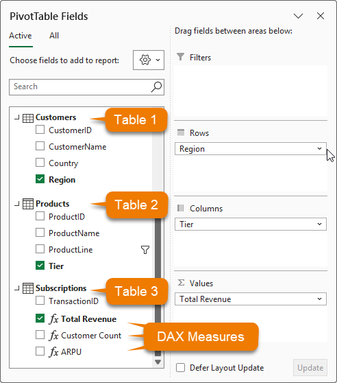
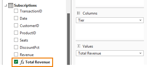
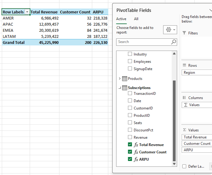
The image below shows the Power Pivot PivotTable field list containing all 3 tables and fields from each used in the Rows, Columns and Values areas:
Example Data Model
We’ll work with three tables:
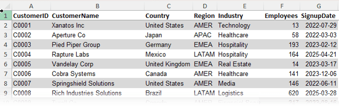
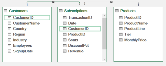
Customers: One row per customer with details like region, country, and industry
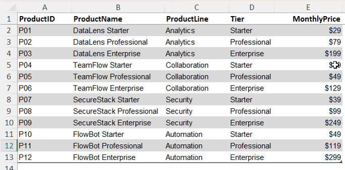
Products: One row per product with attributes like product line and tier
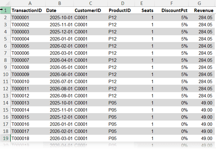
Subscriptions: The transaction table containing payments, dates, customer IDs, product IDs, seats, discounts, and revenue
The key idea is simple. The transaction table connects everything, while the other tables provide descriptive context.
Step 1: Prepare Your Data
Convert each dataset into an Excel Table:
Home tab → Format as Table
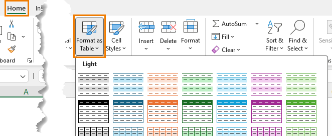
Rename them clearly:
• Customers
• Products
• Subscriptions
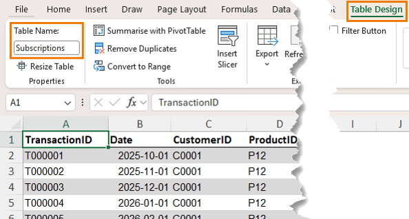
This makes them easier to manage and load into the model.
Step 2: Load Data into the Power Pivot Data Model
For each table:
Power Pivot tab → Add to Data Model
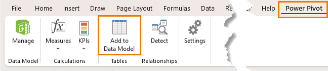
Once added, in the Power Pivot window switch to Diagram View.
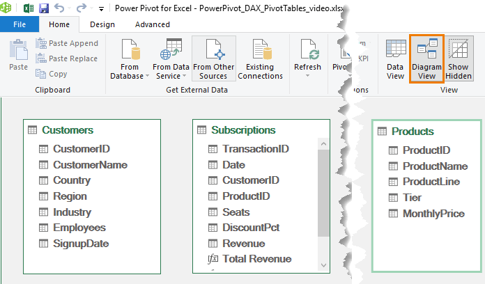
Step 3: Create Relationships
Drag and connect:
• Customers[Customer ID] → Subscriptions[Customer ID]
• Products[Product ID] → Subscriptions[Product ID]
Now the model understands how everything is linked.
Important rule: lookup tables, in this example the Customers and Products tables must contain unique values. If a customer or product appears more than once, you cannot create the relationship. This is to prevent ambiguous results, just like a lookup formula returning multiple matches.
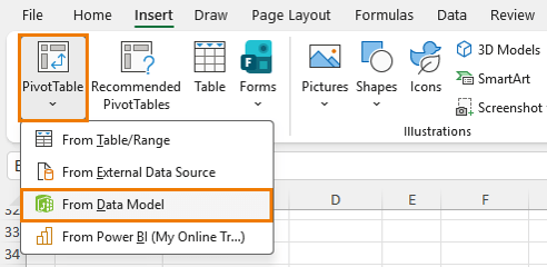
Step 4: Build a PivotTable from Multiple Tables
Insert a PivotTable from the data model:
Power Pivot → Home → PivotTable → From Data Model
Now you can combine fields from different tables:
• Region from Customers
• Product Line from Products
• Revenue from Subscriptions
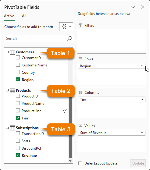
This is something a regular PivotTable cannot do without reshaping the data first.
Problem 1: Implicit Calculations Are Limited
By default, Excel sums values automatically. That works, but it is not reusable or flexible.
Solution: Create a Measure
Create your first DAX measure by right-clicking on the ‘Subscriptions’ table in the field list → Add Measure:
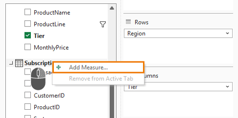
The measure name is Total Revenue and the formula is:
= SUM(Subscriptions[Revenue])
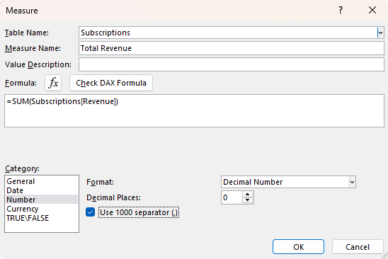
Now you have a reusable calculation that can be used across reports and inside other measures.
Problem 2: Counting Rows Instead of Unique Values
If you add Customer ID to a PivotTable, Excel counts rows, not customers – remember, we only have 200 customers, not 4148:
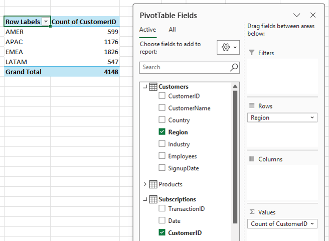
This leads to inflated results because one customer may have multiple transactions.
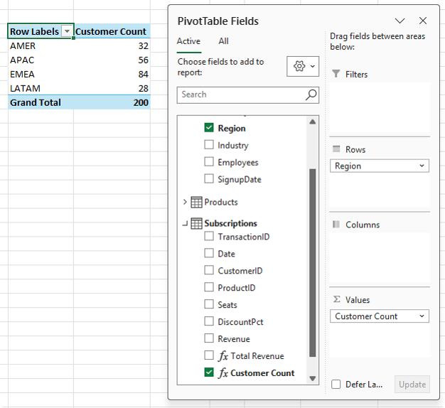
Solution: Use DISTINCTCOUNT
Create a new measure:
Customer Count: = DISTINCTCOUNT(Subscriptions[Customer ID])
Now each customer is counted once per context, which gives accurate results:
Problem 3: Calculations That Depend on Correct Aggregation
Metrics like average revenue per user (ARPU) depend on correct inputs.
If your customer count is wrong, your final calculation is also wrong.
Solution: Build Measures on Top of Measures
Create a measure for ARPU using the measures calculated earlier:
ARPU: = DIVIDE([Total Revenue], [Customer Count], "")
DIVIDE is preferred over the standard division operator because it handles divide-by-zero safely.
Now your report shows:
• Total Revenue
• Unique Customers
• Average Revenue per Customer
All updating correctly as filters change.
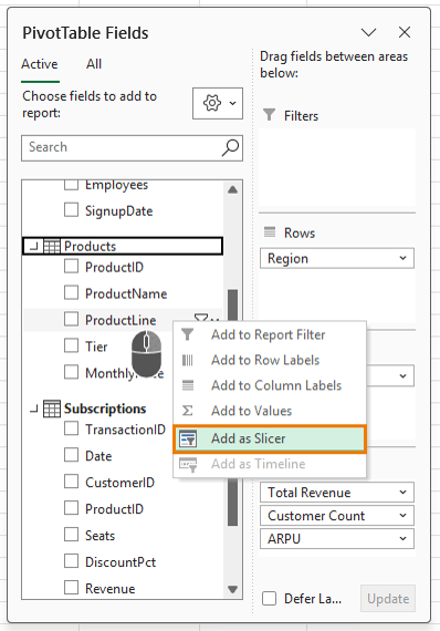
Add Interactivity with Slicers
Insert a slicer for Product Line: right-click the field in the field list → Add as Slicer:
Now when you filter by product line, all measures update instantly:
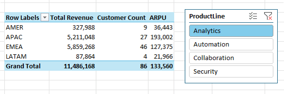
This works because of something called filter context.
Understanding Filter Context
Every cell in a PivotTable has an invisible set of filters applied.
For example:
• Row: Region = AMER
• Column: Tier = Enterprise
• Slicer: Product Line = Analytics
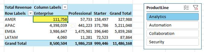
That combination defines what data is included in the calculation – you can think of it like a SUMIFS formula where the row labels, column labels and filters/slicer selections are the criteria.
Each measure runs within that context. The formula does not change, only the data it sees.
Even totals behave differently because they operate under a different context.
Once you understand this, DAX becomes much easier to work with.
What This Means in Practice
Power Pivot sits between raw data and reporting. It gives you:
- Cleaner data models
- More accurate calculations
- Better scalability
- Flexibility to build advanced metrics
It’s also the modelling engine inside Power BI, making it a valuable skill beyond Excel.
Next Steps
If you’re still flattening data, start by moving to a proper data model with relationships and measures. Even a simple setup will improve accuracy straight away.
If you want to go further, my Power Pivot and DAX course shows you how to build models, write measures, and handle more advanced calculations.
