Imagine you're knee-deep in a sales report, trying to pinpoint the key factors driving your revenue. But as you sift through piles of data, the task feels overwhelming.
This is where the Pareto Principle, or the 80/20 rule, becomes your best friend. It helps you focus on the 20% of factors that contribute to 80% of your results.
But how do you identify that crucial 20% without wasting hours? Thankfully, Pareto Analysis in Excel is quick and effective with its powerful tools, turning complex data into actionable insights.
Table of Contents
- Pareto Analysis in Excel Video
- Pareto Analysis Excel File
- Sorting Your Data for Quick Wins
- Using Filters to Zero In on Key Data
- PivotTables: Your Go-To Tool for Large Data Sets
- Enhancing Insights with Conditional Formatting
- Visualizing Data with Pareto Charts
- Next Steps: Setting Up Your Data for Success
Watch the Pareto Analysis Video

Get the Pareto Analysis Excel File
Enter your email address below to download the sample workbook.
Pareto Analysis in Excel Step-by-step
Sorting Your Data for Quick Wins
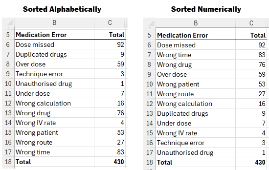
When working with small datasets or data that's already aggregated, one of the simplest ways to apply the Pareto Principle is by sorting your data. For example, if you have a table of medication errors sorted alphabetically, a quick sort in descending order by total errors will bring the most critical issues to the forefront:
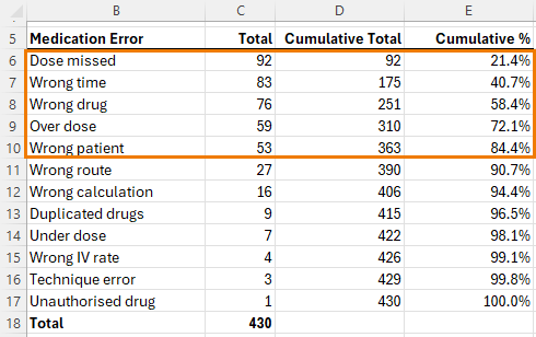
By adding a cumulative total and percentage, you can quickly identify the errors that account for 80% of cases, helping you focus your efforts where they matter most.
Step-by-step Sorting
1. Select Your Data:
Highlight the dataset you want to analyze.2. Sort the Data:
- Go to the Data tab in the Excel ribbon.
- Click on Sort.
- Choose the column you want to sort by, such as "Total Errors" or "Sales".
- Select Sort Largest to Smallest.
3. Add a Cumulative Total:
- In a new column, enter a formula to calculate the running total. For example, if your values start in cell D6, enter =SUM(B$2:B2) and copy down.
- Drag this formula down the column to apply it to the entire dataset.
4. Calculate Cumulative Percentage:
In another column, calculate the cumulative percentage by dividing each cumulative total by the overall total. For example, in cell E6 enter: =C2/$C$18 then copy down.
Using Filters to Zero in on Key Data
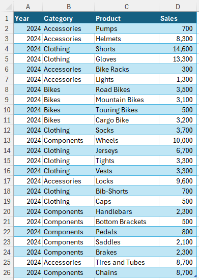
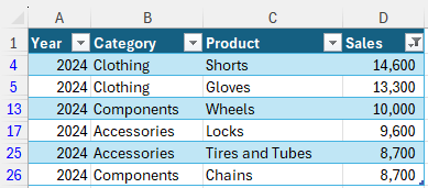
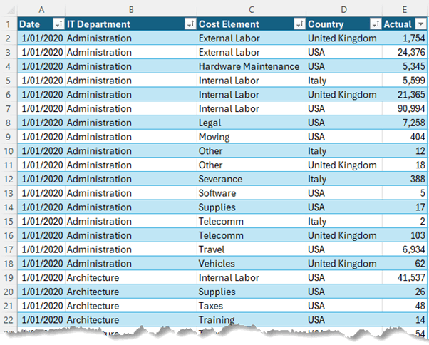
If you're dealing with larger datasets, filters can be your best ally. Suppose you have a table with sales data categorized by year, product, and region.
To focus on your top 5 products by sales value, you can easily add filter buttons and adjust them to show only the top contributors.
This method allows you to focus on the most impactful data points without getting lost in the details.
Step-by-Step Guide to Filters:
1. Activate Filters:
- Select your dataset.
- Go to the Data tab and click Filter. Alternatively, if your data is in an Excel Table, this step might already be done.
2. Filter for Top Values:
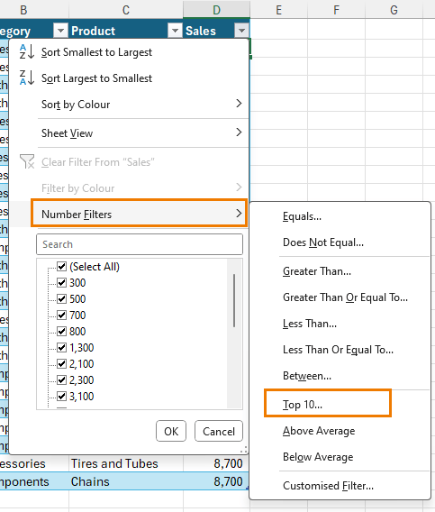
- Click the filter arrow on the column you want to focus on (e.g., Sales).
- Choose Number Filters > Top 10.
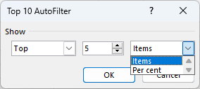
- Adjust the settings to show the top 5, 10, or 20% as needed.
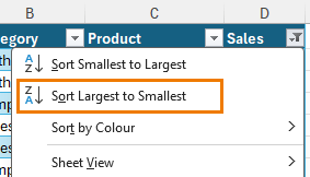
3. Sort Filtered Data:
After filtering, you can also sort the data within the filtered view to see the top contributors at the top.
PivotTables: Your Go-To Tool for Large Data Sets
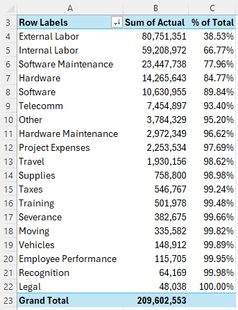
For even larger datasets, PivotTables are invaluable. They allow you to summarize extensive data quickly, revealing hidden insights without the need to scroll through thousands of rows.
By sorting your PivotTable in descending order and using cumulative percentages, you can effortlessly apply the Pareto Principle, identifying the few key elements that account for the majority of your results.
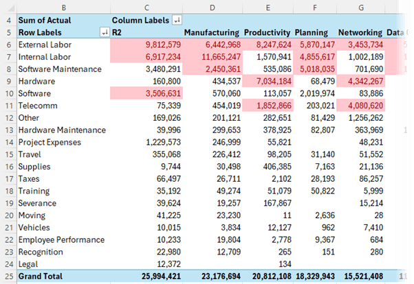
PivotTables also give you the flexibility to analyze your data from different angles, such as by country or department, making it easier to tailor your strategies accordingly.
Step-by-Step Guide to PivotTables:
1. Insert a PivotTable:
- Select your data range.
- Go to the Insert tab and click PivotTable.
- Choose where you want the PivotTable to be placed (new worksheet or existing).
2. Set Up Your PivotTable:
Drag the relevant fields into the Rows and Values areas. For example, you might drag "Cost Element" to Rows and "Cost" to Values.
3. Sort the Data:
- Click on any value within the PivotTable.
- Go to the Data tab, then choose Sort and select Largest to Smallest.
4. Calculate Cumulative Percentage:
- Drag the same field (e.g., "Cost") to the Values area again.
- Right-click the new value, select Show Values As > % Running Total In, and choose the appropriate base field (e.g., "Cost Element").
Enhancing Insights with Conditional Formatting
Sometimes, even after applying sorting and filtering, your data might still feel overwhelming. This is where Conditional Formatting your PivotTables comes in handy. By applying color scales or highlighting the top 20% of values, you can visually pinpoint areas that require your attention. This not only helps you focus on critical data but also makes it easier to communicate your findings to others.
Step-by-Step Guide to Conditional Formatting:
1. Select the Data Range: Highlight the data range within your PivotTable or regular table that you want to analyze.
2. Apply Conditional Formatting:
- Go to the Home tab.
- Click on Conditional Formatting.
- Choose Color Scales to apply a gradient that highlights values from highest to lowest.
3. Highlight Top Percentages:
- For more specific analysis, choose Top/Bottom Rules > Top 10% from the Conditional Formatting menu.
- Adjust the percentage to 20% or any other threshold that suits your analysis.
4. Edit the Rule:
Go to Manage Rules under the Conditional Formatting menu to customize how the top percentages are displayed, such as applying them to each group or category.
Visualizing Data with Pareto Charts
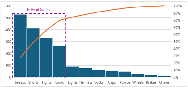
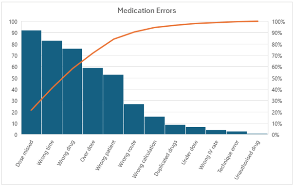
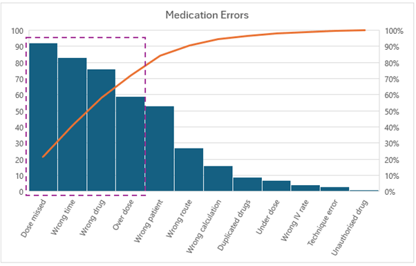
After applying these methods, you can take your analysis a step further by visualizing the 80/20 rule with a Pareto Chart. This chart combines a column graph and a line graph to show individual values and cumulative totals.
It's particularly useful for identifying the few factors that have the most significant impact. With Excel's built-in Pareto Chart feature, you can quickly generate this visualization, even if your data isn't sorted, making it an essential tool for any data-driven decision-maker.
Step-by-Step Guide to Pareto Charts:
1. Prepare Your Data:
Ensure your data is in a table grouped by categories and corresponding values.
2. Insert a Pareto Chart:
- Select the data range you want to include in the chart.
- Go to the Insert tab, click on Statistical Charts, and choose Pareto.
3. Customize the Chart:
- Resize and format the chart to ensure all labels are visible.
- The chart will automatically display a column graph of individual values and a line graph showing the cumulative percentage
4. Interpret the Chart:
Look for the point where the cumulative line crosses the 80% mark. This indicates the categories that contribute to 80% of the total.
Using a Pareto Chart helps you visually confirm the findings from your analysis, making it easier to communicate your insights.
Next Steps: Setting Up Your Data for Success
Before you dive into your own Pareto analysis, it's essential to ensure your data is set up correctly. A common mistake is jumping into analysis without properly formatting your data, which can lead to hours of wasted effort. To avoid this pitfall, check out my tutorial on how to set up your data in the right format.
It's the perfect next step to make your analysis smooth and efficient, ensuring you're extracting the most accurate and actionable insights from your data.



Great artilce
Thank you, Rohan!