• Skip to main content
  • Skip to header right navigation
  • Skip to site footer

My Online Training Hub

Learn Dashboards, Excel, Power BI, Power Query, Power Pivot

  • Courses
  • Pricing
    • Free Courses
    • Power BI Course
    • Excel Power Query Course
    • Power Pivot and DAX Course
    • Excel Dashboard Course
    • Excel PivotTable Course – Quick Start
    • Advanced Excel Formulas Course
    • Excel Expert Advanced Excel Training
    • Excel Tables Course
    • Excel, Word, Outlook
    • Financial Modelling Course
    • Excel PivotTable Course
    • Excel for Customer Service Professionals
    • Excel for Operations Management Course
    • Excel for Decision Making Under Uncertainty Course
    • Excel for Finance Course
    • Excel Analysis ToolPak Course
    • Multi-User Pricing
  • Resources
    • Free Downloads
    • Excel Functions Explained
    • Excel Formulas
    • Excel Add-ins
    • IF Function
      • Excel IF Statement Explained
      • Excel IF AND OR Functions
      • IF Formula Builder
    • Time & Dates in Excel
      • Excel Date & Time
      • Calculating Time in Excel
      • Excel Time Calculation Tricks
      • Excel Date and Time Formatting
    • Excel Keyboard Shortcuts
    • Excel Custom Number Format Guide
    • Pivot Tables Guide
    • VLOOKUP Guide
    • ALT Codes
    • Excel VBA & Macros
    • Excel User Forms
    • VBA String Functions
  • Members
    • Login
    • Password Reset
  • Blog
  • Excel Webinars
  • Excel Forum
    • Register as Forum Member

Excel Waffle Charts with Conditional Formatting

You are here: Home / Excel Charts / Excel Waffle Charts with Conditional Formatting
Excel waffle Charts
December 3, 2020 by Mynda Treacy

Excel Waffle Charts are a popular way to visually display parts to a whole. You can think of them as an alternative to pie and doughnut charts.

Waffle charts are better at displaying small segments that often get lost in a pie chart. However, that doesn’t mean you should get carried away with the number of segments you display in a waffle chart. I still recommend no more than 3. After that it’s too difficult to compare the segments.

There are a couple of ways we can build Excel waffle charts, and in this example we’ll look at Conditional Formatting individual cells based on United States Congress data as shown below.

Excel Waffle Charts

Source: https://www.bbc.com/news/election-us-2020-54853289

Watch the Video

Subscribe YouTube

Download Workbook

Enter your email address below to download the sample workbook.

By submitting your email address you agree that we can email you our Excel newsletter.
Please enter a valid email address.

Download the Excel Workbook and follow along. Note: This is a .xlsx file please ensure your browser doesn't change the file extension on download.

Building Relative Excel Waffle Charts

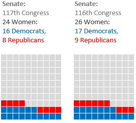
We’ll start with a waffle chart that adds up to 100 or 100% using a 10 x 10 grid of cells, also known as relative waffle charts. The US Senate data works well for this example as there are 100 senators. Of course, it also works well for data that adds up to 100%.

10 x 10 Excel Waffle Charts

Each cell in the waffle charts shown above is numbered from 1 to 100, starting in the bottom left. The numbers are hidden because the cells are too small to display them. However, If your cells are large enough to display the numbers, you can include font formatting colour in the conditional formatting rules for the fill colour (covered later) to hide them.

Waffle Chart Grid

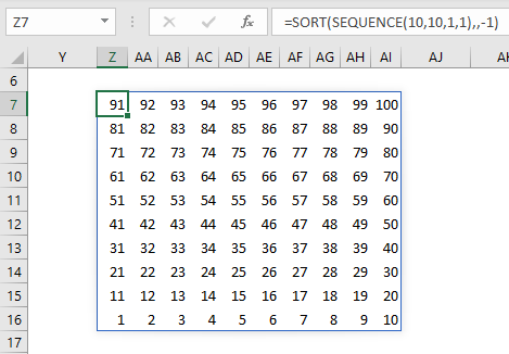
We start by numbering the cells from 1 to 100. Those of us with Dynamic Array formulas can use the SEQUENCE function below to generate the numbers:

=SORT(SEQUENCE(10,10,1,1),,-1)

Enter the SEQUENCE formula in the top left cell, as shown in cell Z7 in the image below:

Excel Waffle Chart grid formula

Note: If you don’t have Dynamic Array functions, you can use the formula below in the top left cell of your table and then copy and paste to the remaining cells in the 10 x 10 grid:

=COLUMNS($A1:A$10)+10*(ROWS($A1:$A$10)-1)

Tip: if you want percentages, divide the formulas by 100:

=SORT(SEQUENCE(10,10,1,1),,-1)/100
=(COLUMNS($A1:A$10)+10*(ROWS($A1:$A$10)-1))/100

Conditional Formatting Relative Waffle Charts

Before I apply the conditional formatting, set the cell fill colour for all cells to a light grey with a white border.

Next, apply the Conditional Formatting to set the cell fill colours based on the values for Democrats and Republicans. Select all of the cells in the 10 x 10 grid then go to the Home tab > Conditional Formatting > New Rule.

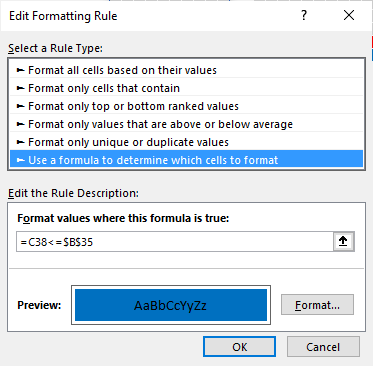
If we take the first waffle chart as the example, you can see in the image below that the red fill colour is set when the current cell number is less than or equal to the value for Democrats in cell B35 + the value for Republicans in cell B36:

Excel Waffle Chart conditional formatting rule

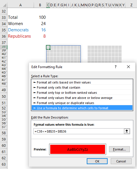
Note: This will colour the cells numbered 1-24 red, but once the blue Conditional Formatting rule is set up it will override cells numbered 1-16.

Repeat the steps above to set up the Conditional Formatting for the blue fill colour, referencing the value in the helper cell B35:

Excel Waffle Chart conditional formatting rule

Ensure the order of formatting rules is correct, with blue at the top of the list, then red:

conditional formatting rules manager

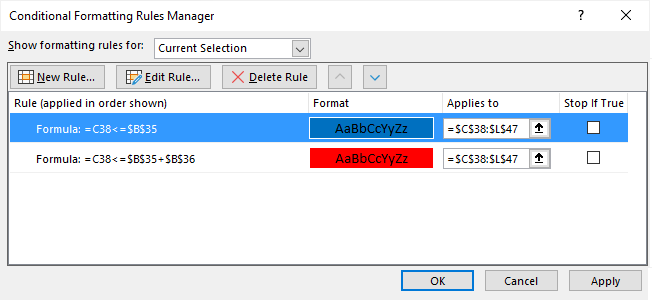
Use the up/down arrows in the Rules Manager dialog box (shown above) to rearrange the order.

Lastly, adjust the row height and column width so that each segment is a square.

Building Absolute Excel Waffle Charts

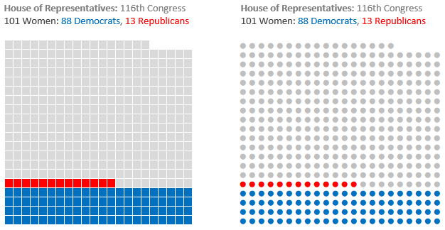
Absolute waffle charts don’t necessarily add up to 100. Instead, each square or dot in the chart represents one unit, with the total number of squares or dots adding up to the total data.

In the example below there are 435 people who make up the United States House of Representatives and each chart displays 435 segments.

Excel Waffle Charts

The formula for the grid is slightly different and will depend on the number of segments you want and the overall shape. To build a 20 row x 22 column grid, which is enough for 435 segments, use the following formula:

=SORT(SEQUENCE(20,ROUNDUP(435/20,0),1,1),,-1)

Tip: Change '435/20' in the ROUNDUP formula above to alter the number of columns returned to suite your needs.

If you don’t have dynamic arrays, you can use this formula:

=COLUMNS($A$1:A1)+22*(ROWS($A1:$A$20)-1)

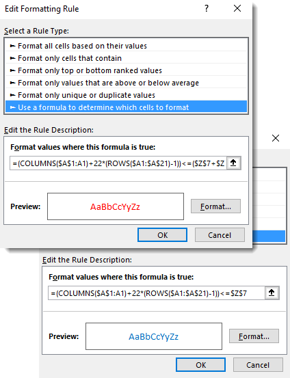
And to display dots instead of squares, use an IF formula to return the dot symbol:

=IF((COLUMNS($A$1:A1)+22*(ROWS($A1:$A$20)-1))<=435,"●","")

You can modify the number of rows and columns in the formulas to suit your data and desired waffle shape.

Conditional Formatting Relative Waffle Charts

The Conditional Formatting for the squares uses the same logic:

conditional formatting rules manager

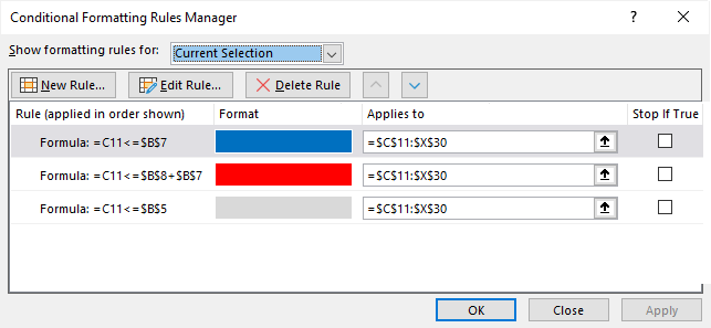
There are only two Conditional Formats for the dots because the dot colour can be formatted with font formatting, which means you only need Conditional Formatting for the red and blue colours. However, notice the formula is more complex because the cells now contain dots instead of the numbers, therefore we need use the COLUMNS & ROWS formula to generate the cell numbers inside of the Conditional Format:

conditional formatting rule formulas

Waffle Chart Titles

Because the column width is tiny, I used a Text Box (Insert tab > Shapes) for my chart title.

excel waffle chart titles

Excel Waffle Chart Limitations

In these examples you’ll have noticed that each segment represents a whole number or whole percentage point. With this technique it’s not possible to show fractions of a percentage point, but in next week’s tutorial I’ll demonstrate an alternate way to build waffle charts that get around this limitation.

Excel waffle Charts

More Excel Charts Posts

picture fill excel charts

Picture Fill Excel Charts

Using a stylish picture fill in your Excel Charts is a simple way to make your data visualizations more captivating and memorable
excel speedometer charts

Excel Speedometer Charts

How to build Excel Speedometer Charts or Gauge Charts as they're also know, why they are BAD and what to use instead.
burn up burn down charts

Excel Project Management Burn Down and Burn Up Charts

Excel Burn Down and Burn Up Charts are easy to make with line or scatter charts. They are useful for monitoring the progress of a project.
wee people font charts

Excel WeePeople Font Charts

Excel WeePeople Font Charts are a nice change from generic shapes for waffle charts, bar/column charts and more.
excel dot map charts

Excel Dot Map Charts

Interactive Excel dot map charts are not built-in, but with some creative use of Excel’s built-in tools we can create something unique.
Excel S Curve Charts

Excel S-Curve Charts

Easy Excel S-curve Charts made with PivotTables for project management. Track progress by including budget amounts.
chart axis switch

Excel Chart Axis Switch

Use radio button form controls to create an Excel chart axis switch enabling you to toggle pannel charts between same axis and own axis.

Excel Charts with Shapes for Infographics

Excel Charts with Shapes for Infographic styling and increased interest in your charts. Easy to insert but there are a few tricks required.
excel pyramid chart

Excel Pyramid Charts

Excel Pyramid charts are useful for visualising demographic data across multiple categories. Let’s look at 3 ways we can build them in Excel.

Highlighting Periods in Excel Charts

Highlighting Periods in Excel Charts helps your users interpret them more quickly and or focus their attention on a point or area.


Category: Excel Charts
Previous Post:dense ranking in power queryDense Ranking in Power Query
Next Post:Stacked Bar Excel Waffle Chartsstacked bar waffle chart

Reader Interactions

Comments

  1. oden ogbin

    December 10, 2020 at 4:16 pm

    how will have cd for this excel training

    Reply
    • Mynda Treacy

      December 11, 2020 at 10:06 am

      We don’t provide our training on CDs sorry.

      Reply

Leave a Reply Cancel reply

Your email address will not be published. Required fields are marked *

Current ye@r *

Leave this field empty

Sidebar

More results...

Featured Content

  • 10 Common Excel Mistakes to Avoid
  • Top Excel Functions for Data Analysts
  • Secrets to Building Excel Dashboards in Less Than 15 Minutes
  • Pro Excel Formula Writing Tips
  • Hidden Excel Double-Click Shortcuts
  • Top 10 Intermediate Excel Functions
  • 5 Pro Excel Dashboard Design Tips
  • 5 Excel SUM Function Tricks
  • 239 Excel Keyboard Shortcuts

100 Excel Tips and Tricks eBook

Download Free Tips & Tricks

Subscribe to Our Newsletter

Receive weekly tutorials on Excel, Power Query, Power Pivot, Power BI and More.

We respect your email privacy

Guides and Resources

  • Excel Keyboard Shortcuts
  • Excel Functions
  • Excel Formulas
  • Excel Custom Number Formatting
  • ALT Codes
  • Pivot Tables
  • VLOOKUP
  • VBA
  • Excel Userforms
  • Free Downloads

239 Excel Keyboard Shortcuts

Download Free PDF

Free Webinars

Excel Dashboards Webinar

Watch our free webinars and learn to create Interactive Dashboard Reports in Excel or Power BI

Click Here to Watch Now

mynda treacy microsoft mvpHi, I'm Mynda Treacy and I run MOTH with my husband, Phil. Through our blog, webinars, YouTube channel and courses we hope we can help you learn Excel, Power Pivot and DAX, Power Query, Power BI, and Excel Dashboards.

Blog Categories

  • Excel
  • Excel Charts
  • Excel Dashboard
  • Excel Formulas
  • Excel PivotTables
  • Excel Shortcuts
  • Excel VBA
  • General Tips
  • Online Training
  • Outlook
  • Power Apps
  • Power Automate
  • Power BI
  • Power Pivot
  • Power Query
microsoft mvp logo
trustpilot excellent rating
Secured by Sucuri Badge
MyOnlineTrainingHub on YouTube Mynda Treacy on Linked In Mynda Treacy on Instagram Mynda Treacy on Twitter Mynda Treacy on Pinterest MyOnlineTrainingHub on Facebook
 

Company

  • About My Online Training Hub
  • Disclosure Statement
  • Frequently Asked Questions
  • Guarantee
  • Privacy Policy
  • Terms & Conditions
  • Testimonials
  • Become an Affiliate

Support

  • Contact
  • Forum
  • Helpdesk – For Technical Issues

Copyright © 2023 · My Online Training Hub · All Rights Reserved. Microsoft and the Microsoft Office logo are trademarks or registered trademarks of Microsoft Corporation in the United States and/or other countries. Product names, logos, brands, and other trademarks featured or referred to within this website are the property of their respective trademark holders.