• Skip to main content
  • Skip to header right navigation
  • Skip to site footer

My Online Training Hub

Learn Dashboards, Excel, Power BI, Power Query, Power Pivot

  • Courses
  • Pricing
    • Free Courses
    • Power BI Course
    • Excel Power Query Course
    • Power Pivot and DAX Course
    • Excel Dashboard Course
    • Excel PivotTable Course – Quick Start
    • Advanced Excel Formulas Course
    • Excel Expert Advanced Excel Training
    • Excel Tables Course
    • Excel, Word, Outlook
    • Financial Modelling Course
    • Excel PivotTable Course
    • Excel for Customer Service Professionals
    • Excel for Operations Management Course
    • Excel for Decision Making Under Uncertainty Course
    • Excel for Finance Course
    • Excel Analysis ToolPak Course
    • Multi-User Pricing
  • Resources
    • Free Downloads
    • Excel Functions Explained
    • Excel Formulas
    • Excel Add-ins
    • IF Function
      • Excel IF Statement Explained
      • Excel IF AND OR Functions
      • IF Formula Builder
    • Time & Dates in Excel
      • Excel Date & Time
      • Calculating Time in Excel
      • Excel Time Calculation Tricks
      • Excel Date and Time Formatting
    • Excel Keyboard Shortcuts
    • Excel Custom Number Format Guide
    • Pivot Tables Guide
    • VLOOKUP Guide
    • ALT Codes
    • Excel VBA & Macros
    • Excel User Forms
    • VBA String Functions
  • Members
    • Login
  • Blog
  • Excel Webinars
  • Excel Forum
    • Register as Forum Member
  • Login

Stacked Bar Excel Waffle Charts

You are here: Home / Excel Charts / Stacked Bar Excel Waffle Charts
stacked bar waffle chart
December 10, 2020 by Mynda Treacy

Last week we looked at building Excel waffle charts using Conditional Formatting. This week we’re looking at building Stacked Bar Excel waffle charts.

Some might say this technique is easier, although it may appear daunting when you look at the number of steps. Don’t let that put you off though, it’s super easy.

The other benefit with using this technique is you can represent precise proportions, as shown below where the Gamma series is 8.5%:

Stacked bar Excel Waffle Charts

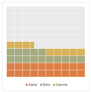
You can also easily add/remove series from stacked bar waffle charts.

Watch the Video

Subscribe YouTube

Download Workbook

Enter your email address below to download the sample workbook.

By submitting your email address you agree that we can email you our Excel newsletter.
Please enter a valid email address.

Download the Excel Workbook and follow along. Note: This is a .xlsx file please ensure your browser doesn't change the file extension on download.

Stacked Bar Waffle Charts Step by Step

The data layout that supports the charts uses formulas to determine which segments should be coloured for each series, plus it has a dummy series for the error bars in column B:

data for Stacked Column Excel Waffle Charts

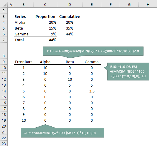
Tip: you can download the file for this tutorial and simply change the data in cells B4:C6, and add/remove series to the table as required. Modify the formulas by following the pattern of changes from the formulas in column E to F.

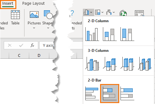
Step 1: Insert Stacked Bar Chart

Select all chart data (cells B9:E19) > Insert tab > Charts: 2-D Stacked Bar Chart:

insert 2-d bar chart

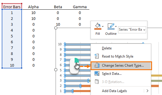
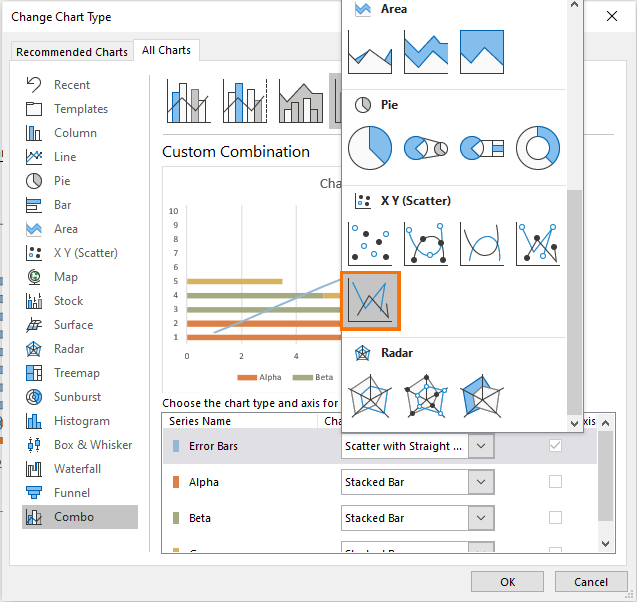
Step 2: Change Error Bar series chart type

Select the Error Bar series in the chart > right-click and select Change Series Chart Type…

change series chart type

Change the Error Bar series to a scatter with straight lines. This will automatically place it on the secondary axis.

scatter with straight lines

Step 3: Set axis maximum and minimum

Set the X axis and secondary Y and X axis minimum to 0 and maximum to 10. Select the secondary Y axis > CTRL+1 to format:
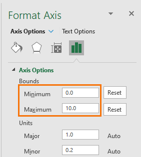
set axis min and max

Repeat for X axis.

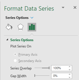
Step 4: Remove gap width for remaining bars

Select one of the bars in the chart > CTRL+1 to format > Set gap width to 0%:

format series

Step 5: Add Error Bars to the Error Bar series

Select the Error Bar series line > click the plus sign to reveal the chart elements list > Error bars > More Options:

add error bars

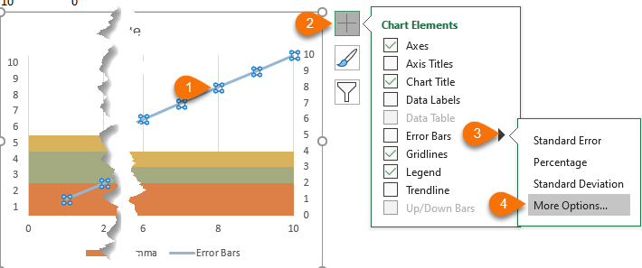
In the Error Bar Options set the vertical error bar to Both directions, No Cap and Fixed Value of 10:

error bar options

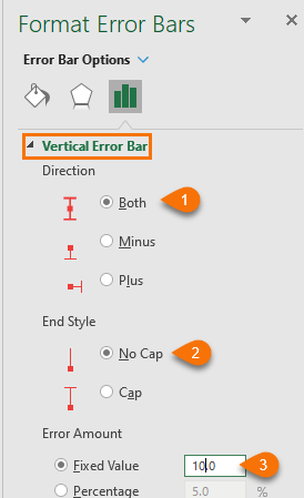
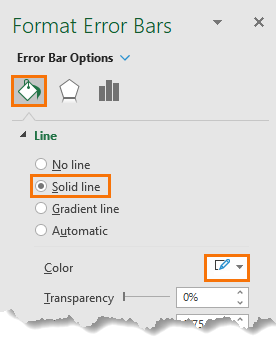
Then go to the Paint Bucket icon and set the formatting to a solid white line:

select horizontal error bars

Repeat for the horizontal error bars. Select the Horizontal Error bar from the ‘Error Bar Options’ drop down:

error bar formatting

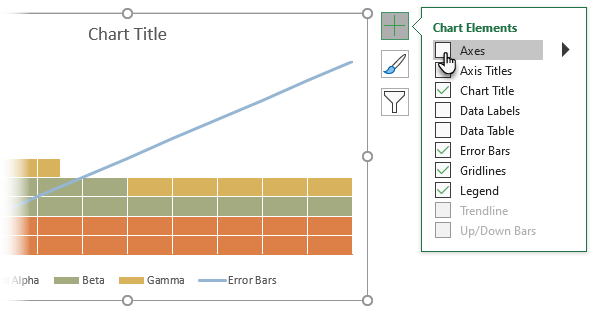
Step 6: Hide Axis Labels

Select the chart > click on the + menu > Deselect Axis labels:

remove axes

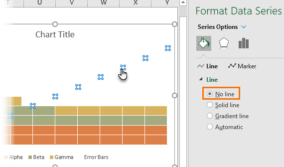
Step 7: Hide Error Bar series

Select the Error Bar series scatter chart line and format to ‘no line’:

hide lines

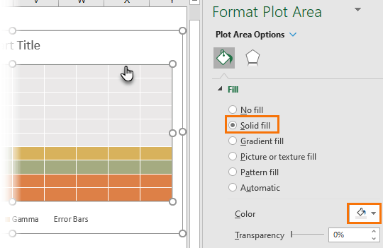
Step 8: Set Plot Area Fill Colour

Select the plot area and set a fill colour for the remaining squares:

plot fill colour

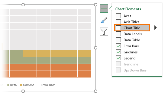
Step 9: Hide Chart Title [Optional]

I don't need the title, so I'm deselecting it from the + menu, but you can keep it if you want:

remove chart title

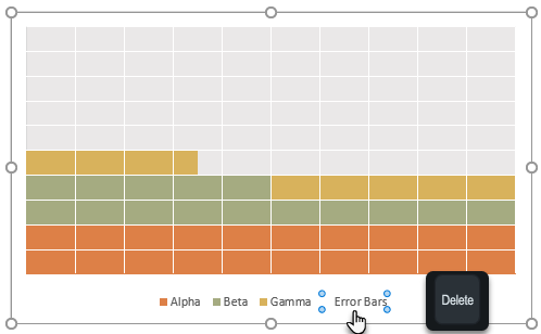
Step 10: Remove Error Bar series from the legend

Select the legend item (left click twice to select), then press delete:

tidy up legend

Step 11: Resize the chart

Lastly, resize the chart so that each segment is square. And there you have a Stacked Bar Excel Waffle Charts:

Stacked Bar Excel Waffle Charts

Thanks

Thanks to Nick Hillman, Associate Professor, University Wisconsin-Madison who shared his template for waffle charts here.

stacked bar waffle chart
Mynda Treacy

Microsoft MVP logo

AUTHOR Mynda Treacy Co-Founder / Owner at My Online Training Hub

CIMA qualified Accountant with over 25 years experience in roles such as Global IT Financial Controller for investment banking firms Barclays Capital and NatWest Markets.

Mynda has been awarded Microsoft MVP status every year since 2014 for her expertise and contributions to educating people about Microsoft Excel.

Mynda teaches several courses here at MOTH including Excel Expert, Excel Dashboards, Power BI, Power Query and Power Pivot.

More Excel Charts Posts

interactive python charts in excel

Interactive Python Charts in Excel

How to build interactive Python Charts in Excel and regular charts with Slicers connected to data from Power Query.
Circle Progress Charts

Excel Progress Circle Charts

How to easily create dynamic Excel Progress Circle Charts, using doughnut charts and some wizardry, including Slicers to change the data.
professional vs amateur chart formatting

Pro Excel Chart Formatting

10 tell-tale signs that show you’re a chart amateur and the Excel chart formatting you should use instead.

Excel Scroll and Sort Table

Excel scroll and sort table using dynamic array formulas is far simpler than the old approach which required multiple tables, formulas and helper columns.
picture fill excel charts

Picture Fill Excel Charts

Using a stylish picture fill in your Excel Charts is a simple way to make your data visualizations more captivating and memorable
excel speedometer charts

Excel Speedometer Charts

How to build Excel Speedometer Charts or Gauge Charts as they're also know, why they are BAD and what to use instead.
burn up burn down charts

Excel Project Management Burn Down and Burn Up Charts

Excel Burn Down and Burn Up Charts are easy to make with line or scatter charts. They are useful for monitoring the progress of a project.
wee people font charts

Excel WeePeople Font Charts

Excel WeePeople Font Charts are a nice change from generic shapes for waffle charts, bar/column charts and more.
excel dot map charts

Excel Dot Map Charts

Interactive Excel dot map charts are not built-in, but with some creative use of Excel’s built-in tools we can create something unique.
Excel S Curve Charts

Excel S-Curve Charts

Easy Excel S-curve Charts made with PivotTables for project management. Track progress by including budget amounts.


Category: Excel Charts
Previous Post:Excel waffle ChartsExcel Waffle Charts with Conditional Formatting
Next Post:Changing Data Source Location in Power Querychanging power query data source settings

Reader Interactions

Comments

  1. Jomili

    December 31, 2020 at 3:52 am

    I’m following the directions, but my results don’t match yours. On the horizontal error bars, if I set the direction as Both I get another set of columns to the left of the chart. Setting it to “Plus” corrects that. I’m also not getting the white lines coming all the way down. the Endpoints of the white lines follow the (invisible) line of the Error bar. I’d attach my chart or a picture of it but don’t know how.

    Reply
    • Mynda Treacy

      December 31, 2020 at 8:00 am

      Hi Jomili, please post your question on our Excel forum where you can also upload a sample file and we can help you further.

      Reply
  2. jomili

    December 31, 2020 at 3:12 am

    Hmm, are we missing steps 11 and 12? We go from m10 to 13.

    Reply
    • Mynda Treacy

      December 31, 2020 at 7:59 am

      Oops! No, I misnumbered the steps. Fixed now 🙂

      Reply

Leave a Reply Cancel reply

Your email address will not be published. Required fields are marked *

Current ye@r *

Leave this field empty

Sidebar

More results...

Popular Content

  • 10 Common Excel Mistakes to Avoid
  • Top Excel Functions for Data Analysts
  • Secrets to Building Excel Dashboards in Less Than 15 Minutes
  • Pro Excel Formula Writing Tips
  • Hidden Excel Double-Click Shortcuts
  • Top 10 Intermediate Excel Functions
  • 5 Pro Excel Dashboard Design Tips
  • 5 Excel SUM Function Tricks
  • 239 Excel Keyboard Shortcuts

100 Excel Tips and Tricks eBook

Download Free Tips & Tricks

239 Excel Keyboard Shortcuts

Download Free PDF

mynda treacy microsoft mvpHi, I'm Mynda Treacy and I run MOTH with my husband, Phil. Through our blog, webinars, YouTube channel and courses we hope we can help you learn Excel, Power Pivot and DAX, Power Query, Power BI, and Excel Dashboards.

Blog Categories

  • Excel
  • Excel Charts
  • Excel Dashboard
  • Excel Formulas
  • Excel Office Scripts
  • Excel PivotTables
  • Excel Shortcuts
  • Excel VBA
  • General Tips
  • Online Training
  • Outlook
  • Power Apps
  • Power Automate
  • Power BI
  • Power Pivot
  • Power Query
microsoft mvp logo
trustpilot excellent rating
Secured by Sucuri Badge
MyOnlineTrainingHub on YouTube Mynda Treacy on Linked In Mynda Treacy on Instagram Mynda Treacy on Twitter Mynda Treacy on Pinterest MyOnlineTrainingHub on Facebook

Sign up to our newsletter and join over 400,000
others who learn Excel and Power BI with us.


Company

  • About My Online Training Hub
  • Disclosure Statement
  • Frequently Asked Questions
  • Guarantee
  • Privacy Policy
  • Terms & Conditions
  • Testimonials
  • Become an Affiliate
  • Sponsor Our Newsletter

Support

  • Contact
  • Forum
  • Helpdesk – For Technical Issues

Copyright © 2023 · My Online Training Hub · All Rights Reserved. Microsoft and the Microsoft Office logo are trademarks or registered trademarks of Microsoft Corporation in the United States and/or other countries. Product names, logos, brands, and other trademarks featured or referred to within this website are the property of their respective trademark holders.