One of the things that makes Excel stand apart from other reporting tools is its immense flexibility. With some tinkering you can make charts and graphics that don’t look anything like Excel.
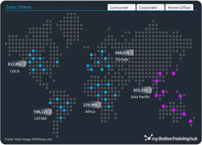
In this post I’m going to take you through the steps to create Excel dot map charts. And while there’s no built in Excel dot map chart, it’s easier than it might appear.
Watch the Video

Download Workbook
Enter your email address below to download the sample workbook.
Creating a Dot Map Chart
Step 1: Find an image of a dot map and insert it in Excel (Insert tab > Pictures). I found one on pngwing.com and you can get a copy of it by downloading the workbook at the link above.
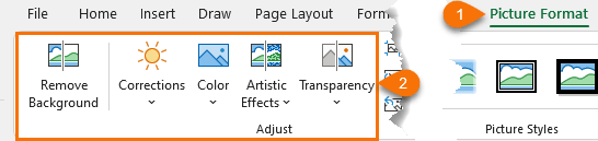
Step 2: use the tools on the Picture Format contextual tab to adjust the colour to suit your needs. I used the recolor tool. See the video for a demonstration.
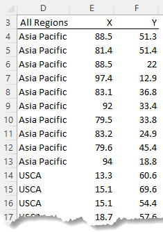
Step 3: Create a table of x and y coordinates which you’ll use to create a scatter chart. Just put some placeholder values between 0 and 100 in the table for now.
Then insert the scatter chart.
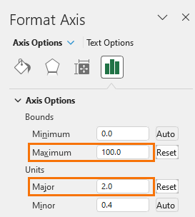
Step 4: set the scatter axis maximums to 100 and the major units to 2.
This places a grid over the map image.
Step 5: set the chart background to no fill and put it on top of the map chart image so that the plot area is the same size as the map image. Tip: you might need to temporarily give your map image a border so you can line them up.
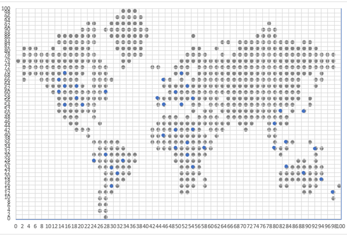
Step 6: use the coordinates on the scatter to match up the dots in the chart and enter those values in the table of x and y coordinates you created in step 3.
Step 7: Turn off gridlines and hide the axis labels by formatting them the same colour as the background. Note: you don’t want to turn off the axes labels because this will resize the chart and the dots will no longer line up.
Step 8: Format the dots with your colour choice and make them bigger/smaller as required to line up with the dots in the underlying map. Also format the axis lines with no line.
Step 9: If you’d like the chart to be interactive you can link it to a PivotTable and use Slicers. For example, you can highlight the maximum value/region with the max function.
Use the XLOOKUP function or INDEX & MATCH to return the region/country. And use the FILTER function to return the coordinates for the max region.
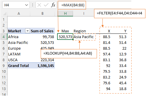
Note: If you don’t have the FILTER function, you can use this technique to lookup and return multiple matches.
Step 10: Add this as a new series to the chart:
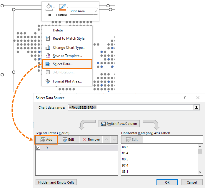
This series sits on top of the original series.
Step 12: set the colour formatting for the new series to something that draws attention to it.
Step 13: add some rectangle shapes to store the values and label for each region in. I’ve formatted mine with a gradient fill and rounded corners. Link each shape to the relevant cell in the PivotTable. Note: you can’t use the GETPIVOTDATA function here as shapes only take cell references.
Step 14: Insert a Slicer for the PivotTable if applicable. I can filter the data by segment; Consumer, Corporate or Home Office.

