• Skip to main content
  • Skip to header right navigation
  • Skip to site footer

My Online Training Hub

Learn Dashboards, Excel, Power BI, Power Query, Power Pivot

  • Courses
  • Pricing
    • Free Courses
    • Power BI Course
    • Excel Power Query Course
    • Power Pivot and DAX Course
    • Excel Dashboard Course
    • Excel PivotTable Course – Quick Start
    • Advanced Excel Formulas Course
    • Excel Expert Advanced Excel Training
    • Excel Tables Course
    • Excel, Word, Outlook
    • Financial Modelling Course
    • Excel PivotTable Course
    • Excel for Customer Service Professionals
    • Excel for Operations Management Course
    • Excel for Decision Making Under Uncertainty Course
    • Excel for Finance Course
    • Excel Analysis ToolPak Course
    • Multi-User Pricing
  • Resources
    • Free Downloads
    • Excel Functions Explained
    • Excel Formulas
    • Excel Add-ins
    • IF Function
      • Excel IF Statement Explained
      • Excel IF AND OR Functions
      • IF Formula Builder
    • Time & Dates in Excel
      • Excel Date & Time
      • Calculating Time in Excel
      • Excel Time Calculation Tricks
      • Excel Date and Time Formatting
    • Excel Keyboard Shortcuts
    • Excel Custom Number Format Guide
    • Pivot Tables Guide
    • VLOOKUP Guide
    • ALT Codes
    • Excel VBA & Macros
    • Excel User Forms
    • VBA String Functions
  • Members
    • Login
    • Password Reset
  • Blog
  • Excel Webinars
  • Excel Forum
    • Register as Forum Member

Excel WeePeople Font Charts

You are here: Home / Excel Charts / Excel WeePeople Font Charts
wee people font charts
October 27, 2022 by Mynda Treacy

Excel WeePeople font charts enable you to build interesting variations on waffle, bar and column charts, to name a few. They’re great for visualising demographic data, survey data and more.

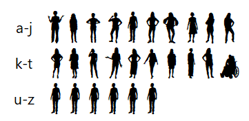
The free WeePeople font, courtesy of ProPublica, consists of 20 different people silhouettes hand drawn by Alberto Cairo. The last 6 letters of the alphabet (u – z) are a repeat of the letter ‘e’ person, as you can see below:

wee people charts example 1

Click here to download the WeePeople font, and click here to read how this font came about.

In Excel letters can be converted to numbers, which means we can do some cool things with these wee people.

wee people animation

Watch the Video

Subscribe YouTube

Download Workbook

Enter your email address below to download the sample workbook.

By submitting your email address you agree that we can email you our Excel newsletter.
Please enter a valid email address.

Download the Excel Workbook and follow along. Note: This is a .xlsx file please ensure your browser doesn't change the file extension on download.

Excel WeePeople Font Charts

Note: for detailed step by step instructions please see the video above.

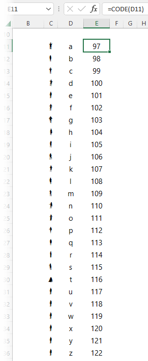
The WeePeople font is available for lower case ‘a’ through ‘z’. We can use the CODE function to convert these letters to numbers so we can work with them in Excel. In the image below you can see that lower case ‘a’ is code 97 and ‘z’ is 122.

wee people charts example 2

We can discard ‘u’ through ‘z’ as these are the same silhouette as the letter ‘e’. In other words, code 97 through 116 are unique silhouettes.

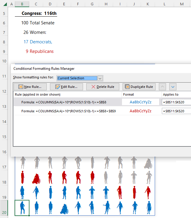
Excel WeePeople Waffle Chart

The image below uses a formula to generate a grid of silhouettes:

wee people charts example 3

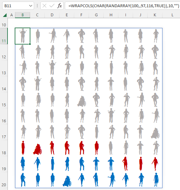
Starting with the RANDARRAY function I can generate a list of 100 random numbers between 97 and 116. And with the CHAR function I can convert the numbers to their corresponding character. With the WRAPCOLS function I can create a 10 x 10 grid, which I can format with the WeePeople font so they appear as silhouettes.

I then used Conditional Formatting formulas to colour code some of the silhouettes based on the selection made in cell D5:

Tip: If you don’t have Dynamic Arrays, you can type the letters directly in the cells, or use the RANDBETWEEN function with the CHAR function and copy the formula to create the 10 x 10 grid e.g.:

=CHAR(RANDBETWEEN(97,116))

wee people charts example 4

Excel WeePeople Bar Charts

There are various ways to generate a bar of WeePeople. One option is to use the TEXTJOIN function with the SEQUENCE function to generate a string from a to t:

wee people charts example 5

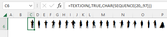
The example above returns 20 WeePeople in a single cell, but you can modify it to return up to 26 characters.

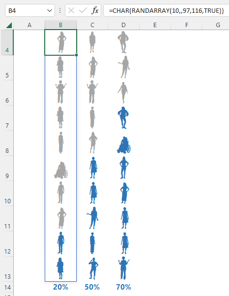
If you prefer a random selection of WeePeople you can use the RANDARRAY function:

wee people charts example 6

The formula above spills the results to multiple cells which enables me to use Conditional Formatting formulas to colour some of the silhouettes:

wee people charts example 7

Excel WeePeople Column Charts

Column charts use the same formulas, except in RANDARRAY the first argument for the number of columns is used, and the second argument for the number of rows is skipped:

wee people charts example 8

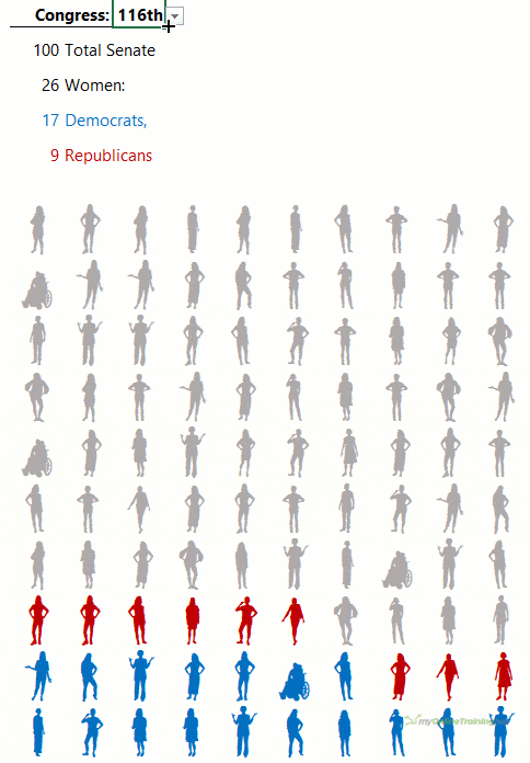
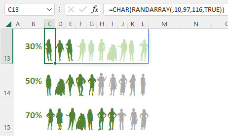
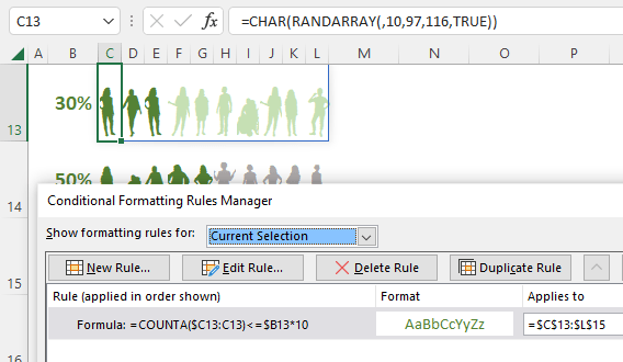
Visualising Survey Data with WeePeople

WeePeople are great for visualising survey data. The bar charts below use WeePeople to show the size and distribution for each survey response:

wee people charts example 9

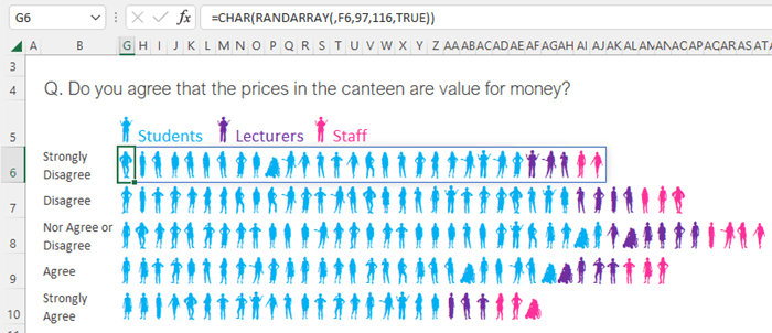
Columns C through F contain the supporting values for the number of wee people and the conditional formatting:

wee people charts example 10

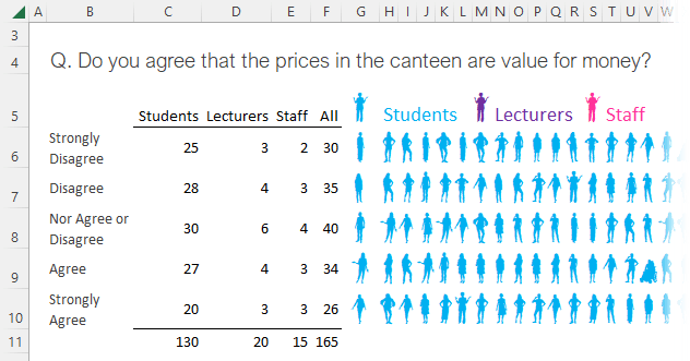
Please refer to the video for detailed instructions on how to implement these graphics.

wee people font charts

More Charts Posts

burn up burn down charts

Excel Project Management Burn Down and Burn Up Charts

Excel Burn Down and Burn Up Charts are easy to make with line or scatter charts. They are useful for monitoring the progress of a project.
excel dot map charts

Excel Dot Map Charts

Interactive Excel dot map charts are not built-in, but with some creative use of Excel’s built-in tools we can create something unique.
Excel S Curve Charts

Excel S-Curve Charts

Easy Excel S-curve Charts made with PivotTables for project management. Track progress by including budget amounts.
highlighting data in power bi visuals

Highlighting Data in Power BI Visuals

Learn several techniques to highlight or label important data points in your Power BI visuals. Sample file and code to download.
shape maps in power bi

Shape Maps in Power BI

Shape maps in Power BI can be used to show the distribution of a variable across geographic regions. Learn a trick to plot discrete data too.
using jitter to avoid over plotting

Using Jitter to Avoid Over Plotting in Power BI

Plotting data that has one variable where values are similar, can result in points that are plotted over each other. Use jitter to avoid this overplotting.
Excel custom chart labels

Excel Custom Chart Labels

Create dynamic Excel custom chart labels with this category axis hijack trick
Sorting Excel Date Slicers

Sorting Excel Date Slicers

Slicers have some shortcomings when it comes to dates and sort order. This post explains a couple of ways to sort dates correctly in Excel slicers.
Charting Disparate Data in Excel – 3 Solutions and 1 Crazy Mess

Charting Disparate Data in Excel – 3 Solutions and 1 Crazy Mess

4 Charts – Same Data. Which do you think is best?

4 Charts – Same Data. Which do you think is best?

More Excel Charts Posts

burn up burn down charts

Excel Project Management Burn Down and Burn Up Charts

Excel Burn Down and Burn Up Charts are easy to make with line or scatter charts. They are useful for monitoring the progress of a project.
excel dot map charts

Excel Dot Map Charts

Interactive Excel dot map charts are not built-in, but with some creative use of Excel’s built-in tools we can create something unique.
highlighting data in power bi visuals

Highlighting Data in Power BI Visuals

Learn several techniques to highlight or label important data points in your Power BI visuals. Sample file and code to download.
animating excel charts

Animating Excel Charts

Use animation correctly to enhance the story your data is telling. Don't animate your chart just for some eye candy. Sample code and workbook to download.
project management dashboard

Excel Project Management Dashboard

Excel project management dashboard video tutorial covering various techniques including conditional formatting, PivotTables, Slicers, charts and more.
jitter in scatter charts

Jitter in Excel Scatter Charts

Jitter introduces a small movement to the plotted points, making it easier to read and understand scatter plots particularly when dealing with lots of data.
Custom Excel Chart Label Positions

Custom Excel Chart Label Positions

Custom Excel Chart Label Positions using a dummy or ghost series to force the label position neatly above the columns of data
Lookup Pictures in Excel

Lookup Pictures in Excel

Lookup Pictures in Excel using values in cells returned by data validation lists (drop down lists) or Slicers. No VBA/Macros required!

Cross Highlight Excel Charts

Filter and Cross Highlight Excel Charts like you can in Power BI using some Excel Power Pivot magic, regular charts and a Slicer.
save chart as image

Save Chart as Image

List all the charts in your workbook then select the ones you want to save as either PNG or JPG. Sample workbook and code to download

More Excel Charts Posts

picture fill excel charts

Picture Fill Excel Charts

Using a stylish picture fill in your Excel Charts is a simple way to make your data visualizations more captivating and memorable
excel speedometer charts

Excel Speedometer Charts

How to build Excel Speedometer Charts or Gauge Charts as they're also know, why they are BAD and what to use instead.
burn up burn down charts

Excel Project Management Burn Down and Burn Up Charts

Excel Burn Down and Burn Up Charts are easy to make with line or scatter charts. They are useful for monitoring the progress of a project.
wee people font charts

Excel WeePeople Font Charts

Excel WeePeople Font Charts are a nice change from generic shapes for waffle charts, bar/column charts and more.
excel dot map charts

Excel Dot Map Charts

Interactive Excel dot map charts are not built-in, but with some creative use of Excel’s built-in tools we can create something unique.
Excel S Curve Charts

Excel S-Curve Charts

Easy Excel S-curve Charts made with PivotTables for project management. Track progress by including budget amounts.
chart axis switch

Excel Chart Axis Switch

Use radio button form controls to create an Excel chart axis switch enabling you to toggle pannel charts between same axis and own axis.

Excel Charts with Shapes for Infographics

Excel Charts with Shapes for Infographic styling and increased interest in your charts. Easy to insert but there are a few tricks required.
excel pyramid chart

Excel Pyramid Charts

Excel Pyramid charts are useful for visualising demographic data across multiple categories. Let’s look at 3 ways we can build them in Excel.

Highlighting Periods in Excel Charts

Highlighting Periods in Excel Charts helps your users interpret them more quickly and or focus their attention on a point or area.


Category: Excel ChartsTag: charts, excel charts
Previous Post:excel dot map chartsExcel Dot Map Charts
Next Post:Excel Project Management Burn Down and Burn Up Chartsburn up burn down charts

Reader Interactions

Leave a Reply Cancel reply

Your email address will not be published. Required fields are marked *

Current ye@r *

Leave this field empty

Sidebar

More results...

Featured Content

  • 10 Common Excel Mistakes to Avoid
  • Top Excel Functions for Data Analysts
  • Secrets to Building Excel Dashboards in Less Than 15 Minutes
  • Pro Excel Formula Writing Tips
  • Hidden Excel Double-Click Shortcuts
  • Top 10 Intermediate Excel Functions
  • 5 Pro Excel Dashboard Design Tips
  • 5 Excel SUM Function Tricks
  • 239 Excel Keyboard Shortcuts

100 Excel Tips and Tricks eBook

Download Free Tips & Tricks

Subscribe to Our Newsletter

Receive weekly tutorials on Excel, Power Query, Power Pivot, Power BI and More.

We respect your email privacy

Guides and Resources

  • Excel Keyboard Shortcuts
  • Excel Functions
  • Excel Formulas
  • Excel Custom Number Formatting
  • ALT Codes
  • Pivot Tables
  • VLOOKUP
  • VBA
  • Excel Userforms
  • Free Downloads

239 Excel Keyboard Shortcuts

Download Free PDF

Free Webinars

Excel Dashboards Webinar

Watch our free webinars and learn to create Interactive Dashboard Reports in Excel or Power BI

Click Here to Watch Now

mynda treacy microsoft mvpHi, I'm Mynda Treacy and I run MOTH with my husband, Phil. Through our blog, webinars, YouTube channel and courses we hope we can help you learn Excel, Power Pivot and DAX, Power Query, Power BI, and Excel Dashboards.

Blog Categories

  • Excel
  • Excel Charts
  • Excel Dashboard
  • Excel Formulas
  • Excel PivotTables
  • Excel Shortcuts
  • Excel VBA
  • General Tips
  • Online Training
  • Outlook
  • Power Apps
  • Power Automate
  • Power BI
  • Power Pivot
  • Power Query
microsoft mvp logo
trustpilot excellent rating
Secured by Sucuri Badge
MyOnlineTrainingHub on YouTube Mynda Treacy on Linked In Mynda Treacy on Instagram Mynda Treacy on Twitter Mynda Treacy on Pinterest MyOnlineTrainingHub on Facebook
 

Company

  • About My Online Training Hub
  • Disclosure Statement
  • Frequently Asked Questions
  • Guarantee
  • Privacy Policy
  • Terms & Conditions
  • Testimonials
  • Become an Affiliate

Support

  • Contact
  • Forum
  • Helpdesk – For Technical Issues

Copyright © 2023 · My Online Training Hub · All Rights Reserved. Microsoft and the Microsoft Office logo are trademarks or registered trademarks of Microsoft Corporation in the United States and/or other countries. Product names, logos, brands, and other trademarks featured or referred to within this website are the property of their respective trademark holders.